Tattoo Fonts: Best Typefaces for Ink
Tattoo fonts occupy a category unlike anything else in typography. Choosing a typeface for a tattoo is one of the few typographic decisions that is genuinely permanent. There is no undo button, no second edition, no responsive breakpoint to fall back on. The letterforms you select will live on skin for decades, shifting and softening as the body changes. That reality demands a different set of criteria than picking a font for a website header or a book cover.
This guide covers more than twenty-five typefaces across five major style categories — script, blackletter, serif, sans-serif, and decorative — and explains what makes each one work or fail as a tattoo. Beyond the font list, it addresses the practical concerns that separate typography on skin from typography on paper or screen: sizing, placement, aging, and the crucial difference between using an existing font and commissioning custom lettering.
What Makes a Good Tattoo Font
The principles that govern good type on screen or in print apply to tattoos, but skin introduces variables that designers rarely encounter elsewhere. Understanding these variables is the first step toward choosing a tattoo typeface that will still look sharp years from now.
Legibility at the planned size. A font that reads beautifully at 72 points on a monitor may become an illegible blur at the size it will actually appear on a forearm or ribcage. Tattoo lettering needs to be legible at its final, real-world dimensions — and those dimensions are often smaller than people expect. Hairline strokes and tight letter spacing that work on paper collapse into muddy shapes when rendered in ink under skin.
Aging well. Ink spreads beneath the skin over time, a process tattoo artists call “blowout” when it happens prematurely and “spreading” when it happens gradually over years. Thin lines blur together. Fine serifs can lose their definition. High-contrast typefaces — those with dramatic differences between thick and thin strokes — are particularly vulnerable. The best tattoo fonts maintain enough stroke weight and letter spacing to remain readable as the ink naturally migrates.
Readability on skin. Skin is not flat. It stretches, wrinkles, curves, and moves. A tattoo on the inside of a bicep will distort every time the arm bends. Lettering across the ribs will compress and expand with each breath. Fonts with rigid, geometric structures can look unnatural on curved surfaces, while typefaces with organic, flowing forms tend to adapt better to the body’s topology.
Style matching the message and placement. A delicate copperplate script across the knuckles will be nearly impossible to execute cleanly. A heavy blackletter on a small wrist will look cramped. The font style needs to match both the emotional tone of the text and the physical reality of where it will sit. This is where tattoo typography diverges most sharply from screen or print work — the “canvas” has its own shape, texture, and movement that must be respected.
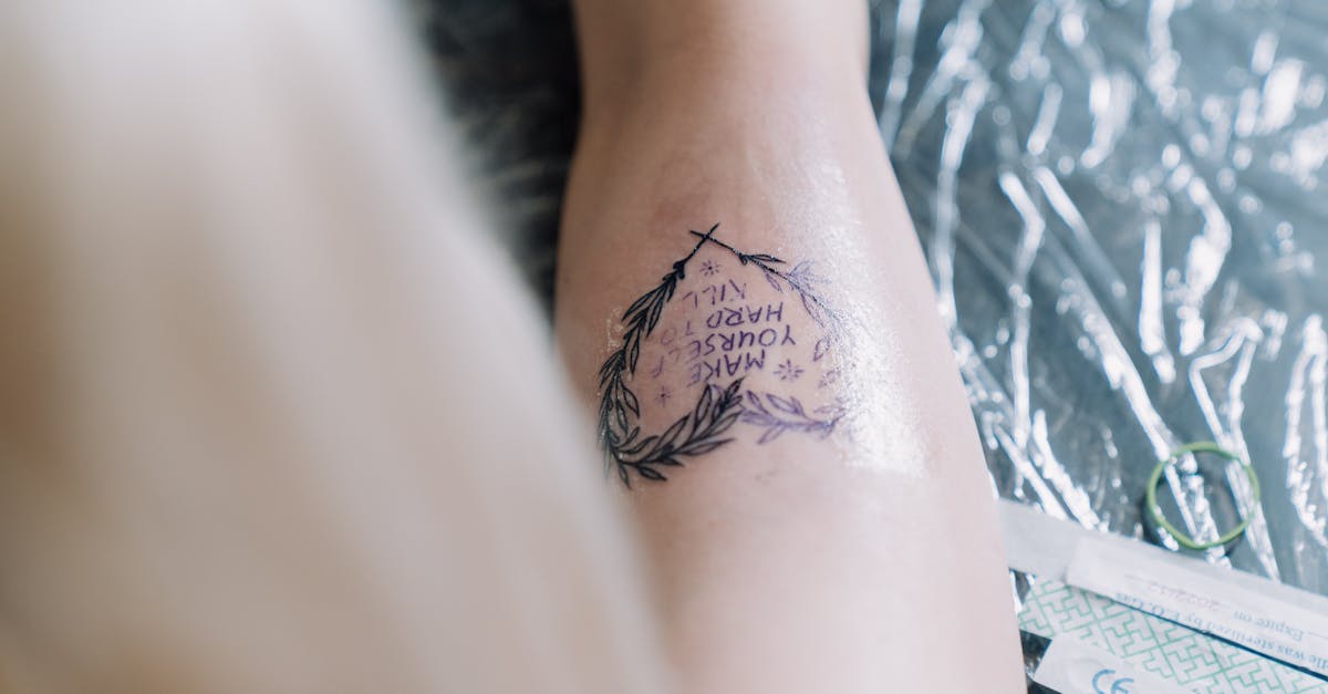
Best Script and Cursive Tattoo Fonts
Script fonts are the most popular category for tattoo lettering, and for good reason. Their flowing, connected letterforms feel personal and organic — qualities that suit the intimate nature of a tattoo. The danger lies in choosing a script that is too delicate. Many script tattoo fonts rely on hairline connections and wispy strokes that will not survive the aging process. The best options for ink strike a balance between elegance and structural durability.
Edwardian Script
Edwardian Script ITC, designed by Edward Benguiat, is one of the most commonly referenced fonts in tattoo shops. Its flowing connected letters lean at a consistent angle, creating a cohesive rhythm that looks natural on skin. The stroke contrast is moderate rather than extreme, which gives it better longevity than ultra-fine copperplate alternatives. It ships with most Windows installations, making it easy to access for reference prints.
The main consideration with Edwardian Script is sizing. At smaller sizes, the connections between letters can merge. For tattoos, it works best at a generous scale — a full forearm phrase rather than a tiny wrist inscription.
Parisienne
Parisienne is a free Google Font that channels the warmth of casual French hand-lettering. Its strokes are more uniform in weight than formal scripts, which is an advantage for tattoo work — there are fewer thin areas vulnerable to spreading. The letterforms have a gentle, unpretentious quality that reads as personal rather than ceremonial.
It pairs well with short phrases and single-word tattoos. The lack of extreme flourishes keeps it practical for mid-size applications.
Great Vibes
Great Vibes sits in the sweet spot between formal elegance and practical durability. Designed by Robert Leuschke, it features connecting strokes that are thick enough to hold up over time while maintaining the flowing grace that people expect from a tattoo lettering font. The capital letters include tasteful swashes that add visual interest without overwhelming the composition.
This is one of the most reliable free options for anyone seeking a script tattoo font that will photograph well, read clearly, and age gracefully.
Allura
Allura is another Leuschke design available through Google Fonts. It leans slightly more formal than Great Vibes, with more pronounced thick-thin contrast in its strokes. The capital letters are more ornate, making it a strong choice for single initials or monogram-style tattoos. For longer text, the higher contrast means it needs to be executed at a larger size to preserve the thin strokes.
Alex Brush
Alex Brush is a casual, brush-style script that feels spontaneous and unforced. Its strokes have a slight roughness that mimics actual brush lettering, which gives it a hand-done quality even before it is translated to skin. The relatively uniform stroke weight makes it forgiving at smaller sizes.
It works particularly well for handwritten-style tattoos where the goal is to replicate the feeling of someone’s actual handwriting rather than formal calligraphy.
Sacramento
Sacramento is a monoline script — its strokes maintain a nearly consistent width throughout. This characteristic makes it one of the most tattoo-friendly scripts available. Without dramatic thick-thin transitions, there are no fragile areas that will blur or disappear over time. The trade-off is a loss of the calligraphic drama that high-contrast scripts provide, but for longevity, Sacramento is a practical choice.
Lavanderia
Lavanderia draws from vintage laundry and dry-cleaning signage, giving it a retro commercial quality that stands apart from the typical wedding-invitation scripts. Its sturdy letterforms have personality without fragility. The three weights — Regular, Sturdy, and Delicate — let you calibrate the stroke weight to the tattoo’s size and placement, though the Sturdy weight is the safest bet for ink.
Best Blackletter and Gothic Tattoo Fonts
Blackletter fonts have deep roots in tattoo culture. From Chicano lettering traditions to heavy metal aesthetics, the angular, dense forms of gothic type carry an unmistakable visual weight. These typefaces tend to age well as tattoos because their strokes are consistently heavy — there are few thin areas to degrade. The challenge is legibility: blackletter can be difficult to read for people unfamiliar with the style, especially at smaller sizes.
Fette Fraktur
Fette Fraktur is the heavyweight of blackletter design, literally and figuratively. Its strokes are thick and commanding, with the angular diamond-shaped serifs and broken curves that define the Fraktur tradition. As a tattoo font, it is nearly indestructible — the heavy strokes will maintain their form for decades. It is the default choice for bold, statement-making text across the chest, back, or stomach.
The uppercase letters are ornate and can be difficult to parse individually, so it works best when the viewer can read the word as a whole shape rather than decoding letter by letter.
Cloister Black
Cloister Black is a textura-style blackletter with slightly more open letterforms than Fette Fraktur. Designed by Morris Fuller Benton and Joseph W. Phinney, it balances the dense, woven quality of medieval manuscripts with enough clarity for modern readability. The stroke weight is substantial without being as overwhelming as Fette Fraktur, making it suitable for medium-sized tattoos where some legibility is needed.
Canterbury
Canterbury leans into the decorative side of blackletter, with more elaborate capital letters and slightly more spacing between characters. It evokes illuminated manuscripts and medieval signage. For tattoos, it works well as a display face — a single name, a short motto, or an initial — rather than for extended text.
Old London
Old London is one of the most accessible blackletter fonts, balancing gothic character with reasonable legibility. Its letterforms are clean enough to read at moderate sizes while retaining the angular, authoritative feel that draws people to blackletter tattoos. It is freely available and widely used in tattoo shops as a starting reference for gothic lettering.
Deutsch Gothic
Deutsch Gothic strips blackletter down to a more geometric, simplified form. It retains the vertical emphasis and angular construction of traditional gothic type but reduces the ornamental complexity. This makes it one of the more legible blackletter options and a practical choice for tattoos that need to be read quickly — a name, a date, a short phrase.
Best Serif Tattoo Fonts
Serif fonts bring a literary, classical quality to tattoo lettering. They suggest permanence, tradition, and seriousness — qualities that align naturally with the permanence of a tattoo. The key concern is the serifs themselves: very fine, hairline serifs can blur or disappear over time. Fonts with bracketed, sturdy serifs hold up better than those with delicate, unbracketed ones.
Times New Roman
Times New Roman is so ubiquitous that it might seem like an unlikely tattoo choice, but its very familiarity gives it a quiet, understated power. It reads as serious and unpretentious — the typographic equivalent of a plain black suit. The serifs are moderate in weight and well-bracketed, making them durable on skin. For text-heavy tattoos — a poem stanza, a passage from a book — Times New Roman’s exceptional readability is a genuine advantage.
Bodoni
Bodoni is the riskiest serif on this list and the most visually striking. Its extreme contrast — thick verticals paired with hairline horizontals and serifs — creates a dramatic, fashion-forward look that appeals to people who want their tattoo to feel typographically sophisticated. The risk is real: those hairlines will soften and thicken over time. For Bodoni tattoos to age well, they need to be executed at a generous size by a skilled artist, and the client should accept that some sharpness will fade.
Trajan
Trajan, designed by Carol Twombly based on the letterforms carved into Trajan’s Column in Rome, is an all-capitals typeface with an inherent monumentality. Its proportions reference two thousand years of inscriptional lettering. The serifs are crisp but not fragile, and the stroke weight is consistent enough to age well. Trajan is a natural choice for names, dates, and memorial tattoos where the tone should feel solemn and enduring.
Garamond
Garamond carries centuries of typographic refinement. Its letterforms are warm, balanced, and quietly elegant — never flashy, always readable. The moderate contrast and well-proportioned serifs make it a safe choice for tattoos, particularly for literary quotes and longer passages. Among the classic serifs, Garamond is one of the most forgiving at smaller sizes.
Baskerville
Baskerville occupies the middle ground between the warmth of Garamond and the sharpness of Bodoni. Designed by John Baskerville in the eighteenth century, it was a transitional typeface that pushed serif design toward higher contrast without abandoning readability. For tattoos, it offers more visual distinction than Garamond while remaining more durable than Bodoni. Studies have suggested that Baskerville is perceived as particularly trustworthy — an intriguing quality for text that will be permanently attached to someone’s body.
Best Sans-Serif Tattoo Fonts
Sans-serif fonts deliver a clean, modern aesthetic that appeals to people who want their tattoo lettering to feel contemporary rather than traditional. Without serifs to worry about, the aging concern shifts to stroke weight and letter spacing. Ultra-thin sans-serifs will blur just as badly as hairline serifs. The best choices for ink have medium to bold weights and generous spacing.
Futura
Futura, Paul Renner’s geometric masterpiece from 1927, translates surprisingly well to skin. Its geometric construction — circles, triangles, and even-weight strokes — creates letterforms that are both distinctive and durable. The medium and bold weights are the safest options for tattoos. Futura’s perfect geometry can feel cold or clinical in some contexts, but on skin, that precision creates a satisfying contrast with the organic texture of the body.
Helvetica
Helvetica is the default of defaults — so neutral that it becomes a statement of anti-style, which is itself a style. As a tattoo font, Helvetica says that the words matter more than the presentation. Its uniform stroke weight and open letterforms age predictably and maintain readability at moderate sizes. For single words, coordinates, or dates, Helvetica delivers quiet confidence.
Bebas Neue
Bebas Neue is a condensed, all-capitals sans-serif with a strong vertical emphasis. Its narrow proportions make it practical for longer words or phrases that need to fit within a limited horizontal space — along a forearm, for instance, or vertically down the spine. The stroke weight is bold and consistent, making it one of the most durable sans-serif options for tattooing.
Gotham
Gotham, designed by Tobias Frere-Jones, draws from the geometric lettering found on mid-twentieth-century American signage. It has a warmth and approachability that pure geometric sans-serifs like Futura lack. The wide range of weights allows precise calibration to the tattoo’s size and placement. Gotham’s cultural associations — it was used extensively in the 2008 Obama campaign — give it a sense of authority and optimism that some clients find meaningful.
Best Decorative and Display Tattoo Fonts
Decorative and display typefaces push beyond the conventions of standard font categories. In tattoo culture, this territory includes Sailor Jerry-style lettering, Traditional Americana, and custom display styles that exist specifically for ink.
Sailor Jerry Style Lettering
The lettering associated with Norman “Sailor Jerry” Collins and the American traditional tattoo movement is not a single font but a recognizable style: bold, slightly rounded sans-serif capitals with thick outlines and a hand-painted quality. Several digital fonts approximate this look, including Tattoo Ink and Sailor Scrawl, but most tattoo artists in this tradition work freehand or from custom-drawn lettering rather than digital typefaces. The style’s heavy strokes and simple forms make it one of the most durable approaches to tattoo lettering.
Traditional Americana
Traditional Americana lettering encompasses the broader sign-painting and carnival-style lettering that influenced tattoo culture throughout the twentieth century. These styles feature bold outlines, dimensional shading, and decorative elements like drop shadows and inline details. Fonts such as Showboat, Diploma, and Carnivalee Freakshow capture aspects of this tradition, but custom work is almost always the better path for achieving an authentic look.
Custom Display and Ornamental Styles
The most distinctive tattoo lettering often falls outside any font category entirely. Ornamental styles that incorporate filigree, flourishes, banners, and illustrative elements are typically designed from scratch by the tattoo artist or a specialist lettering designer. Digital fonts like Harlequin, Piel Script, and Tattoo Pro offer starting points, but they are best treated as reference material rather than finished lettering.
Tattoo Font Size and Placement Considerations
Choosing a font is only half the equation. Where and how large the text appears will determine whether the typography succeeds or fails on skin.
Minimum size for legibility. Most experienced tattoo artists recommend a minimum letter height of roughly one centimetre for simple sans-serif fonts and larger — often 1.5 to 2 centimetres — for scripts and serif faces with fine details. Anything smaller risks becoming unreadable within a few years as the ink spreads. This minimum varies by font style: a bold Futura can survive at smaller sizes than a delicate Edwardian Script.
Body contours and font weight. Curved body surfaces — shoulders, biceps, ribs, calves — distort letterforms. Fonts with consistent stroke weight handle this distortion better than high-contrast designs. A Bodoni on the shoulder will have its thin strokes stretched and compressed unpredictably, while a Futura Bold will maintain its visual consistency across the curve.
Areas that age better. Tattoos on the upper arm, back, chest, and thigh tend to hold their detail longer than those on hands, feet, fingers, and areas that receive heavy sun exposure or frequent friction. If your chosen font has fine details, placing it in a protected, stable area of the body will significantly extend its lifespan.
Orientation. Horizontal text across the forearm reads naturally when the arm hangs at the side. Vertical text along the spine works well because the viewer encounters the full composition at once. Diagonal or curved text — wrapping around the wrist or following the collarbone — introduces additional distortion that the font needs to accommodate. Flowing scripts handle curves more naturally than rigid geometric typefaces.
Custom Lettering vs Existing Fonts
There is a meaningful difference between selecting a font from a library and commissioning custom lettering for a tattoo. Both approaches are valid, but understanding the distinction helps set realistic expectations.
Existing fonts are designed for reproduction across media. They prioritize consistency, scalability, and broad usability. These are strengths for print and digital work, but they can become limitations for tattoos. A font designed to look identical at every size will not account for the specific curve of your forearm or the way ink behaves in your particular skin type.
Custom lettering, by contrast, is drawn for a specific context. A skilled tattoo artist or hand-lettering specialist can adjust stroke weight, letter spacing, and decorative details to suit the exact placement, size, and skin characteristics of the individual tattoo. Letters can be modified to flow with the body’s contours rather than fighting them. This is why many experienced tattoo artists prefer to use font references as starting points rather than following them literally.
The process typically works like this: the client brings a font reference or a general style direction. The artist studies the reference, absorbs its character, and then redraws the letterforms by hand — adjusting proportions, thickening vulnerable thin areas, opening up tight spacing, and adding or removing details to suit the tattoo’s size and location. The result is lettering that carries the spirit of the original font but is optimized for life on skin.
This custom approach costs more in terms of the artist’s time and the client’s patience, but for text-based tattoos that will be highly visible, it is almost always worth the investment.
How to Test a Tattoo Font
Before committing to a tattoo font style, take the time to test it rigorously. The gap between how a font looks on screen and how it will look on skin is often larger than people expect.
Print at actual size. Set the text in your chosen font at the exact dimensions it will appear as a tattoo. Print it on paper. If you cannot read it comfortably at arm’s length, the font is too small, too detailed, or both. This is the single most important test and the one most often skipped.
Live with it. Cut out the printed text and tape it to your skin at the planned location. Wear it for several days. Look at it in mirrors. See how it moves when your body moves. Notice whether it still appeals to you after the initial novelty fades. Many tattoo artists recommend this step, and some will create a temporary transfer for exactly this purpose.
Check at distance. Have someone photograph the taped text from three to five metres away. If the lettering is illegible at that distance and legibility matters to you, consider a bolder weight, a larger size, or a simpler typeface.
Verify aging simulation. Some tattoo studios and online tools offer aging simulations that approximate how ink will spread over five, ten, and twenty years. These simulations are imperfect but useful. Apply the simulation to your chosen font and see whether the letterforms remain distinct and readable at the projected age points.
Ask the tattoo artist. An experienced tattoo artist has seen hundreds or thousands of text tattoos heal and age. Their opinion on whether a particular font will hold up at the planned size and location is far more valuable than any design theory. If your artist recommends modifications or a different font entirely, take that advice seriously. They are the expert on how ink behaves in skin — a domain that no font designer or graphic designer can fully replicate from behind a screen.
Frequently Asked Questions
What is the best font for tattoos?
There is no single best font for all tattoos. The right choice depends on the style you want, the size and placement of the tattoo, and how the font ages over time. For durability and versatility, Great Vibes (script), Fette Fraktur (blackletter), Garamond (serif), and Futura (sans-serif) are strong starting points in their respective categories. The best approach is to choose a font that matches your desired tone and then consult with your tattoo artist about its suitability for your specific placement.
Do tattoo artists use digital fonts?
Many tattoo artists use digital fonts as reference material or starting points, but skilled lettering artists typically modify the letterforms by hand to suit the specific tattoo. Fonts are designed for consistent reproduction on paper and screen, not for skin. A good tattoo artist will adjust stroke weights, spacing, and details to ensure the lettering works at the planned size and placement. Some artists, particularly those specializing in lettering, draw entirely freehand and do not reference digital fonts at all.
What fonts age well as tattoos?
Fonts with consistent, medium-to-heavy stroke weights age best as tattoos. Sans-serifs like Futura Bold and Bebas Neue hold up well because they have no fine details to degrade. Among scripts, monoline designs like Sacramento are more durable than high-contrast options. Blackletter fonts like Fette Fraktur are exceptionally durable due to their heavy strokes. The fonts that age worst are those with extreme thick-thin contrast, such as Bodoni, and any script with hairline connections between letters.
Should I bring a font reference to my tattoo artist?
Yes. Bringing a font reference — whether a printed specimen, a screenshot, or even a rough description of the style — gives your artist a clear starting point and reduces the risk of miscommunication. Most artists appreciate having a concrete reference rather than a vague verbal description. At the same time, be open to their suggestions for modifications. Your artist understands how ink behaves in skin, and their adjustments to the font will almost always improve the final result.
Can any font be used as a tattoo?
In theory, any font can be tattooed. In practice, not every font should be. Extremely thin typefaces, fonts with intricate details at small sizes, and highly compressed condensed faces are all poor candidates for tattooing because they will lose legibility as the ink ages. Decorative fonts with complex internal patterns may also be difficult for an artist to execute cleanly with a tattoo needle. The safest approach is to choose a font you like and then discuss its feasibility with an experienced tattoo artist before committing.


