Taupe vs Beige: What’s the Difference?
If you have ever debated neutral paint swatches or scrolled through brand color options, you have probably wrestled with the taupe vs beige question. Both are warm neutrals, both are endlessly versatile — but they are not interchangeable. Taupe is a darker gray-brown with subtle purple or pink undertones (hex ~#483C32), while beige is a lighter, sandier neutral with a yellow-brown cast (hex ~#F5F5DC). The difference between taupe and beige comes down to depth, undertone, and the overall mood each color creates.
This article unpacks the taupe vs beige color comparison — covering hex values, design applications, and guidance for choosing the right neutral. For a broader tour of neutral shades, visit our neutral color palette resource.
Taupe: The Sophisticated Gray-Brown
Taupe derives its name from the French word for mole (the animal), and the color mirrors the mole’s fur — a dark, complex brownish-gray with elusive undertones. Depending on the formulation, taupe can lean warm with pinkish or purplish undertones, or cool with more gray influence.
Characteristics of Taupe
A common hex representation for taupe is #483C32, translating to RGB 72, 60, 50. This places taupe firmly in the dark neutral range — it is dramatically darker than beige and closer in value to chocolate brown or charcoal. Its hue sits around 27 degrees (orange-brown territory) at very low saturation, but the distinguishing feature is a faint mauve or lavender ghost that separates it from straightforward browns.
Taupe’s complexity is its strength. It reads as neither purely warm nor purely cool, which gives it a chameleon-like ability to shift depending on surrounding colors. Next to warm tones it appears cooler; next to cool tones it appears warmer. This adaptability makes taupe a favorite among interior designers, fashion stylists, and brand strategists who need a neutral that feels modern and intentional rather than default.
Design Applications for Taupe
In graphic and web design, taupe serves as an excellent text color, card background, or overlay tint. It offers the authority of a dark neutral without the starkness of black or charcoal. High-end brands in fashion, beauty, and hospitality lean on taupe to project understated luxury — it pairs beautifully with gold, blush, ivory, and deep jewel tones.
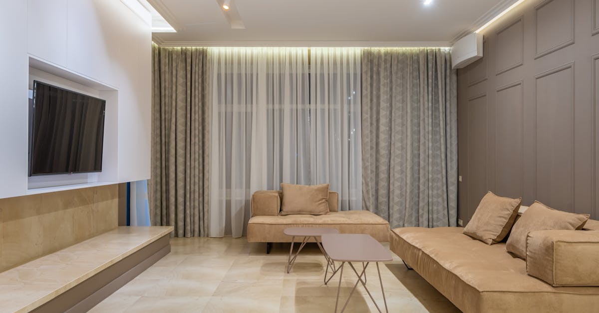
Interior designers use taupe extensively for walls, upholstery, and flooring because it anchors a room without committing to a strong color statement. Its purple-brown depth gives spaces a refined, contemporary feel that pure beige cannot match.
Beige: The Warm Sandy Neutral
Beige is one of the most widely recognized neutrals in the world. Named after the color of natural, undyed wool, it sits at the light end of the warm-neutral spectrum — sandy, accessible, and familiar.
Characteristics of Beige
Beige is typically coded as #F5F5DC (RGB 245, 245, 220). It sits at roughly 60 degrees on the hue wheel with very low saturation and very high lightness, placing it in the pale yellow-gray zone. Compared to taupe, beige is dramatically lighter and more openly warm, with a sandy or tan quality that feels relaxed and approachable.
Where taupe is complex and ambiguous, beige is straightforward and comforting. It evokes sun-warmed linen, sandy beaches, and natural fibers. This simplicity is both its appeal and its limitation — beige can read as safe or uninspired if not paired thoughtfully.
Design Applications for Beige
Beige is a workhorse background color. In web design, it softens layouts without introducing noticeable color. In print, beige-tinted stocks signal craft, heritage, and warmth. Beige dominates in bakery branding, organic product lines, and rustic event design. It pairs naturally with other earth tones — terracotta, olive, sienna, and burnt umber.
Key Differences
Here is a clear breakdown of how taupe and beige diverge:
- Value: Taupe is significantly darker (lightness ~24%); beige is very light (lightness ~91%).
- Undertone: Taupe carries purple, pink, or mauve undertones; beige carries yellow-brown undertones.
- Temperature: Taupe is more neutral-to-cool in feel; beige is clearly warm.
- Mood: Taupe reads as sophisticated, modern, and intentional; beige reads as warm, casual, and traditional.
- Contrast role: Taupe can function as a dark element (text, borders, backgrounds); beige functions as a light element (backgrounds, fills, tints).
- Versatility: Taupe shifts character depending on its neighbors; beige stays consistently warm regardless of context.
Hex Codes and Design Use
Reference values for both colors:
- Taupe (#483C32): RGB 72, 60, 50 | CMYK 0, 17, 31, 72
- Beige (#F5F5DC): RGB 245, 245, 220 | CMYK 0, 0, 10, 4
Because taupe and beige occupy opposite ends of the lightness scale, they actually pair extremely well together. Use beige as a page background and taupe for headings, borders, or card overlays — the result is a warm, tonal hierarchy that feels polished without relying on stark contrast.
In fashion branding, this taupe-and-beige combination is a staple. It projects quiet confidence and aligns with the “quiet luxury” aesthetic that has dominated recent runway seasons. Add a single accent — a muted gold, a dusty rose, or a deep forest green — and the palette is complete.
When working across digital and print, keep in mind that taupe’s subtle undertone is highly sensitive to monitor calibration and paper stock. Always proof taupe elements to ensure the purple or pink undertone reads as intended rather than tipping into muddy brown. Our guide to color harmony covers complementary pairing strategies that help taupe sing.
When to Use Each
Choose Taupe When
- You need a dark neutral that feels more nuanced than black, charcoal, or plain brown.
- The brand or project targets a modern, fashion-forward, or luxury-oriented audience.
- You want a neutral that adapts to both warm and cool palettes.
- Layered, tonal design schemes are the goal — taupe provides rich mid-to-dark depth.
Choose Beige When
- You need a light, warm background that feels more inviting than white.
- The brand or project has a heritage, organic, or artisanal identity.
- Readability and visual comfort are priorities — beige backgrounds reduce glare.
- The palette is built around warm earth tones and natural materials.
FAQ
Is taupe warm or cool?
Taupe sits on the boundary. Its brown base is inherently warm, but its gray and purple undertones introduce a cool quality. Most designers classify taupe as a “balanced neutral” that reads warmer or cooler depending on surrounding colors. This chameleon nature is precisely what makes it so versatile in color harmony applications.
Can taupe replace beige in a design?
Not as a direct swap — they differ too much in lightness. Taupe is a dark neutral and beige is a light one, so they serve different structural roles. However, taupe can replace other dark neutrals (charcoal, dark brown) in a palette that already includes beige as the light base.
What accent colors work with both taupe and beige?
Gold, dusty rose, sage green, burnt sienna, and deep teal all complement both taupe and beige. For a full palette exploration, our earth tone color palette guide provides curated combinations featuring these neutrals.
Which is more on-trend right now?
Taupe has surged in popularity alongside the “quiet luxury” and minimalist movements in fashion and interior design. Beige never truly goes out of style but has been rebranded in recent years under warmer, more intentional names. Both are safe, timeless choices — taupe simply carries a more contemporary connotation at the moment.


