Taupe vs Gray: What’s the Difference?
If you’ve ever stood in a paint aisle wondering whether a swatch is gray or something murkier, you’ve met the taupe vs gray question head-on. The two read as close cousins, but they behave very differently in a room or a layout. Taupe leans warm and earthy; gray stays cool and impartial. Knowing which one you’re working with changes everything from lighting to pairings.
What is Taupe?
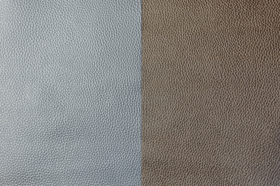
Taupe is a dark grayish-brown named after the fur of the European mole. A representative hex is #483C32, though the family stretches from deep mushroom browns to soft greige tones near #8B8589. Its defining trait is a brown undertone sitting underneath a gray surface, which gives it warmth and an organic, grounded quality. Designers reach for taupe when they want a neutral that feels cozy rather than cold, and it reads as sophisticated, earthy, and timeless.
What is Gray?
Gray is the achromatic midpoint between black and white. A representative hex is #808080, where red, green, and blue values are identical, producing a color with no measurable warmth or coolness in its purest form. True gray reads as neutral, modern, and balanced. In practice many “grays” drift slightly blue, green, or violet, but the canonical version stays undertone-free. It signals calm, professionalism, and restraint without committing to any temperature.
What’s the difference between Taupe and Gray?
The cleanest way to separate them is undertone. Strip the brown out of taupe and you land on gray; add brown back into gray and you drift toward taupe. That brown component is what makes taupe feel warm and lived-in, while gray feels crisp and detached. The comparison below lays out the practical distinctions.
| Property | Taupe | Gray |
|---|---|---|
| Hex code | #483C32 | #808080 |
| RGB | 72, 60, 50 | 128, 128, 128 |
| Undertone | Brown, warm | None / true neutral |
| Hue family | Brown-gray (earth) | Achromatic neutral |
| Best used for | Cozy interiors, leather, earthy branding | Modern UI, minimalist design, backgrounds |
| Mood/feel | Warm, grounded, sophisticated | Cool, balanced, restrained |
When should you use each?
Choose taupe when you want a neutral with personality and warmth, such as a living-room wall, a wood-and-linen color scheme, or a brand that wants to feel artisanal and approachable. It pairs beautifully with cream, olive, and rust. Choose gray when you need a clean, contemporary backdrop that won’t compete with brighter elements, such as a dashboard interface, a corporate identity, or a gallery-style space. For more on how warmth steers these choices, see our guide to warm vs cool colors.
How to tell Taupe and Gray apart
Place the two swatches side by side under neutral daylight. Taupe will suddenly look brown and slightly dirty next to gray, while gray will look noticeably cooler and cleaner. A quick digital check works too: open the hex values and compare the RGB channels. If the red and green values sit higher than blue, you have a warm taupe; if all three values match, you have true gray. Lighting matters, so warm incandescent bulbs can push gray toward taupe and exaggerate taupe’s brownness.
Do Taupe and Gray go together?
Yes, and they make one of the most reliable neutral pairings in design. Because taupe is essentially a warmed-up gray, layering the two creates a sophisticated, tonal palette with just enough contrast to feel intentional. Use gray as the cool anchor and taupe as the warm accent, or vice versa, then add a single saturated color to bring the scheme to life. This warm-cool neutral interplay is a cornerstone of balanced palettes, and you can explore the principle further in our color theory overview.
Frequently Asked Questions
Is taupe a shade of gray or brown?
Taupe is technically both: it’s a grayish-brown, meaning it sits between the two. The base is gray, but a brown undertone gives it warmth. That’s why it can look gray in one light and clearly brown in another, depending on the surrounding colors and the temperature of the lighting in the room.
Why does my gray paint look taupe?
Most likely your “gray” carries a warm undertone that warm lighting amplifies. Incandescent bulbs and afternoon sun add yellow-red light, which pulls a slightly warm gray toward taupe. Test the swatch under cool daylight to see its true temperature before committing to a large surface.
Is taupe warmer than gray?
Yes. Taupe contains a brown undertone, which makes it inherently warmer than true gray. Gray at #808080 has equal RGB channels and no temperature, while taupe’s red and green channels outweigh its blue, producing the warmth that distinguishes the two.
What colors go with taupe but not gray?
Earthy warm tones like terracotta, mustard, olive, and camel sing alongside taupe but can clash with cool gray, which prefers navy, charcoal, white, and icy blues. Because taupe shares their warmth, it bridges natural materials more gracefully than gray does.
Can I use taupe and gray in the same room?
Absolutely. Combining them creates a layered neutral scheme that feels richer than either alone. Keep one dominant and the other as an accent, balance the warm and cool, and introduce texture so the tonal palette stays interesting rather than flat.


