Terracotta vs Rust: What’s the Difference?
Few color pairings cause as much confusion as terracotta vs rust. Both are warm, earthy tones that sit in the orange-red-brown family, and both evoke natural materials and autumnal warmth. But they are distinct colors with different visual properties. Terracotta is a warm orange-brown that resembles fired clay, while rust is a deeper red-brown that resembles oxidized iron. That difference in hue and depth means they create different moods and pair with different palettes.
Let’s explore what defines each color, compare their properties side by side, and look at when each one is the right choice for your design work.
Terracotta: The Clay Orange
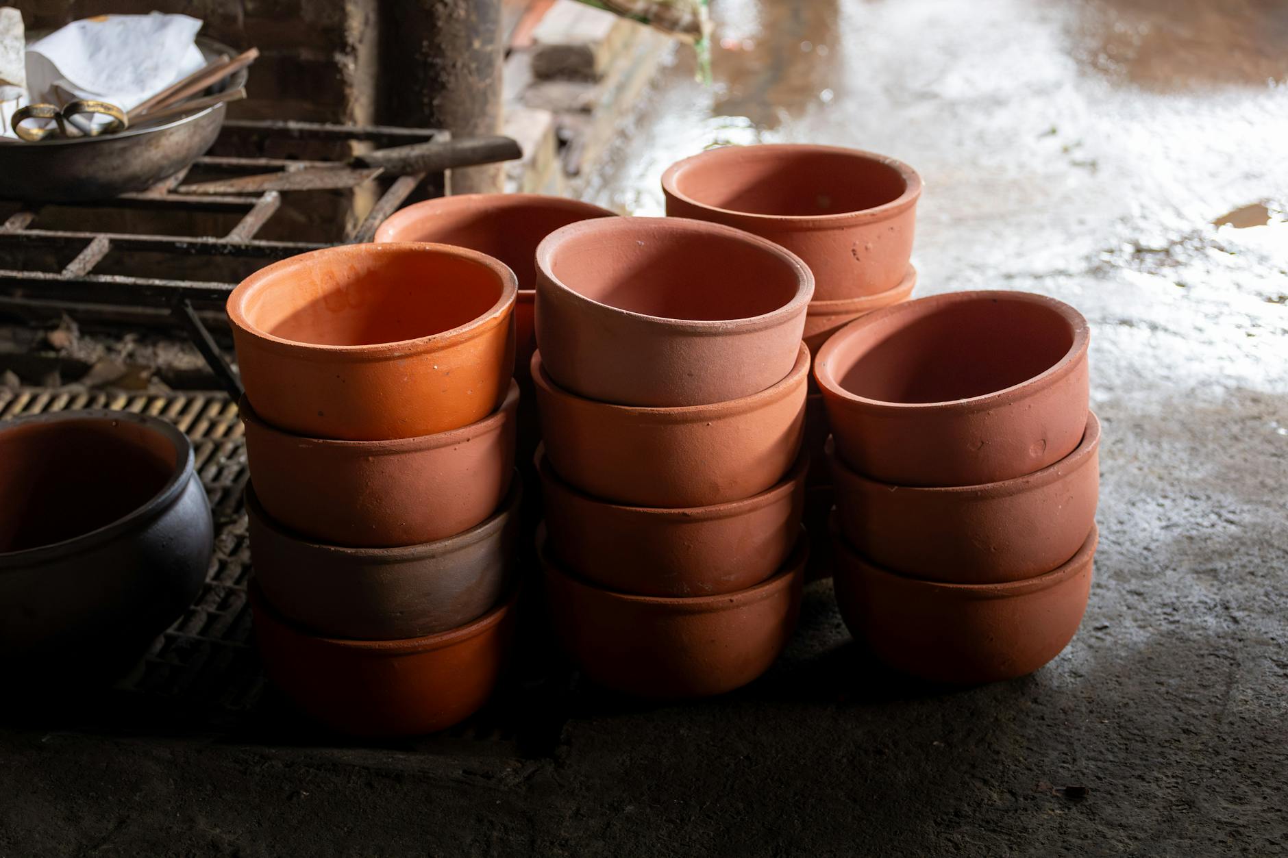
Terracotta literally translates from Italian as “baked earth,” and the color perfectly captures the warm orange-brown of fired clay pottery. The standard terracotta hex code is approximately #E2725B, though variations range from a lighter, pinker version (#CC6A52) to a more brownish variant (#C96A3F).
What makes terracotta distinctive is its strong orange base. It reads clearly as an orange-family color that has been warmed and slightly muted by brown. This gives terracotta an inherently friendly, approachable quality. It feels like sunbaked Mediterranean walls, handmade pottery, and warm afternoon light.
Characteristics of Terracotta
- Hue: Orange-brown, with orange as the dominant component.
- Lightness: Medium. Terracotta is neither particularly dark nor light.
- Saturation: Moderate. It’s muted compared to pure orange but retains visible warmth.
- Mood: Warm, inviting, artisanal, Mediterranean, bohemian.
- Associations: Clay pots, adobe architecture, warm climates, handmade crafts, earth.
Terracotta is a cornerstone of the earth tone palette. It pairs beautifully with cream, sage green, dusty blue, warm white, and other natural tones. In design, it has become a go-to for brands that want to feel handcrafted, organic, or wellness-oriented.
Rust: The Iron Red-Brown
Rust takes its name directly from iron oxide, the reddish-brown coating that forms on metal exposed to moisture. The standard rust hex code is approximately #B7410E, with common variations including #8B3A0E (deeper rust) and #C65D1C (brighter rust).
The defining quality of rust is its strong red base. Where terracotta leans orange, rust leans red. This makes rust a darker, more intense, and more dramatic color. It carries the warmth of the earth-tone family but with added depth and richness that terracotta doesn’t have.
Characteristics of Rust
- Hue: Red-brown, with red as the dominant component.
- Lightness: Medium-dark. Rust is noticeably darker than terracotta.
- Saturation: Moderate to high. Rust has more chromatic intensity than terracotta.
- Mood: Bold, autumnal, industrial, rugged, vintage.
- Associations: Oxidized metal, autumn leaves, burnt sienna, vintage Americana, industrial design.
Rust pairs powerfully with navy, forest green, mustard yellow, cream, and charcoal. It’s a favorite for autumn-themed design, vintage aesthetics, and brands that want to convey rugged authenticity.
Key Differences Between Terracotta and Rust
Here is a direct comparison of the most important differences between terracotta vs rust:
- Base hue: Terracotta is orange-dominant. Rust is red-dominant.
- Darkness: Terracotta is lighter and more mid-toned. Rust is darker and deeper.
- Warmth type: Terracotta feels like warm sunlight. Rust feels like warm embers.
- Intensity: Terracotta is softer and more approachable. Rust is bolder and more assertive.
- Visual weight: Terracotta is medium-weight. Rust is heavier and more grounding.
- Material association: Terracotta evokes clay and earth. Rust evokes metal and industry.
The quickest way to tell them apart: terracotta looks like it could be a warm orange with brown mixed in, while rust looks like it could be a dark red with brown mixed in. The orange-vs-red distinction is the core difference.
Hex Codes and Design Use
For precise work in digital and print design, here are the most commonly used hex values:
Terracotta variations:
- Classic terracotta: #E2725B
- Light terracotta: #E89B7D
- Deep terracotta: #C96A3F
- Pink terracotta: #CC6A52
Rust variations:
- Classic rust: #B7410E
- Deep rust: #8B3A0E
- Bright rust: #C65D1C
- Soft rust: #B5573A
Both colors are warm colors that work well in autumn palettes, bohemian branding, and nature-inspired design. In print, both translate well to CMYK, though rust’s darker value may need careful attention to avoid muddiness in four-color printing.
When to Use Each
Choose Terracotta When You Want
- A lighter, more approachable warm earth tone.
- A Mediterranean, desert, or handmade aesthetic.
- Pairing with soft, light-toned palettes like cream and sage.
- Warmth without heaviness — ideal for backgrounds and large areas of color.
- Bohemian, wellness, or artisanal brand identity.
Choose Rust When You Want
- A deeper, more intense warm earth tone.
- An autumn, vintage, or industrial-inspired aesthetic.
- Pairing with dark, rich palettes like navy, forest green, or charcoal.
- Bold accent color that creates strong contrast against light backgrounds.
- Heritage, outdoor, or craft-focused branding.
In many palettes, terracotta and rust work beautifully together. Terracotta serves as the lighter, more open tone while rust provides depth and grounding. Bridge them with cream or warm white to create a layered, cohesive warm palette.
FAQ
Is terracotta lighter than rust?
Yes, terracotta is consistently lighter than rust. Terracotta sits in the medium range of the lightness scale with a visible orange warmth, while rust sits in the medium-dark range with a deeper red-brown quality. If you placed them side by side, the lightness difference would be immediately obvious.
Can terracotta and rust be used together?
Absolutely. They make a natural pairing because they share the same warm earth-tone family. Use terracotta for larger areas and lighter elements, and rust for accents, text, or details that need more weight. A neutral like cream or tan between them creates a smooth tonal transition that feels cohesive and layered.
Which is better for fall design?
Both are excellent fall colors, but they serve different roles. Rust is arguably the more quintessential autumn tone because its darkness and red undertone mirror fallen leaves and harvest imagery. Terracotta works better as a supporting fall color alongside pumpkin orange, burgundy, and gold. For a complete autumn color scheme, consider using both.
What neutrals pair best with terracotta vs rust?
Terracotta pairs best with lighter neutrals: cream, warm white, light beige, and soft sage. These keep the palette feeling open and airy. Rust pairs better with darker neutrals: charcoal, deep brown, navy, and taupe. These complement rust’s depth without washing it out. Both colors look excellent with natural wood tones and warm metallics like gold and copper.


