Best Thanksgiving Fonts: 20+ Warm Typefaces for Autumn Design
Every November, designers face the same brief: capture the warmth of autumn without sliding into clip-art territory. The right thanksgiving fonts can evoke golden fields, candlelit suppers, and hand-lettered place cards — all without a single cartoon turkey in sight. The wrong ones can make an invitation look like a Halloween clearance flyer or a corporate memo that wandered into a pumpkin patch.
This guide gathers more than twenty typefaces that suit Thanksgiving design across every format, from letterpress-style dinner invitations to Instagram story templates. We have organized them into categories — rustic and handwritten, warm serifs, elegant traditional, modern autumn, and display — so you can find the right tone for your project quickly. We also cover autumn colour palettes, font pairing strategies for menus and invitations, and answers to common questions about seasonal typography.
What Makes a Good Thanksgiving Font?
Before diving into the list, it helps to define what separates a strong thanksgiving font from a generic seasonal novelty. Thanksgiving design occupies a narrow emotional band: it should feel warm, grounded, and slightly nostalgic without tipping into kitschy or overly formal. The best autumn fonts share several qualities.
First, they tend toward organic shapes. Subtle irregularities in stroke weight or baseline — the kind you see in handwritten or humanist typefaces — create a sense of craft that echoes handmade table settings and farmhouse aesthetics. Second, they pair naturally with earthy, muted colour palettes rather than demanding bright, saturated hues. Third, they remain legible at the sizes that Thanksgiving materials actually require: small text on place cards, medium-sized text on menus, and large display text on invitations and social graphics.
The typefaces below have been chosen with all three qualities in mind. Many are available for free through Google Fonts, while others are commercial faces worth the investment for professional work.
Rustic and Handwritten Fonts
Handwritten and rustic typefaces are the backbone of casual Thanksgiving design. They convey warmth and personality, evoking the feeling of a hand-addressed envelope or a chalkboard menu at a farm-to-table dinner. The key is choosing handwriting fonts with enough structure to remain readable at smaller sizes.
Amatic SC
Amatic SC is a tall, narrow, hand-drawn typeface available on Google Fonts. Its condensed letterforms and slight irregularities give it an artisan quality that works beautifully for Thanksgiving headers, menu titles, and social media graphics. Because it is a small-caps font — both cases render as capitals at different sizes — it carries a playful, hand-lettered personality without the readability challenges of true cursive scripts. Pair it with a clean serif for body text, and it immediately anchors a design in a rustic, harvest-table mood.
Caveat
Caveat, designed by Pablo Impallari, mimics the natural rhythm of casual handwriting with a loose, slightly bouncy baseline. It feels like someone jotted a note on a recipe card — warm, quick, and unpretentious. Caveat holds up surprisingly well at paragraph sizes for short blocks of text such as personal messages inside greeting cards or the introductory line on a Thanksgiving dinner invitation. It is available in regular and bold weights through Google Fonts.
Patrick Hand
Patrick Hand is a clean, upright handwriting font that occupies the sweet spot between casual and legible. Where Caveat leans toward quick cursive, Patrick Hand feels more like careful print lettering — the kind of handwriting you might find on a hand-painted farm stand sign. It works well for Thanksgiving projects that want a personal, approachable feel without the visual noise of a heavily stylized script. Use it for subheadings, labels, and short descriptive text alongside a more structured body font.
Permanent Marker
Permanent Marker captures the thick, confident strokes of a felt-tip marker. It is bolder and more assertive than the other handwritten options on this list, making it ideal for Thanksgiving poster designs, social media announcements, and any context where the text needs to command attention from a distance. The heavy strokes pair well with autumn colours — set Permanent Marker in burnt orange or deep red against a cream background, and the result feels like a hand-painted harvest festival sign.
Kalam
Kalam is a handwriting font with roots in Indian calligraphic traditions, designed by the Indian Type Foundry. Its strokes have a natural, brush-like quality with moderate thick-thin contrast that gives it more visual interest than purely monoline handwriting fonts. Kalam’s warmth and slight exoticism make it a distinctive choice for Thanksgiving designs that want to feel personal and culturally inclusive. It includes three weights — Light, Regular, and Bold — which is generous for a handwriting family and allows for basic typographic hierarchy within a single typeface.
Warm Serif Fonts
Serif typefaces bring a sense of tradition and refinement to Thanksgiving design. The best serifs for autumn projects are those with visible warmth — slightly rounded bracketing, generous proportions, and the kind of stroke contrast that feels crafted rather than mechanical.
Playfair Display
Playfair Display is a high-contrast transitional serif that has become one of the most popular heading fonts on Google Fonts, and for good reason. At display sizes, its dramatic thick-thin contrast creates an editorial elegance that suits formal Thanksgiving invitations and elegant table menus. The key to using Playfair Display for autumn design is context: pair it with muted, earthy tones and organic textures rather than bright whites and minimalist layouts. Set in deep burgundy on a textured cream background, Playfair immediately feels like a heritage harvest celebration rather than a fashion magazine cover.
Lora
Lora is a well-balanced, contemporary serif designed by Cyreal. It was built specifically for screen reading, with moderate contrast and sturdy serifs that remain clear at body text sizes. For Thanksgiving design, Lora is the reliable workhorse — it handles everything from invitation body copy to menu descriptions with quiet competence. Its calligraphic roots give it enough personality to feel warm without competing with more expressive display fonts. Lora includes regular, bold, and their italic companions, providing a complete toolkit for structured Thanksgiving print and digital materials.
Libre Baskerville
Libre Baskerville is a web-optimized revival of the eighteenth-century Baskerville typeface, and it brings a sense of historical depth to Thanksgiving design. The original Baskerville was designed in the 1750s during a period of typographic refinement that valued clarity and elegance — qualities that translate directly to a well-set Thanksgiving menu or a formal dinner invitation. The Google Fonts version increases the x-height for screen readability while retaining the graceful proportions of the original. Use it when you want your Thanksgiving materials to feel timeless and slightly literary.
Crimson Text
Crimson Text is an old-style serif with a scholarly, refined character that suits Thanksgiving projects rooted in tradition. Its slightly smaller x-height and finer stroke contrast compared to Lora give it a more bookish quality — think a family recipe book or a formal dinner programme printed on heavy stock. Crimson Text works best at 16px or larger on screen, or at comfortable reading sizes in print. For digital Thanksgiving invitations that need to feel considered and elegant, it is an excellent choice for body text beneath a more dramatic display heading.
Cooper Black
Cooper Black is the outlier in this list — a heavy, rounded serif designed by Oswald Bruce Cooper in 1922 that has become synonymous with warmth, nostalgia, and approachable charm. Its connection to 1970s graphic design gives it a retro warmth that works surprisingly well for Thanksgiving themes. Cooper Black set in mustard yellow or burnt orange against a brown background immediately evokes the harvest season with a playful, vintage sensibility. Use it sparingly — for a single headline or a logo lockup — and pair it with a clean serif or sans-serif for supporting text.
Elegant Traditional Fonts
For formal Thanksgiving gatherings — the kind with linen tablecloths, calligraphed place cards, and multi-course menus — these classical typefaces provide the appropriate level of sophistication.
Cormorant Garamond
Cormorant Garamond is a display-oriented Garamond revival with high contrast and sharp, refined details. At heading sizes, its extreme thick-thin contrast creates a dramatic, almost calligraphic quality that suits formal Thanksgiving invitations and elegant event branding. The lighter weights feel particularly appropriate for autumn design — airy and graceful, like late afternoon sunlight through bare branches. Set Cormorant Garamond large, give it room to breathe with generous margins and leading, and pair it with a sturdier serif or a clean sans-serif for body text.
Baskerville
The full commercial Baskerville family (available through foundries like Storm Type or as part of system font stacks on macOS) offers a level of refinement that its free counterparts approach but do not quite match. The original Baskerville is a transitional serif that bridges the gap between the organic warmth of old-style typefaces and the crisp precision of modern ones — which makes it thematically perfect for Thanksgiving, a holiday that itself bridges the harvest traditions of the past with contemporary celebration. Baskerville in deep olive or forest green on a warm cream stock creates an understated elegance that never feels overdone.
Garamond
The Garamond family, in its many revivals, remains one of the most beautiful serif typefaces ever drawn. For Thanksgiving design, Adobe Garamond Pro or EB Garamond (the free Google Fonts alternative) bring a quiet, humanist warmth rooted in five centuries of typographic tradition. The slightly angled stress, the soft cupping of the serifs, and the graceful italics create a texture on the page that feels inherently warm and organic — qualities that align naturally with autumn fonts sensibilities. Garamond is the typeface equivalent of a linen napkin: simple, timeless, and unmistakably refined.
Modern Autumn Fonts
Not every Thanksgiving project calls for rustic charm or historical elegance. Contemporary sans-serifs can convey an autumnal mood through colour, spacing, and context — proving that modern typefaces and seasonal warmth are not mutually exclusive.
Josefin Sans
Josefin Sans is a geometric sans-serif with vintage Scandinavian influences and a distinctively high waist — the crossbar of the lowercase “e” and the junction of the “a” sit higher than in most sans-serifs. This quirk gives it a gentle, slightly retro personality that pairs well with autumn palettes. Josefin Sans in a mustard or warm ochre, combined with plenty of white space, creates a modern Thanksgiving aesthetic that feels fresh without abandoning seasonal warmth. Its lighter weights are particularly elegant for invitations and event branding.
Montserrat
Montserrat is one of the most versatile sans-serifs on Google Fonts, with eighteen weights ranging from Thin to Black. For Thanksgiving design, its geometric but slightly humanist letterforms provide a neutral canvas that takes on the character of whatever colours and imagery surround it. Set Montserrat in deep red or burnt sienna, layer it over a photograph of autumn foliage or a textured paper background, and it immediately feels seasonal. Its extensive weight range also makes it practical for complex Thanksgiving materials — you can build an entire menu or programme using nothing but Montserrat at different weights and sizes.
Raleway
Raleway started life as a single-weight display font before being expanded into a full family. Its elegant, slightly condensed letterforms have an Art Deco quality that works well for upscale Thanksgiving events. The thin and extra-light weights are particularly beautiful at large sizes, where the fine strokes create a sense of delicacy and sophistication. Raleway in olive green or deep gold, set large with generous letter-spacing, makes a striking heading for formal Thanksgiving dinner invitations and event programmes. Pair it with a warm serif like Lora or Crimson Text for body copy.
Display and Decorative Fonts
Display fonts carry the most personality and the most risk. Used well, they set the entire tone of a Thanksgiving design in a single headline. Used carelessly, they overwhelm everything around them. The rule is simple: one display font per project, used only at large sizes, with a clean companion for all supporting text.
Abril Fatface
Abril Fatface is a Didone-style display serif with extreme stroke contrast and bold, commanding presence. Its thick verticals and hairline horizontals create a sense of drama that works for Thanksgiving event posters, hero sections on seasonal landing pages, and single-word headlines like “Gather” or “Grateful.” The rounded, slightly soft quality of its heavy strokes keeps it from feeling cold or severe, which is important for autumn contexts. Set it in a single deep colour against a muted background and let it do the work.
Lobster
Lobster is a bold connected script that straddles the line between handwritten and display typography. For Thanksgiving design, it brings a friendly, celebratory energy that suits casual gatherings, potluck invitations, and family-oriented social media graphics. The flowing connections between letters give it a ribbon-like quality that feels festive without being formal. Use Lobster at headline sizes only — it becomes unreadable in long passages — and pair it with a simple sans-serif like Montserrat or a clean serif like Lora for balance.
Alfa Slab One
Alfa Slab One is a heavyweight slab serif that brings bold, block-printed energy to Thanksgiving design. Its massive, uniform serifs and minimal stroke contrast give it an industrial, poster-like quality reminiscent of vintage agricultural advertisements and county fair signage. For Thanksgiving projects with a farmhouse or harvest-market theme, Alfa Slab One in warm brown or rust red creates an immediate visual anchor. Limit its use to short headlines — one to four words — and keep the surrounding design clean.
Sacramento
Sacramento is a flowing, monoline script with the look of casual calligraphy. It is lighter and more elegant than Lobster, making it suitable for Thanksgiving place cards, “give thanks” accent text, and decorative flourishes within a larger layout. Sacramento works best when used for a single phrase or name rather than extended text. Pair it with a structured serif like Libre Baskerville or Cormorant Garamond for a combination that feels both personal and polished.
Autumn Colour Palettes for Thanksgiving Typography
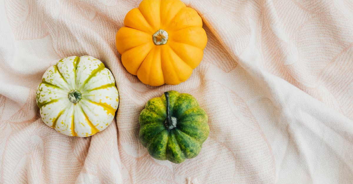
The right fall fonts can only do half the work. Colour carries the other half of the seasonal atmosphere. Thanksgiving colour palettes draw from the natural landscape of late autumn: the burnt oranges of fallen leaves, the deep reds of cranberries, the golden yellows of wheat fields, and the earthy greens of late-season foliage.
Here are four tested palettes that pair naturally with the typefaces in this guide:
Classic Harvest
Burnt orange (#CC5500), deep red (#8B0000), mustard yellow (#D4A017), cream (#FFFDD0), and dark brown (#3E2723). This is the most traditional Thanksgiving palette, evoking falling leaves and candlelit tables. It works beautifully with warm serifs like Playfair Display and Lora, and with rustic handwriting fonts like Amatic SC.
Modern Farmhouse
Olive green (#556B2F), warm grey (#A9A9A9), terracotta (#E2725B), off-white (#FAF0E6), and charcoal (#36454F). This palette suits contemporary Thanksgiving designs that lean toward minimalism. Pair it with Josefin Sans, Montserrat, or Raleway for headings, and a clean serif like Crimson Text for body copy.
Woodland Elegance
Forest green (#228B22), burgundy (#800020), antique gold (#CFB53B), ivory (#FFFFF0), and espresso (#3C1414). This is the formal Thanksgiving palette, ideal for seated dinner invitations and upscale event branding. It pairs naturally with Cormorant Garamond, Baskerville, and Garamond.
Warm Minimal
Soft terracotta (#C27D5B), dusty rose (#DCAE96), warm beige (#F5F0EB), muted sage (#9CAF88), and dark walnut (#5C4033). This muted, contemporary palette works for Thanksgiving designs that want to feel seasonal without being overtly thematic. It pairs well with Josefin Sans, Raleway, and Sacramento for accent text.
Pairing Tips for Thanksgiving Menus and Invitations
Effective font pairing for Thanksgiving materials follows the same principles as any typographic project: contrast in style, harmony in mood. But seasonal design adds an extra consideration — the pairing should reinforce the warmth and intimacy of the occasion without making the text harder to read.
For menus, a clear hierarchy matters most. Use a display or decorative font for the menu title (“Thanksgiving Dinner” or “The Feast”), a warm serif for course headings (First Course, Main, Dessert), and a clean, readable font for dish names and descriptions. A proven combination is Abril Fatface for the title, Playfair Display for course headings, and Lora for dish descriptions. Keep the body text at a comfortable size — guests should not need to squint between the butternut soup and the roast turkey.
For invitations, the pairing depends on the formality of the event. A casual friendsgiving might use Amatic SC for the headline and Patrick Hand for supporting details. A formal seated dinner calls for Cormorant Garamond or Baskerville for the headline with Crimson Text or Libre Baskerville for the event details. In both cases, limit yourself to two typefaces — three at the absolute maximum — and use weight, size, and colour to create visual hierarchy rather than introducing additional font families.
For social media graphics, legibility at small sizes and quick scanning are paramount. Use a bold display font (Permanent Marker, Alfa Slab One, or Cooper Black) for the main message, and a simple sans-serif (Montserrat or Raleway) for secondary information like dates and hashtags. Keep the text brief and the colour contrast high — autumn palettes are inherently muted, so ensure your text colour has sufficient contrast against the background to remain typographically sound.
Frequently Asked Questions
What is the best free Thanksgiving font?
For a single free font that captures the Thanksgiving mood across multiple uses, Playfair Display is the strongest choice. It is available on Google Fonts, includes multiple weights and a true italic, and its high-contrast serif style conveys warmth and tradition at heading sizes. For a more casual, handwritten feel, Amatic SC is an excellent free alternative that works well for headers and short accent text. Both fonts are free for personal and commercial use under the SIL Open Font License.
How do I pair fonts for a Thanksgiving dinner menu?
The most reliable approach is to combine a display or decorative font for the menu title with a warm serif for body text. Start by choosing a heading font that sets the tone — Abril Fatface for drama, Amatic SC for rustic charm, or Cormorant Garamond for elegance. Then pair it with a highly readable serif like Lora, Crimson Text, or Libre Baskerville for dish names and descriptions. Keep the entire menu to two typefaces and use weight, size, and colour to differentiate hierarchy. For more detailed guidance, see our complete font pairing guide.
Can I use modern sans-serif fonts for Thanksgiving design?
Absolutely. Modern sans-serifs like Josefin Sans, Montserrat, and Raleway work well for Thanksgiving projects when paired with autumn colour palettes and organic textures. The warmth comes from the overall design context — colours, imagery, spacing, and materials — rather than the typeface alone. A clean sans-serif set in burnt orange on a textured cream background feels just as autumnal as a rustic handwriting font. The advantage of using a modern sans-serif is that the design will age better and feel less tied to a specific seasonal aesthetic, which matters for brands that want to nod toward Thanksgiving without leaning into cliche.
What colours work best with Thanksgiving fonts?
The strongest Thanksgiving colour palettes draw from the natural autumn landscape. Burnt orange, deep red, mustard yellow, olive green, warm brown, and cream form the core of most successful seasonal designs. For text specifically, dark brown or charcoal on cream backgrounds provides excellent readability with a warm feel. Avoid pure black on pure white — it feels too stark for autumn design. For accent text and headings, burnt orange and deep burgundy are the most versatile choices. The colour palettes section above provides four complete, tested combinations you can use directly in your projects.


