What Font Does The Hunger Games Use?
If you searched for the Hunger Games font, you want that tall, narrow, austere title from the Mockingjay-era posters — condensed letters with a cold, dystopian edge. The honest answer is that the official mark is custom condensed lettering, so any “exact font” claim is an informed observation, not a confirmed spec. Below are the free fan recreations and the sharpest legitimate alternatives to match the look.
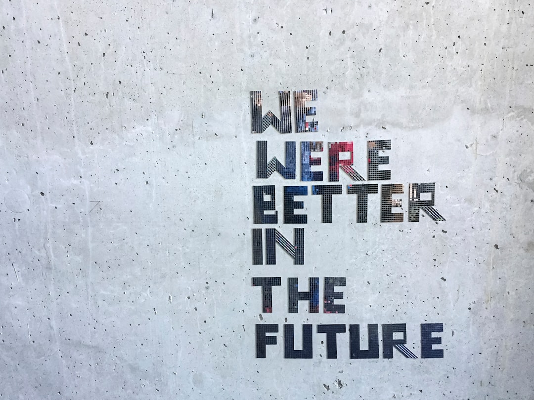
The franchise is a strong example of how condensed type can feel oppressive and regimented. For more on how studios build identity from custom lettering, see our hub on famous brand fonts and what the big logos use.
What font is The Hunger Games logo?
The Hunger Games logo is a custom condensed display — tall, tightly spaced letters with sharp terminals and a severe, authoritarian feel. The Mockingjay-era treatment in particular reads like Capitol propaganda: rigid, narrow, and cold. The metallic Mockingjay emblem and the brushed-steel finishes are artwork, not part of any font. Because the mark is bespoke and trademarked, a lookalike font matches the mood without granting any right to the official logo.
What typeface is used in the Hunger Games franchise?
Across The Hunger Games, Catching Fire, and the two Mockingjay films, the title identity leans on sharp condensed designs — narrow, high-contrast lettering that signals control and scarcity — rather than one publicly sold family. Marketing, credits, and merchandise follow the same austere direction. So when people ask about “the Hunger Games font,” they mean that tall condensed wordmark, which is exactly what the free fan recreations imitate.
Free fonts that look like the Hunger Games font
You can’t download the official mark, but free fan recreations on DaFont imitate the condensed letterforms, and several legitimate condensed faces stand in well. Here’s a practical breakdown by use case.
| Use case | The Hunger Games uses | Free alternative |
|---|---|---|
| Logo / title wordmark | Custom condensed display | Fan recreation (DaFont, personal use) |
| Tall condensed headline | Narrow sharp sans | Oswald or Bebas Neue (Google Fonts) |
| Austere condensed serif | High-contrast narrow serif | Playfair Display SC or Cormorant (Google Fonts) |
Download only from reputable directories and read the bundled license. The fan font and Google alternatives give you the narrow letterforms; you add the brushed-metal finish and the Mockingjay emblem yourself in your design tool.
Why does The Hunger Games use this kind of type?
The world of Panem is built on control, scarcity, and the cold machinery of an authoritarian state, and condensed typography expresses all of that without a word of explanation. Tall, narrow letters feel compressed and rationed — fitting for a society where resources are deliberately withheld — while sharp terminals and tight spacing read as rigid and unforgiving, exactly the tone of the Capitol’s propaganda. The austerity also gives the title a serious, adult weight that separates the franchise from softer young-adult branding, signalling stakes and survival. Building the mark from custom lettering let the studio tune that severity precisely and integrate the metallic Mockingjay emblem as the one spark of resistance against the cold type. That emblem and the brushed-steel finish are artwork, which is why fan recreations match the letter shapes but never quite capture the full poster — the menace lives in the styling you assemble in your design tool, not in the font alone.
How do I recreate the Hunger Games title look?
The Hunger Games look comes from severity, so the goal is cold, compressed, and metallic. Set your text in a tall condensed face like Oswald or Bebas Neue, in all caps, and keep it narrow and rigid. A dependable recipe:
- Tighten the spacing so the letters feel rationed and compressed, echoing the scarcity of Panem.
- Apply a brushed-metal or steel gradient — cool grays with a faint sheen — to give the title its authoritarian, propaganda-poster finish.
- Add a thin sharp bevel for crisp, unforgiving edges; avoid anything soft or rounded.
- Introduce a single metallic emblem (a circular badge in the Mockingjay spirit, kept clearly your own) as the one focal accent against the cold lettering.
If you want a more classical, oppressive variant, a high-contrast condensed serif like Cormorant can replace the sans for a Capitol-elite feel. The austerity is the whole effect: a free condensed font plus tight spacing and a brushed-steel finish gets you convincingly close to the films’ dystopian title.
Can I use the Hunger Games font for my own project?
You can use a sharp condensed font to capture the dystopian vibe, but keep two things separate. First, fan recreations are usually personal-use only — fine for fan art, not for anything you sell. Second, even a fully licensed condensed typeface gives you no right to the trademarked Hunger Games logo, the Mockingjay emblem, or related branding, owned by Lionsgate. You can build a convincing austere title that feels like the films, as long as it stays distinct from the official mark and doesn’t imply affiliation. For commercial work, start with our font licensing guide.
Comparing cinematic title styles? See the sleek minimalism in our John Wick font guide and the eroded sci-fi lettering in the Alien font breakdown.
Frequently Asked Questions
What font does The Hunger Games logo use?
The Hunger Games logo uses custom condensed display lettering — tall, narrow, sharp letters with an austere feel, not a public retail font. Treat any exact-font claim as an informed observation. Free fan recreations on DaFont imitate it; the metallic Mockingjay emblem is separate artwork, not part of any font.
Is there a free Hunger Games font?
Yes — free fan recreations of the condensed wordmark circulate on DaFont, typically under personal-use licenses. For a sharp alternative without a fan font, Oswald or Bebas Neue on Google Fonts deliver the same tall, narrow, severe look that you can finish with a brushed-metal effect to match the posters.
What font is used in Mockingjay?
The Mockingjay films keep the franchise’s sharp condensed identity, built from custom lettering rather than one sold typeface, so treat any exact-font claim as an informed observation. The look is rigid, narrow, Capitol-propaganda lettering paired with the metallic Mockingjay emblem, with the severity carried by spacing and finish.
Can I use the Hunger Games font commercially?
Generally no. Fan recreations are usually personal-use only, and even a licensed condensed lookalike grants no rights to Lionsgate’s trademarked Hunger Games logo, the Mockingjay emblem, or branding. For anything you sell, use a clearly licensed font, keep your design distinct from the official mark, and avoid implying affiliation.


