What Font Does Thief Use?
Before we get into the thief game font, a quick disambiguation: this article is about Thief, the stealth series begun by Looking Glass Studios with Thief: The Dark Project and continued by Eidos, not the everyday word “thief.” If you want the shadowy, gothic wordmark from Garrett’s adventures in the City, you are in the right place. Here is what that logo really is and how to recreate its medieval gloom for free.
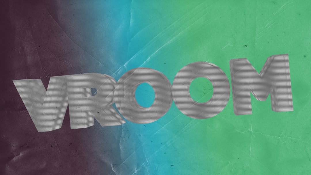
What font is the Thief logo?
The Thief logo is custom gothic lettering rather than a font you can type out. The letterforms borrow from blackletter and engraved medieval traditions, with sharp, slightly ornate strokes and a heavy, shadowed presence that suits a master burglar working in candlelit darkness. The mark feels carved or printed in an old-world script, reinforcing the steampunk-medieval setting of the City.
No major foundry publicly lists the exact face, and the wordmark is not sold as a downloadable font, so any “Thief font” online is a fan recreation. The styling has also varied across the series, from the original Looking Glass titles to the 2014 Eidos reboot, which is another sign the type is bespoke rather than a fixed retail face. Treat the specific identity as an informed observation: the safe statement is that the logo is custom and built for gothic atmosphere.
What typeface does Thief use in-game (UI/menus)?
In-game, Thief balances atmosphere with readability. Decorative gothic and serif styling appears in titles, readables, and scrolls to sell the medieval world, while menus, objectives, and inventory text use cleaner, more legible faces so you can actually plan a heist. The in-world books and notes often lean hardest into the ornate look, while functional UI stays restrained.
The exact UI fonts are not officially published and differ between the classic games and the reboot, so it is safest to describe the style than to name a file. For designers, the lesson is the contrast: ornate gothic type for flavour, clean type for function. If you are recreating the look, reserve blackletter for titles and short in-world snippets, and keep gameplay-critical text easy to read.
Free fonts that look like the Thief font
The real wordmark is not downloadable, but free blackletter and engraved gothic serifs get you close. The goal is a dark, medieval letterform with sharp detailing; add a subtle aged or shadowed texture to echo the candlelit, soot-stained world of the City.
| Use case | Thief uses | Free alternative |
|---|---|---|
| Logo / title | Custom gothic medieval wordmark | A free blackletter or engraved gothic serif |
| Headings | Ornate, shadowed styling | A heavy old-style or engraved serif |
| Body / readables | Aged, in-world text | A free humanist serif with vintage character |
| UI / objectives | Legible gameplay text | A neutral, readable serif or sans |
- Search free libraries for “blackletter,” “gothic,” “medieval,” and “engraved serif” to find candidates.
- Add a grain or shadow overlay to capture the dark, candlelit atmosphere.
- Keep gameplay text readable; use the blackletter only for titles and short flourishes.
A reliable workflow is to set the title in your blackletter face, convert it to outlines, and adjust the spacing so the dense gothic letters do not collide, since blackletter is notoriously hard to read when packed too tightly. Then place the lettering over a dark, textured background and add a soft drop shadow so it appears to emerge from candlelit gloom. A faint gold or tarnished-bronze tint on the letters reinforces the old-world, treasure-hunting feel without overpowering the shadowy mood that defines the series.
For a deeper catalogue of medieval and shadowy display faces, see our roundup of the best gothic fonts.
Why does Thief use this kind of type?
The typography sells the world. Thief takes place in a brooding steampunk-medieval City of guilds, nobles, and dark religion, so a gothic, engraved wordmark instantly signals candlelight, stone, and secrecy. A modern sans would shatter the illusion; the blackletter heritage roots the brand in an old, superstitious, shadow-filled place that rewards stealth over force.
This is the same world-building-through-type principle found across the immersive-sim canon, even when the moods differ wildly. Compare Thief’s medieval gloom with the cold futurism of the Prey game font or the industrial dystopia behind the Dishonored font. In every case the logo is custom because the wordmark has to carry a precise atmosphere a generic font cannot.
Blackletter carries a lot of cultural baggage that works in Thief’s favour, evoking illuminated manuscripts, guild seals, and church authority. Borrowing that heritage instantly tells the player this is an old, religious, hierarchical world long before the plot explains the Hammerites or the Keepers. A custom wordmark also lets the designers temper the blackletter just enough to stay legible at a glance, keeping the historical flavour while avoiding the unreadable density that raw medieval scripts can produce on a title screen.
Can I use the Thief font for my own project?
You cannot use the actual Thief wordmark, because it is a trademarked brand asset owned by its publisher. Recreating the logo for your own game, product, or merchandise risks trademark issues even if you redraw the letters by hand. The safe route is an original gothic logo that captures the mood using properly licensed fonts.
For personal art or fan projects, a free blackletter or engraved gothic serif plus an aged texture captures the Thief feel without copying the trademark. Always confirm each font’s license before commercial use, since many free fonts are personal-use only. Our font licensing guide breaks down desktop, web, and commercial rights clearly.
Frequently Asked Questions
Is the Thief font free to download?
No. The logo is custom gothic lettering and is not distributed as a font. Any “Thief font” download is a fan-made look-alike, not the official wordmark. You can get close with free blackletter or engraved gothic serifs, but treat the original as a bespoke brand asset rather than an installable typeface.
Is this the Looking Glass Thief or the reboot?
This article covers the whole Thief series, including the original Looking Glass games like The Dark Project and the 2014 Eidos reboot. Both share a gothic, medieval-shadow identity, though the exact styling differs between eras. None publish their precise fonts, so treat any specific name as an informed observation.
What font is closest to the Thief logo?
A free blackletter or heavy engraved gothic serif is closest. Add a dark, aged texture to match the candlelit world. No free font matches the custom wordmark exactly, so aim to recreate the medieval, shadowy mood rather than copy the letterforms precisely, and reserve the ornate face for titles.
Can I use a Thief-style font commercially?
You can use a free gothic look-alike commercially only if its own license allows it, and only for original artwork, never to recreate the trademarked Thief logo. Check each font’s license terms first, and read our font licensing guide before using anything in paid or client work.


