What Font Does Tiesto Use?
If you searched for the tiesto font, you are probably looking at that sleek, stripped-back DJ logo across his releases, tour visuals, and merchandise, and wondering whether it comes from a single typeface you can download. The honest answer is that Tiesto’s wordmark is a custom, design-led piece of lettering tuned for clean, modern impact, not a stock font with a tidy name. His branding favors minimalism, which is easy to recreate with free geometric fonts even though the original is bespoke. This guide explains what we can reasonably say and points you to close alternatives.
Electronic music branding has its own set of demands, and they shape why Tiesto’s identity looks the way it does. A DJ’s logo has to survive being splashed across a festival LED wall, shrunk to a tiny avatar, printed on a tour shirt, and animated in motion graphics. Minimal geometric lettering handles all of that gracefully because it stays crisp at any scale and reads instantly in low-light, fast-moving environments. That practical pressure, more than any trend, explains the stripped-back direction of his wordmark.
What font is the Tiesto logo?
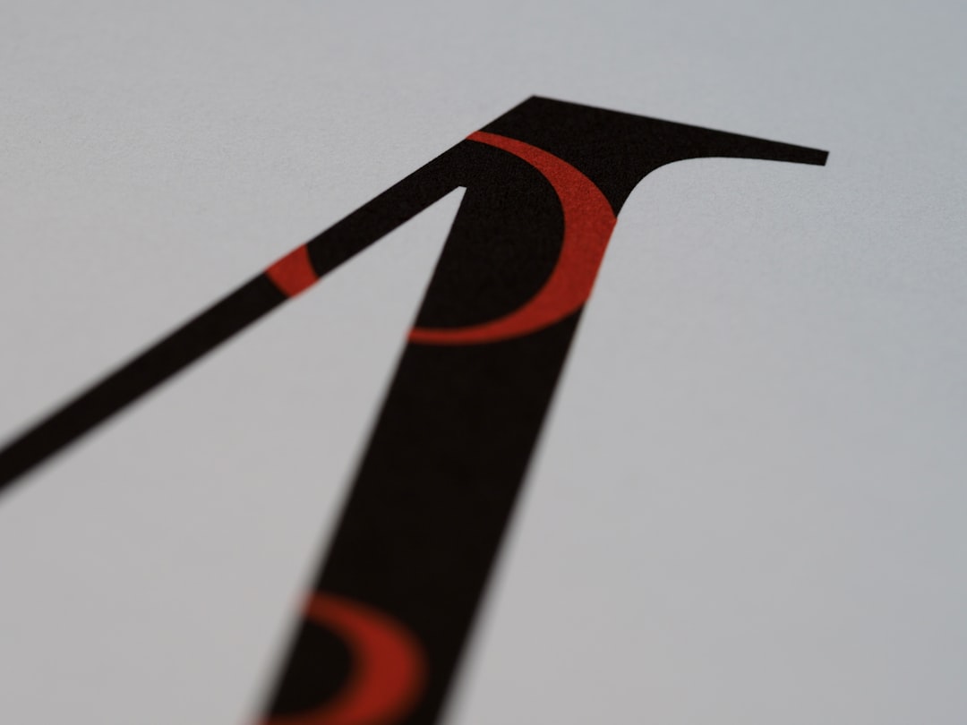
Tiesto’s logo is a clean, minimal wordmark with sleek, geometric-leaning letterforms, the kind of modern, uncluttered styling that defines premium EDM branding. It reads as confident and contemporary, designed to look sharp on festival screens, streaming thumbnails, and merchandise alike. The lettering is custom or heavily customized, built as a brand asset rather than pulled from a font menu.
That means there is no single “Tiesto font” file that matches the logo exactly. Designers and fans have suggested geometric sans look-alikes over the years, but those are approximations. When a download or forum names a precise typeface as “the” Tiesto font, treat it as an informed observation rather than a confirmed spec, especially since his branding has been refreshed across different phases of his long career.
What fonts does Tiesto use on album covers?
Across releases and visuals, the typography is consistently minimal but has evolved, here is the kind of era variation to expect:
- Core wordmark: The clean, sleek Tiesto logo used as the anchor brand mark across singles, albums, and tours.
- Per-release styling: Individual tracks and albums often pair the logo with concept-specific title type, sometimes bolder, sometimes more experimental, to match the music.
- Supporting type: Tracklists, credits, and promo materials typically use clean geometric or neutral sans fonts that complement the main logo.
So Tiesto’s typography is best understood as a stable, minimal core wordmark surrounded by release-specific titles. If you are interested in how other artists balance a fixed wordmark against bolder per-release styling, our guide to the Dr. Dre font covers a heavier, more authoritative approach in a different genre.
Free fonts that look like the Tiesto font
You will not find a free file that is genuinely Tiesto’s logo, but clean geometric sans fonts recreate the sleek, minimal feel well. Choose based on how bold or how refined you want the result.
| Use case | Tiesto uses | Free alternative |
|---|---|---|
| Sleek minimal wordmark | Clean geometric sans | Montserrat or Poppins |
| Modern EDM feel | Geometric display sans | Jost or Spartan |
| Bold tour headline | Heavy geometric caps | Montserrat Black or Anton |
| Clean supporting text | Neutral readable sans | Inter or Work Sans |
For the most authentic result, keep it minimal, even strokes, generous spacing, and restrained weights so the type feels modern and premium. Custom-tweaking a couple of letters helps it read as a logo rather than a stock font. For more clean, modern type options, browse our famous brand fonts guide to see how minimal wordmarks build recognition.
Why does Tiesto use this kind of type?
Clean, minimal lettering matches Tiesto’s brand. EDM branding lives on big screens, social thumbnails, and global merchandise, and sleek geometric type reads clearly at every size while feeling modern and premium. Minimalism also travels well internationally, it does not tie the brand to a specific era’s trends, which matters for an artist with a decades-long career.
A consistent, custom wordmark gives Tiesto a strong, ownable brand asset. A unique minimal logo is more recognizable and more trademark-friendly than a stock font, and it anchors his identity even as individual releases introduce new concept styling. That balance of a stable core mark and flexible per-release titles is standard practice in well-managed music branding.
For practitioners, the lesson is that minimalism is harder than it looks. When you strip a wordmark down to clean geometric forms, every flaw shows, uneven spacing, a slightly off curve, or an inconsistent weight becomes glaringly obvious because there is no ornament to hide behind. That is why convincing minimal logos rely so heavily on precise kerning and proportion. If you recreate the Tiesto look with a free geometric sans, spend most of your effort on spacing and alignment rather than effects. The polish lives in the details you do not consciously notice.
Can I use the Tiesto font for my own project?
You can freely build something in the Tiesto spirit, sleek, minimal, geometric, using the free sans fonts above. That borrows a visual style, which nobody owns.
What you cannot do is reproduce Tiesto’s actual logo or name on merchandise or products you sell. Those are protected by trademark held by the relevant rights holders, and the custom lettering may carry additional protections. Recreating the exact wordmark for a shirt you sell is a legal risk. For personal projects, fan art, or learning typography, recreating the minimal look is fine. Before any commercial use, read our font licensing guide to understand where homage ends and infringement begins.
Frequently Asked Questions
Is there an official Tiesto font?
Not as a downloadable file. Tiesto’s wordmark is custom, design-led lettering rather than a stock typeface, and it has been refreshed over his career. Any precise font name claimed as “the Tiesto font” should be treated as an informed observation, not a confirmed specification.
What free font looks most like the Tiesto logo?
Clean geometric sans fonts get closest. Montserrat and Poppins capture the sleek minimal feel, while Jost or Spartan echo the modern EDM character. Use even spacing and restrained weights for the most convincing result.
Has the Tiesto logo changed over time?
Yes. Like most long-running artists, Tiesto’s branding has been refreshed across different phases of his career. That evolution is why no single font perfectly matches every version of the logo you might encounter across his releases and tours.
Can I sell a shirt with the Tiesto logo?
Not without a license. Tiesto’s name and logo are protected by trademark. Recreating the minimal geometric style for personal art is fine, but selling Tiesto-branded merchandise needs permission from the rights holders to avoid legal trouble.


