Tiffany Font: The Typography of Luxury
The Tiffany font is one of the most quietly powerful typographic identities in the world. While other luxury brands periodically overhaul their logos, chase trends, or swap serifs for sans-serifs, Tiffany & Co has maintained essentially the same serif wordmark for over a century. The result is a typographic identity so deeply associated with luxury, elegance, and aspiration that the letterforms alone — independent of the Tiffany Blue box, the diamonds, or the Fifth Avenue flagship — communicate prestige. Understanding the typographic principles behind the Tiffany logo reveals why certain typeface choices endure while others become dated.
The Tiffany typeface is not a commercially available font that anyone can download and install. It is a custom serif wordmark with proportions and details drawn from the Didone tradition — the high-contrast, thin-serif genre that includes typefaces like Bodoni and Didot. This article examines the Tiffany logo’s typographic roots, why serif typography dominates luxury branding, the role of Tiffany Blue in amplifying the type’s effect, and what designers and brand strategists can learn from one of the most successful typographic identities ever created.
The Tiffany & Co Logo: A Custom Serif with Didone DNA
Origins and Evolution
Tiffany & Co was founded in 1837 by Charles Lewis Tiffany and John B. Young in New York City. The company’s early visual identity evolved through the 19th century, but by the early 20th century, the serif wordmark that we recognize today had largely taken shape. The Tiffany and Co font features uppercase letterforms with high stroke contrast — the difference between thick vertical strokes and thin horizontal strokes is pronounced — and fine, unbracketed serifs that taper to hairline points.
These characteristics place the Tiffany logo firmly in the Didone classification, the typographic category defined by Giambattista Bodoni and Firmin Didot in the late 18th century. Didone typefaces were revolutionary when they first appeared. They replaced the gradual, organic stroke modulation of earlier serif styles with dramatic, rationalized contrast — thick strokes became thicker, thin strokes became thinner, and serifs became fine horizontal lines. The effect was dazzling: Didone typefaces looked precise, elegant, and unmistakably modern for their era. That same quality of refined precision is what the Tiffany logo communicates today.
What Makes the Tiffany Logo Typeface Distinctive
While the Tiffany logo font draws from the Didone tradition, it is not simply a setting of Bodoni or Didot with the company name typed out. The letterforms have been custom-drawn and refined over decades to achieve specific qualities that a standard Bodoni setting would not deliver.
The letter spacing in the Tiffany wordmark is generous. Each character has room to breathe, which gives the logo a sense of composure and confidence. Tight letter spacing tends to communicate urgency or density; the spacious tracking of the Tiffany logo communicates the opposite — there is no rush, no need to compete for attention, no need to shout. This is typography that is comfortable with silence and white space, and that comfort reads as luxury.
The proportions of individual letters have been tuned for harmony within the specific sequence T-I-F-F-A-N-Y. The tall vertical of the T sets an authoritative opening, the repeated F creates a visual rhythm, and the diagonal strokes of the A and Y provide contrast and movement. Every element has been considered not as an individual letter but as part of a composed whole — a principle that separates custom wordmarks from off-the-shelf type settings. Brand identity at the luxury level demands this kind of precision.
Why Serif Typography Signals Luxury
The Psychology of Serifs in Premium Branding
The dominance of serif typefaces in luxury branding is not coincidental. Serifs carry historical associations that align naturally with the values luxury brands seek to communicate. Serif letterforms originated in the inscriptions of Roman architecture and were refined through centuries of European book typography. They carry, embedded in their forms, a connection to tradition, craftsmanship, and cultural heritage. When a luxury brand uses a serif typeface, it borrows that historical depth — it suggests that the brand is not a recent invention but part of a longer tradition of quality and refinement.
Didone serifs in particular — the category that informs the Tiffany logo — add another layer of meaning. The extreme contrast between thick and thin strokes demands precision in both design and reproduction. Historically, only the finest printing presses could render Didone typefaces without the hairline strokes breaking apart. This difficulty became an asset: a Didone typeface on the page was a demonstration of printing quality, a proof that the publisher or brand could afford the best. Today, that association persists. High-contrast serifs still communicate premium quality, meticulous standards, and an unwillingness to cut corners. The luxury font category is dominated by exactly these characteristics.
The Tiffany Logo in Context: Luxury Brands and Their Type Choices
Tiffany & Co is part of a broader pattern of luxury brands choosing serif or Didone typefaces for their primary identities. Vogue magazine uses a custom Didone that draws on the same Bodoni tradition. Harper’s Bazaar has used Didot for decades. Cartier, Rolex, and Bulgari all employ serif wordmarks. The pattern is clear: when a brand needs to communicate heritage, refinement, and exclusivity, it reaches for serifs — and often for the Didone sub-category specifically.
What is remarkable about the Tiffany logo is its consistency. While several luxury fashion brands — including Burberry, Balmain, and Saint Laurent — have recently abandoned their serif logos in favour of sans-serif wordmarks (typically set in variations of Helvetica or similar grotesques), Tiffany has resisted this trend entirely. The brand’s typographic identity has remained essentially unchanged while competitors have chased a minimalist aesthetic that, paradoxically, makes them all look alike. Tiffany’s refusal to follow the sans-serif trend has become a differentiator in itself — a demonstration of the confidence that comes from having a typographic identity strong enough not to need reinvention. This is a lesson in brand identity that extends well beyond typography.
Tiffany Blue and Typography: How Colour Amplifies Type
The Colour-Type Relationship
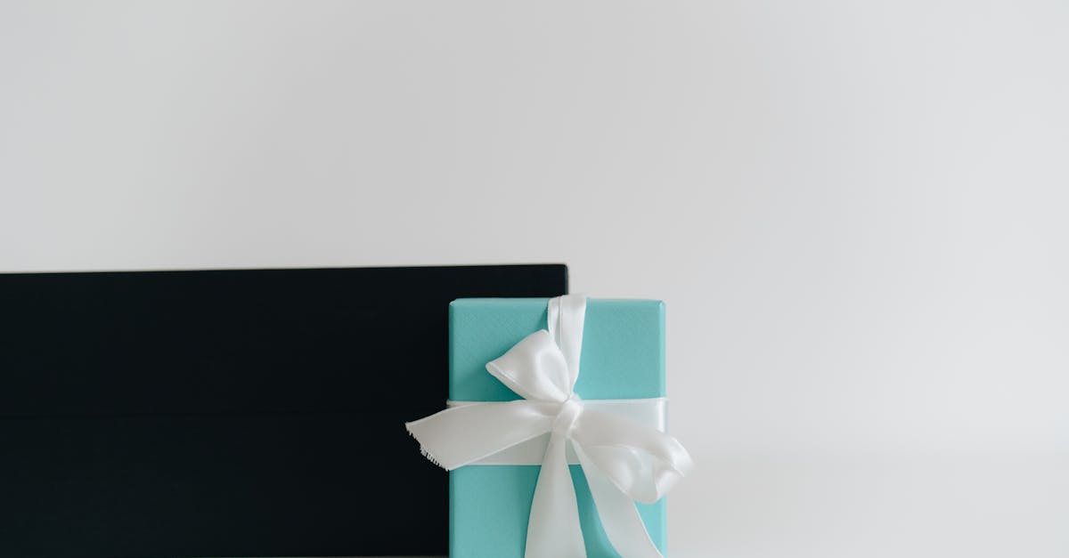
No discussion of the Tiffany visual identity is complete without addressing Tiffany Blue, the trademarked colour (Pantone 1837, a custom colour named for the company’s founding year) that is as iconic as the logo itself. The relationship between Tiffany Blue and the serif wordmark is symbiotic — each element amplifies the other.
Tiffany Blue is a soft, robin’s-egg blue that occupies a unique position in the colour spectrum: it is too refined to be casual, too warm to be corporate, and too specific to be generic. Against this distinctive background, the fine serif letterforms of the Tiffany logo take on additional elegance. The high contrast of the Didone-influenced letterforms — those hairline horizontals and fine serifs — is rendered more visible and more delicate against the blue. A bolder, heavier typeface would overpower the colour. A sans-serif would lack the textural richness to complement it. The fine serif wordmark and the specific blue were made for each other, even if they were not originally designed simultaneously.
For designers, this illustrates a critical principle: colour and typography are not independent variables. The best brand identities create relationships between these elements so that each reinforces the other. Choosing a typeface in isolation from its colour context — or vice versa — misses the opportunity for this kind of synergy.
Fonts Similar to the Tiffany Logo
Because the Tiffany wordmark is a custom design, no single commercially available font replicates it exactly. However, several typefaces share its Didone characteristics and can achieve a similar aesthetic.
Bauer Bodoni is arguably the closest in spirit. The Bauer foundry’s interpretation of Bodoni’s original designs features the dramatic contrast, fine serifs, and classical proportions that define the Bodoni tradition. Set in all caps with generous letter spacing, Bauer Bodoni produces results that echo the Tiffany aesthetic convincingly.
Didot by Linotype is the other major Didone option. Didot tends toward slightly narrower proportions and even more extreme stroke contrast than Bodoni, giving it a fashion-editorial character that works well for luxury branding contexts.
Playfair Display is a free alternative available on Google Fonts. While not a true Didone — its serifs are slightly bracketed, and its proportions are broader — Playfair Display captures some of the high-contrast elegance of the genre and is a serviceable option for projects with limited budgets.
Cormorant Garamond is another free option that, while technically a Garamond revival rather than a Didone, achieves a refined elegance suitable for luxury-adjacent branding when set in lighter weights. For comprehensive options, explore the best serif fonts for refined branding.
Designer Takeaways: What the Tiffany Font Teaches About Luxury Branding
The Tiffany typographic identity offers several principles that designers can apply to their own work.
Restraint is the ultimate luxury. The Tiffany logo does very little — it is simply the company name set in a refined serif. There are no graphic embellishments, no icons, no taglines competing for attention. This restraint communicates confidence. A brand that needs only its name, set in beautiful type, is a brand that trusts its own reputation. For designers working with premium clients, the impulse to add visual complexity should be resisted. Less, in luxury branding, genuinely is more.
Consistency compounds value. Tiffany has maintained essentially the same typographic identity for over a century. Each year of consistency adds another layer of recognition, another deposit in the brand’s visual equity. For designers advising clients on rebrands or refreshes, the Tiffany example is a powerful argument for evolution over revolution — and for resisting the pressure to change for the sake of appearing current.
Typography and colour must work as a system. The Tiffany Blue + serif combination is greater than the sum of its parts. Designers should evaluate their typographic choices in the context of the full colour system, not in isolation. A typeface that looks good in black on white may falter or soar depending on the colour environment it inhabits.
Frequently Asked Questions About the Tiffany Font
What font does Tiffany and Co use?
Tiffany & Co uses a custom serif wordmark that is not commercially available as a downloadable font. The letterforms are based on the Didone tradition — the same typographic category that includes Bodoni and Didot. The custom wordmark features high stroke contrast, fine unbracketed serifs, and generous letter spacing. It has been refined over more than a century to achieve its current form.
Is the Tiffany font Bodoni?
Not exactly. The Tiffany logo shares many characteristics with Bodoni — high stroke contrast, hairline serifs, and classical proportions — but it is a custom design, not a standard setting of any Bodoni version. If you need to approximate the Tiffany look for a design project, Bauer Bodoni set in all caps with generous tracking is the closest commercially available option. For luxury font applications, both Bodoni and Didot provide suitable starting points.
Why do luxury brands use serif fonts?
Serif typefaces carry associations with tradition, craftsmanship, and cultural heritage that align naturally with luxury brand values. The Didone serifs favoured by many luxury brands — including Tiffany, Vogue, and Cartier — add connotations of precision and refinement because their extreme stroke contrast historically required the highest quality printing to reproduce. These accumulated associations make serifs a natural choice for brands that want to communicate premium quality and timelessness. Understanding typography fundamentals helps designers make these choices intentionally.
Can I use the Tiffany font for my own projects?
You cannot use the actual Tiffany wordmark, as it is a proprietary and trademarked design. However, you can achieve a similar aesthetic using commercially available Didone typefaces. Bauer Bodoni, Linotype Didot, and similar high-contrast serifs will produce comparable results when set in uppercase with generous letter spacing. Free options like Playfair Display or Bodoni Moda on Google Fonts offer a more accessible entry point, though they lack the refinement of professional Didone typefaces.


