Timeline Infographic Design: Tips and Templates
A timeline infographic turns a list of dates into a story the eye can follow at a glance. The hard part isn’t the line — it’s the spacing, orientation, and labeling decisions that keep a long chronology readable. This guide covers the layout rules and template options that make timelines clear instead of cluttered.
For the broader workflow, see our infographic design guide and the chart-focused data visualization guide. A timeline is one of several formats — compare it against the full set in our types of infographics breakdown.
When to use a timeline infographic
Reach for a timeline when chronology is the point. It excels at company histories, product roadmaps, project schedules, and any “what happened when” narrative. If the order of events matters but the dates don’t, you likely want a process infographic instead — see our guide to making an infographic for choosing between them.
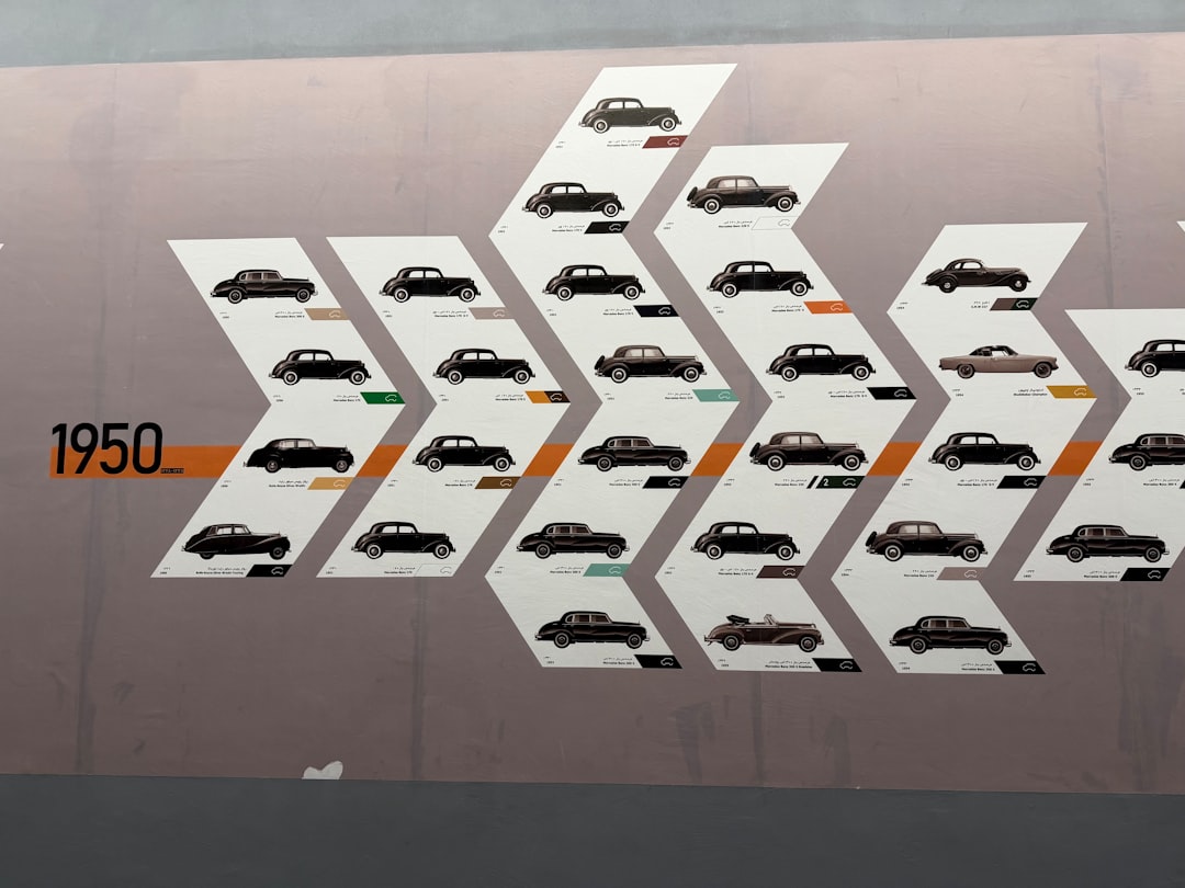
Choose an orientation
Orientation is your first structural decision and depends on event count and where the graphic will live.
| Orientation | Best for | Watch out for |
|---|---|---|
| Horizontal | Few events, slide decks, print | Runs off small screens |
| Vertical | Many events, blog and mobile | Can feel long; use anchors |
| Snake / zigzag | Many events in limited width | Reading order can confuse |
| Alternating sides | Detailed entries per date | Keep the spine obvious |
For web and mobile, a vertical timeline is the safest default — it scrolls naturally and never overflows a phone screen.
Get the spacing right
The most common timeline mistake is even spacing for uneven time. Decide upfront:
- Proportional spacing places events according to real elapsed time, so gaps are honest. Use it when the rhythm of time is meaningful.
- Equal spacing gives each event the same room regardless of date gaps. Use it when you have a few milestones and readability beats temporal accuracy.
- Never mix the two silently — if dates are unevenly spaced, the reader assumes proportional unless told otherwise.
Label every event consistently
Each entry needs the same three parts in the same order: a date, a short title, and an optional one-line description. Consistency is what lets the eye scan. Keep descriptions to a single line where possible, and use an icon per entry only if the icons add meaning rather than noise.
- Anchor dates to the line with a clear marker (dot, diamond, or tick).
- Right-align or left-align all dates the same way for clean columns.
- Cap entries at what fits comfortably — beyond roughly 8–10 events, consider grouping by era.
Color and type for timelines
Keep the palette tight — one accent color for markers and neutrals for everything else — and confirm it is color-blind-safe. Use color to signal phases (for example, a roadmap’s “done,” “in progress,” “planned”) rather than to decorate. For type, a clean sans-serif like Inter (free, Google Fonts) keeps dense date labels legible; set dates in tabular figures so digits align down the line. Apply the data-ink principle and skip drop shadows on the spine.
Templates and tools
You don’t need to build a timeline from scratch. Real options:
- Canva and Venngage — large libraries of editable timeline templates, free tiers available.
- Piktochart — strong for report-style and roadmap timelines.
- Figma — community timeline files plus full custom control.
For a fuller comparison, see our roundup of the best infographic tools. Start from a template that matches your orientation, then swap in your dates and trim anything decorative.
Show phases and milestones clearly
Long timelines become readable when you group events into phases. A product roadmap might split into “research,” “build,” and “launch,” each in a tinted band along the spine. Within each phase, mark the headline events as larger milestones and demote minor ones to smaller ticks. This two-level hierarchy lets a reader grasp the overall arc first, then drill into detail — the same scanning behavior a good chart supports.
- Use a tinted background band or a color shift to signal each phase.
- Make milestone markers visually larger than routine events.
- Add a single label per phase so the structure is obvious without reading every entry.
Common timeline design mistakes
A few errors recur often enough to call out:
- Even spacing for uneven time without saying so, which misleads readers about pace.
- Inconsistent entry structure — dates in different positions or formats break the scan.
- Overcrowding with too many minor events instead of grouping into phases.
- A horizontal layout that runs off the edge of a phone screen.
- Decorative clutter — heavy shadows and oversized icons that bury the actual dates.
Frequently Asked Questions
Should a timeline infographic be horizontal or vertical?
Use vertical for web and mobile, since it scrolls naturally and never overflows a phone screen, and it comfortably holds many events. Use horizontal for slide decks, print, or a small number of milestones. For more than eight or so detailed entries, a vertical or alternating-side layout reads best.
How many events should a timeline include?
Aim for the fewest events that tell the story clearly — often five to ten. Beyond roughly ten, the timeline gets crowded and hard to scan, so group events into eras or phases, or split into multiple timelines. Each entry should earn its place with a meaningful milestone.
What is proportional spacing in a timeline?
Proportional spacing positions events according to the real time between them, so a five-year gap appears wider than a one-month gap. It keeps the chronology honest and is best when the rhythm of time matters. Equal spacing, by contrast, gives every event the same room for readability.
What tools can I use to make a timeline infographic?
Canva and Venngage offer free, editable timeline templates ideal for beginners; Piktochart suits report and roadmap timelines; and Figma or Adobe Illustrator give full custom control. Pick a template matching your orientation, replace the placeholder dates with your verified events, and keep the palette and labels consistent.


