Best Typewriter Fonts for Nostalgic Design
The typewriter font refuses to disappear. In an era of polished variable fonts and precision-engineered superfamilies, typewriter typefaces continue to show up in editorial layouts, indie brand identities, film posters, and literary websites. The reason is simple: no other category of type carries the same weight of authenticity, nostalgia, and raw creative energy. A typewriter font instantly signals something handmade, something personal, something with a story behind it.
Typewriter fonts draw their appeal from association. They evoke war correspondents filing dispatches, novelists hammering out manuscripts, screenwriters punching through drafts, and bureaucratic forms from a pre-digital era. That combination of literary credibility and lo-fi charm makes them uniquely versatile. Whether you are designing a book cover, building a portfolio site, or branding an indie coffee roaster, the right typewriter typeface adds a layer of character that cleaner fonts simply cannot replicate.
This guide covers more than 25 typewriter fonts organized by style, from faithful reproductions of classic machines to modern interpretations that borrow the aesthetic without the limitations. Each entry includes a description, best use case, and pricing information so you can find exactly what your project needs.
What Makes a Typewriter Font
Before exploring specific recommendations, it helps to understand the characteristics that define a typewriter font and separate it from other monospaced or slab-serif designs.
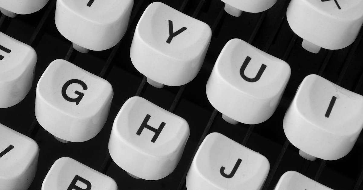
Traditional typewriters used a fixed-width system where every character occupied the same horizontal space. This monospace typewriter font structure is the most recognizable trait of the category — the narrow ‘i’ gets the same width as the wide ‘m’, creating that distinctive uneven rhythm on the page. But monospacing alone does not make a typewriter font. Several other visual qualities work together to create the effect.
Uneven ink distribution is a hallmark. Physical typewriters struck an inked ribbon against paper, producing characters with slightly inconsistent density — heavier where the key struck hardest, lighter at the edges. Many typewriter fonts replicate this through subtle stroke weight variation and textured edges. Character imperfections matter too: slightly misaligned baselines, irregular curves, and the occasional ink splatter all contribute to authenticity. Finally, the letterforms themselves tend toward slab-serif or simple sans-serif terminals, reflecting the mechanical constraints of physical type slugs that needed to be durable and strike cleanly.
Understanding these qualities helps you choose the right level of authenticity for your project. Some typewriter fonts faithfully reproduce every smudge and misalignment from a specific machine. Others strip away the distressing to keep only the structural DNA of typewriter letterforms. Both approaches are valid — the choice depends on how literal you want the reference to be.
Classic & Faithful Reproductions
These typewriter fonts aim to capture the look of real typewriter output with varying degrees of fidelity. They are the workhorses of the category — versatile enough for body text, recognizable enough to trigger instant association with the typewriter aesthetic.
American Typewriter
American Typewriter, designed by Joel Kaden and Tony Stan for ITC in 1974, is arguably the most widely used typewriter typeface in design history. Unlike many typewriter fonts, it is proportionally spaced rather than monospaced, which makes it significantly more readable in body text while retaining the slab-serif structure and mechanical character of typewriter letterforms. The rounded terminals and slightly condensed proportions give it a warm, approachable personality.
The family includes a generous range of weights from Light to Bold, plus condensed variants, making it more flexible than most fonts in this category. American Typewriter has appeared in everything from the “I Love NY” campaign to Apple product packaging, proving that a typewriter aesthetic can work at the highest levels of commercial design.
- Best for: Branding, editorial headlines, packaging, any project needing typewriter warmth with strong readability
- Price: Premium (ITC/Monotype); included as a system font on macOS
Courier
Courier is the typewriter font. Designed by Howard Kettler for IBM in 1955, it became the standard typeface for typewriters, legal documents, and screenplays. Its monospaced structure, uniform stroke weight, and clean slab serifs make it the most neutral and universally recognized typewriter typeface in existence. IBM deliberately chose not to trademark Courier, which is why it became the default monospaced font across operating systems.
The original Courier can feel thin and brittle in digital form, which is why several improved versions exist. As a design choice, Courier works best when you want a direct, unambiguous typewriter reference — screenplays, legal documents, or designs that intentionally reference bureaucratic or institutional aesthetics.
- Best for: Screenplays, legal formatting, institutional design, code snippets
- Price: Free (system font on all major operating systems)
Courier New
Courier New is the redrawn version of Courier created for digital environments. Compared to the original, it has slightly heavier strokes that render more cleanly on screen and at small sizes. The character set is more complete, and hinting is improved for pixel-grid rendering. For most digital applications, Courier New is the better choice over the original Courier.
- Best for: Screen-based applications, code display, digital documents requiring a monospaced typewriter look
- Price: Free (system font on all major operating systems)
Courier Prime
Courier Prime, designed by Alan Dague-Greene for John August’s Quote-Unquote Apps, is a purpose-built improvement on Courier specifically designed for screenwriters. It maintains Courier’s metrics — critical for screenplay formatting — while dramatically improving the aesthetics. Strokes are more balanced, curves are smoother, and the overall texture on the page is cleaner and more pleasant to read across long documents.
Available free on Google Fonts, Courier Prime includes italic, bold, and bold italic variants, plus a sans-serif companion called Courier Prime Sans. For anyone who needs Courier’s proportions without its dated appearance, this is the definitive upgrade.
- Best for: Screenplays, creative writing, any context where Courier metrics are required but better aesthetics are desired
- Price: Free (Google Fonts)
IBM Plex Mono
IBM Plex Mono is the monospaced member of IBM’s corporate typeface family, designed by Mike Abbink with Bold Monday. While it leans more toward a coding fonts than a traditional typewriter font, its connection to IBM’s typewriter heritage gives it a subtle mechanical character. The letterforms are clean, rational, and excellently crafted, with distinctive features like the slashed zero and dotted lowercase ‘l’ that aid readability in technical contexts.
The family is exceptionally complete, with eight weights from Thin to Bold, each with matching italics. As an open-source typeface on Google Fonts, it is one of the best free monospace typewriter fonts available. IBM Plex Mono works well when you want a nod to typewriter heritage without the distressed or vintage aesthetic [LINK: /monospace-font/].
- Best for: Code display, technical documentation, data-driven design, modern brands with tech heritage
- Price: Free (Google Fonts, open source)
Pitch
Pitch, designed by Kris Sowersby at Klim Type Foundry, is a premium monospace typewriter font that balances mechanical precision with contemporary refinement. Sowersby studied mid-century typewriters extensively, and Pitch captures the structural logic of those machines while smoothing away the crudeness. The result is a monospaced font that feels genuinely sophisticated — something rare in this category.
Pitch comes in ten weights with matching italics, plus a Sans version that drops the slab serifs. The sheer range of weights makes it unusable just for body text but also for headlines, UI elements, and complete typographic systems. It is one of the few typewriter fonts that can carry an entire brand identity without needing a contrasting face.
- Best for: Premium editorial design, brand identities, complete typographic systems requiring a typewriter foundation
- Price: Premium (Klim Type Foundry)
Vintage & Distressed Typewriter Fonts
These fonts embrace the imperfections of real typewriter output. Uneven ink, misaligned characters, and textured edges give them a raw, authentic quality that is perfect for projects seeking genuine vintage typewriter font character.
Special Elite
Special Elite, designed by Astigmatic, is one of the most popular free vintage typewriter fonts available. It replicates the output of a well-used typewriter with convincing ink texture, slight baseline irregularities, and the kind of character-level imperfections that come from a machine with thousands of pages behind it. The effect is immediately evocative without being illegible.
Available on Google Fonts, Special Elite works surprisingly well at body text sizes despite its distressed appearance. It is a go-to choice for indie projects, zine-inspired layouts, and any design that needs authentic typewriter grunge without licensing costs.
- Best for: Indie brands, zine layouts, creative portfolios, vintage-themed web design
- Price: Free (Google Fonts)
Veteran Typewriter
Veteran Typewriter pushes the distressed aesthetic further than Special Elite, with heavier ink bleed, more pronounced misalignment, and a generally rougher texture. The effect suggests a typewriter that has seen decades of hard use — keys striking unevenly, ribbon running dry in spots, paper slightly buckled. It is a niche choice, but when you need maximum vintage authenticity, Veteran Typewriter delivers.
- Best for: Period-specific design (wartime, mid-century), film props, heavily distressed editorial layouts
- Price: Free for personal use; commercial license available
Rough Draft
Rough Draft captures the look of a first draft pulled from a typewriter — complete with strike-through marks, uneven spacing, and the kind of imperfections that suggest creative urgency. The font includes alternate characters with varying levels of distress, allowing designers to create more natural-looking text blocks where no two instances of the same letter look identical.
- Best for: Book covers, literary marketing, creative campaigns emphasizing the writing process
- Price: Free for personal use; commercial license available
Underwood Champion
Underwood Champion is based on the output of the Underwood No. 5, one of the most iconic typewriters ever manufactured. The font captures the specific character proportions and ink behavior of that machine with impressive fidelity. Underwood typewriters had a distinctive combination of slightly condensed letterforms and strong slab serifs, and this font reproduces both qualities faithfully.
The level of historical specificity makes Underwood Champion an excellent choice for projects set in or referencing the early-to-mid twentieth century, when the Underwood No. 5 was the dominant typewriter in American offices.
- Best for: Period-specific design, historical publications, projects referencing early twentieth-century Americana
- Price: Free for personal use; commercial license available
FF Trixie
FF Trixie, designed by Erik van Blokland for FontFont, is one of the most celebrated vintage typewriter fonts in professional design. Van Blokland created it by actually typing characters on a typewriter and digitizing the results, preserving every imperfection from the original keystrikes. The font comes in multiple grades of distress — Light, Regular, and Heavy — representing different ribbon conditions and typing pressure.
FF Trixie has been used in high-profile projects ranging from film titles to album art. Its authenticity is virtually unmatched among digital typewriter fonts because it was derived directly from physical typewriter output rather than drawn to look like it. The premium price reflects that quality and the font’s professional pedigree.
- Best for: Film titles, album artwork, premium editorial design, projects requiring the highest level of typewriter authenticity
- Price: Premium (FontFont/Monotype)
Modern & Clean Typewriter Fonts
These fonts take the structural DNA of typewriter design — monospacing, slab serifs, mechanical rhythm — and refine it for contemporary use. The ink bleed and distressing are stripped away, leaving clean letterforms that reference typewriters without mimicking their imperfections.
Nitti
Nitti, designed by Pieter van Rosmalen for Bold Monday, is one of the most refined monospace typewriter fonts on the market. It takes the fundamental geometry of typewriter letterforms and polishes them into something genuinely elegant. The slab serifs are crisp, the proportions are carefully considered, and the overall texture is remarkably even for a monospaced design.
Nitti’s weight range — from Light to Black — gives designers unusual flexibility within a typewriter framework. The Grotesk companion removes the serifs entirely while maintaining the monospaced structure. It is a premium choice, but the level of craftsmanship justifies the investment for projects where a typewriter font needs to carry a professional-grade design.
- Best for: Premium web design, editorial layouts, brand identities blending vintage and contemporary sensibilities
- Price: Premium (Bold Monday)
Atlas Typewriter
Atlas Typewriter is the monospaced member of the Atlas family from Commercial Type. Like Nitti, it takes a refined approach to the typewriter genre — clean strokes, balanced proportions, and a quietly confident character. The family includes a good weight range and works beautifully alongside its proportionally spaced siblings, Atlas Grotesk and Atlas Text, giving designers a complete system with a typewriter option built in.
- Best for: Editorial systems, code-adjacent design, data visualization, projects using the broader Atlas family
- Price: Premium (Commercial Type)
Operator
Operator, designed by Andy Clymer for Hoefler & Co., is a typewriter font with a twist. Its roman styles are clean and modern, but the italics introduce a distinctive script-like quality inspired by the cursive typefaces available on some mid-century typewriters. This combination of mechanical structure and calligraphic flair gives Operator a personality that no other typewriter font can match.
Operator comes in two versions: Operator for display use and Operator Mono for code and text. The Mono version has become popular among developers who want a coding font with more personality than standard monospaced options. For designers, Operator offers a way to use a typewriter aesthetic that feels genuinely fresh rather than purely nostalgic.
- Best for: Code editors, creative tech branding, editorial design requiring a distinctive monospaced voice
- Price: Premium (Hoefler & Co.)
Letter Gothic
Letter Gothic, designed by Roger Roberson for IBM in 1962, is a sans-serif typewriter font — no slab serifs, just clean monospaced letterforms with a distinctly mechanical rhythm. Its stripped-down simplicity gives it an almost clinical quality that works well in technical, scientific, or government-inspired design contexts. The lack of serifs makes it more legible at small sizes than many serif-based typewriter fonts.
- Best for: Technical documentation, government and institutional design, minimal editorial layouts
- Price: Premium (various foundries); Letter Gothic Std included with Adobe Fonts
Prestige Elite
Prestige Elite was designed by Clayton Robie for IBM in 1953 and became one of the standard typefaces used on IBM Selectric typewriters. It has a slightly condensed structure with thin, precise strokes and delicate slab serifs that give it a more refined character than Courier. The letterforms feel businesslike and efficient — less romantic than other typewriter fonts, but with a quiet elegance that rewards careful attention.
- Best for: Business correspondence aesthetics, retro-corporate design, mid-century period pieces
- Price: Premium (various foundries); system font on some platforms
Decorative & Display Typewriter Fonts
These typewriter fonts push beyond strict mechanical reproduction into more expressive territory. They use the typewriter concept as a starting point for designs that prioritize visual impact and personality over strict fidelity.
Olivetti
Olivetti typewriters were renowned for their Italian industrial design, and several fonts pay homage to their distinctive output. Olivetti typewriter fonts typically feature slightly rounded terminals, a more humanist structure than their American counterparts, and an overall warmth that reflects the Italian design philosophy. The letterforms carry a sophistication that elevates them above the purely mechanical.
These fonts work particularly well in design contexts that reference mid-century European modernism, Italian design culture, or the intersection of technology and art that Olivetti represented.
- Best for: Design-conscious branding, projects referencing mid-century European modernism, gallery and museum materials
- Price: Varies by specific version; several free and premium options available
Trivia Serif
Trivia Serif takes the slab-serif skeleton of a typewriter font and pushes it into display territory with exaggerated proportions and distinctive character details. It maintains the monospaced rhythm of a typewriter but with the kind of personality and visual weight that demands attention at large sizes. The design sits at an interesting intersection between typewriter, slab serif fonts, and display type.
- Best for: Poster design, display headlines, typographic compositions, projects requiring a bold typewriter-adjacent aesthetic
- Price: Premium
Typing Monospace
Typing Monospace embraces the decorative potential of typewriter letterforms with slightly exaggerated serifs, generous spacing, and a character that feels more illustrative than mechanical. It works best at display sizes where its distinctive details can be appreciated. At smaller sizes, the decorative qualities that make it interesting at large scales can interfere with readability.
- Best for: Headlines, social media graphics, logo concepts, short-form typographic compositions
- Price: Free for personal use; commercial license available
Free Typewriter Fonts on Google Fonts
Budget-conscious designers have excellent options on Google Fonts. These best typewriter fonts cost nothing to use, load quickly via Google’s CDN, and carry open-source licenses suitable for commercial work [LINK: /best-google-fonts/].
Courier Prime
Already covered above, Courier Prime deserves a second mention here as the best free upgrade to standard Courier. It is the ideal choice for web projects that need a typewriter feel without licensing complications. The Google Fonts integration means simple implementation with a single link tag.
- Best for: Web projects, screenplays, creative writing platforms
- Price: Free (Google Fonts)
Special Elite
The best free vintage typewriter font on Google Fonts. Special Elite brings convincing distress and authentic typewriter texture at no cost, making it a staple for indie and vintage-themed web projects.
- Best for: Vintage web design, indie brand sites, blog headers with character
- Price: Free (Google Fonts)
Cutive Mono
Cutive Mono is a clean, understated monospace typewriter font with a contemporary sensibility. Its slab serifs are minimal, its strokes are even, and its overall appearance is tidy without being sterile. Cutive Mono works well for projects that want a subtle typewriter reference rather than a heavy-handed one. The screen optimization is solid, making it a practical choice for web body text at moderate sizes.
- Best for: Minimal web design, subtle typewriter accents, pull quotes, metadata display
- Price: Free (Google Fonts)
IBM Plex Mono
Covered in detail above, IBM Plex Mono is the most professionally crafted free monospaced font on Google Fonts. Its eight-weight range and excellent italics make it versatile enough for complete typographic systems. It bridges the gap between typewriter font and modern coding font with rare elegance [LINK: /monospace-font/].
- Best for: Developer tools, technical blogs, data-driven design, modern brands
- Price: Free (Google Fonts)
JetBrains Mono
JetBrains Mono, created by JetBrains for their IDE products, is technically a coding font, but its monospaced structure and mechanical character give it a modern typewriter quality. The design features increased letter height and distinctive ligatures for code. Outside of coding contexts, JetBrains Mono works well for projects in the tech and creative-developer space that want a monospaced font with contemporary polish.
- Best for: Developer-focused branding, tech blogs, creative coding projects, presentations with a technical edge
- Price: Free (Google Fonts, open source)
When to Use Typewriter Fonts
Knowing when a typewriter font strengthens your design — and when it undermines it — is essential. The aesthetic carries strong associations that can work powerfully in the right context and feel completely wrong in the wrong one.
Where Typewriter Fonts Excel
Editorial and literary projects are natural territory. Book covers, literary magazines, poetry collections, and creative writing platforms all benefit from the association between typewriters and the craft of writing. The font choice immediately signals creative seriousness and a connection to literary tradition [LINK: /what-is-typography/].
Indie and artisan branding leverages the handmade, anti-corporate quality of typewriter fonts. Coffee roasters, craft breweries, independent bookstores, and boutique creative agencies often use typewriter typefaces to signal authenticity and independence from mass-market aesthetics [LINK: /graphic-design-styles/].
Vintage and retro design is an obvious fit. Any project referencing the mid-twentieth century — from period film marketing to retro-themed packaging — benefits from the immediate temporal association typewriter fonts carry.
Code and technical display connects to the monospaced heritage of typewriter fonts. While dedicated coding fonts have surpassed typewriter fonts in technical optimization, a typewriter face can add personality to code snippets in editorial or marketing contexts [LINK: /monospace-font/].
Where Typewriter Fonts Struggle
Corporate and institutional design typically requires polish, precision, and neutrality — qualities that typewriter fonts inherently resist. A law firm or financial institution using a distressed typewriter font would undermine the trust and professionalism their audience expects.
Luxury branding generally calls for refinement and elegance. While there are exceptions, typewriter fonts tend to connote rawness and informality rather than sophistication. Reach for a Didone or a refined serif instead [LINK: /best-serif-fonts/].
UI design at small sizes presents practical challenges. Many typewriter fonts, especially distressed ones, lose legibility at the small sizes common in interface design. The monospaced structure also consumes more horizontal space than proportional alternatives, which is a significant limitation in space-constrained UI contexts.
Pairing Tips for Typewriter Fonts
Typewriter fonts carry so much personality that pairing them requires care. The goal is contrast — a companion font that provides visual relief and functional balance without clashing with the typewriter’s character [LINK: /font-pairing/].
Clean sans-serifs are the safest pairing partners. A typewriter font for headlines paired with a neutral sans like Helvetica, Inter, or DM Sans for body text creates a clear hierarchy where the typewriter aesthetic draws attention without overwhelming the reading experience. The simplicity of the sans-serif provides visual breathing room that the typewriter font needs.
Humanist serifs offer a warmer contrast. Pairing a typewriter heading with body text in a readable serif like Georgia, Libre Baskerville, or Charter creates a more literary tone. Both fonts feel text-oriented, but the shift from monospaced to proportional creates enough contrast to establish hierarchy [LINK: /best-serif-fonts/].
Avoid pairing two monospaced fonts unless the design intentionally calls for a fully monospaced system. Two different typewriter fonts in the same layout almost always create tension without resolution. Pick one typewriter font and let it carry the aesthetic on its own.
Scale matters. Typewriter fonts often work best at display sizes where their character details are visible. At body text sizes, switch to a more readable proportional font. This display-plus-body approach gives you the best of both worlds: typewriter personality where it counts and comfortable reading where it matters.
Frequently Asked Questions
What is the most realistic typewriter font?
FF Trixie is widely considered the most realistic typewriter font available because it was created by digitizing actual typewriter output rather than drawing letterforms from scratch. Each character preserves the genuine ink texture, baseline variation, and imperfections of a physical typewriter. For free alternatives, Special Elite on Google Fonts offers convincing distressed typewriter texture, though it does not match FF Trixie’s level of authenticity. The right choice depends on how much realism your project demands and your budget.
Are typewriter fonts the same as monospace fonts?
Not exactly. While most typewriter fonts are monospaced — meaning every character occupies the same horizontal width — the two categories are not identical. Some typewriter fonts, like American Typewriter, are proportionally spaced. Meanwhile, many monospaced fonts, like coding fonts, have no visual connection to typewriter aesthetics at all. The typewriter category is defined by a combination of monospacing, slab-serif or mechanical letterforms, and textural qualities that reference physical typewriter output. Monospacing is one ingredient, not the whole recipe [LINK: /monospace-font/].
Can I use typewriter fonts for web body text?
You can, but with caveats. Clean typewriter fonts like Courier Prime, IBM Plex Mono, and Nitti perform well as web body text at moderate sizes. Distressed typewriter fonts like Special Elite and FF Trixie are harder to read in long passages and work better as display or accent fonts on the web. The monospaced structure of most typewriter fonts also means lines hold fewer characters than proportional fonts at the same size, which affects layout efficiency. For long-form web content, consider using a typewriter font for headings and a proportional font for body text [LINK: /best-google-fonts/].
What is the best free typewriter font for commercial use?
Courier Prime is the best overall free typewriter font for commercial projects. It is available on Google Fonts under the SIL Open Font License, which permits commercial use without restriction. For a vintage aesthetic, Special Elite is an excellent free option with the same permissive license. IBM Plex Mono offers the most professional-grade free option with its extensive weight range and excellent screen rendering. All three fonts are hosted on Google Fonts, making them straightforward to implement in web projects and fully licensed for print, packaging, and branding use.


