Typography Design Principles That Work
Typography is the craft of making language readable and giving it a voice. Most of what people read every day is shaped by typographic decisions they never notice — and that invisibility is the point. Good typography design principles exist because type either disappears into effortless reading or it gets in the way. When hierarchy is muddy, line lengths run too wide, or four fonts fight for attention, readers feel the friction even if they cannot name it. These principles keep type working for the reader rather than against them.
The key principles of typography design
These seven principles underpin everything from a book page to a web interface. They govern how type is chosen, sized, spaced, and arranged.
| Principle | Why it matters |
|---|---|
| Clear hierarchy | Readers grasp structure before reading a word |
| Legibility and readability | The text must be easy to decode and to sustain |
| Limited typefaces | Two or three faces keep a design coherent |
| Consistent scale and rhythm | A repeating system feels intentional and calm |
| Comfortable line length | 45 to 75 characters keeps reading effortless |
| Appropriate leading | Line spacing controls how text breathes |
| Thoughtful pairing and contrast | Complementary faces and weights create interest |
1. Establish a clear hierarchy
Hierarchy is what lets a reader understand a page before reading it — headline first, then subheads, then body, then captions. Use distinct steps in size, weight, and spacing so each level is obviously different from the next. Vague hierarchy, where a heading is only slightly larger than the body, leaves readers unsure what is important. Strong visual hierarchy in type guides the eye and signals structure at a glance.
2. Prioritize legibility and readability
Legibility is how easily individual letters are distinguished; readability is how comfortably whole passages are read. Both matter. Choose typefaces with clear letterforms for body text, set them at a comfortable size, and avoid extremes of condensed width or light weight in long passages. Decorative faces belong in headlines, never body copy. If terms like x-height and counter are unfamiliar, the typography glossary explains the anatomy that drives legibility.
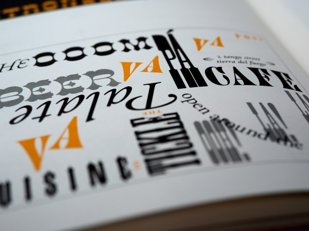
3. Limit your typefaces
Restraint is a hallmark of mature typography. Two typefaces — often one for headings and one for body — are enough for most projects, and three is usually the ceiling. Each additional face dilutes coherence and risks visual clashes. You can create plenty of variety within a single well-built family by using its weights, italics, and sizes, which keeps the design unified while still expressive.
4. Use a consistent scale and rhythm
Sizes should not be chosen at random. A modular type scale — a set of related sizes derived from a ratio — gives headings, subheads, and body a harmonious relationship and makes the whole design feel deliberate. Pair that with a consistent vertical rhythm, where spacing aligns to a baseline grid, so the page reads as a calm, ordered system rather than a collection of arbitrary measurements.
5. Control line length
Line length, or measure, has a direct effect on reading comfort. Lines that are too long make it hard to find the start of the next line; lines too short chop the text into a stuttering rhythm. The well-established target is roughly 45 to 75 characters per line for body text. On the web, set a max-width on text containers rather than letting paragraphs stretch across an entire wide screen.
6. Set appropriate leading
Leading — the vertical space between lines — determines how text breathes. Too tight and lines crowd into each other; too loose and they drift apart, breaking the connection between them. Body text generally reads well at a line height around 1.4 to 1.6 times the font size, with larger headings needing proportionally tighter leading. Adjust with line length and font size, since longer lines benefit from a little more space. Generous white space around and within text supports the same goal.
7. Pair faces and manage contrast
When combining typefaces, aim for clear contrast with underlying harmony — a serif body with a sans-serif heading, for example, or two faces that differ noticeably in structure rather than subtly. Faces that are too similar look like a mistake; faces that clash create tension. The same logic applies to weight and size contrast within a single family: meaningful differences create emphasis, while timid ones read as indecision.
Common typography mistakes to avoid
- Using too many typefaces so the design loses coherence.
- Letting body text run far wider than 75 characters per line.
- Setting hierarchy so subtly that headings barely differ from body text.
- Cramming lines with too little leading or spreading them too far apart.
Frequently Asked Questions
What are the most important typography design principles?
The most important principles are establishing clear hierarchy, ensuring legibility and readability, and limiting typefaces. A defined hierarchy guides the reader, legible type sustains reading, and restraint in font choice keeps the design coherent. Consistent scale, line length, and leading then refine the experience.
How many fonts should I use in a design?
Two typefaces are enough for most projects, typically one for headings and one for body text, with three as a practical maximum. You can generate ample variety using the weights, italics, and sizes within a single family, which keeps the design unified rather than scattered.
What is the ideal line length for readability?
The widely accepted target is roughly 45 to 75 characters per line for body text. Lines longer than that make it hard to track to the next line, while very short lines fragment the reading rhythm. On the web, constrain text width rather than letting it span the full screen.
What is leading in typography?
Leading is the vertical space between lines of text. It controls how text breathes: too tight and lines crowd together, too loose and they lose connection. Body text usually reads well at a line height around 1.4 to 1.6 times the font size, adjusted for line length and size.
How do I pair typefaces well?
Pair typefaces that contrast clearly but share an underlying harmony, such as a serif paired with a sans-serif. Avoid faces that are nearly identical, which look like errors, and faces that clash. Strong, intentional contrast in structure, weight, and size creates emphasis and visual interest.


