What Font Does V for Vendetta Use?
If you are searching for the v for vendetta font — the dramatic, theatrical lettering from the 2006 film and Alan Moore and David Lloyd’s graphic novel — the honest answer is that it is custom-drawn branding rather than a font you can install. The title treatment leans on a carved, slightly antique character with that unmistakable angular “V” at its heart. Below we separate the trademarked logo from fonts you can actually license, and show you how to recreate the revolutionary mood.
What font is the V for Vendetta logo?
The V for Vendetta logo centers on the bold, pointed V — the same red insignia that recurs throughout the story — with the rest of the title set in ornate, high-contrast lettering that feels closer to an engraved or theatrical serif than a plain sans. The forms carry a sense of old propaganda posters and revolutionary pamphlets, which is exactly the period mood the design is reaching for.
There is no public confirmation that the title is a retail font. Like most film and comic identities, it was drawn or heavily customized for the brand. So if a forum tells you V for Vendetta “uses” one specific named typeface, treat that as an informed observation, not a confirmed spec. What you can state confidently is the category: an ornate, high-contrast display face — often serif-flavoured — with theatrical, slightly antique detailing.
It is worth noting that the comic and the film treat the identity differently. David Lloyd’s original artwork is shadowy and painterly, with the “V” recurring as graffiti and propaganda inside the story rather than as a polished marketing logo. The 2006 film distilled that into a cleaner title lockup for posters and trailers. Both versions, though, share the same instinct: lettering that feels like it belongs on an old playbill or a wartime proclamation, not a modern multiplex.
What typeface is used in the film?
Across the 2006 film’s marketing — posters, the title card, home-video packaging — the type stays dramatic and a little baroque. The headline lettering is ornate so it evokes the revolutionary, pre-modern world of the story, while supporting credits and copy shift to cleaner, more neutral sans-serifs for legibility. That split between a characterful display title and a workhorse body face is standard practice across film branding.
The practical takeaway is that the franchise does not lean on a single font everywhere. It leans on a hierarchy: a distinctive, ornate display treatment carries the name and the red “V” does the symbolic heavy lifting, while a quiet grotesque handles the small print. If you want to match the vibe, nail the ornate display headline first, because that is the part viewers actually register as “V for Vendetta.”
Free fonts that look like the V for Vendetta font
You cannot legally download the brand’s wordmark, but you can get strikingly close with free ornate display and bold serif fonts. Match the character first — high contrast, theatrical flourish, a strong serif backbone — before fussing over tiny details.
| Use case | V for Vendetta uses | Free alternative |
|---|---|---|
| Main title / headline | Custom ornate display | Cinzel (Google Fonts) — carved, classical caps |
| Poster / theatrical lettering | Bespoke high-contrast serif | Playfair Display or UnifrakturMaguntia |
| Body / credits text | Neutral grotesque sans | Inter or Lora |
- Cinzel — the closest free match for the carved, classical, slightly antique cap feel.
- Playfair Display — high-contrast serif with a theatrical, period flavour.
- UnifrakturMaguntia — a blackletter option if you push toward old-pamphlet drama.
As with most film logos, the font choice is only the starting point. The theatrical mood comes from how you stage it: deep reds and blacks, a touch of texture as if printed on aged paper, and generous spacing that lets each letter breathe like an engraving. Set your chosen serif in caps, add a subtle distress layer, and let the pointed “V” anchor the composition. A clean web font on a plain background will feel modern; the period drama lives in the treatment.
Before publishing anything commercial, skim our font licensing guide so you know which of these allow business use (most ship under the SIL Open Font License).
Why does V for Vendetta use this kind of type?
Ornate, high-contrast lettering does specific jobs for a revolutionary period drama. It evokes old proclamations, theatre bills and propaganda — the visual world of a story set against a stylised, authoritarian Britain. The carved character also gives the title gravity and a sense of history, which a plain modern sans simply cannot carry.
There is a thematic angle too. The pointed red “V” is both a letter and a symbol of resistance, so the design has to let those two readings coexist. Pairing an ornate display title with that single charged emblem lets the brand flex between pure icon and named lockup, a hallmark of mature identity systems. For another dark, message-driven adaptation, compare the blocky treatment in our Watchmen font breakdown.
Can I use the V for Vendetta font for my own project?
You can recreate the style, but not the brand. The V for Vendetta wordmark and the “V” emblem are protected by trademark and copyright owned by their rights holders, so reproducing them — or making something confusingly similar for commercial use — invites legal trouble. What is perfectly fine is using a free ornate display or bold serif font to build your own original title or poster.
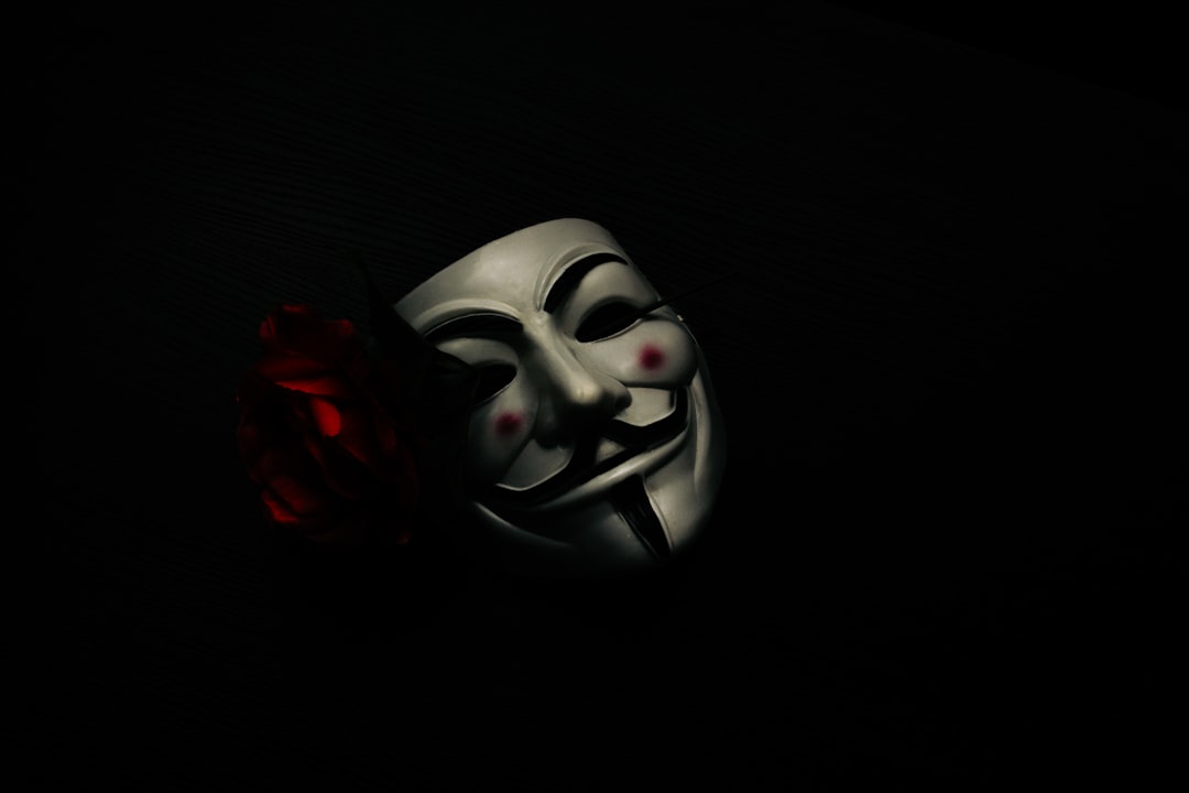
The Guy Fawkes mask deserves its own note. Although it has become a real-world protest symbol, the specific stylised mask design tied to the film and comic is still protected artwork. You can design your own original mask or revolutionary emblem inspired by the idea, but lifting the exact illustration for commercial products is risky. For personal projects, fan art and study pieces, recreating the lettering style is a genuinely useful exercise in how historical type signals mood and politics.
If you like this ornate, theatrical look, browse our roundup of the best gothic fonts for more period-flavoured display faces. You can also see how a very different comic adaptation handles its lettering in our 300 movie font guide.
Frequently Asked Questions
Is the V for Vendetta font a real downloadable font?
No. The V for Vendetta title is custom lettering created for the film and comic brand, not a retail typeface you can buy or download. Any named “V for Vendetta font” you find online is a look-alike or someone’s best guess, so treat it as an informed observation rather than a confirmed match.
What free font looks most like the V for Vendetta title?
Cinzel from Google Fonts is the closest free match because it shares the carved, classical, high-contrast cap character of the title. Playfair Display is a strong alternative if you want a theatrical serif headline with period flavour for a poster or revolutionary-style design.
What is the red “V” in the logo?
The pointed red “V” is both a letter and a standalone resistance symbol, not a separate font. It is a trademarked emblem tied to the story and often appears alongside the wordmark. You cannot reproduce it legally, but you can design your own original mark inspired by its angular, defiant character.
Can I use a V for Vendetta look-alike font commercially?
Yes, if the font itself is licensed for commercial use — most Google Fonts are, under the SIL Open Font License. The catch is you must build an original design. Copying the actual V for Vendetta wordmark or “V” emblem, even with a free font, can still infringe the rights holders’ trademarks.


