What Font Does Verve Use?
If you are searching for the verve coffee font to rebuild that clean, modern wordmark for a mockup, a deck, or a design study, the honest answer is that no single off-the-shelf typeface matches it exactly. To be clear, this is about Verve Coffee Roasters, the California-born specialty roaster — not the general word “verve” or any unrelated product. The logo is custom lettering, not a released font, so there is no public file called “Verve Coffee” to install. Below we break down what the wordmark actually is, why it leans into a clean, modern look, and which free fonts get you closest without touching the trademark.
What font is the Verve logo?
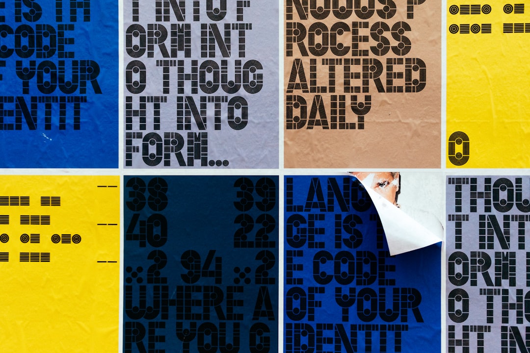
The Verve Coffee Roasters logo is best read as a clean, modern lettering treatment rather than a single installed font. The letters are even, precise, and confident, drawn with the bright, balanced clarity you would expect from a roaster rooted in California surf-and-coffee culture. That clean, contemporary character carries the feel: the wordmark looks fresh and considered rather than rugged or ornate, with steady strokes that signal modern craft and energy. The restraint keeps attention on the name and its lively spirit.
Because major brands commission type designers and agencies for their identity, treat the precise construction as an informed observation, not a confirmed spec. What we can say confidently is that it is not a famous commercial font dropped in unedited. The treatment is reminiscent of clean geometric and humanist sans faces rather than any one downloadable file. If it were a stock typeface, designers would have named it long ago, so treat the construction as bespoke lettering built specifically for the brand and its modern identity.
What typeface does Verve use in branding?
Across packaging, the website, cafes, and supporting material, Verve keeps its clean custom wordmark while pairing it with neutral, legible sans faces for body copy, product names, and labels. The logo sets a fresh, modern tone; functional text such as origin details and menu items stays in a quieter face so everything reads cleanly on a bag or a screen. This split between a refined wordmark and clean supporting type is standard across modern specialty-coffee branding.
- Primary wordmark: clean custom lettering anchoring the logo, bags, and cafe signage.
- Supporting type: neutral modern sans-serifs for headlines, body copy, and labels.
- Tone: clean, fresh, and contemporary — the typography signals energy and craft.
So if you want to mirror the whole identity, you need two decisions: one clean modern face for the logo-style headline, and one calm, well-spaced sans for the paragraphs and labels. For more brand-by-brand breakdowns, see our roundup of famous brand fonts.
Free fonts that look like the Verve Coffee font
No free font will be an exact match, but several capture the clean, modern spirit well enough for a poster, a mockup, or a fan project. The table pairs each part of the look with a free alternative you can actually download and use under its own license.
| Use case | Verve uses | Free alternative |
|---|---|---|
| Logo / wordmark feel | Clean modern sans | Montserrat or Jost |
| Headline / display | Geometric sans | Poppins or Work Sans |
| Body / supporting | Neutral readable sans | Inter or Roboto |
Montserrat is a strong starting point for the wordmark because its clean, geometric character shares the logo’s fresh, modern feel; set it with open, even spacing to match. Jost brings a slightly sharper geometric flavor, and Poppins works well for friendly modern headlines. For neutral supporting copy, Inter and Roboto stay clean and readable. The clean character is what makes the label read as “Verve,” so the spacing and restraint matter as much as the font, and no free font will recreate the exact brand mark for you. For a related clean roaster, see our Ruby Coffee font guide.
Why does Verve use this kind of type?
The lettering is doing real branding work. Verve is positioned around fresh, modern California coffee culture, so its logo needs to feel clean and energetic rather than rugged or ornate. Even, modern letterforms read as bright and considered, exactly the mood the brand wants on a bag of beans or a cafe wall. A heavy distressed face or a quirky display font would feel wrong here, undercutting the fresh, design-forward promise the roaster is known for.
There is also a practical argument. A clean wordmark stays legible at any size and survives the varied contexts of packaging, web, and cafe signage. The modern style keeps the focus on energy and consistency, which compounds the brand’s recognition over time. A bespoke treatment lets the designers pitch the feel precisely, somewhere between clean and fresh, which is exactly the register a modern specialty roaster wants. For a tougher contrast, our Death Wish Coffee font guide shows how a bold wordmark sets a very different mood.
Can I use the Verve Coffee font for my own project?
You can recreate the style, but you cannot use the actual logo. The Verve Coffee Roasters name, wordmark, and brand design are trademarked branding, so copying them for merchandise, a business, or anything implying affiliation is off-limits. Even if someone posts a “Verve Coffee font” file online, that file is at best an unofficial recreation and is not licensed for commercial use.
What you can do is use a legitimately licensed free font (like the options above) to build your own original wordmark with a similar clean, modern mood. That keeps you on solid ground. Before you ship anything commercial, confirm the license on whatever font you pick — our font licensing guide walks through desktop, web, and embedding rights so you do not get caught out.
Frequently Asked Questions
Is the Verve Coffee font free to download?
No. The Verve Coffee Roasters logo is custom clean lettering, not a released font, so there is no official file to download. Any “Verve Coffee font” you find is a fan recreation or look-alike. For the style, use free fonts like Montserrat or Jost, keep the spacing open and even, and check each license before commercial use.
What font is closest to the Verve Coffee logo?
A clean geometric sans comes closest. Montserrat and Jost, both free on Google Fonts, capture the fresh, modern feel of the wordmark. Set them with open, even spacing for the nearest match — without copying the trademarked Verve Coffee Roasters wordmark in commercial work.
Is this about the coffee brand or the word verve?
This guide is about Verve Coffee Roasters, the California specialty roaster, not the general word “verve” or any unrelated product. The brand’s wordmark is clean, modern custom lettering tied to its coffee identity, so a “fonts like verve” search should point you to fresh sans options rather than anything tied to the dictionary word.
Can I use a Verve-style font commercially?
You can use a free look-alike font commercially if its license permits, but you cannot reproduce the trademarked Verve Coffee Roasters wordmark on products you sell. Set your own text in a free clean modern sans instead of copying the official logo, and verify both the font license and trademark rules first.