Web Design Principles: A Complete Guide
Good web design principles are not about decoration—they are the rules that make a page legible, fast, and trustworthy. Apply them and visitors find what they need without thinking; ignore them and even beautiful sites leak users. This guide breaks down the nine principles that matter most, with concrete ways to apply each one.
If you want the cross-discipline foundation behind these ideas, start with our master guide to design principles, then come back here for the web-specific application. What makes the web distinct is that it is interactive, fluid, and measured: a layout has to work across thousands of device sizes, load over unreliable connections, and respond to clicks, taps, and keyboards. That is why the principles below blend classic graphic-design ideas with technical concerns like performance and accessibility—on the web, the two are inseparable.
1. Visual hierarchy
Visual hierarchy is the deliberate ordering of elements so the eye lands on the most important thing first. On the web you build it with size, weight, color, and position: a large bold headline outranks body text, a high-contrast button outranks a secondary link. Most users scan in an F-pattern on text-heavy pages and a Z-pattern on sparse landing pages, so place your value proposition and primary action along those lines. Establish a type scale (for example 16px body, 20px lead, 32px H2, 48px H1) and stick to it so importance reads instantly. A reliable test: blur a screenshot of the page until text is unreadable. If you can still tell what’s most important from shape and contrast alone, your hierarchy is working; if everything blurs into one gray field, it isn’t. See our dedicated breakdown of visual hierarchy for the full system.
2. Consistency
Consistency means the same element behaves and looks the same everywhere. Buttons share one style, links share one color, spacing follows one scale, and headings follow one type ramp. Internal consistency reduces cognitive load—users learn your interface once. External consistency (matching platform and web conventions, like a logo top-left that links home, a search icon as a magnifying glass) lets users apply habits they already have. A small, documented design system or component library is the fastest way to enforce this at scale.
3. White space
White space—the empty area around and between elements—is an active design tool, not wasted room. Generous spacing groups related items, separates unrelated ones (the law of proximity), and gives the eye rest, which raises perceived quality and comprehension. Tight, cramped layouts feel cheap and slow to read. Increase line height to roughly 1.5 for body copy, keep measure (line length) around 50–75 characters, and add padding inside containers so content never touches an edge.
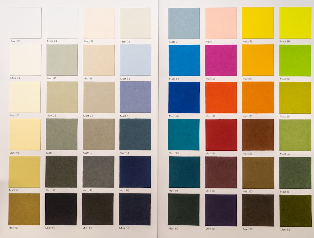
4. Contrast and color
Contrast directs attention and guarantees legibility. Use it intentionally: a bright primary button against a neutral page pulls the click; muted secondary actions recede. Color contrast is also an accessibility requirement—body text should meet at least a 4.5:1 ratio against its background, and large text 3:1, per WCAG. Pick a restrained palette (one or two brand colors plus neutrals) and reserve your most saturated color for the single action you want users to take.
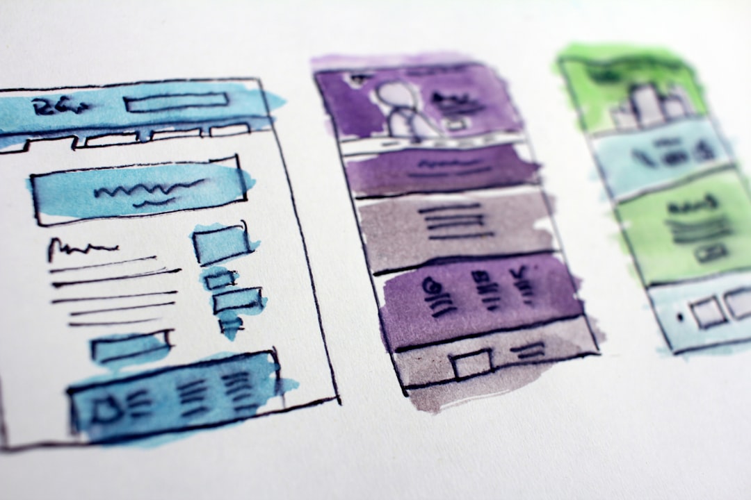
5. Alignment and grids
Alignment creates the invisible order that makes a layout feel intentional. Anchor elements to a shared grid—commonly a 12-column responsive grid—so edges line up and the page reads as organized rather than scattered. Consistent left alignment for text blocks aids scanning; centered text is best reserved for short headings. A baseline grid keeps vertical rhythm tidy across columns. When everything snaps to the same lines, even dense pages feel calm.
6. Responsive design
Responsive design ensures one codebase adapts gracefully from a 360px phone to a wide desktop. Design mobile-first: define the small-screen layout, then progressively enhance with breakpoints as space allows. Use fluid units (%, rem, vw) and flexible images, stack multi-column layouts vertically on narrow screens, and make tap targets at least 44×44px so fingers can hit them. With mobile-first indexing the norm, your phone layout is effectively your primary layout. For where the discipline is heading, see our web design trends for 2026.
7. Page speed and performance
Page speed is a design principle because performance is experience: slow pages raise bounce rates and erode trust before a single word is read. Optimize the things designers control—compress and correctly size images, serve modern formats like WebP/AVIF, lazy-load below-the-fold media, limit web fonts and heavy scripts, and protect Core Web Vitals (LCP, INP, CLS). Reserve space for images and embeds so layout does not shift as the page loads. A fast, stable page is a usable page.
8. Accessibility (WCAG)
Accessibility makes your site usable by people with visual, motor, auditory, or cognitive differences—and the same work improves usability for everyone. Follow WCAG: provide descriptive alt text, use real semantic HTML (headings, landmarks, buttons vs links), ensure full keyboard operability with visible focus states, label every form field, and never rely on color alone to convey meaning. Accessibility is both an ethical baseline and, in many regions, a legal one.
9. Clear calls to action
A clear call to action tells users exactly what to do next. Each screen should have one obvious primary action, written as a specific verb phrase (“Start free trial,” not “Submit”), styled with the strongest contrast on the page, and given breathing room so nothing competes. Remove friction around it: fewer form fields, no surprise steps. When the next action is unmistakable, conversion follows the hierarchy you already built. Secondary actions—”Learn more,” “Maybe later”—should be visibly subordinate (a ghost button or plain link) so they don’t dilute the primary path. And repeat the main CTA at natural decision points on long pages rather than burying it once at the very top or bottom.
Web design principles at a glance
| Principle | What it does | How to apply it |
|---|---|---|
| Visual hierarchy | Orders attention | Use a type scale, support F/Z scan patterns |
| Consistency | Lowers learning cost | One button style, one component library |
| White space | Improves comprehension | 1.5 line height, 50–75 char measure, padding |
| Contrast | Guides and ensures legibility | Meet 4.5:1 text contrast; one strong accent |
| Alignment | Signals intent | 12-column grid, consistent left alignment |
| Responsive | Works on any device | Mobile-first, fluid units, 44px targets |
| Page speed | Reduces abandonment | Compress media, protect Core Web Vitals |
| Accessibility | Includes everyone | Semantic HTML, alt text, keyboard focus |
| Clear CTA | Drives action | One primary action, specific verb, high contrast |
How the principles work together
These principles are interlocking, not a checklist to tick once. Hierarchy decides where the CTA sits; contrast makes it pop; white space stops it from being crowded; accessibility ensures a keyboard user can reach it; responsive design keeps it tappable on a phone; and speed makes sure the page loads before the user leaves. Treat them as one system. When a page feels “off” but you can’t say why, walk the list: it is almost always a hierarchy that’s flat, contrast that’s too low, spacing that’s too tight, or a layout that breaks at one screen size. Naming which principle is being violated turns a vague critique into a concrete fix. The cousins of web work apply the same logic—compare how the rules shift for screens that move in our motion design principles, and how they translate to native apps in our app design principles guide.
Frequently Asked Questions
What are the most important web design principles?
The most important are visual hierarchy, consistency, white space, contrast, responsive layout, page speed, and accessibility. Hierarchy and contrast guide attention, consistency and white space aid comprehension, and responsive design, speed, and accessibility make the site usable for everyone on any device.
What is the difference between web design principles and visual hierarchy?
Visual hierarchy is one specific principle—the ordering of elements by importance using size, color, and position. Web design principles is the broader set that also includes consistency, white space, contrast, responsive layout, speed, accessibility, and clear calls to action. Hierarchy is the most visible member of that family.
How do web design principles improve usability?
They reduce the effort needed to use a page. Hierarchy shows what matters first, consistency lets users reuse what they learned, white space and contrast make content readable, and accessibility plus responsive design ensure anyone can complete tasks regardless of device or ability—turning a page into a tool people finish using.
Do these principles apply to mobile design?
Yes, and they matter even more. With mobile-first indexing, the phone layout is effectively primary. Apply larger tap targets (at least 44px), simplified hierarchy, stacked single-column layouts, and aggressive performance optimization, since mobile users often have slower connections and less screen space to spare.
How is accessibility related to good web design?
Accessibility is a core design principle, not an add-on. Meeting WCAG—semantic HTML, sufficient color contrast, keyboard operability, and alt text—makes sites usable for people with disabilities while also improving SEO, readability, and overall usability for every visitor. Good accessible design is simply good design.