What Font Does Wednesday Use?
Quick note: this guide is about the Netflix series Wednesday — the Addams Family spin-off starring the character Wednesday Addams — not the weekday. If you’re looking for a font called “Wednesday” for a calendar or planner, that’s a different search.
If you’ve searched for the wednesday font, you’ve found that there’s no neat file to install. The title logo for Netflix’s Wednesday — that tall, elegant, faintly gothic lettering wrapped around the show’s eerie-but-stylish tone — is custom artwork, not an off-the-shelf typeface. It balances refinement and menace, exactly like the character herself. This guide breaks down what the wordmark actually is, what circulates online, and the closest free fonts you can use to recreate the gothic look honestly and legally.
What font is the Wednesday logo?
The honest answer: the primary Wednesday logo is custom display lettering, not a commercial typeface. The wordmark reads as elegant and gothic — tall capitals with refined, high-contrast strokes and subtle dark styling that nods to blackletter and Victorian mourning typography without becoming a full Gothic blackletter. It’s deliberately poised between beautiful and unsettling, mirroring the show’s deadpan macabre humor.
Because it’s a designed logo, there’s no official “Wednesday” download from Netflix. Fan recreations circulate online and some get close to the elegant gothic feel, but they’re unofficial — useful as reference, not as a licensed asset. If a site claims to sell “the real Wednesday font,” be skeptical: the genuine mark is protected branding, and any font using the name is at best a look-alike. The broader Addams Family franchise has used various ornate and gothic styles over the years, so don’t assume one fixed typeface.
What typeface is used in the show?
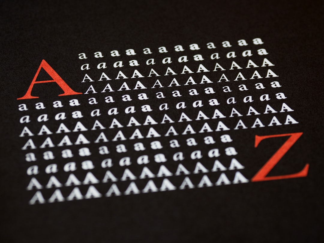
Across the title card, key art, and marketing, the typography follows a consistent gothic-elegant recipe. A few traits define it:
- Tall, refined proportions — elongated capitals that feel stately and a little severe.
- High stroke contrast — thin and thick strokes that recall classical engraving and Victorian display type.
- Gothic atmosphere — subtle dark detailing and styling that evokes mourning, academia, and the macabre without tipping into cartoonish horror.
Supporting text in marketing leans on clean, restrained serifs or sans-serifs so the ornate title stays the centerpiece. The takeaway for designers: the mood here is elegant gothic, not splattery horror. Reach for refinement and high contrast first, then add darkness — the menace is in the poise, not in heavy distress.
Free fonts that look like the Wednesday font
You can’t download the genuine logo, but you can rebuild its energy. The trick is to start with either a high-contrast elegant serif or a refined blackletter and lean into the dark, academic mood. Below are free starting points by use case.
| Use case | Wednesday uses | Free alternative |
|---|---|---|
| Main gothic wordmark | Custom elegant gothic lettering | Cinzel or Pirata One |
| Blackletter accent | Dark Victorian styling | UnifrakturMaguntia |
| Elegant serif headline | High-contrast display serif | Playfair Display |
| Body / caption text | Restrained supporting type | EB Garamond |
None of these is a pixel match — the show’s logo has bespoke details — but set in dark ink on a muted, moody palette, Cinzel or Pirata One reads as unmistakably in the Wednesday family. To go deeper on the dark-and-ornate direction, browse a curated set of the best gothic fonts for blackletter and Victorian-flavored options that pair beautifully with this aesthetic.
Why does Wednesday use this kind of type?
The elegant gothic lettering does real character work. Wednesday Addams is morbid, brilliant, and impeccably composed — never sloppy, never loud. Type that is refined, high-contrast, and quietly macabre captures that exactly: it’s beautiful enough for a fashion editorial and dark enough for a graveyard. A cruder horror font would have missed her deadpan sophistication entirely.
There’s also a franchise logic. The Addams Family has always lived at the intersection of the gothic and the genteel — old money, old houses, old mourning rituals — so the typography reaches for Victorian and blackletter cues that feel timeless and a little funereal. The result is instantly ownable and atmospheric on a poster or thumbnail. That same “let the wordmark set the mood” instinct drives other genre titles, including the gritty custom logo we cover in the Narcos font guide.
Can I use the Wednesday font for my own project?
Separate two very different things. The actual Wednesday logo — and the Addams Family branding around it — is protected intellectual property owned by the rights holders. You cannot legally use the exact wordmark (or a deliberate clone) on merchandise, cover art, or anything implying affiliation. Trademark protects that brand identity whether or not a downloadable “font” exists.
What you can do is build your own elegant-gothic look from legitimately licensed fonts. Free faces like Cinzel, Playfair Display, UnifrakturMaguntia, and EB Garamond typically ship under the SIL Open Font License, which generally permits personal and commercial use — but always confirm each font’s terms before shipping a paid product, and note that fan-made “Wednesday” recreations usually carry personal-use-only terms. The rule of thumb: a generic elegant gothic serif or blackletter is yours to use; a recreation copying the exact Wednesday wordmark to trade on the name is not. When in doubt, check the license file and our font licensing guide.
Frequently Asked Questions
Is there an official Wednesday font to download?
No. The Netflix Wednesday title is custom gothic lettering, not a packaged typeface. Files shared as “the official Wednesday font” are unofficial fan recreations or trademark-infringing clones, so download with caution and avoid commercial use without checking the uploader’s terms.
What free font looks most like the Wednesday logo?
An elegant high-contrast display like Cinzel or a refined blackletter such as Pirata One is the closest free starting point. Set it dark on a muted palette to capture the show’s poised, macabre mood. It won’t be identical, but it reads as the same elegant gothic family.
Is the Wednesday font a blackletter or a serif?
It sits between the two. The logo borrows high-contrast classical serif structure with subtle gothic and blackletter detailing — elegant rather than heavy. That’s why a high-contrast serif like Playfair Display and a soft blackletter like Pirata One both work as free approximations.
What font goes well with an Addams Family aesthetic?
Pair an elegant gothic display such as Cinzel for titles with a classic serif like EB Garamond for body text, adding a blackletter accent for drama. Keep the palette dark and refined. That combination delivers the gothic-genteel mood without copying any protected logo.


