What Font Does Bose Use? The Bose Font Explained
Wondering what the Bose font is? The “BOSE” wordmark is a clean custom sans-serif, while the brand’s wider communications use a refined neo-grotesque tuned for minimalist clarity. Neither is a font you can simply install. This guide explains the wordmark, the brand type, and the free fonts that get you closest to Bose’s understated, premium look.
Bose is a classic example of a premium-audio brand using neutral, confident type to signal engineering precision over flash. For the wider picture, browse our overview of fonts used by famous brands.
What font is the Bose logo?
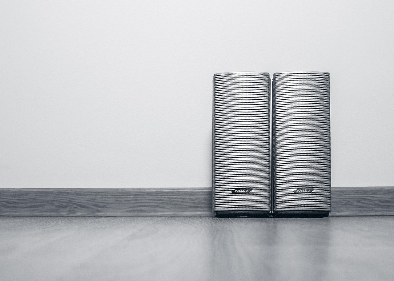
The “BOSE” letters are a clean custom sans-serif — a trademarked wordmark rather than characters typed from a stock font. The capitals are even, open, and minimal, with no decorative flourishes, drawn to read instantly on speakers, headphones, and packaging. The mark has stayed remarkably consistent for decades, reinforcing the brand’s reputation for restraint and precision. Because the lettering is bespoke and protected, it cannot be legally reproduced, though its neo-grotesque feel is straightforward to approximate.
What is Bose’s brand typeface?
For everything beyond the wordmark — advertising, product UI, packaging, and digital — Bose leans on a refined neo-grotesque sans in the broad Helvetica tradition. The brand voice is deliberately quiet: clean weights, tight spacing, and plenty of white space let the products and sound do the talking. Where the exact corporate specimen is not publicly documented, it is safest to treat Bose’s brand type as a high-quality grotesque sans rather than a single named retail font you can buy off the shelf.
Why does Bose use a refined grotesque?
A neutral, refined grotesque communicates exactly what a premium-audio brand needs: precision, calm confidence, and zero distraction. Bose’s whole identity is built on understatement, so the type stays out of the way — there is no personality to compete with the product. That places Bose alongside other minimalist consumer-tech brands; compare it with our breakdown of the Beats font, which takes a bolder, sportier route to the same headphone market.
Can I use the Bose font?
No. Both the wordmark lettering and Bose’s corporate type are proprietary brand assets, so you cannot license or reuse them for your own projects. The clean, premium look is easy to approximate with free grotesques, though. Before you publish, confirm the terms of whatever you choose — our font licensing guide explains desktop, web, and app licensing so you stay compliant.
Free and paid alternatives to the Bose font
You cannot license Bose’s corporate faces, but several refined grotesques deliver the same neutral, premium feel. Helvetica (paid) — especially Neue or Now — is the obvious paid reference. For free options, Inter and Arimo (a metric-compatible Arial/Helvetica substitute) are excellent stand-ins.
| Use case | Font (paid reference) | Free alternative |
|---|---|---|
| Bose-style wordmark / headline | Helvetica Now (paid) | Inter (free) |
| Clean, premium body text | Helvetica Neue (paid) | Arimo (free) |
| UI / product display text | Akkurat (paid) | Inter (free) |
| Minimal spec sheets / captions | Neue Haas Grotesk (paid) | Roboto (free) |
If you license a paid grotesque such as Helvetica Now, confirm your tier covers web embedding and app use as well as desktop, especially for product interfaces and packaging artwork.
How do I get the Bose look in my own design?
Set headlines and body in Inter or a licensed Helvetica, keep weights light to regular, and lean on generous white space, tight letter-spacing, and a restrained monochrome palette. Bose’s premium feel comes from discipline and negative space, not decoration — strip everything back and let the layout breathe. For a friendlier electronics identity built on rounder geometry, see our breakdown of the LG font.
How has the Bose identity evolved?
Bose has changed its look less than almost any major consumer brand. Founded in 1964 by MIT professor Amar Bose, the company built an identity around engineering credibility, and the clean “BOSE” wordmark has stayed essentially the same for decades — a rare consistency that itself signals confidence. As the brand moved from home hi-fi into headphones, wearables, and connected apps, it modernised its supporting type toward cleaner, screen-friendly grotesques and tightened its digital design system, but it never chased trends or added ornament. The constant through every product era is restraint: a premium-audio brand has to feel precise and uncluttered on a speaker grille, a phone screen, and a magazine spread alike, and a neutral grotesque delivers exactly that. That pattern of a near-unchanging wordmark plus a quietly evolving brand face is the same logic you will spot across our famous brand fonts roundup.
Helvetica, Inter, or Arimo: which alternative fits?
All three sit in the neutral-grotesque family Bose’s corporate sans belongs to. Helvetica (paid) is the closest authentic reference for the refined, premium feel, but it carries licensing costs. Inter is the best free all-rounder: screen-tuned, multi-weight, and ideal for UI, web, and modern brand work. Arimo is metrically compatible with Arial and Helvetica, making it the safe free pick when substituting into existing layouts. For most new projects chasing the Bose look, Inter set with restraint will get you there.
Frequently Asked Questions
What font does the Bose logo use?
The “BOSE” wordmark is a clean custom sans-serif — even, open, minimal capitals drawn specifically for the brand. It is a trademarked, bespoke mark in the neo-grotesque tradition, not a downloadable retail font, so it cannot be legally reproduced.
What is Bose’s brand font?
Beyond the wordmark, Bose uses a refined neo-grotesque sans in the broad Helvetica family across advertising, UI, and packaging. Where the exact corporate specimen is not publicly documented, treat it as a high-quality grotesque rather than a single named retail font.
Is the Bose font Helvetica?
Not exactly. The Bose wordmark is custom, but it sits firmly in the same neo-grotesque family as Helvetica, which is why Helvetica, Inter, and Arimo all make convincing alternatives for the clean, premium look.
Is the Bose font free?
No. The wordmark lettering and Bose’s corporate type are proprietary and not publicly available. For a free, legal substitute with the same neutral, refined feel, use Inter or Arimo, or license a Helvetica for a closer reference match.
Can I use the Bose font for commercial work?
You cannot use the Bose wordmark lettering or its corporate type commercially, as they are protected brand assets. You can use free alternatives like Inter and Arimo, or a licensed Helvetica, for your own projects as long as you hold the correct license.


