What Font Does Microsoft Use?
The short answer to the microsoft font question is Segoe UI — the humanist sans-serif that powers Windows, Office, and most of Microsoft’s branding. The four-square logo sits next to a custom Segoe-derived wordmark. Below we break down where each font appears, whether you can legally use it, and the best free substitutes. For more brands like this, see our guide to famous brand fonts.
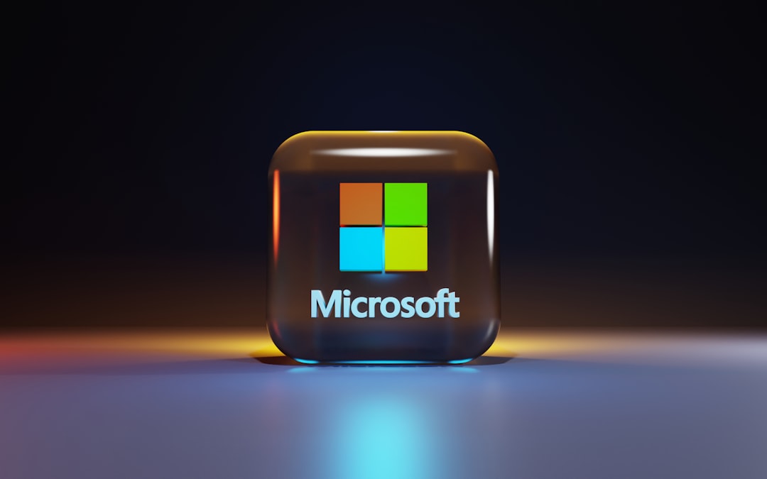
What font is the Microsoft logo?
The current Microsoft logo, introduced in 2012, pairs a four-color grid with a wordmark set in a customized version of Segoe (specifically Segoe Semibold, with bespoke tweaks). It is not a stock font you can download — the lettering was refined for the wordmark, so it counts as proprietary brand art even though the underlying family is licensable. If you need the look, Segoe UI Semibold is the closest licensed match, and Selawik is the closest free one.
What font does Microsoft use for Windows and its UI?
Segoe UI has been the Windows system font since Windows Vista (2007) and remains the default through Windows 11. It is a clean, legible humanist sans-serif optimized for on-screen reading at small sizes. Starting with Windows 11, Microsoft layered in Segoe UI Variable, a variable-font version that adjusts optical sizing — tightening spacing at large display sizes and opening it up for tiny caption text. Office apps, Outlook, Teams, and Azure dashboards all lean on the Segoe family for body and heading text.
| Use case | Font | Free / licensable alternative |
|---|---|---|
| Logo wordmark | Custom Segoe Semibold | Selawik, Open Sans Semibold |
| Windows UI | Segoe UI | Selawik |
| Windows 11 system text | Segoe UI Variable | Open Sans, Source Sans 3 |
| Office / web body | Segoe UI | Selawik, Open Sans |
Why did Microsoft choose Segoe?
Segoe was a deliberate move toward warmth and on-screen clarity. Before Vista, Windows leaned on Tahoma and Verdana — competent but mechanical bitmap-era faces. Segoe UI’s humanist construction — open counters, a generous x-height, and gently flaring strokes — reads more naturally in running text and scales better as displays grew sharper. It also gave Microsoft a single, ownable voice across products at a time when Apple had San Francisco and Google was building Roboto. The 2012 logo refresh extended that voice into the wordmark, replacing the older italic “Microsoft” lettering with an upright, modern Segoe-based mark beside the four-color window.
The Segoe family is also unusually deep. Beyond Segoe UI, Microsoft maintains companions like Segoe UI Symbol, Segoe MDL2 / Fluent icon fonts for interface glyphs, and Segoe Script. That breadth is part of why a clean swap is hard: replacing Segoe means replacing an entire ecosystem of weights, symbols, and language coverage, which is exactly the problem Selawik’s metric compatibility was built to solve.
Can I use the Microsoft font?
Segoe UI ships with Windows and Microsoft software, but its license is tied to those products — you cannot freely redistribute it, embed it in your own commercial app, or host it on a non-Microsoft website without a separate license from Monotype, which owns the Segoe family. Because Microsoft’s wordmark uses custom lettering, copying it for your own brand also risks trademark issues, not just font licensing. When a typeface is proprietary like this, the safe path is a licensed or open-source substitute — our font licensing guide explains exactly what each license tier permits.
What are free alternatives to the Microsoft font?
Microsoft itself solved this problem. It published Selawik, an open-source (SIL Open Font License) typeface that is metric-compatible with Segoe UI — meaning text laid out in Segoe keeps the same line breaks and spacing when swapped to Selawik. That makes it the single best free stand-in.
- Selawik — free, metric-compatible with Segoe UI; the closest legal match.
- Open Sans — a friendly humanist sans with a similar feel; great for body text. See our Open Sans deep dive.
- Source Sans 3 — Adobe’s open UI sans, clean and highly legible.
For a closer look at the actual Microsoft typeface, read our Segoe UI font page. Working through other tech brands? Compare with what font Amazon uses and what font Samsung uses.
A practical tip for designers recreating a Microsoft look: pair Selawik (or Open Sans) for body text with Selawik Semibold for headings to echo the logo weight. Keep tracking tight and lean on a neutral, mid-gray text color rather than pure black — that subtle softness is a big part of why Microsoft’s interfaces feel calm rather than harsh.
How has the Microsoft font changed over time?
Microsoft’s typographic identity has moved through clear eras. The 1987 logo set “Microsoft” in a custom italic Helvetica-style face with the famous “Pac-Man” slash through the “o.” That stayed until 2012, when the company shipped its first major redesign in 25 years: an upright Segoe-based wordmark paired with the four-color logo grid. On the software side, the jump from Tahoma/Verdana to Segoe UI in Vista (2007), and then to Segoe UI Variable in Windows 11 (2021), traces a steady push toward humanist warmth and resolution-independent rendering. Each step kept the family recognizable while modernizing the details — a textbook example of evolving a brand typeface without breaking it.
Frequently Asked Questions
What font does Microsoft Word use by default?
As of 2026, Microsoft Word’s default body font is Aptos (formerly codenamed Bierstadt), which replaced Calibri in 2023. Calibri itself had been the default since Office 2007. The surrounding ribbon and menu UI, however, still render in Segoe UI.
Is Segoe UI free to download?
No. Segoe UI is bundled with Windows and Microsoft 365, but it is not free to license separately or redistribute. The Segoe family is owned by Monotype and requires a paid license for outside use. For a free, near-identical option, use Microsoft’s own open-source Selawik.
What is Segoe UI Variable?
Segoe UI Variable is a variable-font evolution of Segoe UI introduced with Windows 11. It bakes optical-size adjustments into a single file, so the same typeface looks balanced from tiny caption text up to large display headings without swapping fonts.
What font is the Windows 11 interface?
Windows 11 uses Segoe UI Variable as its primary system typeface, building on the long-standing Segoe UI that has shipped since Windows Vista. It governs everything from the Start menu to Settings and File Explorer.


