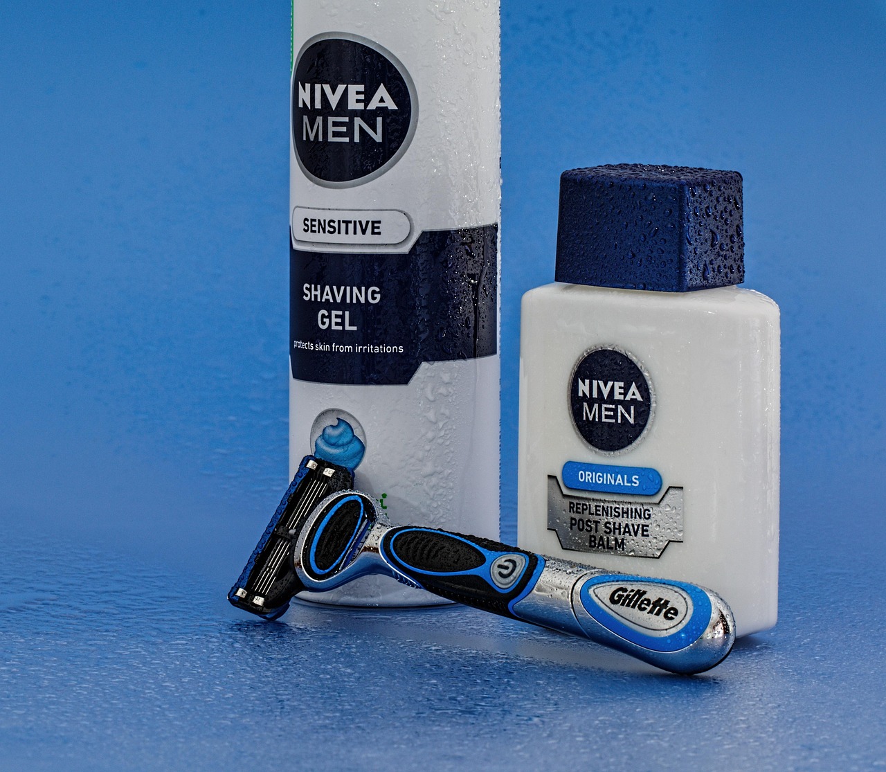
What Font Does Nivea Use?
The NIVEA font is one of the most minimalist in personal care: clean white capitals centered in a deep-blue disc, almost unchanged for decades. The short answer is that the wordmark is custom — a plain, even-weighted sans-serif drawn for the brand and protected as a trademark — not an off-the-shelf font you can download. Around it, Nivea uses neutral sans-serifs for packaging and copy. Below we cover what’s used where and the closest free alternatives. For more like this, see our hub on famous brand fonts.
What font is the NIVEA logo?
The NIVEA logo wordmark is a clean custom sans-serif set in all capitals, white on the signature blue. The letterforms are simple and even — minimal contrast, geometric-leaning but neutral — which is exactly why the mark has aged so well and felt timeless for generations. It reads as calm, reliable, and clinical-but-warm. Because the lettering is bespoke and trademarked, there is no official downloadable “NIVEA font.” Any file labeled that way on a free-font site is an unofficial imitation of the wordmark.
What makes the mark distinctive isn’t a flourish — it’s the absence of one. The capitals are wide, generously spaced, and almost perfectly even in weight, which is unusual restraint for a global brand. That deliberate plainness is why the logo has needed only minor refinements across more than a hundred years: there’s no stylistic trend baked in to go out of date.
What typeface does the Nivea brand use?
Beyond the logo, Nivea pairs its custom mark with neutral sans-serifs for product names, claims, and body copy — clean, high-legibility type that keeps the packaging uncluttered and trustworthy. Publicly documented specimens naming a single official brand font are limited, so we’d treat any one definitive claim with caution. What’s consistent is the style: minimalist, neutral grotesque or neo-grotesque sans-serifs in the Helvetica tradition, which suits Nivea’s pared-back, dependable identity.
Why does Nivea use a custom logo font?
Nivea’s whole identity is built on consistency and trust — the same blue tin, the same wordmark, for over a century. A custom, ultra-simple sans lets the brand own its exact letterforms and the precise blue as a trademark, and keeps the mark recognizable in any market and at any size. Simplicity is the point: there’s nothing to date. To understand why brands commission lettering rather than license a font, see our font licensing guide.
Free fonts that look like the NIVEA font
You can’t use the NIVEA wordmark, but free fonts capture its clean, neutral minimalism. Match the role first: an even all-caps sans for the logotype, and a neutral sans for body copy.
| Use case | Nivea uses | Free alternative |
|---|---|---|
| Logo / wordmark | Custom clean sans (all caps) | Inter or Arimo |
| Headlines / claims | Neutral sans | Inter or Archivo |
| Body / packaging copy | Neutral sans | Arimo or Roboto |
| Geometric alt feel | Even, simple sans | Jost or Questrial |
Inter is the most versatile free match — a neutral neo-grotesque with a clean all-caps setting and wide language support, ideal for echoing Nivea’s calm minimalism. Arimo is metric-compatible with Helvetica/Arial, so it nails the classic, timeless neutrality. For a slightly more geometric, even feel close to the NIVEA capitals, Jost or Questrial work well. All are free for commercial use under open licenses.
Is the NIVEA font Helvetica or Futura?
Both come up as guesses because the wordmark is so clean and even — but the NIVEA mark is custom lettering, not Helvetica, Futura, or any single licensed face. The capitals have a slightly geometric, even quality that sits between the neutral grotesque world of Helvetica and the pure geometry of Futura, which is exactly why people reach for both names. In practice it’s bespoke, drawn to be timeless and ownable as a trademark. If you want to approximate the geometric evenness, Futura-style free faces like Jost get closer than a strict grotesque; for neutral simplicity, Inter or Arimo win.
How to recreate the Nivea look
If you’re building a clean, trustworthy skincare identity, set your wordmark in a neutral sans like Inter or Arimo, all caps, with comfortable letter-spacing, and place it in a single bold color shape — Nivea’s blue disc is the model. Keep everything else minimal: white space, one or two colors, no decoration. The Nivea lesson is that timelessness comes from restraint, not trend. For sibling breakdowns, see what font Dove uses and what font Garnier uses.
For supporting copy, stay in the same neutral sans and resist the urge to add accent fonts — Nivea’s strength is that nothing competes with the wordmark and the blue. Set claims and ingredient text at high contrast for legibility, and use weight, not extra typefaces, to create hierarchy. The brand has barely changed its logo in over a century, and that consistency is the point: when the type is this quiet and this constant, the mark becomes a kind of visual shorthand for reliability.
Can I use the NIVEA font for my own project?
No — not the real wordmark. The NIVEA logo is custom lettering and a registered trademark owned by Beiersdorf. Using it outside official materials risks both trademark and licensing issues. For your own brand, set a free neutral sans like Inter or Arimo and draw your own mark. Any “NIVEA font” download is an unofficial imitation, not the genuine letterforms.
Frequently Asked Questions
What font does Nivea use in its logo?
Nivea’s logo uses a clean custom sans-serif set in all capitals, white inside the brand’s deep-blue circle. It is bespoke, minimalist lettering registered as a trademark, so it is not downloadable. Inter or Arimo are the closest free alternatives.
Is the NIVEA font available to download?
No. The NIVEA wordmark is proprietary custom lettering and a registered trademark, not a downloadable font. Any “NIVEA font” on a free-font site is an unofficial imitation. For a similar clean, neutral look, use a free sans such as Inter, Arimo, or Jost.
What free font looks most like Nivea?
Inter is the closest all-purpose free match for Nivea’s clean, neutral minimalism. Arimo is excellent if you want classic Helvetica-style neutrality, and Jost suits the slightly geometric all-caps feel. All are free for commercial use under open licenses.
What is the Nivea blue color?
The NIVEA logo uses a deep, slightly cool blue that is trademarked alongside the wordmark. The exact value is proprietary, but for design work a deep navy-blue in the Pantone 280-type family gets you in the right range for a similar effect.


