What Font Does Sega Use?
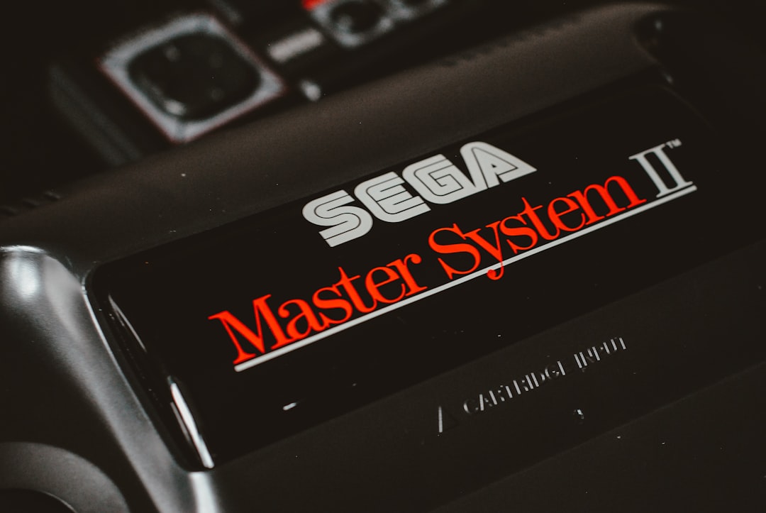
The Sega font is one of gaming’s most recognizable wordmarks: the bold, forward-leaning blue “SEGA” has stayed remarkably consistent since the company’s arcade and console heyday. It’s custom italic lettering, not a font you can install, and Sega’s wider identity uses custom and licensed type whose exact names aren’t comprehensively public. Below we cover what’s used, the wordmark’s history, and the closest free fonts — hedging where specimens aren’t documented. For more breakdowns, see our hub on famous brand fonts.
What font is the Sega logo?
The Sega logo wordmark — the bold blue “SEGA” set in a brisk forward italic — is custom lettering, bespoke artwork drawn for the brand rather than typed from an off-the-shelf font. The slant gives it speed and momentum (fitting for a company built on arcade energy and Sonic), and the rounded, even strokes keep it friendly and legible at any size. It’s a long-standing, registered trademark, so there’s no downloadable “Sega logo font” to install. The mark has barely changed for decades, which is exactly why it reads as instantly nostalgic and recognizable.
Why is the Sega logo italic?
The forward slant is the defining feature of the Sega wordmark, and it’s a deliberate signal of speed, motion, and energy — the same qualities Sega’s arcade and console catalog traded on. Italic logotypes have long been shorthand for dynamism (think sports and racing brands), and Sega leaned into that to feel fast and playful. The blue color reinforces a clean, optimistic, tech-forward tone. If you’re studying how a single typographic gesture can carry a whole brand personality, our game logo design guide breaks down the mechanics.
What typeface does the Sega brand use?
Beyond the wordmark, Sega’s branding and game UI use a mix of custom and licensed typefaces rather than one single public font, and the exact named brand face isn’t comprehensively documented in public specimens. So we’d avoid stating a definitive “official Sega font” name — treat any such claim online with caution unless it’s from Sega’s own brand guidelines. What’s reliable is the style: bold, clean, often slanted display type for impact, with neutral sans-serifs for body and menus. Matching the style is far safer than chasing an unverified font name.
Has the Sega logo changed over the years?
Remarkably little. The bold blue italic SEGA wordmark has been the constant through the company’s arcade era, the Genesis/Mega Drive and Saturn console years, and its later shift to a software-first publisher. Minor refinements to weight, proportion, and the exact blue have happened, but the core gesture — heavy, rounded, forward-slanting caps — has held for decades. That consistency is a branding asset most companies never achieve; it’s why a single glimpse of the wordmark triggers instant recognition and nostalgia across generations of players. Stability, not reinvention, is the lesson here.
Is the Sega font free to download?
No. The blue SEGA wordmark is custom artwork and a registered trademark, and any Sega brand typeface would be proprietary or licensed. Any site advertising a free “Sega font” is offering an unofficial imitation or a fan-made recreation of the lettering. To get the look legitimately, use a free bold italic sans alternative and draw your own wordmark. Our font licensing guide explains why brands rely on bespoke lettering and how licensing works.
Free fonts that look like the Sega font
You can’t use the SEGA wordmark, but several free fonts capture the same bold, fast, italic feel. Match the role first: a heavy italic/oblique sans for the wordmark style, with a neutral sans for body.
| Use case | Sega uses | Free alternative |
|---|---|---|
| Logo / wordmark | Custom bold italic lettering | Archivo (bold italic) or Saira (italic) |
| Display headlines | Bold slanted sans | Oswald (italic) or Rajdhani |
| UI & body | Neutral sans | Inter or Roboto |
| Captions | Neutral sans | Inter (regular) |
Archivo in a bold italic is the closest free match for the SEGA wordmark feel — a confident grotesque with strong italic cuts, free on Google Fonts. Saira offers a slightly more technical, slanted look, and Rajdhani brings a squarer, gamer-leaning vibe for headlines. For body and UI, drop to a neutral Inter so the slanted display type stays the star. All are free for commercial use; pair them with your own custom wordmark rather than the SEGA mark.
How to recreate the Sega look
To echo Sega specifically, set a bold sans in a true italic or oblique, in a generous weight, then keep the color clean and confident — the classic Sega blue or a similar bright hue. Lean into the slant: that forward momentum is the whole point. Keep supporting type quiet and neutral so the slanted wordmark dominates. Avoid copying the exact SEGA letterforms — draw your own wordmark in the same spirit to stay clear of the trademark. For more on type that fits play, see our best fonts for gaming guide and our sibling breakdown of what font PlayStation uses.
Frequently Asked Questions
What font does the Sega logo use?
The blue SEGA wordmark is custom italic lettering — bespoke, forward-slanting artwork drawn for the brand, not a downloadable typeface — and has stayed consistent for decades. It is a registered trademark. There is no official “Sega logo font”; a bold italic of Archivo or Saira is the closest free stand-in.
Why is the Sega logo slanted?
The forward italic slant signals speed, motion, and energy — fitting for Sega’s arcade and console heritage and characters like Sonic. Italic logotypes are long-standing shorthand for dynamism. Combined with the clean blue color, the slant gives the wordmark its fast, playful, instantly recognizable personality.
Is the Sega font free to download?
No. The SEGA wordmark is custom trademarked artwork and any brand typeface is proprietary or licensed. Free “Sega font” downloads are unofficial fan recreations. Use a free bold italic sans such as Archivo or Saira and draw your own wordmark instead of copying the SEGA lettering.
What free font looks most like Sega?
A bold italic of Archivo is the closest free match for the slanted SEGA wordmark, with Saira and Rajdhani good for technical or gamer-leaning headlines. All are on Google Fonts. Pair them with a neutral Inter for body text and create your own wordmark rather than copying the trademark.
Can I download the Sega font?
No. The SEGA wordmark is trademarked custom italic artwork, and the exact brand typeface isn’t publicly available — so any “Sega font” download is an unofficial imitation. Use a legitimate free bold italic sans such as Archivo and create your own logo.


