What Is Calligraphy? History, Traditions, and Modern Practice
What is calligraphy? At its simplest, calligraphy is the art of beautiful writing. The word comes from the Greek “kallos” (beauty) and “graphein” (to write). But that definition barely scratches the surface of a practice that spans thousands of years, dozens of cultures, and an enormous range of tools, scripts, and philosophies. Calligraphy is simultaneously a visual art, a meditative discipline, a cultural tradition, and in the modern era, a thriving creative community. From the Roman inscriptions on Trajan’s Column to the illuminated manuscripts of medieval Europe, from the flowing brushwork of Chinese masters to the geometric precision of Islamic Kufic, calligraphy letters have shaped civilization’s visual heritage.
This guide provides a comprehensive overview: what calligraphy is, how it differs from hand lettering and typography, its rich history across cultures, the tools and materials of the practice, and how the modern calligraphy movement is making this ancient art accessible to a new generation.
What Is Calligraphy? Defining the Art
Calligraphy is the art of producing decorative handwriting or lettering with a pen, brush, or other writing instrument. What separates calligraphy from ordinary handwriting is intentionality, skill, and beauty. A calligrapher controls the tool, the pressure, the angle, and the speed of each stroke to produce calligraphy letters that are aesthetically harmonious. Unlike [LINK: /hand-lettering/], where letters are drawn and constructed (often with sketching, outlining, and refining), calligraphy is written — each stroke is produced in a single, deliberate movement. The beauty emerges from the interaction between the calligrapher’s trained hand and the tool’s natural behavior.
In many cultures, calligraphy has a spiritual or philosophical dimension. East Asian calligraphy is considered a form of self-cultivation. Islamic calligraphy is a primary art form in a tradition that historically limited figurative imagery. Western calligraphy has roots in monastic devotion. Understanding calligraphy means understanding not just a technique, but a worldview.
Calligraphy vs. Hand Lettering vs. Typography
These three disciplines are related but distinct:
- Calligraphy is writing letters with a specialized tool in real-time strokes. The tool and the calligrapher’s movement create the thick-thin variation naturally.
- Hand lettering is drawing letters. A letterer sketches, outlines, and refines letterforms, treating each as an illustration. See our [LINK: /hand-lettering/] guide for more detail.
- Typography is the art of selecting, arranging, and setting pre-designed typefaces. A typographer works with existing fonts rather than creating letterforms. Typography is a core element of [LINK: /what-is-graphic-design/].
In practice, these disciplines overlap constantly. A calligrapher’s work inspires typeface designs. A hand letterer uses calligraphic stroke logic. A typographer selects calligraphic typefaces for their warmth and personality. Understanding the distinctions helps you appreciate what each discipline contributes.
The History of Western Calligraphy
Western calligraphy has a continuous written tradition stretching back more than two thousand years, with each era producing distinctive scripts and styles.
Roman Capitals (1st–5th Century)
The foundation of Western letterforms is the Roman square capital, best exemplified by the inscription at the base of Trajan’s Column in Rome (113 CE). These letters, carved in stone but believed to have been first written with a flat brush, established the proportions and shapes that still underlie modern serif typefaces. The thick-thin stroke variation comes from the angle of the brush, and the serifs likely originated as finishing strokes to clean up the ends of carved letters. Roman capitals remain the gold standard for formal inscriptional lettering.
Uncial and Half-Uncial (4th–8th Century)
As Christianity spread across Europe, scribes in monasteries developed rounder, more efficient scripts for copying religious texts. Uncial script features rounded letterforms that are easier to write quickly with a broad-nibbed pen. Half-uncial introduced ascenders and descenders (letters extending above and below the baseline), moving toward the two-story lowercase alphabet we use today. The Book of Kells (circa 800 CE), an illuminated Gospel book created in a Columban monastery, is the supreme example of Insular calligraphy — a related tradition that combined Uncial letterforms with extraordinary ornamental complexity.
Carolingian Minuscule (8th–12th Century)
Charlemagne’s scholarly advisor Alcuin of York standardized a clean, highly legible script known as Carolingian minuscule. This script introduced clear word spacing, consistent letterforms, and a distinction between uppercase and lowercase that had been muddied in earlier scripts. Carolingian minuscule is the direct ancestor of our modern lowercase alphabet. Its clarity and efficiency made it the dominant European script for centuries and later inspired the humanist typefaces of the Renaissance.
Gothic / Blackletter (12th–15th Century)
As parchment became expensive and the demand for books grew, scribes compressed Carolingian minuscule into the narrow, angular, densely packed scripts known collectively as Gothic or Blackletter. The major variants include Textura (the most formal, used in Gutenberg’s 42-line Bible), Rotunda (a rounder Southern European variant), Bastarda (a faster, less formal version), and Fraktur (a German variant that remained in use into the 20th century). Gothic scripts are beautiful but challenging to read. They fell out of general use in most of Europe after the Renaissance but persist in German-speaking countries and in decorative contexts worldwide.
Italic and Humanist Scripts (15th–16th Century)
Renaissance humanists, inspired by their rediscovery of Carolingian manuscripts, developed a clean, round hand called “humanist minuscule” that deliberately rejected the density of Gothic. The Italian writing master Ludovico Vicentino degli Arrighi popularized a sloped, flowing variant called Italic (cancelleresca) in his writing manual “La Operina” (1522). These humanist and Italic hands became the basis for the typefaces we now call serif and italic, making them among the most influential calligraphic scripts ever developed.
Copperplate / English Roundhand (17th–19th Century)
The development of the pointed flexible steel nib in the 17th century enabled a completely new style of calligraphy. Instead of the broad-nib pen’s angle-dependent thick-thin variation, the pointed pen produces thick-thin through pressure: light pressure for thin hairline strokes, heavy pressure for thick swelling strokes. The Copperplate style (named because writing manuals were reproduced via copperplate engraving) features extreme contrast between thick and thin, flowing curves, and elaborate flourishes. Spencerian script, an American adaptation, became the standard business hand in 19th-century America and influenced early corporate logos. The classic Coca-Cola logo, for example, is rooted in Spencerian script.
The Calligraphic Revival (20th Century–Present)
By the late 19th century, industrial printing had nearly killed calligraphy as a living practice. Edward Johnston revived it almost single-handedly. His 1906 book “Writing & Illuminating, & Lettering” returned to broad-nib pen fundamentals and inspired a generation of calligraphers. Johnston’s student, Eric Gill, went on to design the Gill Sans typeface. Johnston himself designed the typeface still used by London’s Underground transit system. The 20th-century calligraphy revival produced masters like Hermann Zapf (who designed Palatino and Optima), Donald Jackson (creator of the Saint John’s Bible), and Sheila Waters, establishing calligraphy as both an art form and a living craft tradition.
East Asian Calligraphy
In East Asia, calligraphy holds a status equivalent to painting — and in many periods, superior to it. The calligraphic traditions of China, Japan, and Korea share common origins but have evolved into distinct practices.
Chinese Calligraphy (Shūfǎ 书法)
Chinese calligraphy is one of the oldest continuous art forms in the world. The “Four Treasures of the Study” — brush (bǐ), ink (mò), paper (zhǐ), and inkstone (yàn) — are the essential tools. The five major script categories are:
- Seal script (zhuànshū): The oldest, most formal style, used for official seals and ceremonial inscriptions. Characters are symmetrical and archaic.
- Clerical script (lìshū): Developed during the Han dynasty for bureaucratic efficiency. Flatter, wider, and more structured than seal script, with characteristic horizontal strokes that flare at the ends.
- Regular script (kǎishū): The standard script for everyday writing, developed by the 4th century CE. Clear, balanced, and structured. Wang Xizhi (303–361 CE), often called the “Sage of Calligraphy,” brought regular script to its highest expression.
- Running script (xíngshū): A semi-cursive style that connects some strokes for faster writing while remaining largely legible. The most commonly used script for personal correspondence and artistic calligraphy.
- Grass script (cǎoshū): Highly cursive, often abstract. Characters are radically simplified and strokes flow into each other. Grass script prioritizes expressive energy over legibility and is considered the most “artistic” of the five scripts.
In Chinese culture, calligraphy is considered a form of self-cultivation — the physical discipline of brush control mirrors the mental discipline of character development. A person’s calligraphy is believed to reveal their temperament, education, and moral quality.
Japanese Calligraphy (Shodō 書道)
Japanese calligraphy, “the way of writing,” was introduced from China and developed its own character over centuries. Japanese calligraphers work with three writing systems: kanji (Chinese characters), hiragana (a flowing syllabary), and katakana (an angular syllabary). The hiragana system, developed in the Heian period (794–1185) primarily by women of the court, produced some of Japan’s most distinctive calligraphic works. The flowing, connected hiragana style — sometimes called “women’s hand” (onnade) — has a softness and rhythm distinct from Chinese calligraphy. Modern Japanese calligraphy includes a vibrant avant-garde movement that pushes beyond legibility into abstract expression.
Korean Calligraphy (Seoye 서예)
Korean calligraphy encompasses both Chinese characters (Hanja) and the Korean alphabet Hangul, created in 1443 by King Sejong the Great. Hangul calligraphy is distinctive because the alphabet’s geometric design lends itself to compositions that feel architectural — circles, lines, and squares arranged in syllable blocks. Contemporary Korean calligraphers have explored Hangul’s graphic potential in innovative ways, creating calligraphic work that bridges Eastern and Western sensibilities.
Islamic and Arabic Calligraphy
Islamic calligraphy holds a unique position in art history. Because Islamic tradition discouraged figurative imagery in religious contexts, calligraphy became the supreme visual art form — the primary vehicle for beauty and spiritual expression in mosques, manuscripts, ceramics, textiles, and architecture.
Major Arabic Scripts
- Kufic: The earliest major Arabic calligraphic script, angular and geometric, used for the earliest copies of the Quran and for architectural inscriptions. Kufic evolved into many decorative variants — foliated Kufic (with leaf-like extensions), plaited Kufic (with interlacing), and square Kufic (an extremely geometric form often used in tilework). Square Kufic, in particular, has influenced contemporary graphic designers with its grid-based, almost pixel-like quality.
- Naskh: A rounded, legible script that became the standard for Quranic manuscripts and is the basis for most modern Arabic typesetting. Developed and codified by the master calligrapher Ibn Muqla (885–940 CE), Naskh is characterized by clear letterforms, consistent proportions, and moderate contrast.
- Thuluth: An elegant, large-scale script used for titles, headings, and architectural decoration. Thuluth features long, sweeping strokes, dramatic curves, and elaborate diacritical marks. It is considered one of the most beautiful and difficult Arabic scripts to master.
- Diwani: A highly decorative script developed during the Ottoman period for court correspondence. Dense, flowing, and ornate, Diwani was deliberately complex — a kind of visual encryption for official documents.
- Nastaliq: Developed in Persia, Nastaliq is a fluid, elegant script that hangs from an imaginary diagonal line. It is the primary script for Urdu, Farsi, and Pashto. Nastaliq is considered one of the most difficult scripts to write and to digitize as a typeface.
The Spiritual Dimension
In Islamic tradition, calligraphy is not merely decorative — it is a form of devotion. The act of writing the words of the Quran beautifully is itself an act of worship. Master calligraphers undergo years of apprenticeship, and receiving an “ijazah” (certificate of mastery) from a recognized master is a significant milestone. This spiritual dimension gives Islamic calligraphy a depth and intentionality that goes far beyond aesthetics.
Indian Calligraphy Traditions
India’s calligraphic traditions are diverse, reflecting the subcontinent’s linguistic variety. Key traditions include:
Devanagari calligraphy: The Devanagari script, used for Hindi, Sanskrit, Marathi, and other languages, features a distinctive horizontal headline (shirorekha) connecting letters. Calligraphic Devanagari, traditionally written with a reed pen or flat-nibbed pen, produces beautiful thick-thin variation and flowing connections. Contemporary designers like Kimya Gandhi and foundries like Indian Type Foundry are bringing new attention to Devanagari calligraphy and type design.
Tamil calligraphy: Tamil script, one of the oldest surviving scripts in the world, has a rounded, curvilinear form distinct from Devanagari. Tamil calligraphy was traditionally practiced on palm leaves with a stylus, which influenced the rounded shapes of the letters.
Sikh calligraphy (Gurmukhi): The Gurmukhi script, used for Punjabi and the Sikh holy scripture Guru Granth Sahib, has its own calligraphic traditions. Manuscripts of the Guru Granth Sahib feature elaborate calligraphic title pages and decorative borders.
Indian calligraphy is experiencing a contemporary revival as designers explore the calligraphic potential of Indic scripts through both traditional tools and digital media.
Tools and Materials for Calligraphy
The tools of calligraphy vary dramatically by tradition, but understanding the major categories will help you choose the right starting point.
Broad-Nib Pens (Western Calligraphy)
The broad-nib (or flat-nib) pen is the foundational tool of Western calligraphy. The flat edge produces thick strokes when the pen moves perpendicular to its edge and thin strokes when it moves parallel. Pen angle (the angle of the nib relative to the baseline) determines the contrast pattern of each stroke. Common options include:
- Pilot Parallel Pen: The best pen for beginners. Available in four nib widths (1.5mm, 2.4mm, 3.8mm, 6.0mm). Cartridge-fed, so no dipping required. Produces sharp, consistent calligraphy letters.
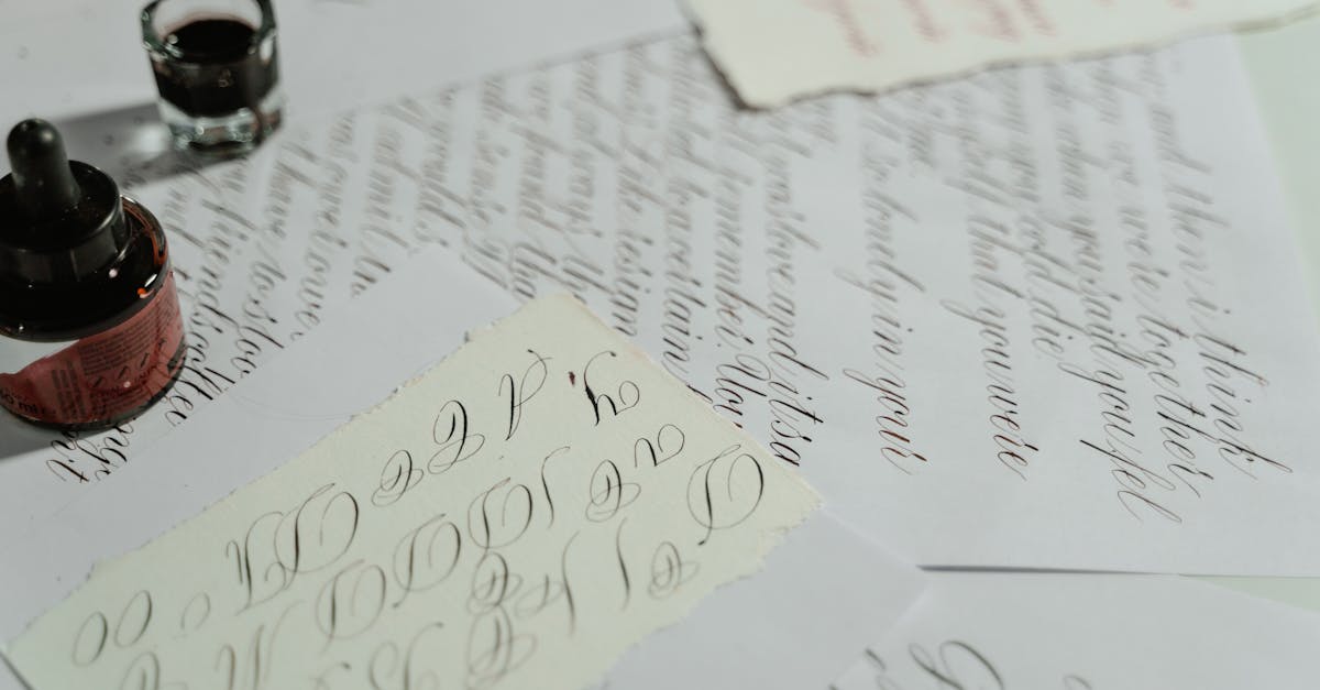
- Brause, Mitchell, or Speedball nibs with a holder: Traditional dip pen nibs for broad-nib calligraphy. Require an oblique or straight holder and bottled ink. More authentic experience and greater nib variety, but messier and require more setup.
Pointed Pens (Copperplate/Spencerian)
Pointed pens have a single point that splits under pressure to produce a thicker stroke. They are essential for Copperplate, Spencerian, and modern pointed pen calligraphy. The Nikko G nib is the standard recommendation for beginners — durable, flexible enough for contrast, and widely available. More advanced calligraphers may prefer the Leonardt Principal EF, Hunt 101, or Brause Rose nibs for different flex characteristics.
Brushes (East Asian Calligraphy)
East Asian calligraphy uses soft-haired brushes (usually goat, weasel, or synthetic fibers) held vertically. The brush’s flexibility allows an enormous range of stroke variation — from hair-thin lines to broad, expressive sweeps. Beginners should start with a medium-sized “wolf hair” (weasel) brush, which offers a balance of flexibility and control. Chinese calligraphy ink is ground from an ink stick on a stone with water, though bottled sumi ink is a convenient alternative for practice.
Brush Pens (Modern Calligraphy)
Brush pens bridge the gap between traditional calligraphy and modern convenience. They produce calligraphic thick-thin variation through pressure (like a pointed pen) but require no dipping or ink preparation. The Pentel Fude Brush Pen, Kuretake No. 13, and Tombow Fudenosuke are popular choices. Many modern calligraphers, especially those working in wedding calligraphy and event lettering, use brush pens as their primary tool.
Reed Pens and Other Traditional Tools
Arabic calligraphy traditionally uses a reed pen (qalam) cut to a specific angle and width. The natural variation in reed pens gives Arabic calligraphy its organic character. Some calligraphers also use bamboo pens, cola pens (made from aluminum cans), and ruling pens for experimental work. Part of calligraphy’s enduring appeal is the direct, tactile relationship between hand, tool, ink, and paper.
Modern Calligraphy: A Living Art
The modern calligraphy movement, which has exploded in popularity since the mid-2010s, has made calligraphy accessible to a vast new audience while expanding the definition of what calligraphy can be.
Modern Pointed Pen Calligraphy
Modern calligraphy, sometimes called “modern script,” takes the thick-thin principles of Copperplate and loosens the rules. Letters bounce above and below the baseline. Loops are exaggerated or eliminated. Letterforms are personalized rather than following a strict exemplar. Calligraphers like Molly Suber Thorpe, Laura Hooper, and Lindsey Bugbee have popularized this style through workshops, books, and social media. Modern pointed pen calligraphy is the dominant style in wedding invitation calligraphy, which represents a significant commercial market.
Brush Pen Calligraphy
Brush pen calligraphy uses felt-tip brush pens (like the Tombow Dual Brush or Pentel Touch) to create calligraphic letterforms. It is more forgiving than pointed pen calligraphy because brush pens require less setup, are portable, and produce consistent results. The style tends to be looser and more casual than pointed pen work, making it popular for journaling, note-taking, and social media content.
iPad Calligraphy
The Apple Pencil and apps like Procreate have created a new calligraphic medium. Digital calligraphy preserves the pressure sensitivity and gestural quality of physical calligraphy while adding infinite undo, layers, easy color changes, and no messy cleanup. Purists debate whether digital calligraphy is “real” calligraphy, but the skill of controlling strokes, managing rhythm, and producing beautiful letterforms is the same regardless of medium. Digital calligraphy also makes it easier to create calligraphic work for commercial applications — logos, social media graphics, and product designs.
Experimental and Contemporary Calligraphy
At the artistic edge of the practice, contemporary calligraphers push beyond legibility into abstraction. Artists like Brody Neuenschwander, Denis Brown, Yves Leterme, and Pokras Lampas create large-scale installations, mixed-media pieces, and performances that use calligraphic gesture as the basis for abstract visual expression. This work bridges calligraphy, fine art, graffiti, and graphic design, demonstrating that calligraphic principles can generate visual power far beyond the written word.
Getting Started with Calligraphy
If you want to begin practicing calligraphy, here is a recommended path.
- Choose your tradition and script. Start with one: modern pointed pen calligraphy (most popular for English speakers), broad-nib Italic (the most forgiving Western historical script), or brush pen calligraphy (the lowest barrier to entry). Do not try to learn multiple scripts simultaneously.
- Get the right tools. For broad nib, start with a Pilot Parallel Pen (3.8mm) and smooth practice paper. For pointed pen, get a Nikko G nib, an oblique holder, Sumi ink, and Rhodia paper. For brush pen, get a Tombow Fudenosuke (hard tip) and HP Premium32 paper.
- Study a structured resource. Books like “Mastering Copperplate Calligraphy” by Eleanor Winters, “Italic Letters” by Inga Dubay, or “Modern Calligraphy” by Molly Suber Thorpe provide structured curricula with exemplars and exercises.
- Practice fundamentals before letters. Spend your first sessions on basic strokes — straight lines, curves, ovals, pressure transitions — before attempting full alphabets. Muscle memory built on solid fundamentals will serve you for years.
- Join a community. The calligraphy community is welcoming and supportive. Organizations like IAMPETH (International Association of Master Penmen, Engrossers, and Teachers of Handwriting), the Society for Calligraphy (Los Angeles), and local calligraphy guilds offer workshops, conferences, and critique groups.
Once you have developed basic calligraphic skill, you might also explore [LINK: /hand-lettering/] — the two disciplines complement each other beautifully, and many practitioners work across both.
Frequently Asked Questions
What is calligraphy in simple terms?
Calligraphy is the art of beautiful handwriting produced with specialized tools like dip pens, brushes, or brush pens. Unlike regular handwriting, calligraphy involves deliberate control of the tool, ink, pressure, and stroke speed to create letters that are aesthetically pleasing. The word comes from Greek: “kallos” meaning beauty and “graphein” meaning to write. Calligraphy traditions exist across cultures, from Western Copperplate to Chinese brush calligraphy to Arabic scripts.
What is the difference between calligraphy and hand lettering?
Calligraphy is writing — each stroke is produced in a single, real-time movement with a specialized tool, and the thick-thin variation comes naturally from the tool’s interaction with the surface. Hand lettering is drawing — letters are sketched, outlined, refined, and often built up from multiple strokes. Calligraphy emphasizes the process and flow of writing, while hand lettering focuses on the finished visual result. Many artists practice both, and the skills are complementary. See our [LINK: /hand-lettering/] guide for more on lettering.
What tools do I need to start calligraphy?
For brush pen calligraphy (the easiest starting point), you need a Tombow Fudenosuke pen and smooth paper like a Rhodia dot pad. For broad-nib calligraphy, start with a Pilot Parallel Pen (3.8mm width). For pointed pen Copperplate-style calligraphy, you need a Nikko G nib, an oblique pen holder, Sumi ink, and smooth paper. Avoid starting with a calligraphy “set” from a craft store — the tools are usually low quality and will frustrate you.
How long does it take to learn calligraphy?
Basic proficiency — producing attractive, consistent calligraphy letters in a single style — takes most people two to three months of regular practice (15–30 minutes, several times per week). Developing a refined personal style takes six months to a year. Mastering a historical script to a high level can take years. The learning curve varies by script: brush pen calligraphy is the most forgiving for beginners, while Copperplate and Arabic scripts have steeper learning curves.
Can I learn calligraphy on an iPad?
Yes. An iPad with Apple Pencil and Procreate (or a dedicated calligraphy app like Calligraphy Master) is a legitimate way to learn and practice calligraphy. The pressure sensitivity of the Apple Pencil simulates the thick-thin variation of physical tools reasonably well. Benefits include infinite undo, no messy ink, easy sharing, and the ability to practice anywhere. However, many calligraphers recommend starting with physical tools to develop a feel for real ink, paper texture, and the natural behavior of nibs and brushes before going digital.


