Y2K Graphic Design: The Futuristic Aesthetic That Came Back
Between roughly 1998 and 2003, a distinct visual language took hold across advertising, music, fashion, tech, and the early web. It was shiny. It was optimistic. It was obsessed with the future. This was Y2K graphic design — the aesthetic of the millennium turn, driven by dot-com euphoria, rapid technological change, and a collective sense that a gleaming digital future was just around the corner.
Two decades later, Y2K design has come roaring back. Gen Z has adopted its chrome textures and bubble lettering. Fashion runways reference its metallic fabrics. TikTok feeds are saturated with its candy-bright color palettes. What was once a product of genuine techno-optimism is now a nostalgic style revived for a very different era.
This guide covers the full story of the Y2K aesthetic: where it came from, what defines it visually, why it disappeared, and why it returned. Whether you want to understand its place in graphic design history or create Y2K-inspired work of your own, you will find everything you need here.
What Is Y2K Graphic Design?
Y2K graphic design refers to the visual aesthetic that emerged in the late 1990s and peaked around 2000 to 2003. The name comes from “Year 2000,” the abbreviation that dominated cultural conversation as the millennium approached. While the Y2K bug was a source of anxiety, the broader Y2K aesthetic was the opposite — it was energetic, forward-looking, and almost naively optimistic about technology.
At its core, the Y2K aesthetic is a visual expression of digital utopianism. Designers of the era imagined a future where technology would be sleek, colorful, playful, and accessible. This was not the grim, dystopian vision of cyberpunk. Y2K design was friendly, consumer-oriented, and above all, fun. Think less Blade Runner, more iMac G3.
The style appeared everywhere: product design, album covers, movie posters, magazine layouts, early websites, TV graphics, fashion campaigns, and consumer electronics packaging. It was the default visual language of the mainstream internet’s first golden age.
Historical Context: The Culture Behind the Chrome
The Dot-Com Boom
The late 1990s saw an explosion of internet startups flush with venture capital. Companies needed to look futuristic, innovative, and exciting. Y2K graphic design became the visual shorthand for “cutting edge.” Websites, banner ads, and corporate identities all reached for the same toolkit of glossy gradients, 3D lettering, and space-age imagery.
Millennium Excitement
The turn of the millennium carried genuine cultural weight. The year 2000 felt like a threshold — the beginning of something entirely new. This sense of possibility permeated design. Everything was oriented toward the future: futuristic typefaces, orbital shapes, cosmic color schemes, and imagery that borrowed heavily from science fiction.
Digital Utopianism
Before the dot-com crash, before widespread concerns about privacy and surveillance, mainstream culture held an almost uncritical enthusiasm for digital technology. Personal computers were becoming household items. The internet was opening up vast new worlds. Mobile phones were shrinking. The Y2K aesthetic captured this moment of pure, untempered optimism about what technology could deliver.
Consumer Electronics as Design Driver
Apple’s 1998 iMac G3, with its translucent colored shell, became one of the defining objects of the era. It signaled that technology could be beautiful, colorful, and approachable. Its influence rippled outward into graphic design, product design, and fashion. Translucency, candy colors, and rounded forms became visual signatures of the period, directly inspired by what was happening in hardware design.
Key Visual Elements of Y2K Design
The Y2K style is immediately recognizable thanks to a consistent set of visual elements. Here are the defining characteristics that appear again and again in 2000s graphic design from this period.
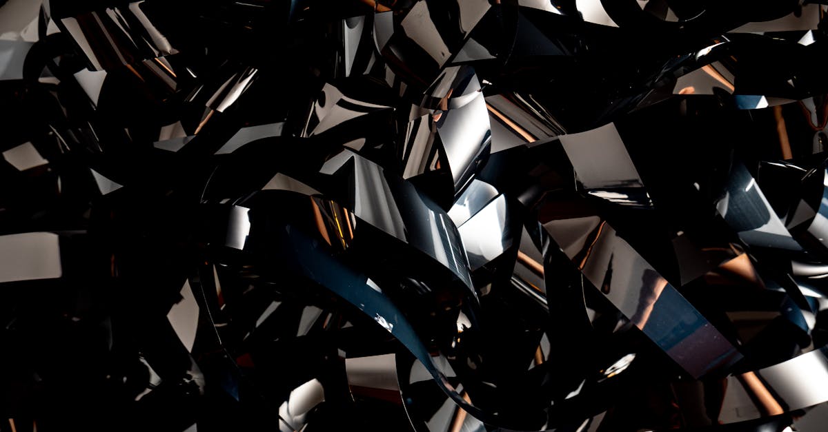
Chrome and Metallic Textures
Nothing says Y2K louder than chrome. Reflective metallic surfaces, liquid silver gradients, and mirror-finish text were everywhere. Chrome conveyed futurism, sleekness, and the polished promise of new technology. Designers used it on typography, backgrounds, 3D objects, and interface elements. The look drew on the same fascination with reflective materials seen in fashion (silver fabrics, metallic accessories) and automotive design.
Bubble and Inflatable 3D Shapes
Soft, rounded, inflated-looking 3D forms are a hallmark of Y2K design. These puffy, balloon-like shapes — often rendered with glossy highlights and bright colors — gave designs a tactile, almost toy-like quality. They appeared in logos, web graphics, and product packaging. The aesthetic suggested playfulness and accessibility, making technology feel friendly rather than intimidating.
Bright, Saturated Colors
Y2K palettes were bold and unapologetic. Hot pink, electric blue, lime green, bright orange, and purple dominated. These colors were often used in high-contrast combinations, sometimes with metallic or holographic accents. The palette reflected the era’s energy and optimism, borrowing from rave culture, pop music, and the newly colorful world of consumer tech.
Futuristic Typography
Typefaces of the Y2K era leaned heavily into geometric, space-age, and techno styles. Fonts like Eurostile, Bank Gothic, and OCR-style monospaced faces were staples. Custom display type with chrome effects, beveled edges, or 3D extrusion was common. The type was meant to look like it belonged on a spaceship console or in a sci-fi film title sequence. Futura also saw heavy use, its geometric precision fitting the era’s techno-modernist mood. For display purposes, designers frequently turned to novelty space fonts that pushed the futuristic theme even further.
Translucent and Iridescent Materials
Inspired by the iMac and broader trends in industrial design, translucency became a graphic motif. Designers simulated frosted glass, transparent plastic, and gel-like surfaces. Iridescent and holographic effects — surfaces that shifted color depending on the angle — added to the futuristic feel. These textures suggested a world where even solid objects were becoming lighter, more ethereal, and more connected to digital space.
Circuit Board and Digital Patterns
Visible references to the inner workings of technology were a recurring motif. Circuit board traces, binary code, data streams, and wireframe grids appeared as background textures and decorative elements. These patterns served as visual reminders that a digital revolution was underway. They grounded the aesthetic in its technological moment.
Early 3D Renders
The late 1990s and early 2000s were a formative period for consumer-grade 3D software. Designers experimented with 3D rendering tools, producing imagery that, by today’s standards, looks charmingly rough. Low-polygon models, visible faceting, and imperfect reflections are now part of the Y2K look. This slightly crude 3D quality is distinct from what came later and contributes to the style’s nostalgic appeal.
Butterfly and Nature Motifs
Butterflies were ubiquitous in late-1990s and early-2000s design, especially in fashion and music visuals. They symbolized transformation and beauty — fitting metaphors for an era that saw itself as emerging into something new. Flowers, stars, and celestial bodies also appeared frequently, often rendered in the same glossy, hyper-saturated style as other Y2K elements.
Space and Cosmic Themes
Outer space imagery was a natural fit for Y2K design’s future-facing orientation. Planets, nebulae, stars, orbital paths, and astronaut imagery all featured prominently. The space theme tied into the era’s sense of limitless possibility and its sci-fi cultural references, from The Matrix to music videos by artists like TLC and Destiny’s Child.
Famous Examples of Y2K Design
The Y2K aesthetic was not confined to niche design circles. It was mainstream culture. Here are some of the era’s most recognizable examples.
Apple’s Product Design (1998-2003)
The iMac G3, iPod, and early OS X interface defined Y2K design in the consumer technology space. Jony Ive’s translucent plastics, candy-colored finishes, and smooth organic forms established a visual standard that the rest of the industry followed. Apple’s graphic design and advertising from this period — clean, bright, and unmistakably futuristic — became iconic.
Destiny’s Child and Pop Music
Album art and music videos from artists like Destiny’s Child, TLC, Britney Spears, and NSYNC were steeped in Y2K aesthetics. Metallic outfits, CGI-enhanced visuals, chrome text treatments, and futuristic set designs were standard. The “Say My Name” and “Jumpin’ Jumpin’” music videos are particularly strong examples of the style in motion.
The Matrix (1999)
While The Matrix’s narrative was darker than the typical Y2K tone, its visual design — the green cascading code, the sleek leather costuming, the digital reality premise — became inseparable from turn-of-the-millennium aesthetics. Its influence on graphic design was enormous, spawning countless imitations of the “digital rain” effect.
Early Web Design
The first generation of commercial websites leaned heavily on Y2K visual tropes. Flash intros with animated chrome logos, splash pages with 3D-rendered navigation, and backgrounds featuring space imagery or circuit patterns were common. Sites for tech companies, entertainment brands, and fashion labels were especially prone to the full Y2K treatment. Understanding what graphic design is in a broader sense helps contextualize just how much web design of this era pushed visual boundaries with the tools available.
Windows XP and Console Gaming
Microsoft’s Windows XP default wallpaper (the rolling green hill called “Bliss”) arrived at the tail end of the Y2K moment, but the operating system’s glossy, rounded interface elements — the blue taskbar, the green Start button, the bubble-like window controls — were pure Y2K. Meanwhile, the PlayStation 2’s startup sequence and the visual design of early-2000s gaming were deeply embedded in the same aesthetic language.
The 2020s Revival: Why Y2K Came Back
Starting around 2020-2021, Y2K design experienced a dramatic resurgence. The revival has been driven by several converging forces.
Gen Z Nostalgia
Members of Generation Z, born between roughly 1997 and 2012, experienced Y2K aesthetics during their earliest years. For many, the style triggers childhood nostalgia — memories of early family computers, CDs, flip phones, and the visual world of early-2000s children’s media. This generation, now dominant on social media and in trend-setting cultural spaces, has embraced Y2K as a core aesthetic reference point.
TikTok and Social Media
TikTok’s short-form video format became the primary vehicle for the Y2K revival. Creators shared outfit inspiration, room decor, and graphic design tutorials referencing the era. The hashtag #y2k accumulated billions of views. The platform’s algorithm amplified Y2K content to massive audiences, accelerating the trend far beyond what earlier social platforms could have achieved.
Fashion Industry Adoption
High fashion and fast fashion alike picked up on the Y2K revival. Brands reintroduced low-rise jeans, metallic fabrics, butterfly clips, and other signature pieces from the era. The fashion revival reinforced the graphic design revival, as campaigns and editorials adopted matching visual treatments: chrome text, glossy 3D imagery, and saturated color palettes.
Adjacent Aesthetics: Brat and Beyond
The broader 2020s trend landscape created fertile ground for Y2K’s return. Charli XCX’s “Brat” era, with its neon green palette, anti-polished attitude, and digital-native visual language, shares conceptual DNA with Y2K design even when it diverges stylistically. Both aesthetics embrace boldness, digital culture, and a certain irreverent energy. The success of adjacent movements kept audiences receptive to Y2K’s particular flavor of maximalism.
Cyclical Nostalgia
Design trends tend to cycle on roughly 20-year loops. The 2020s revival of Y2K aesthetics follows the same pattern that brought 1970s styles back in the 1990s and 1980s styles back in the 2000s. As the early 2000s moved far enough into the past to feel distinct and romanticizable, the conditions were right for its visual language to be rediscovered and reinterpreted.
Y2K Typography: The Fonts of the Future
Typography was central to Y2K design. The era’s type choices reinforced its themes of futurism, technology, and sleek modernity.
Eurostile and Eurostile Extended
Eurostile, designed by Aldo Novarese in 1962, became one of the defining typefaces of the Y2K period. Its squared-off letterforms and wide proportions had long been associated with science fiction and technology (it appeared in countless sci-fi films and TV shows). During the Y2K era, Eurostile Extended was especially popular for headlines, logos, and interface text, lending an authoritative, futuristic feel.
Bank Gothic
Morris Fuller Benton’s Bank Gothic, originally designed in 1930, found new life in the Y2K era. Its condensed, uppercase-only design with flat-topped letterforms made it a go-to for movie posters, video game packaging, and tech branding. It conveyed strength and precision — qualities the era associated with cutting-edge technology.
OCR and Monospaced Faces
Typefaces that referenced computer processing — OCR-A, OCR-B, and various monospaced fonts — were used to signal digital authenticity. Their mechanical, grid-based appearance evoked the inner workings of machines, reinforcing the theme of technology as a defining cultural force.
Custom and Display Typefaces
Much of Y2K typography was custom or heavily modified. Designers applied chrome effects, 3D extrusions, bevels, glows, and distortions to create headline treatments that functioned more as illustrations than conventional type. This approach was enabled by advances in graphic design software, particularly Photoshop and early 3D tools, which made complex type effects accessible to a wider range of designers.
Futuristic Sans-Serifs
Beyond specific named typefaces, the era favored a general category of geometric, clean sans-serifs with a futuristic feel. Futura, Avenir, Century Gothic, and their descendants appeared frequently. The preference was for typefaces that looked precise, modern, and slightly cold — the typographic equivalent of brushed aluminum.
How to Create Y2K Designs Today
Recreating the Y2K aesthetic is entirely achievable with modern tools. Here is a practical breakdown of how to approach it.
Color Palette
Start with a Y2K-appropriate color foundation. The core palette includes:
- Hot pink (#FF69B4 or similar bright magentas)
- Electric blue (#00BFFF or vivid cyans)
- Lime green (#32CD32 or neon greens)
- Silver and chrome (metallic gradients from #C0C0C0 to #E8E8E8)
- Bright orange (#FF6600)
- Lavender and purple (#9370DB to #8A2BE2)
- White and light gray (for clean, tech-forward backgrounds)
Use these in high-contrast combinations. Pair metallic silvers with saturated brights. Do not be subtle — the Y2K palette is inherently bold.
Textures and Materials
Chrome and metallic gradients are essential. In Photoshop or Illustrator, use gradient maps and reflection simulations to create liquid metal surfaces. For bubble and inflatable effects, use 3D tools (Blender is free and capable) to create soft, rounded shapes with glossy shaders. Translucency can be simulated with lowered opacity, glass-effect blurs, and subtle color shifts.
Typography Approach
Choose geometric sans-serifs or explicitly futuristic display faces. Apply chrome or metallic gradient fills to headline text. Add subtle bevels or inner shadows for a 3D embossed look. For body text, keep things cleaner — the heavy treatments work best at display sizes.
3D Elements
Modern 3D software makes it straightforward to create Y2K-style elements. In Blender, Cinema 4D, or even browser-based tools like Spline, model rounded, inflated shapes. Apply high-gloss materials with environment reflections. Render against solid-color or gradient backgrounds for the authentic early-2000s look. For extra authenticity, slightly lower the polygon count or add visible faceting.
Composition and Layout
Y2K layouts tend toward the dynamic and asymmetric. Elements float and overlap. Text wraps around 3D objects. Backgrounds feature cosmic imagery or abstract digital patterns. The overall feel should be energetic and slightly chaotic — this was not an era of minimalist restraint.
Recommended Tools
- Adobe Photoshop — metallic text effects, texture creation, compositing
- Adobe Illustrator — vector chrome gradients, glossy shapes, clean typography
- Blender — free 3D modeling and rendering for bubble shapes and metallic objects
- Figma — quick mockups with gradient fills and glass effects
- Spline — browser-based 3D design tool, well-suited to glossy Y2K shapes
For a broader look at the software landscape for graphic design, including options for beginners and professionals, our dedicated guide covers the major tools in detail.
Y2K vs. Vaporwave: Understanding the Difference
Y2K design and vaporwave are often confused or conflated, but they represent fundamentally different relationships with the same source material.
Y2K: Sincere Futurism
Y2K design was created in the moment. It was the genuine visual expression of an era that believed in the promise of technology. There was no irony in its chrome textures or cosmic imagery. Designers and brands used these elements because they sincerely evoked excitement about the digital future. The aesthetic was commercial, mainstream, and forward-looking.
Vaporwave: Ironic Nostalgia
Vaporwave, which emerged around 2010-2013, is a retrospective, ironic, and often critical reinterpretation of 1990s and early-2000s consumer culture. Where Y2K design celebrated technology and commerce, vaporwave deconstructs and satirizes them. Its visual language — Roman busts, VHS glitches, Japanese text, pastel grids, slowed-down muzak — is deliberately surreal and detached. It uses the visual remnants of Y2K-era capitalism as raw material for commentary.
Key Differences
- Intent: Y2K is earnest; vaporwave is ironic
- Color palette: Y2K favors bright, saturated, high-contrast colors; vaporwave leans toward pastels, pinks, and purples with a washed-out quality
- Typography: Y2K uses futuristic, geometric sans-serifs; vaporwave often uses Japanese characters, serif fonts, or Windows 95-era system fonts
- Mood: Y2K is energetic and optimistic; vaporwave is dreamy, melancholic, and detached
- Era of creation: Y2K was made during the late 1990s/early 2000s; vaporwave is a 2010s art movement looking backward
Both are now part of the broader visual vocabulary available to designers. Understanding their distinctions helps in deploying either aesthetic with precision and intentionality. For a wider view of how different graphic design styles relate to one another, see our comprehensive guide.
The Legacy of Y2K Design
Y2K graphic design captures a specific cultural moment — the brief window when mainstream culture was genuinely, uncritically excited about the digital future. The dot-com crash, September 11, and the subsequent decade’s more complicated relationship with technology brought that moment to an end. But the visual language it produced has proven durable.
The 2020s revival is not merely about copying chrome effects and bubble letters. Contemporary designers are reinterpreting Y2K elements through a modern lens, combining them with current techniques and sensibilities. The result is work that references the past while remaining relevant to the present. Y2K design has moved from a period style to a permanent entry in the design vocabulary, available for quotation, remixing, and recontextualization.
Whether you see it as a nostalgic indulgence or a genuinely compelling visual system, Y2K graphic design remains one of the most distinctive and recognizable aesthetics of the past three decades. Its influence on current design, fashion, music, and digital culture shows no signs of fading.
FAQ
What years does Y2K graphic design cover?
Y2K graphic design primarily spans from approximately 1998 to 2003. The aesthetic emerged in the late 1990s as the millennium approached, peaked around 2000 to 2001, and faded after the dot-com crash and broader cultural shifts in the early 2000s. Some elements lingered in mainstream design through 2004 and 2005, particularly in consumer electronics and pop music visuals.
Why is Y2K design popular again?
Several factors drive the Y2K revival. Gen Z, who experienced the aesthetic during early childhood, has reached the age where they set cultural trends and feel nostalgic for early-2000s visual culture. Social media platforms, particularly TikTok, have amplified the trend to massive audiences. The fashion industry’s adoption of Y2K clothing styles has reinforced the graphic design revival. Additionally, design trends tend to cycle on 20-year intervals, making the early 2000s ripe for rediscovery in the 2020s.
What software do I need to create Y2K-style designs?
Adobe Photoshop is the most versatile option for creating chrome effects, metallic textures, and composited Y2K visuals. Adobe Illustrator works well for vector-based chrome gradients and glossy shapes. For the 3D bubble and inflatable elements central to Y2K design, Blender (free and open source) is an excellent choice. Figma can handle simpler Y2K-inspired mockups with gradient fills. Spline offers browser-based 3D design suited to glossy, rounded shapes. No single tool covers every aspect of the style — most designers use a combination.
What is the difference between Y2K and vaporwave?
Y2K design and vaporwave draw from similar source material but differ in intent and execution. Y2K design was created during the late 1990s and early 2000s as a sincere expression of techno-optimism, featuring bright saturated colors, chrome textures, and futuristic typography. Vaporwave emerged in the early 2010s as an ironic, retrospective commentary on 1990s consumer culture, characterized by pastel colors, Japanese text, Roman statuary, and a deliberately surreal, melancholic mood. Y2K is earnest and energetic; vaporwave is detached and critical.


