What Font Does Deadman Wonderland Use?
If the blood-spattered title card of Deadman Wonderland made you wonder what the deadman wonderland font actually is, the answer needs a little nuance. The lettering looks like a typeface, but it is almost certainly custom. Below we separate the grungy logo from the functional type used in the anime, and we point you to free fonts that capture its horror-tinged, distressed energy without pretending to be the real thing.
What font is the Deadman Wonderland logo?
The Deadman Wonderland title treatment is best understood as custom lettering rather than a stock font. The wordmark carries a grungy, eroded texture and a horror edge that matches the series’ brutal prison-amusement-park premise. As with most marquee anime, the logo was almost certainly drawn or heavily modified for the property so it could be trademarked and stay recognizable across the manga, anime, and merchandise.
Because the mark is bespoke, its exact distress pattern, weight, and spacing do not line up with any single retail typeface. Some fan sources name a particular grunge font as the basis, but those should be treated as informed guesses rather than confirmed facts. The honest read: the logo is a one-off design, and the best you can do is a close visual relative — not a clone.
What typeface is used in the anime?
Within the series, typography handles two different jobs. The grungy, horror styling is concentrated in the title card and key art, where the custom wordmark and blood-stained graphics carry the tone. Subtitle text, episode titles in localized releases, and credits use neutral, legible sans-serif or serif faces chosen for readability rather than brand flavor.
This split is standard for horror and thriller properties. The marketing logo gets to be rough and distressed because it only appears at large sizes, while the functional text stays clean so viewers can follow the story. So when fans ask which typeface “is used” in Deadman Wonderland, the practical answer is that the iconic part is custom and the readable part is generic — there is no single downloadable Deadman Wonderland font.
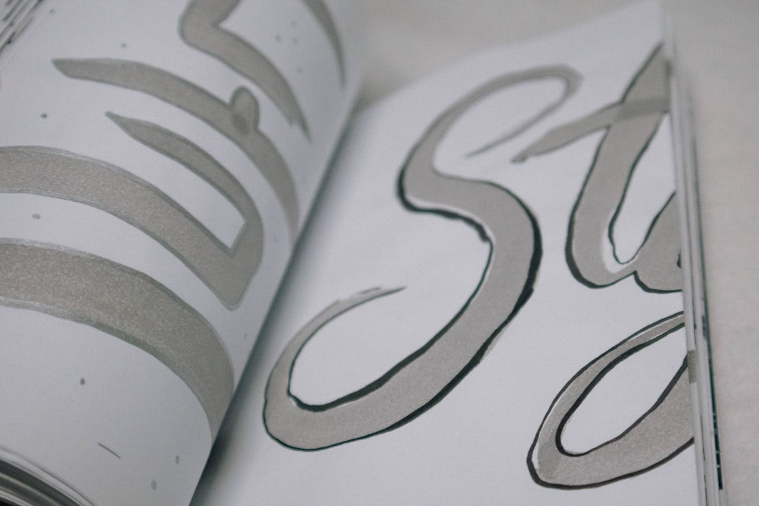
One detail worth flagging: a lot of the “grunge” in the logo is not the typeface at all, but the treatment applied on top of it. Distress is usually a texture layer — scratches, ink bleed, erosion masks — overlaid onto an otherwise solid base shape. This matters for anyone trying to recreate the look, because the rough character you are seeing comes as much from the post-processing as from the underlying letterforms. That is good news: it means you can start from almost any sturdy display face and build the horror texture yourself, rather than hunting for a single mythical “Deadman Wonderland font” that does it all in one file.
Free fonts that look like the Deadman Wonderland font
You cannot legitimately download the original wordmark, but free distressed and grunge display faces can recreate its horror-tinged texture. Aim to match the eroded edges, rough weight, and uneasy feel rather than chasing a perfect copy. Good free starting points include grunge faces like Rubik Distressed, the rough Special Elite typewriter look, and heavy display faces you can texture with overlays.
| Use case | Deadman Wonderland uses | Free alternative |
|---|---|---|
| Main title / hero | Custom grunge horror wordmark | Rubik Distressed |
| Subtitle / tagline | Distressed drawn lettering | Special Elite |
| Body & captions | Neutral sans-serif | Inter or Roboto |
| Poster accents | Rough, eroded display | Nosifer or Creepster |
Because horror and dark-fantasy branding overlap, our roundup of the best gothic fonts includes dark-display and horror-leaning faces that pair well with grunge textures. If you want another grim anime aesthetic to compare, the Seraph of the End font breakdown covers a gothic, apocalyptic direction that complements the same dread.
Why does Deadman Wonderland use this kind of type?
The grungy, distressed lettering is a deliberate tone-setter. Deadman Wonderland is a violent survival story set in a deceptively cheerful prison theme park, and the contrast between “wonderland” and horror is central. The logo’s rough, blood-tinged texture sells that menace instantly — a clean, neutral font would undercut the unease.
- Tone signaling: distressed edges telegraph horror and decay before a word is read.
- Thematic contrast: rough type clashes with the “wonderland” name to create dread.
- Ownership: a custom mark can be trademarked, which a stock font cannot.
- Recognition: bespoke lettering keeps the brand consistent across manga, anime, and merch.
This is the same logic behind many horror logos: the type does emotional work. Distress, erosion, and roughness carry instant associations with violence, ruin, and the macabre — all central to this story.
Can I use the Deadman Wonderland font for my own project?
Not the original wordmark, and not commercially. The Deadman Wonderland logo is a protected brand asset. Strictly personal, non-commercial fan art is the usual gray area, but once your project involves sales, merchandise, or client work, recreating the mark exposes you to trademark and copyright risk.
For fan posters, the reliable workflow is to set your text in a heavy display face, convert it to outlines, then erode the edges with a grunge brush, add ink-spatter, and blend a faint blood-red tint. Keep your result visibly distinct from the official lockup so it reads as homage rather than a copy of the protected mark. This delivers the horror texture and unease without relying on the original wordmark.
The professional route is a free or licensed look-alike with verified terms. Some free fonts allow commercial use while others are personal-only, so the license file matters. Our font licensing guide explains desktop, web, and embedding rights in plain language. And if you want a high-energy companion aesthetic for an action-horror project, the Redline font article covers a bold, racing display direction.
Frequently Asked Questions
Is there an official Deadman Wonderland font to download?
No. The title is a custom-drawn grunge wordmark created for the franchise, not a released typeface. Any “official” download is a fan recreation or a similar distressed face renamed. Treat such files carefully and confirm their license before using them for anything beyond personal experimentation.
What free font looks most like the Deadman Wonderland logo?
Grunge faces like Rubik Distressed and rough typewriter looks like Special Elite get closest to the eroded texture, while Nosifer and Creepster add horror flavor. None match the original exactly, but with added overlays and texturing they capture the distressed, blood-tinged mood for posters and fan art.
Can I use a grunge look-alike font commercially?
Sometimes — it depends on each font’s individual license. Some free grunge fonts permit commercial use; others restrict it to personal projects. Recreating the actual Deadman Wonderland wordmark commercially is not safe because it is protected. Always read the license and choose a font explicitly cleared for commercial work.
How do I add the distressed look to a clean font?
Set your text in a heavy display face, then apply grunge texture overlays, roughen the edges with a brush mask, or blend in a distress layer in your editor. This recreates the eroded, horror feel of the Deadman Wonderland logo without needing the exact, protected original wordmark.


