What Font Does 300 Use?
To be clear, this article is about the 300 movie font — the title treatment from Zack Snyder’s 2006 film, adapted from Frank Miller and Lynn Varley’s graphic novel about the Battle of Thermopylae — not the number 300 or any general numeral styling. People search for the 300 typeface because the weathered, bronze-and-blood lettering looks ancient, brutal and cinematic, and they want to recreate that energy. Below we separate the trademarked branding from fonts you can actually license, and explain what makes the look tick.
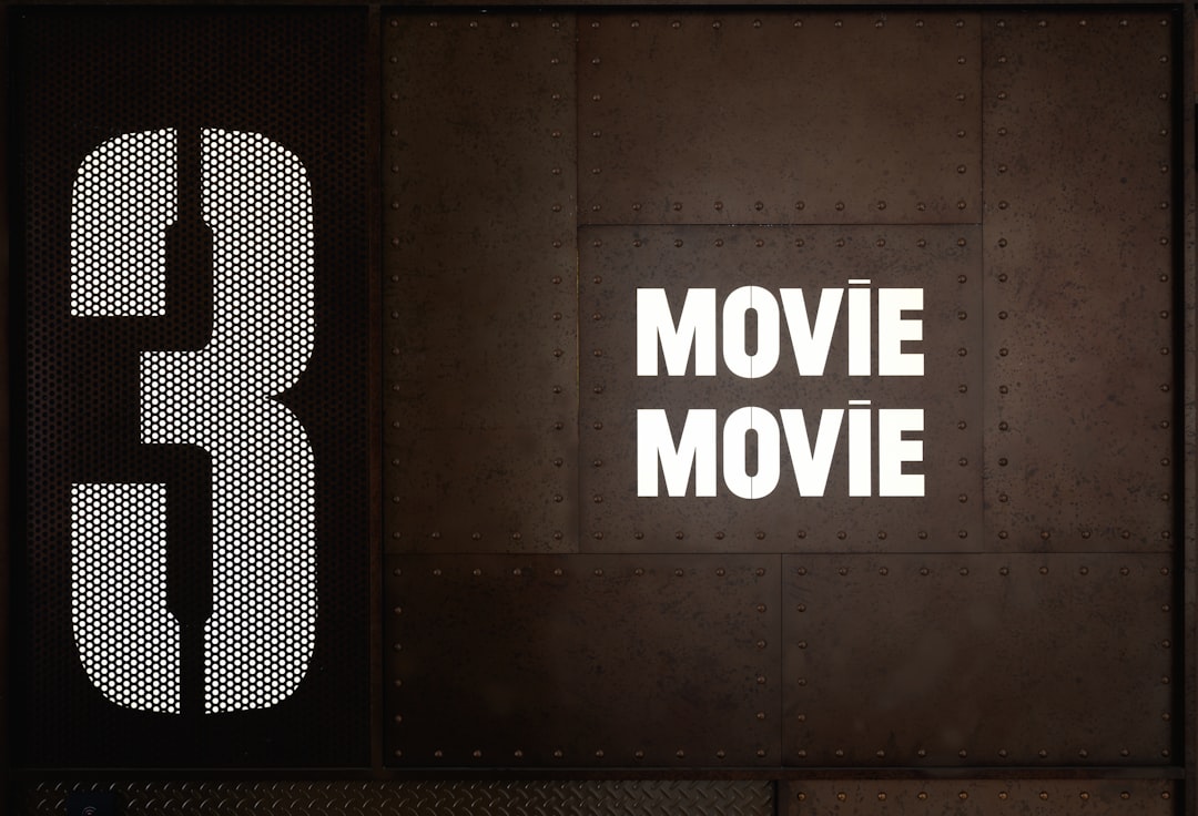
What font is the 300 logo?
The 300 logo is built around distressed, heavy capitals with a carved, ancient feel — rough edges, eroded surfaces and a bronze-and-blood colour story that evokes Spartan armour and battlefield grit. The forms read like something hammered into metal or chiselled into stone, then left to weather, which suits a stylised retelling of an ancient last stand.
There is no public confirmation that the title is a retail font. Like most film and comic identities, it was drawn or heavily customized for the brand. So if a forum tells you 300 “uses” one specific named typeface, treat that as an informed observation, not a confirmed spec. What you can state confidently is the category: a heavy, distressed display face — often serif- or stencil-flavoured — with weathered texture and an ancient, martial character.
The distinction from the bare number “300” matters here. Plenty of designs simply set the numeral in a clean modern typeface, but the film’s identity is specifically about texture and antiquity. Frank Miller and Lynn Varley’s graphic novel established a bronze-and-shadow palette with heavy, painterly forms, and Snyder’s film carried that into its marketing. So the “font” people are really asking about is less a clean letterform and more a fully art-directed treatment: weathered capitals soaked in a battlefield colour story.
What typeface is used in the film?
Across the 2006 film’s marketing — posters, the title card, home-video packaging — the type stays distressed and monumental. The headline lettering is weathered so it evokes ancient bronze and stone, while supporting credits and copy shift to cleaner, more neutral sans-serifs for legibility. That split between a textured display title and a workhorse body face is standard practice across film branding.
The practical takeaway is that the franchise does not lean on a single font everywhere. It leans on a hierarchy: a distinctive, distressed display treatment carries the name, while a quiet grotesque handles the small print. If you want to match the vibe, nail the weathered display headline first, because that is the part viewers actually register as “300.”
Free fonts that look like the 300 font
You cannot legally download the brand’s wordmark, but you can get strikingly close with free distressed serif and heavy stencil fonts. Match the texture first — eroded edges, heavy weight, an ancient feel — before fussing over tiny details.
| Use case | 300 uses | Free alternative |
|---|---|---|
| Main title / headline | Custom distressed ancient caps | Cinzel (Google Fonts) — carved classical caps |
| Battle-worn poster lettering | Bespoke distressed display | Trajan Pro-style free alts or Special Elite (textured) |
| Body / credits text | Neutral grotesque sans | Inter or EB Garamond |
- Cinzel — the closest free match for the carved, classical, ancient-Greek cap feel.
- Special Elite — a free face with built-in distressed, worn texture.
- EB Garamond — a refined free serif if you add your own weathering effects.
The texture is where the magic happens. Start with crisp classical caps, then layer grunge brushes, cracked-stone overlays or a rough metal texture set to a clipping or overlay blend mode. Push the colour toward bronze and oxblood, add a faint inner shadow so the letters look carved, and let a few edges crumble. A clean serif on a flat background will never read as “300”; the film’s identity is roughly half typeface and half deliberate erosion applied on top.
For genuine distress, set clean caps like Cinzel and then layer grunge or erosion textures over them in your design tool. Before publishing anything commercial, skim our font licensing guide so you know which of these allow business use (most ship under the SIL Open Font License).
Why does 300 use this kind of type?
Distressed, ancient-style capitals do specific jobs for a stylised war epic. They feel old, brutal and monumental — which suits a heightened retelling of Thermopylae rendered in bronze, blood and shadow. The weathered texture signals antiquity and violence at a glance, so the title carries the film’s tone before any footage plays.
There is a thematic angle too. Carved, eroded letterforms echo the stone and metal of the ancient world, reinforcing the graphic-novel source’s painterly, hyper-real style. Pairing a textured classical title with the film’s bronze palette gives the brand a consistent, mythic identity. For another dark, message-driven adaptation with ornate lettering, compare our V for Vendetta font breakdown.
Can I use the 300 font for my own project?
You can recreate the style, but not the brand. The 300 wordmark is protected by trademark and copyright owned by its rights holders, so reproducing it — or making something confusingly similar for commercial use — invites legal trouble. What is perfectly fine is using a free distressed serif or stencil font to build your own original ancient-themed title or poster.
This weathered, classical style works well for historical game branding, fantasy book covers, gym and combat-sport identities, and dramatic poster work. Keep your own piece clearly distinct from the film: pick different wording, your own composition and colour mix so nobody confuses it with official 300 artwork. With a commercially licensed font and original distress textures, you can publish and sell the result while still channelling that ancient, battle-worn energy.
If you like this weathered, classical look, browse our roundup of vintage fonts for more aged and distressed display faces. You can also see how a colder, industrial adaptation handles its lettering in our Snowpiercer font guide.
Frequently Asked Questions
Is the 300 font a real downloadable font?
No. The 300 title is custom lettering created for the 2006 film, not a retail typeface you can buy or download. Any named “300 font” you find online is a look-alike or someone’s best guess, so treat it as an informed observation rather than a confirmed match.
What free font looks most like the 300 title?
Cinzel from Google Fonts is the closest free starting point because it shares the carved, classical, ancient-Greek cap character of the title. Add your own grunge or erosion textures over it to capture the distressed, blood-and-bronze battle-worn finish the film uses.
Does the 300 logo use a Greek font?
The logo uses Latin capitals styled to feel ancient and Greek rather than an actual Greek-alphabet font. The carved, weathered character evokes classical inscriptions. A free classical face like Cinzel, with added distress, recreates that ancient inscription feel for your own designs.
Can I use a 300 look-alike font commercially?
Yes, if the font itself is licensed for commercial use — most Google Fonts are, under the SIL Open Font License. The catch is you must build an original design. Copying the actual 300 wordmark, even with a free font, can still infringe the rights holders’ trademarks.


