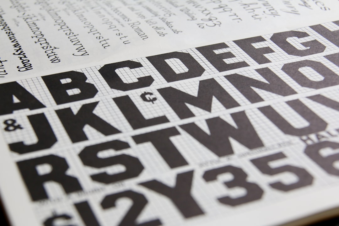
What Font Does Hyouka Use?
If you have searched for the Hyouka font hoping to type your name in the same lettering as the Kyoto Animation series, the honest answer is that no single downloadable typeface will give you an exact match. Like most polished anime logos, the Hyouka title was custom-built by a designer for the show, then refined for the Blu-ray packaging, novels and promotional art. What we can do is read the logo carefully, describe what kind of type it behaves like, and point you to free fonts that land in the same soft, school-mystery register. That is the useful, practitioner-level answer most people actually want.
What font is the Hyouka logo?
The Hyouka logo is a bespoke wordmark. The Latin “Hyouka” lettering reads as a lightly humanist set of letters with open counters, gentle curves and just enough warmth to feel inviting rather than clinical. Whether the production used a serif or a clean sans as a starting point, the strokes have been hand-tuned so the spacing, the terminals and the overall rhythm feel deliberate. That tuning is exactly why an off-the-shelf font never lines up perfectly: kerning has been optimised for that one word, and the proportions are tailored to the title rather than to a full alphabet.
It helps to separate two things. There is the trademarked Hyouka wordmark, which belongs to the rights holders and should be treated as a logo, not a font. And there is the broader style of that wordmark, which anyone can reference. Designers do this constantly: you study the mood of a logo, then pick a typeface that evokes the same feeling without copying the protected artwork. For Hyouka, that mood is refined, soft and quietly literary, the visual equivalent of a well-kept classics club room.
What typeface is used in the anime?
Inside the show, the typography splits along a familiar line. The original Japanese title and the stylised eyecatches use the custom logo lettering. But the supporting on-screen text, such as episode numbers, credits, subtitle-style captions and the cleaner promotional materials, leans on standard Japanese and Latin families rather than anything exotic. For Latin text in this kind of Kyoto Animation production, you typically see workmanlike, highly legible sans and serif faces chosen for clarity at small sizes rather than for personality.
That two-tier approach is normal. The logo carries the brand identity and the emotion; the functional text exists to be read quickly and disappear. So if you are trying to recreate “the Hyouka font,” it is worth deciding which layer you want. Do you want the expressive title lettering, or the calm body text that surrounds it? Most fan projects want the former, which is where look-alike fonts come in. Treat the exact production faces for body text as unconfirmed; they vary by release and platform.
Free fonts that look like the Hyouka font
You will not find the genuine wordmark for download, but you can get strikingly close with free typefaces. The goal is to match the feeling, soft, refined and a touch literary, rather than to clone the letters. Below are practical pairings depending on what part of the look you are chasing.
| Use case | Hyouka uses | Free alternative |
|---|---|---|
| Main title / hero word | Custom soft wordmark | Cormorant or EB Garamond (elegant serif) |
| Clean modern subtitle | Humanist supporting text | Source Sans 3 or Open Sans |
| Literary / classics-club mood | Refined display feel | Playfair Display |
| Captions and small body text | Highly legible neutral type | Noto Sans or Lato |
If you want the closest single recommendation, start with an elegant serif such as Cormorant, lighten the weight, and add a little extra letter-spacing. That captures the soft, slightly old-world refinement of the title. If you prefer the cleaner, more contemporary side of the show, a humanist sans like Source Sans 3 gives you the calm, readable feel without trying to imitate the protected logo.
- Match the weight first: Hyouka’s lettering is light and unhurried, so avoid heavy bold cuts.
- Loosen tracking slightly; tight spacing reads as corporate, not gentle.
- Keep contrast moderate; an ultra-high-contrast Didone feels too fashion-magazine for this mood.
Why does Hyouka use this kind of type?
Typography is mood made visible, and Hyouka is a series built on mood. It is a slow-burn mystery about ordinary high-school puzzles, curiosity and quiet emotional undercurrents, not gunfights or grand conspiracies. A hard, mechanical typeface would fight that tone. The soft, refined lettering signals exactly what the audience is getting: something thoughtful, a little nostalgic, and gently intelligent.
The refinement also nods to the show’s literary roots. The story revolves around a club, books and small acts of deduction, so an elegant, slightly bookish character in the title makes the brand feel cohesive. There is also a practical commercial reason: a clean, attractive wordmark scales beautifully across Blu-ray spines, novel covers and merchandise. Custom lettering lets the studio own a recognisable mark that no competitor can replicate, which is why studios invest in bespoke logos instead of licensing a stock face.
This is the same logic behind countless famous identities, where a tailored wordmark does emotional and legal work at once. If you enjoy seeing how big names engineer that effect, our roundup of famous brand fonts breaks down the technique across industries.
Can I use the Hyouka font for my own project?
For personal, non-commercial fun, such as a phone wallpaper, a tribute edit or fan art you are not selling, you have wide practical latitude, and the free look-alikes above will serve you well. Where you must be careful is anything commercial or anything that reproduces the actual wordmark. The Hyouka logo is intellectual property tied to the franchise. Recreating it precisely and selling merchandise, thumbnails or templates with it can expose you to trademark and copyright issues.
The safe, professional route is to use a freely licensed font that captures the vibe, then confirm that font’s licence covers your use, especially for commercial work, embedding or logos. Licences differ more than people expect, and “free to download” does not always mean “free for every use.” Our font licensing guide walks through exactly what to check before you ship.
If you are exploring other refined, mystery-flavoured anime titles, you may also enjoy our breakdowns of the Moriarty the Patriot font and the gothic, Victorian feel of the Gosick font, both of which use the same custom-logo, look-alike-font strategy.
Frequently Asked Questions
Is the Hyouka font free to download?
No. The Hyouka title is a custom wordmark owned by the franchise, so there is no official font file to download. You can, however, get very close for free using elegant serifs like Cormorant or clean humanist sans options such as Source Sans 3, then fine-tune weight and spacing.
What font is closest to the Hyouka logo?
For the refined, soft, literary feel, an elegant serif such as Cormorant or EB Garamond gets you closest at a light weight with slightly loosened tracking. If you prefer the show’s cleaner side, a humanist sans like Open Sans works. Treat any match as an informed approximation, not a confirmed spec.
Can I use a Hyouka-style font commercially?
You should not reproduce the actual logo commercially, since it is protected intellectual property. You can use a freely licensed look-alike font, but only if that font’s licence permits commercial use. Always read the licence first and check whether logo or embedding use needs an upgrade.
Does Hyouka use a serif or a sans-serif?
The custom logo reads as soft and refined and can be approximated with either an elegant serif or a clean humanist sans, depending on which mood you want. The supporting on-screen text generally favours neutral, highly legible faces. Choose based on the layer of the look you are recreating.


