What Font Does Westworld Use?
If you searched for the westworld font, you are probably trying to recreate that cool, restrained title card, the one that pairs spare capital lettering with the famous spiraling maze. The short version: there is no retail typeface called “Westworld.” The wordmark is bespoke lettering commissioned for the HBO show, and the maze is a separate piece of branded artwork. Below we break down what the logo actually is, what the series likely uses on screen, and which free fonts get you closest without copying a trademark.
What font is the Westworld logo?
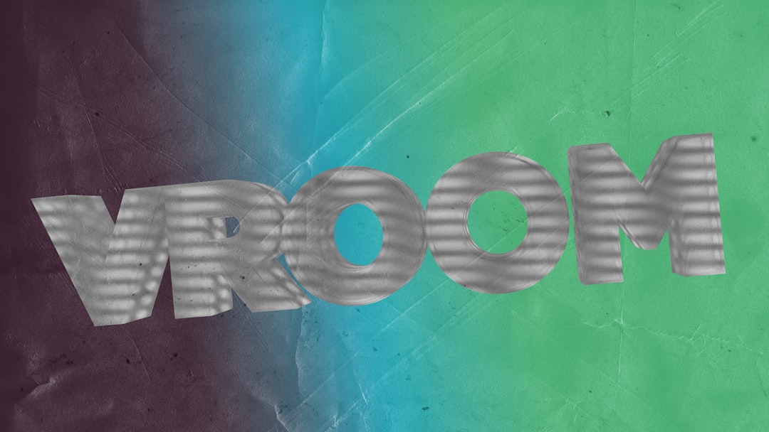
The Westworld logo is custom artwork. The wordmark is built from clean, evenly weighted capitals with quiet, precise terminals, the kind of lettering that feels engineered rather than handwritten. It carries a futuristic calm: no flourishes, no aggressive contrast, just controlled geometry that hints at machinery and code beneath a frontier surface.
That restraint is the whole point. Westworld is a story about hosts, loops, and the thin line between human and machine, so the branding avoids anything ornamental. The lettering sits somewhere between a humanist sans and a lightly modulated serif depending on the season’s treatment, but it always reads as deliberate, cold, and precise.
Because the mark is hand-built, any claim that the logo “is” a specific commercial font is unreliable. Treat such claims as an informed observation, not a confirmed spec.
What typeface is used in the show?
On screen, Westworld splits its type into two jobs. The title card and key-art wordmark use the custom lettering described above. The functional type, episode credits, the Delos corporate branding, lab readouts, and interface text, leans on clean, neutral sans-serifs so the futuristic, clinical world reads as believable and legible.
HBO has never published an official type spec sheet for the series, so the exact families used in titles and graphics are not publicly confirmed. What you can rely on practically is the contrast pattern: a refined, almost luxury-grade wordmark for the brand, and plain, technical grotesques for the corporate and laboratory interfaces that fill the park.
Free fonts that look like the Westworld font
You cannot download the official wordmark, but you can get a convincing tribute. The goal is clean, even capitals with a futuristic-yet-refined feel, then the maze motif added as a separate graphic. A few good free starting points:
- Cormorant — a free Google Fonts serif with elegant, high-end proportions when you want the more refined, serif-leaning Westworld treatment.
- Jost — a free geometric sans that captures the cool, engineered futurism of the wordmark in its capital forms.
- Spectral — a free serif that balances warmth and precision, useful for the frontier-meets-future tension at the heart of the brand.
Set your chosen face in wide, evenly tracked capitals, keep the color palette muted, and place the concentric maze as a standalone vector beside the word.
| Use case | Westworld uses | Free alternative |
|---|---|---|
| Main logo / title card | Custom refined capital lettering | Jost or Cormorant in tracked caps |
| Maze motif | Bespoke concentric graphic | Draw as separate vector artwork |
| Delos / corporate UI | Clean neutral sans (unconfirmed) | Inter or Roboto (Google Fonts) |
| Lab / interface readouts | Technical monospace-leaning sans | IBM Plex Mono (Google Fonts) |
If you are pulling together a wider sci-fi or branded type system, our roundup of famous brand fonts shows how restrained wordmarks like this carry a whole identity.
Why does Westworld use this kind of type?
Westworld is about control, artifice, and the eerie perfection of a designed world. Loud, decorative type would undercut that. Instead the branding uses spare, engineered lettering to signal precision and intelligence, the cold competence of the people who built the park, and the machine logic running underneath the hosts.
The maze motif does the storytelling that the type deliberately withholds. By keeping the wordmark minimal, the design lets that single graphic carry the mystery. This is a common move in prestige sci-fi: pair near-neutral lettering with one unforgettable symbol. You can see a similar industrial-restraint philosophy in the The Expanse font, where hard science fiction leans on stripped-back, functional type rather than spectacle.
Can I use the Westworld font for my own project?
Here is the important split. The Westworld wordmark, the specific logo lettering, the maze symbol, and the name itself, is owned by HBO. You cannot use it to brand a product, sell merchandise, or imply an official association. That is a trademark issue, separate from any font file.
The free look-alike fonts are a different matter. Faces like Jost, Cormorant, and Spectral ship under open licenses (SIL Open Font License) that allow commercial use. So you can absolutely build a Westworld-flavored title for fan art, a personal project, or a mood board using freely licensed type. What you cannot do is reproduce the actual wordmark or maze and present it as your own brand.
When in doubt, separate the two questions: is the font file licensed for my use, and am I implying an official brand connection? For a deeper walkthrough of that distinction, see our font licensing guide. And for a darker, more dystopian sci-fi treatment, compare the neon edge of the Altered Carbon font.
Frequently Asked Questions
Is there an official Westworld font I can download?
No. The Westworld logo is custom-drawn artwork created for HBO, not a released typeface, and the maze is separate branded graphics. There is no official font file. The closest route is building your own with a clean free sans or serif and adding the maze motif as standalone artwork.
What font is closest to the Westworld logo?
A clean, evenly weighted capital face gets closest. Free options like Jost give you the engineered, futuristic sans feel, while Cormorant suits the more refined serif treatment. Track the letters wide, keep the palette muted, and add the maze separately to approximate the look without copying the wordmark.
Can I use a Westworld-style font commercially?
You can use freely licensed look-alike fonts commercially if their license allows it, such as OFL faces. You cannot use the actual Westworld wordmark, maze, or name commercially, since those are HBO trademarks. Always separate the font license question from the trademark question.
What font does the Westworld interface use?
HBO has not published the exact families, so any specific answer is unconfirmed. In practice the show’s corporate and lab interfaces rely on clean, technical sans-serifs for legibility. Free faces like Inter, Roboto, or IBM Plex Mono reproduce that clinical, engineered feel for fan projects.


