Brand Guidelines: How to Create a Style Guide That Works
A brand without guidelines is a brand without consistency, and inconsistency erodes trust faster than almost any other failure in design or communication. Brand guidelines are the document that prevents this erosion. They codify how a brand looks, sounds, and behaves across every touchpoint — giving everyone who touches the brand, from in-house designers to external agencies, a shared reference for making decisions that keep the brand coherent. Without them, every new hire, every new agency, and every new campaign becomes an opportunity for the brand to drift further from its intended identity. A strong brand strategy defines why a brand exists and what it stands for. Brand guidelines translate that strategy into actionable, repeatable rules for execution.
The best guidelines do not stifle creativity. They channel it. They provide the structure within which creative work can happen confidently, because the boundaries are clear and the rationale behind them is documented. The result is a brand that feels consistent without feeling rigid — recognizable across contexts without becoming monotonous. This guide covers what brand guidelines should contain, how to build them from scratch, and the mistakes that make most brand guides either too restrictive or too vague to be useful.
What Are Brand Guidelines?
A brand style guide is a reference document that defines the standards for representing a brand visually and verbally. It specifies how the logo should be used, which colors are approved, what typefaces to set text in, how photography should look, and how the brand should sound in written communication. The scope varies — some guides run to hundreds of pages, others fit on a single sheet — but the purpose is always the same: to ensure that anyone creating brand materials can do so consistently, without needing to consult the original designer for every decision.
It is worth distinguishing brand guidelines from brand strategy. Strategy is the why — the positioning, values, purpose, and audience definition that give the brand direction. Guidelines are the how — the practical rules that translate strategic intent into visual and verbal output. A brand strategy might declare that the brand should feel “premium and understated.” The guidelines then specify exactly what that means in terms of color values, type choices, image treatments, and tone of voice. Strategy without guidelines leaves interpretation open to whoever happens to be designing that day. Guidelines without strategy produce a brand that looks consistent but lacks meaning. Both are necessary, and they should be developed in sequence: strategy first, guidelines second.
Brand guidelines also function as institutional memory. When the designer who created the identity moves on, when a new marketing director joins, or when the brand expands into new markets and media, the guidelines ensure that the accumulated thinking behind every visual and verbal choice is preserved. They are the difference between a brand that maintains its character across years and leadership changes and one that reinvents itself accidentally every time someone new touches it. Understanding foundational graphic design principles helps in creating guidelines that are rooted in established design thinking rather than arbitrary personal preference.
Why Every Brand Needs Guidelines
The case for brand guidelines is fundamentally a case for consistency, and the evidence that consistency matters is extensive. Brands that present themselves consistently across platforms see measurably higher recognition and trust. The reasons are both practical and psychological.
Consistency Across Teams, Agencies, and Freelancers
Most brands today are not managed by a single designer. They involve internal marketing teams, external agencies, freelance contractors, social media managers, product teams, and often international partners — each producing materials independently. Without a shared set of rules, each contributor brings their own interpretation of the brand. The logo appears in slightly different colors. The typography shifts from one typeface to another depending on who built the latest presentation. Photography alternates between polished studio shots and casual smartphone images with no clear rationale. Over time, these small inconsistencies compound into a brand that looks and feels fragmented.
Brand guidelines solve this coordination problem. They give every contributor the same reference point, reducing the need for constant creative oversight and approval loops. A well-documented guide allows a freelancer in another city to produce materials that are indistinguishable from what the in-house team produces. This is not about eliminating individuality in execution — it is about ensuring that all execution happens within a defined visual and verbal framework.
Faster Design Decisions
Without guidelines, every new design project begins with a series of small debates: which blue should the header be, what font should the body text use, how much white space is appropriate. These decisions consume time and creative energy that could be spent on higher-order thinking — layout, hierarchy, messaging, concept. Guidelines eliminate this friction by pre-deciding the recurring choices. The blue is specified. The font is documented. The spacing system is defined. Designers can focus on solving the unique challenges of each project rather than re-litigating the basics.
Protection of Brand Equity
Brand equity — the value that accumulates when audiences consistently associate specific qualities with a brand — is built through repetition. Every time someone encounters the brand and recognizes it, the association strengthens. Every time the brand appears in an unfamiliar or inconsistent way, that recognition falters. Guidelines protect the investment that has already been made in building recognition by ensuring that the visual and verbal patterns audiences have learned to associate with the brand are maintained reliably.
Onboarding New Team Members
When a new designer, copywriter, or marketing manager joins an organization, the brand guidelines serve as their introduction to how the brand operates. Instead of absorbing the brand through osmosis — watching what others do and gradually intuiting the rules — new team members can study the guidelines and begin producing on-brand work immediately. This reduces the learning curve, minimizes errors during the onboarding period, and ensures that the brand does not suffer during transitions in personnel.
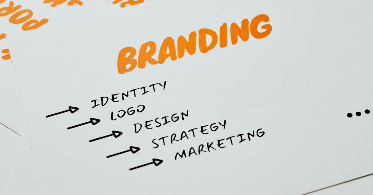
Essential Elements of Brand Guidelines
While every brand guide should be tailored to the specific needs of the brand it documents, certain elements are foundational. These are the components that every set of brand identity guidelines should address, regardless of the brand’s size or industry.
Logo Usage
Logo guidelines are typically the first section of any brand guide, and for good reason — the logo is the single most recognizable brand element, and it is also the most frequently misused. Effective logo guidelines cover several dimensions.
Clear space rules define the minimum amount of empty space that must surround the logo at all times, preventing other visual elements from crowding it. This is usually measured in relation to the logo itself — for example, the clear space might equal the height of a specific letter in the wordmark. Minimum size specifications establish the smallest dimensions at which the logo can be reproduced while remaining legible and recognizable. This varies between print and digital contexts.
Placement rules establish where the logo should appear on different types of materials — upper left on letterhead, centered on social media profiles, lower right on presentation slides. Color variations document the primary full-color version, a reversed (white) version for dark backgrounds, and a single-color version for limited-palette applications. Understanding the various types of logos helps inform which rules are most critical for the specific logo format being used.
Perhaps most importantly, effective logo guidelines include a “what not to do” section with clear visual examples: do not stretch the logo, do not change the colors, do not add drop shadows, do not place it on busy backgrounds without sufficient contrast. These counter-examples are often more instructive than the positive rules because they address the specific misuses that actually occur in practice.
Color Palette
Color guidelines define every approved color in the brand palette and specify exact values across color systems. A thorough color section includes hex values for digital use, RGB values for screen-based design, CMYK values for print production, and Pantone (PMS) references for spot-color printing where exact color matching is critical. This level of specification eliminates the subtle color drift that occurs when people approximate brand colors by eye.
The palette itself is typically organized into tiers. Primary colors are the core brand colors — the ones that appear most frequently and carry the strongest brand association. Secondary colors extend the palette for additional design flexibility, supporting the primary colors without competing with them. Accent colors are used sparingly for highlights, calls to action, or specific functional purposes like error states or success indicators. Understanding color relationships like complementary colors and analogous colors helps build palettes that are both visually harmonious and functionally versatile.
Good color guidelines also specify usage ratios — the approximate percentage of a layout that should be occupied by primary versus secondary versus accent colors. This prevents situations where a secondary color overwhelms the primary palette, diluting the brand’s color identity. Some guides include accessibility notes as well, documenting which color combinations meet WCAG contrast requirements for text readability.
Typography
Typography guidelines govern which typefaces the brand uses, how they are applied, and the hierarchy that structures text across all materials. Typography is one of the most powerful tools for establishing brand personality — a serif typeface communicates something fundamentally different from a geometric sans-serif — and inconsistent type usage can undermine brand perception as quickly as inconsistent color usage.
A complete typography section specifies the primary typeface (used for headlines and prominent text), the secondary typeface (used for body copy and supporting text), and any additional typefaces reserved for specific applications such as captions, data displays, or digital interfaces. For each typeface, the guidelines should document which weights are approved — not every weight in a family may be appropriate for the brand — and how those weights map to specific uses. For example: headings in bold, subheadings in semibold, body text in regular, captions in light.
Type hierarchy rules define sizing, line height, letter spacing, and the relationships between heading levels. Some guides include pre-set type scales — a system of sizes that maintain proportional relationships, such as a scale based on a 1.25 or 1.333 ratio. Effective font pairing is also documented here, showing how the primary and secondary typefaces should interact on a page and what combinations to avoid.
Fallback fonts should also be specified for situations where the primary typefaces are unavailable — typically in email clients, system-rendered text, or third-party platforms that do not support custom fonts. Choosing fallbacks that approximate the proportions and character of the brand fonts prevents jarring visual shifts in these contexts.
Imagery Style
Imagery guidelines define the visual tone and quality standards for photography, illustration, and iconography used in brand materials. This section prevents the common problem of a brand that uses carefully specified colors and typography alongside random, tonally inconsistent images.
Photography direction covers lighting style (natural versus studio, warm versus cool), composition tendencies (tight crops versus environmental shots), subject matter guidelines (what to show and what to avoid), and post-processing standards (color grading, contrast levels, filter usage). Some brands include mood boards that capture the intended photographic feel through curated reference images. This is often more effective than written descriptions alone, because visual tone is easier to communicate visually.
Illustration guidelines, if the brand uses illustration, define the style (line-based, flat, dimensional, textured), the color usage within illustrations (should they draw from the brand palette or use a distinct illustrative palette), and the level of detail or abstraction. Iconography guidelines specify the icon style (outlined, filled, rounded, squared), stroke weight, grid system, and the minimum/maximum complexity for individual icons.
Voice and Tone
Voice and tone guidelines govern how the brand communicates in words. Voice is the brand’s consistent personality in language — whether it is authoritative, conversational, technical, or playful. Tone is how that voice adapts to different contexts — a congratulatory email sounds different from a service interruption notice, even when both reflect the same underlying brand voice.
Effective voice guidelines describe the brand’s communication personality using specific, paired descriptors: “confident but not arrogant,” “warm but not casual,” “precise but not clinical.” These pairings are more useful than single adjectives because they define both what the voice is and what it is not. Writing samples demonstrating the voice in action — and counter-examples showing what off-brand writing looks like — make the guidelines practical for copywriters and content creators who need to match the brand’s communication style.
Tone variations across contexts should also be documented. The brand’s voice on social media may be slightly more relaxed than its voice in formal communications, but the underlying personality remains consistent. Defining these variations prevents the common problem of a brand that sounds like a different entity on every platform.
Layout and Grid
Layout guidelines establish the spatial framework for brand materials. This includes grid systems (the column structures and proportional divisions that organize content), margin specifications, spacing systems (often based on a base unit that scales consistently), and alignment rules.
These guidelines ensure that materials produced by different people share a common structural logic, even when the content differs. A presentation, a social media post, and a print brochure may serve different purposes, but if they all follow the same spatial principles — the same proportional relationships, the same approach to white space, the same alignment patterns — they will feel like they belong to the same brand. Layout guidelines are particularly valuable for brands that produce high volumes of templated content, where consistent spatial structure prevents the gradual erosion of visual quality.
Optional Elements to Consider
Beyond the essentials, many brands benefit from guidelines that address additional dimensions of the brand experience. These optional elements are particularly relevant for brands with complex communication ecosystems or those operating across multiple media.
Motion and animation guidelines define how the brand moves — transition styles, animation timing and easing curves, the behavior of animated logos, and the principles that govern motion across digital interfaces and video content. As brands appear increasingly in motion-based media, these guidelines prevent the randomness that occurs when each animator or motion designer invents their own approach.
Social media templates provide pre-designed frameworks for the most common social post types — quote cards, announcements, product features, event promotions. These templates maintain visual consistency across platforms while allowing content to vary. They are especially useful for social media managers who may not have design training.
Data visualization style standardizes how charts, graphs, infographics, and statistical presentations look across the brand. This includes chart color sequences, axis and label styling, annotation approaches, and the visual treatment of data points. Brands that frequently communicate data — in reports, presentations, or content marketing — benefit significantly from consistent data visualization standards.
Sound and audio branding covers sonic identity elements: audio logos, hold music, podcast intros, notification sounds, and the general sonic character the brand aims to project. As voice interfaces and audio content grow, this dimension of brand identity becomes increasingly relevant.
Co-branding rules specify how the brand’s identity should interact with partner brands — logo lock-ups, hierarchy of brand marks, color and space requirements when brands appear together, and any restrictions on how the brand can be combined with external identities.
Creating Brand Guidelines: Step by Step
Understanding how to create brand guidelines involves a sequential process that begins with assessment and ends with a living document designed for ongoing use. Rushing through these steps or skipping them produces guides that are either incomplete or disconnected from the reality of how the brand is actually used.
Step 1: Audit Existing Brand Assets
Before documenting how the brand should be used, assess how it is currently being used. Gather every brand touchpoint you can find — website pages, social media profiles, email templates, presentation decks, packaging, signage, advertising, internal documents. Lay them out and look for patterns and inconsistencies. Where is the brand already consistent? Where has it drifted? What materials feel on-brand, and which feel like they belong to a different organization? This audit reveals the gaps that the guidelines need to address and the existing strengths they should codify.
Step 2: Define the Non-Negotiables
Not everything in a brand guide carries equal weight. Some elements are absolute — the logo must never be redrawn, the primary brand color must always use the exact specified hex value, the brand name must always be capitalized in a specific way. Other elements allow for more flexibility. Identifying which rules are non-negotiable and which allow interpretation helps produce guidelines that are appropriately strict where precision matters and appropriately flexible where creative latitude is beneficial. This hierarchy of rigidity should be explicit in the document.
Step 3: Document with Clear Examples and Counter-Examples
Every rule in a brand guide should be accompanied by visual examples showing correct application and, ideally, counter-examples showing incorrect application. Rules stated only in text are open to interpretation. Rules shown visually are concrete. “The logo must have adequate clear space” is vague. A diagram showing the logo with measured clear space, alongside an example of the logo crowded by other elements, is actionable. The most effective brand guides are more visual than verbal — the text explains the reasoning, but the images show the execution.
Step 4: Make It Accessible
A brand guide that nobody can find is a brand guide that nobody uses. Consider the format and distribution carefully. PDFs are portable and maintain formatting fidelity but become outdated quickly and cannot be updated once distributed. Web-based guides hosted on an internal site or platform are easier to update and always present the current version. Figma or design tool libraries give designers direct access to components, colors, and type styles within their working environment. The best approach often combines formats: a web-based master guide that serves as the source of truth, supplemented by downloadable assets and design tool libraries for practical use.
Step 5: Include Do and Do Not Examples
This point bears repetition because it is the single most impactful element in making guidelines usable. For every major rule — logo usage, color application, typography, imagery — include side-by-side comparisons of correct and incorrect application. Label them clearly. Explain why the incorrect version is wrong, not just that it is wrong. “Do not stretch the logo” is a rule. “Do not stretch the logo because distortion undermines the visual integrity of the mark and signals carelessness to audiences” is a rule with reasoning that makes it more likely to be respected and remembered.
Step 6: Plan for Updates
Brands evolve. New channels emerge, products expand, markets shift, and design standards advance. Brand guidelines should include a version history, a clear owner responsible for maintaining the document, and a process for proposing and approving updates. Guidelines that are treated as a finished artifact will gradually become irrelevant as the brand outgrows them. Guidelines that are treated as a living document — reviewed regularly, updated deliberately, and versioned clearly — remain useful over time.
Great Brand Guidelines Examples
Studying how established brands approach their guidelines offers practical insight into what makes a brand guide effective. Several companies have set benchmarks that are worth examining.
Apple maintains some of the most controlled brand guidelines in existence. Their emphasis on simplicity — clean photography, precise spatial relationships, and exacting standards for how Apple products are depicted — reflects the brand’s broader philosophy. What makes Apple’s guidelines effective is their specificity: nothing is left to interpretation. Every rule has a clear rationale grounded in the brand’s core values of simplicity and precision.
Spotify publishes a publicly accessible brand guide that balances structure with creative energy. Their guidelines include detailed color specifications, duotone photography treatments, and type usage rules alongside generous examples of the system in action. The effectiveness lies in showing the guidelines applied across real-world contexts — playlists, ads, partner materials — so that users can see the principles in practice, not just in isolation.
Mailchimp has been widely praised for voice and tone guidelines that are among the most thorough in any brand guide. Their content style guide defines not just what the brand sounds like but how the voice adapts across contexts — marketing emails versus error messages versus billing notifications. What makes this approach effective is its recognition that voice consistency does not mean identical tone in every situation. The guidelines give writers enough structure to maintain the brand’s personality while allowing natural variation across communication types.
Uber rebuilt its brand system from the ground up in 2018, and the resulting guidelines demonstrate how a complex global brand maintains consistency across dozens of markets and thousands of touchpoints. Their system includes a bespoke typeface, a modular composition framework, and detailed specifications for how the brand adapts across cultural contexts. What makes Uber’s guidelines effective is their scalability — they are designed to work at a massive operational scale without constant centralized oversight.
Brand Guidelines for Small Teams
Not every brand needs a hundred-page style guide. For startups, small businesses, solo practitioners, and designers building personal brands, a minimum viable brand guide can be equally effective — provided it covers the essentials with clarity and specificity.
A one-page brand guide is a legitimate starting point. It should include the logo with clear space rules, the primary color palette with hex and RGB values, the primary and secondary typefaces with basic hierarchy, a brief voice description, and a short list of the most critical do-not rules. This single page, if well-executed, prevents the majority of brand consistency issues that small teams face. It can live as a PDF, a pinned document in a team channel, or even a page on the company’s internal wiki.
The key for small teams is prioritization. Determine which elements cause the most inconsistency in practice and address those first. For many small brands, the biggest issues are logo misuse, color approximation, and inconsistent typography — so those should receive the most attention. Voice guidelines, motion standards, and data visualization rules can be added later as the brand grows and the team expands. Building guidelines incrementally is better than waiting until the brand is “mature enough” for a comprehensive guide — by then, inconsistency has already become entrenched.
Small teams should also consider tool-based guidelines. If the team works primarily in Canva, create a Canva brand kit. If the team uses Figma, build a shared component library. Embedding guidelines directly into the tools people actually use makes compliance effortless rather than aspirational. The best guideline is the one that requires no additional effort to follow.
Common Mistakes in Brand Guidelines
Even well-intentioned brand guidelines can fail if they fall into common traps. Understanding these mistakes helps in creating guidelines that are genuinely useful rather than performative.
Too Rigid
Guidelines that leave no room for creative interpretation produce brand materials that feel mechanical and lifeless. When every element is controlled to the pixel — when there is no space for a designer to make creative decisions within the system — the guidelines become a constraint rather than a framework. Effective guidelines define boundaries while leaving room within those boundaries for skilled execution. They specify what must remain consistent and identify where creative judgment is welcome. The distinction between “rules” (non-negotiable standards) and “guidance” (recommended approaches that allow flexibility) should be explicit. Reviewing various graphic design examples shows how the best brand work balances systemic consistency with creative execution.
Too Vague
The opposite failure is equally damaging. Guidelines that rely on subjective descriptors without visual examples — “use clean, modern design” or “the brand should feel premium” — provide no actionable direction. Different designers interpret “clean” and “premium” in very different ways. Vagueness in guidelines is usually a sign that the strategic decisions have not actually been made — that the guide is documenting aspirations rather than specifications. Every guideline should be specific enough that two designers working independently would produce materially similar results.
Not Accessible
A beautifully designed brand guide that lives as a 200MB PDF buried in a shared drive is functionally useless. If the people who need the guidelines cannot find them or do not know they exist, the guidelines serve no purpose. Accessibility means putting the guide where people actually work — in their design tools, in their project management platforms, on a clearly linked internal page. It also means making the guide itself easy to navigate, with a clear table of contents, logical organization, and the ability to quickly find specific sections without reading the entire document.
Never Updated
Brand guidelines created at launch and never revisited become historical artifacts rather than living tools. The brand inevitably evolves — new products launch, new channels are adopted, new team members bring new challenges — and guidelines that do not evolve with it become obstacles rather than aids. Teams begin ignoring the guide because it no longer reflects reality, and the inconsistency the guide was meant to prevent returns. Assigning clear ownership, scheduling regular reviews, and maintaining version control keeps guidelines relevant and respected.
FAQ
What are brand guidelines?
Brand guidelines are a reference document that defines the rules and standards for how a brand is represented visually and verbally. They typically include specifications for logo usage, color palette, typography, imagery style, voice and tone, and layout principles. The purpose is to ensure that anyone creating materials for the brand — whether an in-house designer, external agency, or freelance contractor — can produce work that is consistent with the brand’s established identity. Guidelines translate the strategic intent behind a brand into practical, repeatable instructions that maintain coherence across every touchpoint and over time.
How long should a brand guide be?
There is no universal length. A small business or personal brand can operate effectively with a one-page guide covering the logo, colors, typography, and core do-not rules. A large enterprise brand with complex product lines, international markets, and diverse media channels may need a guide spanning a hundred pages or more. The right length is determined by the brand’s complexity and the number of people who need to use the guide. The priority should always be completeness and clarity over length — a concise guide that covers everything essential is more useful than a lengthy guide padded with unnecessary detail. Start with the essentials and expand as needs grow.
Who should create brand guidelines?
Brand guidelines are typically created by the designer or design team that developed the brand identity, often in collaboration with brand strategists and marketing leadership. The designer understands the technical specifications and the thinking behind each visual decision. The strategist ensures the guidelines reflect the broader brand positioning and values. Marketing leadership provides insight into the practical contexts where the guidelines will be applied. For smaller organizations, a skilled graphic designer with brand experience can handle all three roles. The critical factor is that whoever creates the guidelines has both design expertise and a thorough understanding of the brand strategy that the visual system is built to express.
How often should brand guidelines be updated?
Brand guidelines should be reviewed at least annually and updated whenever significant changes warrant revision — a new product line, a shift in brand positioning, expansion into new media channels, or a visual refresh. Minor updates, such as adding specifications for a new social media platform template or updating approved photography examples, can happen as needed throughout the year. Major revisions — changes to the logo, color palette, or typographic system — should be less frequent and driven by strategic necessity rather than trend-following. Most brands find that a light annual review with incremental updates keeps the guidelines relevant without requiring wholesale rewrites.
What is the difference between brand guidelines and a brand strategy?
Brand strategy defines the foundational decisions about a brand — its purpose, values, target audience, competitive positioning, personality, and voice. It answers the question of why the brand exists and what it stands for. Brand guidelines define how those strategic decisions are expressed in practice — the specific visual and verbal standards that ensure the strategy is communicated consistently. Strategy is the thinking; guidelines are the execution rules. A brand strategy document might state that the brand should feel “authoritative and trustworthy.” The brand guidelines then specify which typefaces, colors, imagery styles, and writing conventions produce that feeling reliably. Both documents are essential, and strategy should always precede guidelines in the development process.


