Mood Board: How to Create One for Design Projects
Every design project begins with an abstraction: a feeling, a direction, an intention that has not yet taken visual form. The challenge is translating that abstraction into something concrete, something a designer can build from and a client can evaluate. A mood board is the tool that bridges that gap. It collects colors, textures, images, typography, and visual references into a single composition that communicates the creative direction of a project before any actual design work begins.
Mood boards have been part of the design process for decades, long before digital tools made them faster to assemble. Interior designers pinned fabric swatches and paint chips to corkboards. Fashion designers arranged tearsheets from magazines. Graphic designers collected printed samples and photography to establish tone. The medium has evolved, but the purpose remains the same: to align everyone involved in a project around a shared visual language before committing time and resources to execution. Understanding graphic design principles helps you build mood boards that communicate with precision rather than ambiguity.
Whether you are establishing the visual identity for a new brand, redesigning a website, or developing packaging for a product launch, a well-crafted mood board reduces guesswork, shortens revision cycles, and ensures the final deliverable reflects the original intent. This guide covers everything from assembling your first board to presenting it to stakeholders with confidence.
What Is a Mood Board?
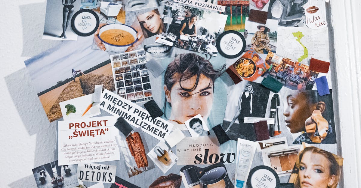
A mood board is a curated collection of visual references arranged together to communicate the aesthetic direction of a design project. It typically includes images, color palettes, typography samples, textures, patterns, and sometimes words or phrases that capture the intended feel of the final work. The board functions as a visual brief, a tangible representation of ideas that might otherwise remain vague or open to misinterpretation.
In the design process, mood boards serve three core purposes. First, they align vision. When a client says they want something “modern and clean,” that phrase means different things to different people. A mood board gives those words a specific visual definition that everyone can agree on. Second, they communicate direction efficiently. Rather than describing a design concept through paragraphs of text, a mood board shows it. Third, they reduce revision cycles. By establishing the visual direction before any design work begins, mood boards catch misalignments early, when they are cheap to fix, rather than late, when they require rework.
Physical mood boards use tangible materials: printed photographs, fabric swatches, paper samples, paint chips, and other objects pinned or glued to a board. They are particularly useful for interior design, fashion, and projects where material texture matters. Digital mood boards are assembled on screen using design software, collaborative platforms, or even simple slide presentations. They are easier to share, revise, and store, making them the default choice for most graphic design and branding work today.
Why Mood Boards Matter
Mood boards are sometimes dismissed as an optional step, something nice to have but not essential. This is a mistake. In practice, skipping the mood board phase is one of the most common reasons design projects run over budget and past deadline.
Client communication is the most immediate benefit. Design is inherently subjective, and clients often struggle to articulate what they want in visual terms. A mood board gives them something concrete to react to. Instead of trying to describe their preferences in words, they can point to specific elements and say “yes, that” or “not that.” This clarity saves hours of back-and-forth during the design phase.
For creative direction, mood boards function as a compass. They keep the designer focused on the agreed-upon aesthetic rather than drifting toward personal preference or trending styles that may not suit the project. When you reach a decision point during the design process, you can refer back to the mood board and ask whether a particular choice aligns with the established direction.
Team alignment becomes critical on larger projects. When multiple designers, copywriters, photographers, and developers are contributing to the same project, a mood board ensures everyone is working toward the same visual outcome. Without one, each team member brings their own interpretation, and the result often feels disjointed.
Perhaps most importantly, mood boards reduce subjective design debates. “I don’t like it” is difficult to address. “This doesn’t match the mood board we approved” is a productive conversation. The mood board provides an objective reference point that depersonalizes feedback and keeps discussions focused on the project goals rather than individual taste.
Types of Mood Boards
Not all mood boards serve the same purpose. The type you create depends on what you are trying to communicate and at what stage of the project you are working.
Brand Mood Boards
A brand mood board captures the overall aesthetic, personality, and emotional tone of a brand identity. It is broader in scope than a project-specific board, often including lifestyle imagery, environmental photography, and cultural references that evoke the brand’s positioning. Brand mood boards inform every subsequent design decision, from logo development to marketing materials. You can see how brand aesthetics translate into finished work across a range of graphic design portfolio examples.
Project Mood Boards
These are created for specific deliverables: a website redesign, a packaging project, an advertising campaign. They are narrower in focus and more tactical, zeroing in on the visual treatment for a particular output rather than the brand as a whole.
Typography Mood Boards
When typography plays a central role in the design, a dedicated type board can be invaluable. These boards showcase different typeface options, weight variations, and font pairing combinations in context. They help clients and team members understand how typographic choices affect tone and readability before committing to a direction.
Color Mood Boards
Color mood boards isolate the palette conversation. They present color combinations alongside imagery that demonstrates how those colors function in real-world contexts: interiors, nature, fashion, product design. This is particularly useful when color is a primary differentiator for the brand or when the client has strong but undefined color preferences.
Competitor Audit Boards
Sometimes the most useful mood board shows the competitive landscape. By collecting visual references from direct and indirect competitors, you can identify opportunities for differentiation and help clients understand where their brand sits within the market. These boards are typically presented alongside the creative mood board to provide strategic context for the chosen direction.
What to Include in a Mood Board
The elements you include depend on the project scope, but most effective mood boards draw from a consistent set of visual building blocks.
Color palettes are foundational. Include both the specific hex or Pantone values you are proposing and imagery that shows those colors in context. A swatch of navy blue communicates one thing; a photograph of a navy blue storefront with brass hardware communicates something far richer.
Typography samples show how your proposed typefaces look at different sizes, weights, and in different contexts. Include both heading and body text treatments so stakeholders can see how the type system functions as a whole, not just as isolated letterforms.
Photography and image style set the emotional tone more powerfully than any other element. The difference between high-contrast editorial photography and soft, natural-light lifestyle imagery fundamentally changes how a brand feels. Be specific about lighting, composition, color grading, and subject matter.
Textures and patterns add depth and tactile quality to the board. These might include paper textures, fabric weaves, architectural surfaces, or geometric patterns. For packaging and print projects, texture references are especially important because they inform material choices.
Logo inspiration collects examples of logo styles, icon treatments, and mark designs that align with the creative direction. These are not designs to copy but references that communicate the stylistic territory you intend to explore. Browse graphic design examples for a wide range of visual references across different categories.
Layout references show how information might be organized on the page or screen. These could be screenshots of websites, printed publications, or app interfaces that demonstrate the type of grid, hierarchy, and spatial relationships you are considering.
Keywords and adjectives anchor the visual elements in language. Three to five carefully chosen words (for example: “refined,” “warm,” “approachable”) give the board an interpretive framework and help prevent misreadings of the visual material.
Material samples apply primarily to physical mood boards for projects involving tangible outputs. Paper stocks, fabric swatches, metal finishes, and other material references help stakeholders understand how the design will look and feel in the real world.
How to Create a Mood Board: Step by Step
Building an effective design mood board is a process of expansion followed by ruthless contraction. You gather widely, then curate tightly. Here is a practical framework for each stage.
Step 1: Define the Project Brief and Goals
Before collecting a single image, clarify what the mood board needs to communicate. Review the project brief. Identify the target audience, the brand personality, the competitive context, and any constraints. Write down three to five adjectives that describe the desired outcome. These words will serve as your filter throughout the curation process. If the brief is vague, push for specifics before proceeding. A mood board built on unclear objectives will produce unclear results.
Step 2: Research and Gather Inspiration
Cast a wide net. Look beyond your immediate design discipline for references. If you are designing a brand identity, study architecture, fashion, film, fine art, and product design for relevant visual language. Pull from design archives, photography platforms, physical bookstores, and real-world observation. Aim to collect 50 to 100 references at this stage. Do not filter yet. The goal is volume and variety so you have rich material to curate from.
Step 3: Curate Ruthlessly
This is the step that separates useful mood boards from visual noise. Review your collected references against the project brief and your guiding adjectives. Remove anything that does not clearly support the direction. If an image is beautiful but irrelevant, cut it. If two images communicate the same idea, keep the stronger one. Your final board should contain 15 to 25 elements, each earning its place. Every item should answer the question: “What does this tell us about the design direction that nothing else on the board already says?”
Step 4: Arrange with Intention
Composition matters. The way you arrange elements on the board communicates hierarchy, relationships, and emphasis. Place the most important references centrally or at larger scale. Group related elements together. Use white space to let the board breathe. A cluttered mood board overwhelms rather than inspires. Think of the board itself as a design artifact: it should look intentional, not like a collage made by committee.
Step 5: Add Annotations
Brief annotations transform a mood board from a collection of pretty pictures into a strategic tool. Label key elements to explain why they are included. Note the specific qualities you are referencing: “the warmth of this color palette,” “the editorial quality of this photography style,” “the restraint of this typographic hierarchy.” Annotations guide interpretation and prevent stakeholders from fixating on the wrong details.
Step 6: Present to Stakeholders
How you present the mood board matters as much as what is on it. Walk stakeholders through the board rather than sending it as an email attachment. Explain the brief, share your guiding adjectives, and then reveal the board as the visual answer to those objectives. Invite specific feedback: “Does this color direction feel right for your audience?” is more productive than “What do you think?” Document the discussion and any agreed-upon refinements so the approved mood board becomes a reference document for the rest of the project.
Digital Mood Board Tools
The tool you choose should support your workflow, not complicate it. Here is a brief overview of the most widely used options for creating mood board design compositions.
Figma is the most versatile option for designers who want full control over layout, typography, and composition. Its collaborative features allow multiple team members to contribute and comment in real time. For designers already working in Figma, building mood boards within the same ecosystem keeps everything accessible.
Miro excels at collaborative brainstorming and is useful when the mood board process involves input from non-designers. Its infinite canvas and low learning curve make it approachable for clients and team members who are not comfortable in design software.
Pinterest works well for the initial research and collection phase. Its visual search algorithm surfaces related content quickly, making it efficient for building a large pool of references. However, Pinterest boards lack the compositional control needed for a polished final presentation. Use it for gathering, not for presenting.
Milanote is purpose-built for mood boards and creative projects. It strikes a balance between the freeform flexibility of Miro and the design control of Figma. Its drag-and-drop interface handles images, text, color swatches, and links naturally.
Adobe InDesign or Illustrator remain relevant for designers who prefer print-quality output or need to integrate the mood board into a larger brand strategy document. They offer the most precise typographic and layout control but lack real-time collaboration features.
Physical mood boards still make sense in specific contexts. For interior design, fashion, and any project where material texture is a primary consideration, handling actual samples communicates something a screen cannot. Physical boards also tend to command more attention in client meetings. There is something about a large, tangible board on an easel that invites engagement in a way a shared screen does not.
Mood Board Best Practices
After building hundreds of mood boards across branding, web design, and print projects, several principles consistently separate effective boards from ineffective ones.
Limit to 15-25 elements. More than that and the board becomes noisy. Each element should communicate something distinct. If you cannot articulate why a particular image is on the board, remove it. A focused board with fewer elements is always more useful than a comprehensive one that tries to cover everything.
Maintain visual consistency. The board itself should feel cohesive. If your references span wildly different styles, the board is trying to say too many things at once. This does not mean every image should look the same. It means the overall impression should read as a single direction, not three competing ones. Understanding principles of visual hierarchy helps you arrange elements so the board communicates a clear, unified message.
Include negative examples. Showing what to avoid is sometimes as valuable as showing what to pursue. A small section labeled “not this” can prevent misinterpretation and clarify boundaries. This is especially useful for clients who have strong dislikes but struggle to articulate them in abstract terms.
Keep typography limited. Do not show more than three to four typeface options on a single mood board. Too many type choices dilute the direction. If typography warrants deeper exploration, create a separate type-specific board rather than crowding the main board with competing options.
Show real references, not stock imagery. Stock photography undermines the specificity that makes mood boards useful. Wherever possible, use real-world references: actual brand identities, published editorial photography, existing websites, physical products. The goal is to reference the quality and style of real work, not to present generic placeholders.
Update as projects evolve. A mood board is a living document during the early stages of a project. As decisions are made and the direction becomes more defined, refine the board to reflect the current state of the project. The mood board at the start of a logo design process may look different from the one that guides the final refinements.
Mood Boards for Branding Projects
Branding projects demand a particular kind of mood board: one that captures not just a visual style but a personality. A brand mood board must communicate who the brand is, how it speaks, how it makes people feel, and how it differs from its competitors. This is a higher bar than simply establishing a color palette and image style.
For logo design, the mood board should include examples of mark styles (wordmarks, lettermarks, emblems, abstract symbols) that align with the brand’s positioning. It should also show how similar brands handle their visual identity systems, not to copy but to establish the territory. If the brand aims for minimalism, the mood board should feature logos that demonstrate sophistication through restraint. If the brand embraces maximalism, the board should reflect that energy. Explore approaches across graphic design portfolio examples to see how different brand identities translate from concept to finished work.
Color palette selection for branding requires mood board references that go beyond swatches. Show colors in context: on packaging, in environments, across digital interfaces, in fashion. A particular shade of green reads differently on a luxury skincare box than it does on an outdoor equipment website. The mood board should clarify not just which colors you are proposing but how those colors will function in the brand’s specific context.
Font choices for branding carry enormous weight, and the mood board should demonstrate typographic tone across multiple applications. Show how your proposed typefaces handle headlines, body copy, captions, and navigational elements. Include references to brands with similar typographic personalities so stakeholders can see the type direction in real-world use. Thoughtful font pairing is often the difference between a brand that feels considered and one that feels assembled from defaults.
The overall brand aesthetic, the sum of all these individual choices, should emerge from the mood board as a coherent impression. When a stakeholder looks at the board, they should be able to imagine the brand existing in the world: how its website would feel, how its business card would look, how its social media presence would read. This holistic quality is what separates a brand mood board from a generic collection of inspiration. Each element should reinforce the others, building toward a visual identity that feels inevitable rather than arbitrary.
For branding projects specifically, consider creating multiple mood boards that represent two or three distinct creative directions. Presenting options gives stakeholders a meaningful choice and often generates richer feedback than a single board. The discussion about why one direction resonates more than another surfaces preferences and priorities that might otherwise remain hidden until later, more expensive stages of the project.
Common Mood Board Mistakes
Knowing what to avoid is as useful as knowing what to do. These are the mistakes that most frequently undermine mood board effectiveness.
Overcrowding the board. The temptation to include everything interesting you found during research is strong. Resist it. A mood board with 40 or 50 elements communicates nothing because it communicates everything. If the board feels overwhelming, it needs editing, not a larger canvas.
Prioritizing beauty over relevance. A stunning photograph that has nothing to do with the project direction does not belong on the mood board, no matter how visually compelling it is. Every element must earn its place through strategic relevance, not aesthetic merit alone.
Skipping annotations. Unannotated mood boards are open to interpretation, and interpretation is exactly what you are trying to control. Without brief notes explaining what each reference contributes, stakeholders will project their own meanings onto the board, sometimes accurately, sometimes not.
Using the mood board as a design comp. A mood board establishes direction; it does not predict the final design. If the board starts looking like a draft of the deliverable, it has gone too far. Keep mood boards atmospheric and directional rather than prescriptive and literal. The principles of design should inform the board’s composition, but the board itself should inspire rather than dictate.
Presenting without context. Emailing a mood board as a PDF attachment without explanation is a recipe for misunderstanding. Always present the board in conversation, whether live or via video call, so you can guide interpretation and respond to questions in real time.
FAQ
What is a mood board in design?
A mood board is a curated collection of visual references, including images, colors, typography, textures, and sometimes words, arranged together to communicate the aesthetic direction and emotional tone of a design project. It serves as a visual brief that aligns designers, clients, and team members around a shared creative vision before detailed design work begins. Mood boards are used across disciplines including graphic design, interior design, fashion, film, and product development.
How many images should a mood board have?
An effective mood board typically contains 15 to 25 elements total, including images, color swatches, typography samples, and texture references. This range provides enough material to communicate a clear direction without overwhelming the viewer. Fewer than 10 elements rarely gives a comprehensive picture. More than 30 starts to feel like a scrapbook rather than a strategic tool. The exact number depends on the project scope, but the principle of “every element earns its place” should always apply.
What is the difference between a mood board and a style guide?
A mood board is an exploratory, directional tool used at the beginning of a project to establish creative vision. It shows the intended feel and aesthetic territory through collected references. A style guide is a definitive, prescriptive document created after the design work is complete. It specifies exact colors, typefaces, spacing, logo usage rules, and other standards that govern how the brand identity is applied. The mood board inspires the design; the style guide codifies it.
Can I use Pinterest as a mood board?
Pinterest is excellent for the research and collection phase of mood board creation, but it has significant limitations as a presentation tool. Pinterest boards lack compositional control, meaning you cannot arrange elements with intention, control scale relationships, or create the visual hierarchy that makes a mood board effective. Use Pinterest to gather inspiration, then transfer your curated selections into Figma, Milanote, or another design tool where you can arrange, annotate, and present them with the precision the project requires.
Do I need a mood board for every project?
Not necessarily, but the projects that benefit from mood boards far outnumber those that do not. Any project involving subjective aesthetic decisions, particularly branding, web design, packaging, and editorial design, benefits from the alignment and clarity a mood board provides. Small projects with a well-established visual identity and a clear brief may not need one. However, for new client relationships, large-scale projects, or any work where the creative direction is not yet defined, investing time in a mood board consistently saves more time than it costs.


