Fancy Lettering: Styles, Fonts and Creative Inspiration
Fancy lettering sits at the intersection of writing and visual art. It is the practice of drawing, writing, or designing letterforms that go beyond mere communication to become objects of beauty in their own right. Where standard typography prioritizes legibility and functional clarity, fancy lettering embraces decoration, personality, and craft. The letters themselves become the design, carrying meaning not just through the words they spell but through the visual qualities of the forms themselves.
This guide covers the full landscape of fancy lettering: the major styles and their visual characteristics, the best fonts for achieving decorative effects digitally, techniques for creating ornamental letters by hand, and practical applications across design disciplines. Whether you are a calligrapher looking to push your work toward greater ornamentation, a designer searching for the right decorative typeface, or someone drawn to the beauty of elaborate letterforms for personal projects, the approaches and resources here will give you a foundation to work from. The tradition of hand lettering runs deep through every style discussed below, and understanding that tradition is the key to creating fancy lettering that feels intentional rather than arbitrary.
What Is Fancy Lettering?
Fancy lettering refers to decorative, ornamental, or elaborate letterforms that prioritize visual beauty over simplicity. It encompasses a broad range of approaches, from the precise, rule-governed elegance of formal calligraphy to the spontaneous energy of brush lettering to the intricate complexity of Victorian display type. What unites these varied styles is a shared emphasis on the letter as a visual object, not merely a functional symbol.
The distinction from standard typography is one of intent. A well-designed body text font is meant to disappear, to convey words without drawing attention to the shapes of the letters. Fancy lettering reverses that priority. The shapes are the point. The viewer is meant to notice and appreciate the swashes, the flourishes, the interplay of thick and thin strokes, the decorative elements that transform simple alphabetic characters into something closer to illustration.
Fancy lettering draws from three overlapping traditions. The first is calligraphy, the art of beautiful writing with pen, brush, or marker, where letterforms are created through deliberate manipulation of a writing tool. The second is hand lettering, the drawing and designing of letters as visual compositions, often involving sketching, refining, and inking. The third is decorative type design, the creation of typefaces and fonts intended for display use, where ornamentation and visual impact take precedence over the neutral clarity expected of text fonts. Many practitioners work across all three, and the best fancy lettering often blends calligraphic fluency with the compositional thinking of lettering and the systematic consistency of type design.
Styles of Fancy Lettering
The world of fancy lettering styles is vast, but most work falls into a handful of recognizable categories. Each has its own history, visual vocabulary, and emotional register. Understanding these categories gives you a framework for choosing the right approach for any project and a starting point for developing your own decorative lettering voice.
Calligraphic Lettering
Calligraphic fancy lettering is rooted in the pointed pen tradition, where a flexible nib produces thick downstrokes and thin upstrokes through variations in pressure. The result is an inherently elegant rhythm of swelling and tapering lines that gives calligraphic letters their distinctive grace. Copperplate, Spencerian, and modern calligraphy all fall under this umbrella, each with its own degree of formality and ornamentation.
What makes calligraphic lettering “fancy” rather than simply “calligraphic” is the level of embellishment. Basic calligraphy is already beautiful, but fancy calligraphic lettering pushes further with extended ascenders, looping descenders, ornamental capitals, and connecting flourishes that fill the space around and between words. The visual mood is refined, sophisticated, and often romantic. This style appears most frequently on wedding invitations, formal certificates, and luxury branding, where it communicates elegance and attention to craft. Understanding what calligraphy is at its core helps you embellish it without losing the structural integrity that makes it readable.
Gothic and Blackletter
Gothic lettering, also known as blackletter, originated in medieval European scriptoria and remained the dominant lettering style in German-speaking countries into the twentieth century. Its defining features are angular, fractured strokes, heavy vertical emphasis, and a dense, dark texture on the page. The letters are built from a series of straight and diagonal strokes rather than curves, giving the style a sharp, architectural quality.
As a fancy lettering style, blackletter carries associations of age, authority, tradition, and a certain dramatic intensity. It appears on beer labels, metal album covers, newspaper mastheads, tattoos, and certificates. The style ranges from the rigid formality of Textura to the more flowing, rounded qualities of Rotunda and the elaborate ornamentation of Fraktur. Blackletter capitals, in particular, offer rich territory for decorative treatment, with their complex constructions and opportunities for added hairline flourishes, diamond-shaped terminals, and interstitial ornament.
Script and Cursive
Script lettering encompasses a wide range of connected, flowing styles that mimic the movement of handwriting but with greater deliberation and polish. Within fancy lettering, script styles range from formal copperplate-derived designs to loose, casual brush scripts, all connected by the fundamental quality of letters that link to one another in a continuous visual flow.
The fancier end of script lettering features exaggerated loops, extended entry and exit strokes, and dramatic variation in letter size. The visual mood depends entirely on execution: a tight, precise script reads as formal and refined, while a loose, expressive one feels energetic and personal. Script lettering is one of the most versatile fancy lettering categories, adaptable to wedding stationery, product packaging, restaurant branding, fashion logos, and social media graphics.
Art Nouveau Lettering
Art Nouveau lettering emerged in the late nineteenth century as part of the broader Art Nouveau movement, which drew inspiration from natural forms, organic curves, and the belief that art should be integrated into everyday life. The lettering style reflects these principles: letters are built from sinuous, plant-like curves, with strokes that suggest vines, tendrils, and flowing water. Terminals often end in whiplash curves or bud-like forms.
The visual effect is lush, sensuous, and unmistakably of its period. Art Nouveau lettering works well for projects that want to evoke the elegance of the Belle Epoque, for branding in the beauty, perfume, or wine industries, and for any design that benefits from an organic, handcrafted feel. The style demands careful construction, as the complex curves must flow naturally and maintain consistent stroke weight relationships to avoid looking clumsy.
Ornamental and Victorian Lettering
Victorian-era lettering represents perhaps the most extreme expression of decorative lettering in the Western tradition. The nineteenth century saw an explosion of display type styles driven by the demands of advertising, handbills, and commercial printing. Type designers competed to create the most attention-grabbing letterforms possible, resulting in styles with inline details, shadow effects, dimensional illusions, decorative serifs, and ornamental fills.
Ornamental Victorian letters often feature multiple layers of visual information within a single character: an outline, a shadow, a fill pattern, and decorative terminals. The effect is dense, rich, and intentionally overwhelming. This style works well for vintage-themed projects, circus and carnival graphics, craft beer labels, and any design that wants to channel the exuberant maximalism of the nineteenth century. The challenge is restraint: Victorian lettering at its best is controlled excess, where every detail serves the overall composition.
Brush Lettering
Brush lettering uses a brush or brush pen as the primary tool, producing letterforms with distinctive thick-to-thin transitions, textured edges, and a sense of spontaneous energy. As a fancy lettering style, brush lettering occupies a middle ground between the precision of formal calligraphy and the looseness of casual handwriting. The brush allows for dramatic stroke variation, from broad, saturated downstrokes to delicate, dry-brush upstrokes.
Fancy brush lettering pushes the decorative potential of the tool through exaggerated proportions, expressive flourishes, and compositions that play with scale and spacing. The visual mood is dynamic, contemporary, and personal. Brush lettering has become particularly prominent in social media graphics, motivational posters, packaging for artisanal products, and branding for businesses that want to communicate authenticity and handmade quality.
Flourished Lettering
Flourishing is less a distinct lettering style than a decorative technique that can be applied to almost any style. A flourish is an extended, ornamental stroke that extends beyond the basic letter structure, adding visual complexity and filling space. Flourishes can take the form of spiraling loops, graceful curves, crosshatched shading within loops, and extended strokes that connect letters or frame words.
Well-executed flourished lettering requires a thorough understanding of the underlying letter structure. The flourishes must grow organically from the letterforms, not look like afterthoughts glued onto the surface. The best flourishers think of the negative space around and between letters as compositional territory to be filled with purposeful, balanced ornament. Over-flourishing is the most common mistake: when every letter sprouts tendrils in every direction, the result is visual chaos rather than elegant decoration.
Best Fonts for Fancy Lettering
When a project calls for the look of fancy lettering but the timeline, budget, or context demands a font rather than hand-drawn work, these typefaces deliver genuinely decorative results. Each was selected for the quality of its ornamental details, the range of its character set, and its ability to evoke the feeling of crafted, deliberate fancy letters. For broader font recommendations, see the guide to the best Google Fonts.
Great Vibes
Great Vibes, designed by Robert Leuschke, is a free Google Font that captures the flowing elegance of formal calligraphic lettering. Its connected letterforms feature smooth, confident curves with consistent thick-thin contrast that mimics a pointed pen. The capitals are generously proportioned with built-in swash terminals, giving headlines and short phrases immediate visual impact without requiring OpenType adjustments.
Great Vibes works best at display sizes for wedding invitations, event signage, greeting cards, and social media graphics. Its legibility holds up well at moderate sizes, making it one of the more versatile free fancy lettering fonts available. It pairs effectively with clean sans-serifs or simple serifs for body text.
Pinyon Script
Pinyon Script is another free Google Font that takes its cues from the copperplate engraving tradition. Its letterforms are more restrained than Great Vibes, with a slightly more upright angle and finer hairlines. The result is a script that reads as formal and traditional, suited to projects that require classical elegance without excess ornamentation.
Pinyon Script is particularly effective for certificates, formal invitations, and premium product labels. Its fine hairlines demand careful use: it needs sufficient size and contrast against its background to remain legible, and it loses its delicacy when rendered too small on screen.
Alex Brush
Alex Brush, also by Robert Leuschke, occupies the casual end of the calligraphic script spectrum. Its letterforms are connected and flowing but with a lighter, more relaxed energy than Great Vibes or Pinyon Script. The stroke contrast is moderate, and the overall impression is friendly and approachable rather than formally elegant.
This font works well for branding in the lifestyle, beauty, and food industries, for blog headers, social media posts, and personal stationery. It is free through Google Fonts and performs well at both screen and print sizes, making it a practical choice for projects that span digital and physical media.
Cinzel Decorative
Cinzel Decorative moves in an entirely different direction from the script fonts above. Designed by Natanael Gama, it is a display serif inspired by classical Roman inscriptional lettering, with added decorative elements that transform its capitals into something closer to Art Deco ornamentation. The inline details and stylized serifs give the letters a carved, architectural quality.
Cinzel Decorative is uppercase only, which focuses its use on titles, headings, monograms, and short display text. It pairs naturally with its companion font, Cinzel, for a cohesive hierarchy. The style suits luxury branding, editorial headlines, film titles, and any project that wants the gravity of classical lettering with a decorative edge. It is free through Google Fonts.
UnifrakturMaguntia
For projects that call for blackletter fancy lettering, UnifrakturMaguntia is a free Google Font based on the Peter Schoeffer Fraktur tradition. Its angular, fractured strokes and dense vertical rhythm are authentic to the historical blackletter style, and its character set supports German and other European languages that historically used Fraktur scripts.
UnifrakturMaguntia works for beer labels, band logos, certificates with a medieval or traditional German aesthetic, and any design that requires the dramatic weight of blackletter. Readability is inherently limited with Fraktur styles, so it is best reserved for short text, headings, and display applications where visual impact matters more than rapid legibility.
Lobster
Lobster, designed by Pablo Impallari, is a bold, connected script with a retro feel that references mid-twentieth-century sign painting and commercial lettering. Its thick strokes, tight connections, and confident curves give it a punchy, eye-catching quality that stands out at headline sizes. OpenType features provide contextual alternates that prevent repeated letter combinations from looking mechanical.
Lobster is one of the most widely used free display fonts on the web, which is both its strength and its limitation. It works well for food and beverage branding, casual restaurant signage, poster headlines, and projects with a vintage or playful mood. Its popularity means it can read as generic if not deployed with strong supporting design choices.
Parisienne
Parisienne, designed by Astigmatic, is a casual connecting script with a distinctly European sensibility. Its letterforms are rounder and more upright than most calligraphic scripts, with a warmth and charm that suggests handwritten personal correspondence. The stroke contrast is gentle rather than dramatic, and the overall texture is airy and inviting.
This font suits branding for boutiques, bakeries, cafes, and fashion labels, as well as personal projects like blog headers, social media profiles, and printed stationery. It is available free through Google Fonts and pairs well with geometric sans-serifs for a modern-meets-traditional contrast.
Tangerine
Tangerine, designed by Toshi Omagari, is a calligraphic script with fine, delicate letterforms and a tall x-height that gives it a distinctly elongated, graceful silhouette. The hairlines are extremely fine, creating an effect that recalls engraved copperplate printing. It comes in two weights: Regular and Bold, the latter adding enough stroke width for better screen legibility.
Tangerine is best suited for formal applications where elegance and refinement are paramount: wedding invitations, luxury packaging, and premium event materials. Like Pinyon Script, its fine details require adequate size and contrast. It is free through Google Fonts.
Playfair Display
While not a script, Playfair Display deserves mention as a fancy lettering font for its high-contrast, transitional serif design that channels the elegance of eighteenth-century typography. Its dramatic thick-thin stroke variation, refined ball terminals, and sharp serifs create letterforms that are inherently decorative, particularly at large display sizes where the contrast becomes most visible.
Playfair Display works for editorial headlines, fashion and luxury branding, book covers, and any project that needs the sophistication of high-contrast serif lettering. It pairs effectively with calligraphic scripts for layered typographic compositions. It is free through Google Fonts and includes italic styles with particularly elegant lowercase forms.
Creating Fancy Lettering by Hand
Digital fonts provide convenience, but hand-drawn fancy lettering offers something no typeface can: genuine uniqueness. Every stroke carries the evidence of the hand that made it, and the imperfections inherent in handwork contribute to an authenticity that even the most sophisticated font cannot fully replicate.
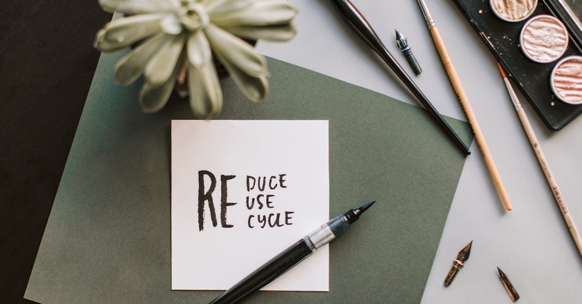
Basic Tools
Starting with fancy lettering requires surprisingly few tools. A set of brush pens in varying tip sizes provides the most immediate results, as brush pens produce natural thick-thin variation without the learning curve of dip pens. Tombow Dual Brush Pens and Pentel Fude Touch Sign Pens are reliable starting points. For more refined work, a pointed dip pen with a flexible nib (such as a Nikko G or Hunt 101) and bottled ink offer greater control over stroke variation. Smooth, bleed-resistant paper is essential: Rhodia, Clairefontaine, or HP Premium LaserJet paper all perform well. A light table or window for tracing, a ruler for guidelines, and a pencil for sketching round out the basic toolkit.
Building Decorative Elements
The transition from basic lettering to fancy lettering happens through the deliberate addition of decorative elements. These are not random embellishments but structured ornamental components, each with its own conventions and principles.
Swashes are extended entry or exit strokes on letters, typically on capitals or on the first and last letters of a word. Effective swashes follow smooth, confident curves and avoid crossing over the letters they extend from. They should feel like natural extensions of the stroke rather than appendages.
Flourishes are more elaborate ornamental strokes that extend into the space around and between letters. They often form loops, spirals, or figure-eight patterns. The cardinal rule of flourishing is that loops should never cross other loops at the same angle: crossing strokes should meet at roughly perpendicular angles to maintain visual clarity.
Drop caps are oversized, decorated initial letters that begin a word or paragraph. In fancy lettering, drop caps often incorporate illustrative elements, inline patterns, or dimensional effects. They serve as visual anchors that draw the eye and establish the decorative tone for the rest of the composition.
Inline details involve adding a thin line or pattern within the thicker strokes of a letter, creating a sense of dimension and refinement. This technique, common in Victorian and Art Deco lettering, transforms solid strokes into something lighter and more intricate. It requires a steady hand and a fine-tipped pen or brush.
Practice Progression
A sensible progression for developing fancy lettering skills begins with mastering basic letterforms. Before adding any decoration, you need confident, consistent base letters. Spend time with fundamental stroke drills: ovals, vertical strokes with entry and exit curves, compound curves, and connecting strokes. Once your basic letters are reliable, begin adding simple swashes to capitals, focusing on smooth curves and consistent weight. Gradually increase complexity, adding flourishes, then inline details, then combined treatments. Study historical examples from lettering manuals, Victorian trade cards, and the work of master calligraphers for inspiration and structural understanding.
Fancy Lettering for Design Projects
Fancy lettering is not merely an artistic exercise. It has direct, practical applications across a wide range of design disciplines. The key is matching the style and intensity of the decorative lettering to the context and audience.
Wedding invitations remain the most common context for fancy lettering, and for good reason. The visual language of ornamental script, with its associations of elegance, tradition, and personal care, aligns naturally with the occasion. Calligraphic or flourished script styles work best here, and many couples commission hand-lettered invitation suites for the uniqueness and warmth that custom work provides. For those using wedding fonts instead, pairing a decorative script with a clean serif for details creates a balanced, readable hierarchy.
Certificates and diplomas rely on fancy lettering to communicate formality and significance. The decorative quality of the lettering signals that the document is important, that it represents an achievement worth commemorating with visual care.
Product packaging for premium goods frequently uses fancy lettering to communicate quality, heritage, and craft. Wine labels, artisanal food packaging, perfume boxes, and luxury gift items all benefit from decorative lettering that positions the product as special and worth its price.
Social media graphics use fancy lettering to stop the scroll. In a feed full of standard typography and photography, a hand-lettered quote or decoratively typeset headline stands out through sheer visual distinctiveness.
Logo design draws on fancy lettering traditions when a brand wants to communicate artisanal quality, historical roots, or personal touch. Hand-lettered and custom script logos create immediate personality and are inherently difficult to replicate, giving brands a distinctive visual identity.
Book covers use decorative lettering to establish genre, mood, and quality before the reader opens the first page. Historical fiction, romance, fantasy, and literary fiction frequently feature fancy lettering on their covers, drawing on the associations each style carries. For comprehensive lists of display faces suited to these applications, see the guide to calligraphy fonts.
Digital Fancy Lettering
Digital tools have opened new possibilities for creating fancy lettering without traditional pen-and-ink methods. While the fundamentals of good letterform construction remain the same regardless of medium, digital workflows offer specific advantages: unlimited undos, precise symmetry tools, easy scaling, and the ability to combine hand-drawn and typographic elements seamlessly.
iPad and Procreate
Procreate on the iPad with an Apple Pencil has become one of the most popular platforms for digital lettering. The pressure sensitivity of the Apple Pencil replicates the thick-thin variation of brush and pointed pen work, and Procreate’s brush engine allows users to create or download custom brushes that simulate specific lettering tools. The Streamline setting smooths strokes in real time, compensating for the slight wobble that occurs when drawing on glass.
For fancy lettering specifically, Procreate’s layer system allows you to build decorative compositions in stages: base letters on one layer, flourishes on another, inline details on a third. This layered approach makes it easy to experiment with decorative treatments without risking the underlying letterforms.
Adobe Illustrator
Illustrator remains the professional standard for lettering that needs to be delivered as vector artwork. Its Pen tool and Bezier curves allow for precise construction of letterforms and decorative elements, and its Stroke and Width profiles can simulate calligraphic variation. For lettering artists who work in a hybrid workflow, scanning or photographing hand-drawn lettering and then refining it in Illustrator combines the organic quality of handwork with the precision of digital tools. Exploring graphic design software options can help you identify the right tool for your preferred workflow.
Adding Flourishes Digitally
One of the most practical digital techniques for fancy lettering is adding flourishes and decorative elements to existing letterforms. Starting with a well-drawn or typeset base word, you can extend strokes, add ornamental curves, and build surrounding decoration using digital drawing tools. The advantage of working digitally is the ability to draw flourishes on separate layers, adjust their weight and position independently, and flip or rotate elements for symmetry. The risk is over-polishing: digitally drawn flourishes can look mechanical if every curve is too smooth and every spiral too perfect. Intentionally introducing subtle variation in stroke weight and curve shape helps maintain a handcrafted feel.
Fancy Lettering Alphabet Ideas
Creating a complete fancy lettering alphabet, all twenty-six letters in a consistent decorative style, is one of the most effective exercises for developing your skills and building a personal portfolio of lettering work.
A to Z Inspiration Approaches
One productive method is to choose a single decorative treatment and apply it consistently across all twenty-six letters. Draw the entire alphabet with Victorian inline details, or with Art Nouveau organic curves, or with heavy brush strokes and gestural flourishes. The constraint of a single style forces you to solve different structural problems with the same visual vocabulary, and the result is a cohesive set that demonstrates range within consistency.
Another approach is to draw each letter in a different style, creating a sampler alphabet that showcases the breadth of fancy lettering possibilities. This is less practical as a working alphabet but excellent as a learning exercise and portfolio piece, as it requires you to study and execute multiple styles.
Themed Alphabets
Themed alphabets add a conceptual layer to the decorative work. A botanical alphabet incorporates plant forms into each letter, with vines wrapping around strokes and flowers blooming from terminals. A celestial alphabet might feature star patterns, crescent shapes, and radiating lines. A maritime alphabet could integrate rope textures, anchor forms, and wave motifs. The theme provides a creative constraint that generates ideas and pushes you beyond generic decoration into more inventive territory.
Themed fancy letters also have strong commercial potential. Illustrated alphabets sell well as prints, digital downloads, and licensing properties. They work as educational materials for children, as decorative art for nurseries and classrooms, and as design assets that other creatives can use in their own projects.
Developing a Consistent Decorative Style
The ultimate goal for any lettering artist working in the fancy lettering space is to develop a recognizable personal style. This does not happen overnight. It emerges through sustained practice, study of historical and contemporary examples, and experimentation with different tools and techniques. Pay attention to the decorative choices that feel most natural and satisfying to you. Some letterers gravitate toward minimal, precise flourishing; others toward dense, maximalist ornamentation. Some prefer the structural discipline of blackletter; others the fluid grace of copperplate scripts.
Consistency comes from developing a set of personal conventions: how you treat terminals, what angle your flourishes follow, how much contrast you build between thick and thin strokes, what relationship your decorative elements have to the underlying letter structure. Document these decisions as you discover them. Over time, they become the visual fingerprint that makes your fancy lettering identifiably yours.
Frequently Asked Questions
What is the difference between fancy lettering and calligraphy?
Calligraphy is a specific discipline focused on writing beautiful letterforms with a pen, brush, or marker, following established scripts and traditions. Fancy lettering is a broader category that includes calligraphy but also encompasses hand lettering, decorative type design, digitally created ornamental letters, and any approach to letterforms that emphasizes visual beauty and decoration. All calligraphy can be considered fancy lettering, but not all fancy lettering is calligraphy.
What fonts look like fancy lettering?
Script fonts such as Great Vibes, Pinyon Script, and Alex Brush mimic calligraphic fancy lettering. For blackletter styles, UnifrakturMaguntia is a strong free option. Cinzel Decorative offers ornamental serif lettering. Lobster provides bold, retro-styled script. Parisienne and Tangerine deliver elegant, delicate scripts. All of these are available free through Google Fonts, and many premium options on foundry sites offer even richer character sets with additional swash and flourish alternates.
How do I start learning fancy lettering?
Begin with a set of brush pens and smooth paper. Practice basic strokes (ovals, upward curves, downward strokes) to build muscle memory and control. Then progress to forming simple letters, focusing on consistency before adding decoration. Study historical lettering specimens and contemporary lettering artists for structural understanding. Add swashes, flourishes, and decorative details gradually as your base letterforms become confident. Consider taking an online course focused on a specific style that appeals to you, whether that is pointed pen calligraphy, brush lettering, or Victorian ornamental lettering.
Can I create fancy lettering digitally without hand-drawing skills?
Yes, to a degree. Starting with a decorative font and customizing it in Illustrator or Procreate is a valid approach. You can extend strokes, add flourishes, adjust letterforms, and combine elements from different fonts to create something more personalized than a straight font setting. However, understanding basic letterform structure, even at a conceptual level, will significantly improve the quality of your digital fancy lettering. Studying how strokes connect, where weight changes occur, and how flourishes relate to letter anatomy helps you make more informed design decisions even when working entirely digitally.
What is the best fancy lettering style for wedding invitations?
Calligraphic script styles, particularly those derived from copperplate and Spencerian traditions, remain the most popular choice for wedding invitations. These styles communicate formality, elegance, and personal care. Modern calligraphy, with its more relaxed, organic quality, suits less formal weddings and couples who want a contemporary feel. For digital production, fonts like Great Vibes, Pinyon Script, or premium options such as Burgues Script provide the calligraphic look with the consistency and scalability that professional printing requires.


