What Is Web Design? A Complete Guide
Every website you visit — from a local bakery’s homepage to a sprawling e-commerce platform — was shaped by decisions about layout, color, type, and interaction. Those decisions fall under the discipline of web design: the process of planning, conceptualizing, and arranging content intended for the internet. It sits at the intersection of visual communication and technology, drawing on many of the same graphic design principles used in print while introducing constraints and possibilities unique to the screen. If you are new to the broader field, our guide on what is graphic design provides useful context before you continue here.
This article covers the web design definition in full, explains how it differs from web development, breaks down the core elements every designer must consider, walks through the standard design process from discovery to launch, and outlines the principles, tools, and career paths that define the discipline today.
Web Design Definition
The web design meaning, at its simplest, is the creation of websites. But that one-liner undersells the scope. A more precise web design definition is: the practice of planning the structure, visual appearance, and interactive behavior of websites so that users can find, understand, and act on the content presented to them. It encompasses visual design (how a site looks), user experience design (how a site feels to navigate), user interface design (how interactive elements behave), and front-end considerations (how design decisions translate into code).
Web design is not a single skill. It is a convergence of disciplines — typography, color theory, layout, information architecture, interaction design, and accessibility — all applied within the technical constraints of browsers, screen sizes, and connection speeds. A web designer may specialize in one area or work across several, depending on the size of the team and the scope of the project.
Web Design vs. Web Development
The distinction between web design and web development is one of the most common points of confusion for people entering the field. The simplest way to frame it: designers create the look, feel, and experience; developers build it.
A web designer determines how a homepage should be structured, which typefaces to use, what colors reinforce the brand, how navigation should behave, and what the user sees at each step of a journey. The deliverable is typically a set of design files — mockups, prototypes, style guides — that specify every visual and interactive detail.
A web developer takes those specifications and writes the HTML, CSS, JavaScript, and back-end code that makes the design function in a browser. Front-end developers work closest to the design, translating visual layouts into responsive, accessible code. Back-end developers handle server logic, databases, and application functionality that the user never sees directly.
In practice, the boundary is not rigid. Many designers write HTML and CSS. Many developers have a strong eye for layout and typography. On small teams or freelance projects, one person may handle both roles entirely. The overlap has grown with the rise of design tools that export production-ready code and development frameworks that give developers fine-grained control over visual output. Regardless of overlap, understanding where design ends and development begins helps teams communicate clearly and build better products.
Core Elements of Web Design
Every website is built from a finite set of design elements. Mastering them — individually and in combination — is what separates competent web design from guesswork. Here are the elements that matter most.
Layout and Grid
Layout is the arrangement of visual elements on a page. It determines what users see first, where their eyes travel next, and how content groups relate to each other. Most professional web layouts are built on grid systems — invisible structural frameworks that divide the page into columns and rows. Grids enforce alignment, create visual rhythm, and make complex pages feel orderly rather than chaotic.
The 12-column grid is the most common standard in web design, largely because 12 divides evenly into halves, thirds, quarters, and sixths, giving designers flexibility within a consistent structure. CSS Grid and Flexbox have made grid-based layouts far easier to implement than they were in the era of float-based hacks, which means designers can now propose more ambitious layouts with confidence that developers can build them faithfully.
Typography
Type is the primary carrier of information on almost every website. Choosing the right typefaces, sizes, weights, line heights, and spacing is not decoration — it is a core usability decision. Poor typography makes content harder to read, reduces time on page, and undermines credibility. Strong web typography makes content inviting, scannable, and accessible across devices.
Web designers typically work with a type scale: a set of predefined sizes for headings, subheadings, body text, captions, and labels that maintain proportional harmony. Pairing a serif with a sans-serif, or using different weights of a single family, creates contrast without visual noise. For a deeper look at how letterforms work and why they matter, see our guide on what is typography.
Color
Color sets mood, directs attention, signals interactivity, and reinforces brand identity. A web designer selects a palette — usually a primary color, one or two secondary colors, and a set of neutrals — and applies it consistently across backgrounds, text, buttons, links, icons, and borders. The choices are never arbitrary. Color psychology plays a direct role: blue suggests trust and stability (banking, healthcare), green signals growth or sustainability, red creates urgency (sales, alerts), and so on.
Beyond aesthetics, color must meet accessibility standards. The Web Content Accessibility Guidelines (WCAG) require a minimum contrast ratio of 4.5:1 between text and its background for normal-sized type. Designers who ignore contrast ratios produce sites that are difficult or impossible to read for users with low vision or color deficiencies.
Imagery and Graphics
Photography, illustration, iconography, and video give websites visual interest and emotional resonance. The choice between a photograph and an illustration, or between a detailed icon set and a minimal one, shapes the personality of the site as much as the color palette does. Web designers must also consider performance: unoptimized images are the single largest contributor to slow page loads. Modern formats like WebP and AVIF, responsive image techniques (srcset), and lazy loading are standard considerations during the design phase, not afterthoughts.
Navigation
Navigation is the system that lets users move through a website. It includes the primary menu, secondary menus, breadcrumbs, footer links, search bars, and any other wayfinding elements. Good navigation is invisible — users find what they need without thinking about the mechanism. Bad navigation is the fastest way to lose visitors. Web designers structure navigation based on information architecture: the logical organization of content into categories, subcategories, and pages. Card sorting, tree testing, and user flow mapping are common research methods used to validate navigation structures before visual design begins.
Responsive Design
More than half of global web traffic comes from mobile devices. Responsive web design is the approach that ensures a single website adapts gracefully to any screen size — phone, tablet, laptop, desktop, or ultra-wide monitor. Rather than building separate mobile and desktop sites, responsive design uses fluid grids, flexible images, and CSS media queries to reflow content based on the viewport width.
Responsive design is not just a technical implementation detail. It is a design philosophy that affects every decision from layout to typography to navigation. A menu that works at 1440 pixels wide may need to collapse into a hamburger icon at 375 pixels. A three-column grid may need to restack into a single column. Body text that reads well at 16 pixels on desktop may need to increase to 18 pixels on mobile for comfortable reading. The designer must plan for all of these states, not just the one that looks best in a portfolio mockup.
Types of Web Design
Not all websites serve the same purpose, and the type of site directly influences the design approach.
Static vs. Dynamic Websites
A static website delivers the same fixed content to every visitor. The pages are pre-built HTML files that do not change unless a designer or developer manually updates them. Static sites are fast, secure, and simple — well-suited for portfolios, landing pages, and small business sites with content that rarely changes.
A dynamic website generates content on the fly, often pulling from a database and customizing what each user sees based on their behavior, preferences, or account data. E-commerce stores, social media platforms, news sites, and web applications are all dynamic. Dynamic sites require more complex design thinking because the designer must account for variable content — product listings that grow, user-generated reviews, personalized recommendations — rather than fixed text and images.
Single-Page vs. Multi-Page Websites
A single-page website (also called a one-pager) presents all content on a single scrolling page, often with anchor links that jump to different sections. This format works well for event promotions, product launches, personal portfolios, and any scenario where the content is linear and the user goal is straightforward.
A multi-page website uses a traditional structure with separate pages connected by navigation. Most business websites, publications, and platforms are multi-page because they contain enough content to warrant categorization and separate entry points. The design challenge is maintaining consistency and coherence across dozens or hundreds of pages while giving each page type — homepage, about page, product page, blog post — a layout suited to its function.
Web Applications
Web applications (web apps) are interactive software products that run in the browser. Think of project management tools, email clients, design editors, or banking dashboards. Designing a web app is closer to product design than traditional web design. The focus shifts from presenting content to enabling tasks, managing complex states (loading, error, empty, populated), and creating interfaces that users interact with for extended periods. Web app design demands rigorous attention to usability, performance, and accessibility because users depend on the tool rather than simply browsing it.
The Web Design Process
Professional web design follows a structured process. The exact steps and terminology vary by team, but the general flow is consistent across the industry.
Discovery
Every project starts with research. The designer gathers information about the business, its goals, its audience, its competitors, and any existing brand assets or guidelines. Discovery may include stakeholder interviews, user surveys, analytics review, competitor audits, and content inventories. The output is typically a creative brief or project brief that defines the scope, objectives, and constraints of the design work ahead.
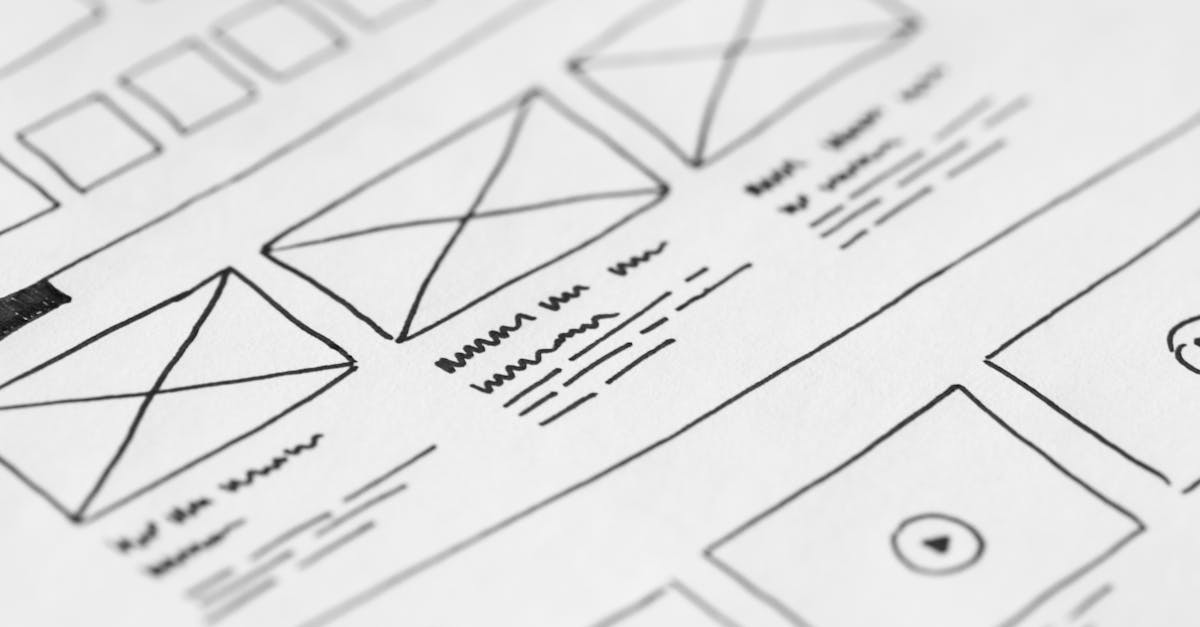
Wireframing
Wireframes are low-fidelity structural blueprints that show where elements will go on each page without specifying colors, typefaces, or imagery. They focus on hierarchy, content placement, and user flow. Wireframing is fast and cheap, which makes it the right stage for experimentation. A designer might produce three different wireframe concepts for a homepage, test them with stakeholders or users, and refine the strongest one before investing time in visual design.
Visual Design
With wireframes approved, the designer applies the visual layer: color palette, typography, imagery, iconography, spacing, and branding. This is where the site’s personality emerges. Visual design comps (also called mockups or high-fidelity designs) show exactly what the finished pages will look like at specific screen sizes. Designers create these in tools like Figma, Sketch, or Adobe XD.
Prototyping
A prototype adds interactivity to static mockups. Clickable prototypes let stakeholders and test users navigate between screens, interact with menus, fill out forms, and experience transitions — all without writing a line of code. Prototyping reveals usability issues that are invisible in static files. A button that looks intuitive in a mockup may confuse users in practice. A page flow that seems logical on paper may feel disorienting when clicked through. Catching these problems before development saves significant time and cost.
Development Handoff
Handoff is the process of transferring finalized designs to the development team with enough detail for accurate implementation. Modern design tools generate style specifications, export assets, and provide CSS values automatically. A well-organized handoff includes a component library, spacing and sizing documentation, interaction notes, and responsive breakpoints. Poor handoff leads to a built site that looks noticeably different from the approved designs.
Testing
Before launch, the site is tested across browsers (Chrome, Firefox, Safari, Edge), devices (phones, tablets, desktops), and assistive technologies (screen readers, keyboard navigation). Testing catches rendering inconsistencies, broken interactions, accessibility failures, and performance bottlenecks. Designers review the built site against their original comps and flag deviations. User testing at this stage provides a final check on usability.
Launch and Iteration
Launch is not the end of the design process. It is the beginning of a feedback loop. Post-launch analytics, heatmaps, user session recordings, and A/B tests reveal how real users interact with the site. Designers use this data to make informed refinements — adjusting layouts, rewriting calls to action, simplifying navigation, or rethinking page structures. The best websites are continuously improved, not designed once and forgotten. Staying current with web design trends helps inform these ongoing refinements.
Web Design Principles
Principles guide the decisions designers make at every stage of the process. These five are foundational.
Visual Hierarchy
Visual hierarchy is the arrangement of elements so that users perceive the most important information first. Size, color, contrast, spacing, and position all contribute to hierarchy. A large, bold headline draws the eye before a smaller paragraph of body text. A brightly colored button stands out against a neutral background. Without clear hierarchy, pages feel flat, and users struggle to determine where to look or what to do next.
Consistency
Consistency means using the same visual and interactive patterns throughout a site. Buttons should look and behave the same way on every page. Heading styles should follow a predictable scale. Link colors should not change from section to section. Consistency reduces cognitive load and creates balance — once a user learns how one part of the site works, they can predict how the rest will work. Design systems and component libraries enforce consistency at scale.
Accessibility
Accessible web design ensures that people with disabilities can perceive, understand, navigate, and interact with a website. This includes users who are blind or low-vision (screen reader compatibility, sufficient contrast), deaf or hard of hearing (captions, transcripts), motor-impaired (keyboard navigation, large click targets), and cognitively diverse (clear language, predictable layouts). Accessibility is not an optional add-on. In many jurisdictions it is a legal requirement, and in all contexts it is a measure of design quality. A site that excludes users by design is a site that has failed at its fundamental purpose.
Performance
Design decisions directly affect how fast a site loads. Heavy images, custom fonts, complex animations, and excessive JavaScript all add weight. Users abandon sites that take more than three seconds to load, and search engines penalize slow pages in rankings. Performance-conscious designers optimize images, limit font file sizes, use animation sparingly, and collaborate with developers to ensure that visual ambition does not come at the cost of speed.
Mobile-First Design
Mobile-first is a design strategy that begins with the smallest screen and progressively enhances the layout for larger viewports. Starting with mobile forces designers to prioritize content ruthlessly — there is no room for clutter on a 375-pixel-wide screen. It also ensures that the mobile experience, which is how most users will encounter the site, receives primary attention rather than being treated as a compressed afterthought of the desktop layout.
Tools Used in Web Design
The tools a web designer uses depend on the task, the team, and personal preference. Four platforms dominate the current landscape.
Figma is a browser-based design tool that has become the industry standard for UI and web design. Its key advantage is real-time collaboration — multiple designers, developers, and stakeholders can view and edit the same file simultaneously. Figma handles layout, prototyping, design systems, and developer handoff in a single environment, which has made it the default choice for most product and web design teams.
Sketch is a macOS-native design tool that pioneered many of the features now standard in the category: artboards, symbols (reusable components), and a plugin ecosystem. While Figma has overtaken it in market share, Sketch remains popular among designers who prefer a native desktop application and work primarily within Apple ecosystems.
Adobe XD is Adobe’s entry into the UI and web design space. It integrates with the broader Adobe Creative Cloud suite (Photoshop, Illustrator, After Effects), which makes it a natural fit for designers already embedded in that ecosystem. It supports wireframing, visual design, prototyping, and handoff.
Webflow is a visual development platform that lets designers build responsive, production-ready websites without writing code. It blurs the line between design tool and development environment. Designers who want full control over the final output — without depending on a developer to translate their mockups — use Webflow to design and publish directly. It is particularly popular among freelancers and small agencies.
Beyond these four, web designers routinely use image editors (Adobe Photoshop, Affinity Photo), vector tools (Adobe Illustrator, Affinity Designer), and code editors (VS Code) depending on the project requirements.
Career Paths in Web Design
Web design offers multiple career trajectories, each with a different balance of visual, technical, and strategic skills.
A web designer in the traditional sense creates the visual layouts and user interfaces for websites. This is a generalist role that requires proficiency in design tools, an understanding of HTML/CSS basics, and strong visual communication skills. Web designers work at agencies, in-house design teams, and as freelancers. Building a strong design portfolio is essential for landing roles in any of these settings.
A UI designer focuses specifically on the interface elements users interact with — buttons, forms, menus, modals, toggles, and navigation patterns. UI designers often work on web applications and digital products where interaction design is central to the user experience.
A UX designer takes a broader view, focusing on the entire user journey rather than individual screens. UX designers conduct user research, create personas and journey maps, define information architecture, and test prototypes with real users. The role is more research-driven and strategic than visual.
A front-end developer with design skills (sometimes called a design engineer or creative developer) bridges the gap between design and code. These professionals implement designs in HTML, CSS, and JavaScript while making nuanced visual decisions during development. They are highly valuable because they eliminate the translation loss that occurs during handoff.
A freelance web designer runs an independent practice, handling client acquisition, project management, design, and sometimes development. Freelancing offers autonomy and variety but demands business skills alongside design skills.
With experience, web designers can move into design leadership — roles like design director, head of design, or VP of design — where the focus shifts from producing work to managing teams, setting design strategy, and ensuring quality across an organization’s digital presence.
Frequently Asked Questions
Is web design the same as web development?
No. Web design focuses on the visual appearance, layout, and user experience of a website. Web development focuses on writing the code that makes those designs function in a browser. Designers determine how a site should look and behave; developers build it. The two disciplines overlap — many professionals have skills in both — but they are distinct areas of expertise with different tools, processes, and deliverables.
Do I need to know how to code to be a web designer?
You do not need to be a proficient programmer, but understanding the basics of HTML and CSS is strongly recommended. Knowing what is technically feasible — and what is expensive or fragile to build — makes you a more effective designer. It improves your communication with developers and helps you create designs that translate cleanly into code. Many designers also learn enough CSS to prototype interactions or build simple pages themselves.
What is the difference between UI design and UX design?
UI (user interface) design deals with the visual and interactive elements a user directly engages with: buttons, menus, forms, icons, and layouts. UX (user experience) design deals with the overall experience a user has while interacting with a product, including research, information architecture, user flows, and usability testing. UI is a subset of UX. A strong web designer understands both, even if they specialize in one.
How long does it take to design a website?
Timelines vary widely depending on scope. A simple landing page might take one to two weeks. A multi-page business website typically takes four to eight weeks. A complex web application or e-commerce platform can take three to six months or longer. The discovery and wireframing phases often take as long as the visual design phase, and testing and iteration add time after the initial design is complete.
What is the most important skill for a web designer?
The ability to solve communication problems visually. Technical skills with tools can be learned, and trends change constantly, but the fundamental capacity to organize information, guide attention, and create clarity through visual decisions is what separates effective web designers from people who simply know how to use design software. Empathy for the end user — understanding their goals, context, and constraints — underpins every good design decision.


