Graphic Design Trends 2026: What Is In and Out
The defining theme of graphic design trends 2026 is a reaction against the flat, frictionless, AI-default look that flooded the last few years. Expressive typography, tactile texture, hand-made marks, and bold maximalist color are in; sterile gradients, generic geometric sans-only systems, and the over-polished “corporate Memphis” illustration style are out. Below is an honest read on what’s rising, what’s fading, and — more usefully — which trends are worth adopting versus which are just noise.
Trends only matter once you can execute the fundamentals, so treat this alongside the durable skills in our graphic design skills guide, the logo design process, and color theory basics — the things that don’t go out of style.
What’s in for 2026
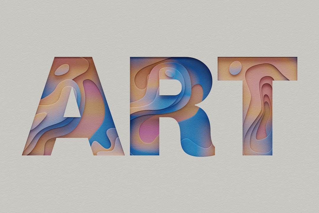
Expressive, oversized typography
Type is the loudest trend. Designers are treating headlines as the primary visual element — huge scale, tight tracking, mixed weights, and characterful display faces over clinical geometrics. Slightly imperfect, “designed-by-a-human” faces like Bricolage Grotesque and editorial serifs like Instrument Serif are everywhere because they read as deliberate and warm rather than generated.
Anti-AI texture and imperfection
As AI imagery became instantly recognizable, brands started signaling authenticity through texture: grain, paper, risograph print artifacts, visible halftones, hand-drawn marks, and analog photography. The deliberately imperfect look is now a differentiator — it says “a person made this.”
Bold, maximalist color
The muted, safe palettes of the late 2010s are giving way to saturated, high-energy color and unexpected pairings. Confident brands are using color as identity rather than decoration — see color theory basics for building palettes that stay coherent even when they’re loud.
Motion and kinetic type
With variable fonts mainstream and web animation cheap, type that moves — kinetic headlines, animated logos, scroll-reactive lettering — is a growing part of digital identity systems rather than a gimmick reserved for showreels.
Retro and analog revival
Late-’90s and Y2K influences, plus broader vintage and mid-century cues, continue to feed nostalgia-driven design. The skill is borrowing the feeling without producing pastiche.
What’s out for 2026
- Generic AI-default aesthetics. The soft-gradient, glossy 3D blob, vaguely-futuristic look that signals “made in thirty seconds” is now a liability, not a shortcut.
- Corporate Memphis illustration. The flat, big-limbed, pastel character style is thoroughly exhausted.
- Sterile minimalism for its own sake. Stripping everything to a thin geometric sans and lots of white space now reads as generic rather than premium.
- Over-engineered gradients and glassmorphism applied without purpose.
- Trend-chasing logos. Identities built entirely on a passing style date fast — the opposite of what a logo should do.
What to actually adopt (and what to skip)
Not every trend deserves your project. A practical filter:
| Trend | Adopt when… | Skip when… |
|---|---|---|
| Expressive typography | Brand voice is confident, content is short | You have dense, utilitarian content to read |
| Anti-AI texture | Authenticity is core to the brand | It muddies legibility or print reproduction |
| Maximalist color | You can maintain contrast and accessibility | The brand needs calm, trustworthy restraint |
| Kinetic type | The work lives primarily on screen | Print/static is the main deliverable |
| Retro revival | It genuinely fits the brand story | It’s purely decorative nostalgia |
Typography trends to watch specifically
Because type leads the year, it’s worth calling out the specific directions: high-contrast serifs paired with quiet sans bodies; variable fonts used for fluid weight and width shifts; wide and condensed extremes used for tension; and a return of decorative, characterful display faces. The constant: let the headline carry personality while the body stays calm and readable. For the rules behind that pairing logic, our graphic design skills guide and broader typography coverage go deeper.
How to use trends without dating your work
- Anchor on fundamentals first. Hierarchy, contrast, grid, and legibility never go out of style; trends sit on top of them.
- Apply trends to the surface, not the structure. Let texture, color, and type personality flex while the underlying system stays solid — especially for logos, which should outlast any trend (see the logo design process).
- Pick trends that fit the brand story, not trends that are merely popular.
- Test for accessibility. Bold color and expressive type still have to clear contrast and legibility bars.
- Build a system, not a one-off. A trend you can systematize (a color logic, a type scale) ages better than a single flashy layout.
Trends by medium: print, digital, and brand
A trend that sings in one medium can fall flat in another, so it helps to sort 2026’s directions by where they actually belong:
- Digital and web. Kinetic type, variable-font weight shifts, scroll-reactive layouts, and bold interactive color systems live here. Motion is the differentiator, and variable fonts make it cheap to ship.
- Print and packaging. This is where anti-AI texture earns its keep — risograph, spot colors, embossing, uncoated stock, and tactile finishes that a screen can’t fake. Maximalist color reproduces beautifully on physical substrates.
- Brand identity systems. The trend here is flexibility: expressive type and color held together by a strong, restrained core mark. The logo stays timeless while the system around it flexes with the year — the exact balance covered in the logo design process.
Matching the trend to the medium is half the battle. Texture that reads as premium on uncoated paper can become noise on a small screen; motion that delights in a browser is meaningless in a static print ad.
The throughline of 2026
If there’s one idea connecting every trend this year, it’s human authorship as a value. After a flood of generated, interchangeable visuals, audiences reward work that feels intentional, tactile, and made by someone with a point of view. Expressive type, analog texture, and confident color are all ways of signaling that. The brands that win in 2026 aren’t the ones chasing the most trends — they’re the ones using a few of them to look unmistakably like themselves.
Frequently Asked Questions
What are the biggest graphic design trends for 2026?
The biggest are expressive oversized typography, anti-AI texture and imperfection (grain, risograph, hand-made marks), bold maximalist color, kinetic and animated type, and retro/analog revivals. The unifying theme is human authorship — work that looks intentionally made by a person rather than generated by default.
What design styles are going out of style in 2026?
Generic AI-default aesthetics (soft gradients, glossy 3D blobs), corporate Memphis illustration, sterile minimalism for its own sake, purposeless glassmorphism, and trend-chasing logos are all fading. These styles now read as generic or quickly dated rather than fresh or premium.
Should I follow design trends for a logo?
Be cautious. A logo should outlast trends, so build it on fundamentals — strong concept, clarity, and timelessness — and let trends influence surrounding brand elements like color and texture instead. A logo built entirely on a passing style dates fast. See our logo design process guide for a durable approach.
Is AI imagery still in for 2026?
Default-looking AI imagery is out as a trend — audiences now recognize and discount it. The reaction is a move toward texture, analog photography, and hand-made marks that signal authenticity. AI remains useful as a tool in the workflow, but the generic generated look itself is a liability rather than an asset.
How do I use trends without my work looking dated?
Anchor on timeless fundamentals — hierarchy, contrast, grid, legibility — and apply trends to the surface rather than the structure. Choose trends that fit the brand’s story, systematize them into reusable color and type logic, and always check accessibility. A few well-chosen trends age far better than many chased at once.


