UI Design Trends 2026: What Is Shaping Interfaces
The UI design trends 2026 worth your attention aren’t about chasing novelty, they’re about the genuine shifts in how interfaces look, feel, and behave this year. The headline change is that AI has moved from a feature bolted onto products to a force reshaping the interface itself, while on the visual surface, expressive typography and bold, confident minimalism continue to define modern screens. This guide separates the trends that matter from the ones that will date fast.
A quick caveat before we start: trends are the surface layer. They sit on top of the timeless fundamentals in our UI design principles guide, hierarchy, contrast, feedback, which don’t change. The best work applies stable principles through the visual language of the moment, so treat these trends as styling choices, not replacements for the basics.
1. AI-Driven and Conversational Interfaces
The biggest shift in 2026 is structural. AI has changed interfaces from things you navigate to things you talk to. Conversational and prompt-driven UIs, search boxes that accept natural language, assistants embedded directly in products, generative actions, are now mainstream rather than experimental.
For designers, this raises new questions: how do you signal what an AI feature can do? How do you design for unpredictable, generated output instead of fixed screens? How do you keep users in control and able to undo? The interfaces that win aren’t the ones with the most AI, they’re the ones that make AI legible and trustworthy. Expect to design more empty states, suggestion chips, and graceful handling of uncertainty than ever before.
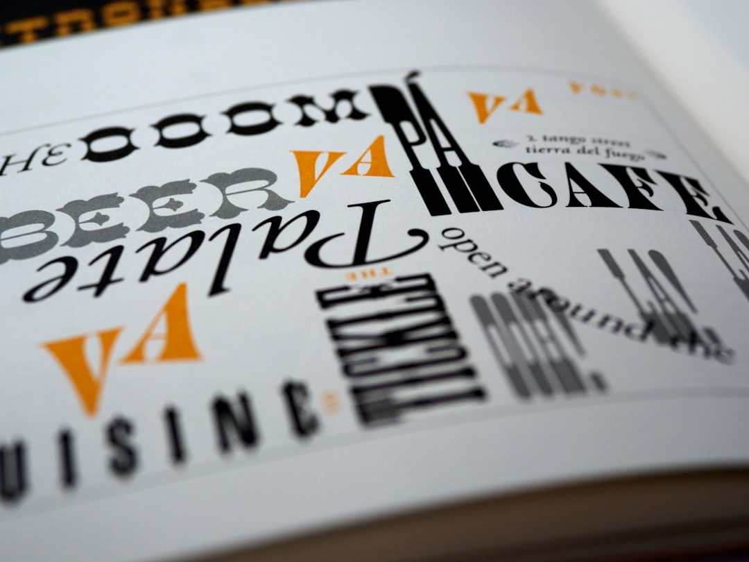
2. Expressive, Oversized Typography
Type is doing more visual work than it has in years. Large, confident headlines, variable fonts that flex weight and width, and type used as a primary graphic element, not just to label things, define a lot of 2026 interfaces. The trend favors character: distinctive grotesques, high-contrast display faces, and the occasional serif used boldly where sans-serifs once dominated.
This is a trend that rewards type knowledge. If you want to wield expressive type without sacrificing legibility, especially across screen sizes, our web typography guide covers building a scale that stays readable while still making a statement.
3. Bold Minimalism (Not Empty Minimalism)
Minimalism has matured. The flat, sparse, slightly sterile minimalism of the past has given way to what’s often called bold or expressive minimalism: still clean and uncluttered, but with strong color, confident type, and clear focal points. The restraint is in the number of elements, not in their energy.
The practical takeaway is that “minimal” no longer means “timid.” A 2026 minimal interface might use one saturated accent color at full strength, generous whitespace, and a single oversized headline, clean, but anything but boring.
4. Purposeful Motion and Micro-Interactions
Motion continues to mature from decoration into communication. Micro-interactions, the small animations when you toggle a switch, complete an action, or pull to refresh, do real work: they confirm input, guide attention, and make products feel responsive and alive. The 2026 sensibility favors motion that’s quick, subtle, and meaningful over flashy transitions that slow people down.
Good motion reinforces a core principle, feedback. Every animation should answer “what just happened?” or “what can I do next?” rather than simply showing off. When in doubt, make it faster and quieter.
5. Dark Mode as Default, Not Afterthought
Dark mode is no longer a toggle teams add at the end, it’s increasingly the primary design context, with light mode as the variant. Designing dark-first changes your decisions: you think in terms of layered surfaces and elevation rather than drop shadows, you tune color saturation carefully (fully saturated colors vibrate uncomfortably on dark backgrounds), and you pay closer attention to contrast.
This is where design tokens earn their keep, supporting both themes cleanly is far easier when colors are tokenized. Our guide to design systems explains how token-based theming makes light and dark modes two values rather than two designs.
6. Richer Color and Subtle Depth
After years of flat, restrained palettes, 2026 interfaces are embracing more color and a touch of dimensionality. Gradients are back, used with more subtlety than the heavy-handed versions of the past. Soft shadows, gentle blurs, and translucent layers add a sense of depth and hierarchy without returning to skeuomorphism. The aim is to make interfaces feel tactile and layered while staying clean.
Used well, depth supports hierarchy, elevated surfaces read as more important or more interactive. Used poorly, it’s noise. The discipline is to let depth serve structure, not decorate it.
7. Accessibility Moving From Compliance to Craft
One of the most encouraging shifts is that accessibility is increasingly treated as a design quality rather than a legal checkbox. More teams are designing with sufficient contrast, clear focus states, scalable type, and reduced-motion options from the first screen. This dovetails with dark mode and expressive type, both of which can go wrong for accessibility if handled carelessly. Designing accessible, fluid type is central here; our responsive typography guide is a good companion for getting it right.
Trends to Approach With Caution
Not every trend deserves your time. A few to be skeptical of:
- Heavy decorative effects that hurt usability. If an effect makes text harder to read or actions harder to find, it fails regardless of how current it looks.
- AI features added for novelty. An AI feature that doesn’t solve a real user problem is friction, not innovation.
- Trend-chasing over consistency. Adopting every new style fragments your product. Pick what fits your brand and apply it consistently.
The test for any trend is simple: does it serve the user and the principles, or just the portfolio? Apply the ones that pass, and let the rest go.
How to Use Trends Without Being Dated
The safest way to stay current is to keep your foundation, principles, type system, and design system, stable, and treat trends as a thin, swappable layer on top. That way, when the visual mood shifts again next year, you update tokens and styling rather than rebuilding. Ground your work in the fundamentals first; if you’re still building that base, start with our UI design principles pillar and layer the trends here on top.
Frequently Asked Questions
What are the biggest UI design trends in 2026?
The defining trends are AI-driven and conversational interfaces, expressive oversized typography, bold (not empty) minimalism, purposeful motion and micro-interactions, dark mode as a default rather than an afterthought, and richer color with subtle depth. Accessibility is also increasingly treated as craft rather than compliance.
Is minimalism still a trend in 2026?
Yes, but it has evolved. The flat, sparse minimalism of the past has given way to bold or expressive minimalism, still clean and uncluttered, but with strong color, confident typography, and clear focal points. The restraint is in the number of elements, not in their energy or impact.
How is AI changing UI design?
AI is shifting interfaces from things you navigate to things you converse with, through natural-language search, embedded assistants, and generative actions. This makes designers focus on signaling what AI can do, handling unpredictable output, and keeping users in control, with more emphasis on empty states and graceful uncertainty.
Should I follow every UI design trend?
No. Trends are a surface layer over timeless principles like hierarchy and feedback. Adopt trends that serve your users and brand, and apply them consistently. Skip decorative effects that hurt usability, AI features added for novelty, and trend-chasing that fragments your product’s coherence.
How do I keep my designs current without them dating quickly?
Keep your foundation, design principles, type system, and design system, stable, and treat trends as a thin, swappable layer on top. Tokenize colors and styles so refreshing the look means updating values rather than rebuilding. Ground decisions in fundamentals first, then apply current styling over them.