Magazine Layout Design: Grids and Best Practices
Magazine layout is the art of making many short pieces feel like one coherent publication. Unlike a book, a magazine juggles features, departments, sidebars, captions, and advertising — all of which have to share a visual logic. The grid is what makes that possible, and the type system is what makes it readable.
This guide covers the grids, alignment, and pacing that professional magazine designers rely on. It sits under our editorial design guide, the pillar for the publication-design cluster.
The Magazine Grid
Most magazines are built on a multi-column grid, typically two to four columns depending on page size and reading distance. The columns give you flexible flow: a feature can run wide across three columns for a calm read, while a department page splits into narrow columns to pack in more, shorter items.
Two grid concepts do most of the heavy lifting:
- The column grid sets vertical structure — how text and images divide horizontally across the page.
- The baseline grid sets horizontal rhythm — every line of body text snaps to a shared baseline so columns align across the gutter and across spreads.
The baseline grid is the secret behind that clean, professional feeling in good magazines: when you flip a page, body lines in the left and right columns sit at exactly the same height. For the underlying theory and column math, read our guide to grid systems in graphic design.
Building the Type System
A magazine needs a deliberate, compact set of type styles applied consistently across every issue. At minimum, define styles for:
- Body text — the workhorse, set at roughly 9–10pt with leading around 120–135%.
- Headlines — large and distinct, the entry point of each feature.
- Standfirsts / decks — the bridge between headline and body.
- Subheads — to break up long features.
- Captions and credits — small, often a contrasting style or weight.
- Pull quotes — large, used to break text and create rests.
For type pairing, a common and reliable structure is a serif for body and a sans for furniture, or the reverse. Contemporary text serifs like Tiempos and Lyon hold up beautifully at body sizes while their display cuts give headlines real personality. Pair them with a clean grotesque such as Founders Grotesk for decks and captions. If you want a deeper framework for choosing complementary families, our font pairing guide walks through the principles.
Anatomy of a Feature Spread
The feature opener is where a magazine spends its visual budget. It announces a new section, sets tone, and pulls the reader in. The strongest openers commit to one dominant element — a full-bleed image or an oversized headline — rather than competing focal points.
A typical feature sequence:
- Opener spread — dominant image or headline, minimal body text.
- Continuation spreads — body text returns to the full column grid, with images and pull quotes pacing the read.
- Closing spread — often a lighter touch that releases the reader toward the next section.
Pacing and Rhythm Across the Issue
Readers move through a magazine front to back, so the issue needs rhythm. Alternate dense department pages with airy feature openers; follow a text-heavy spread with a visual one. If every page carries the same density, the reader fatigues.
Recurring furniture keeps the reader oriented: running heads, folios (page numbers), and section markers should appear in the same place issue after issue. Consistency in the small elements is what lets the big elements vary freely.
Handling Images and Captions
Images in a magazine should sit on the grid, not float arbitrarily. Align image edges to column edges and to the baseline grid wherever possible. Decide on a caption system early — typically a small contrasting style placed consistently relative to its image — and stick to it so readers always know where to look for context.
| Element | Typical size | Alignment |
|---|---|---|
| Body text | 9–10pt | To baseline grid, within columns |
| Captions | 7–8pt | Edge-aligned to image |
| Headlines | 30–80pt+ | Snapped to column edges |
| Folios / running heads | 7–9pt | Fixed master-page position |
Tools and Setup
Adobe InDesign is the standard for magazine work, with master pages, paragraph and character styles, and reliable PDF/X export for press. Affinity Publisher is a capable subscription-free alternative. Set up your document with a baseline grid, your column structure, and master pages for furniture before placing a single article — the system you build first is what makes every later page fast and consistent.
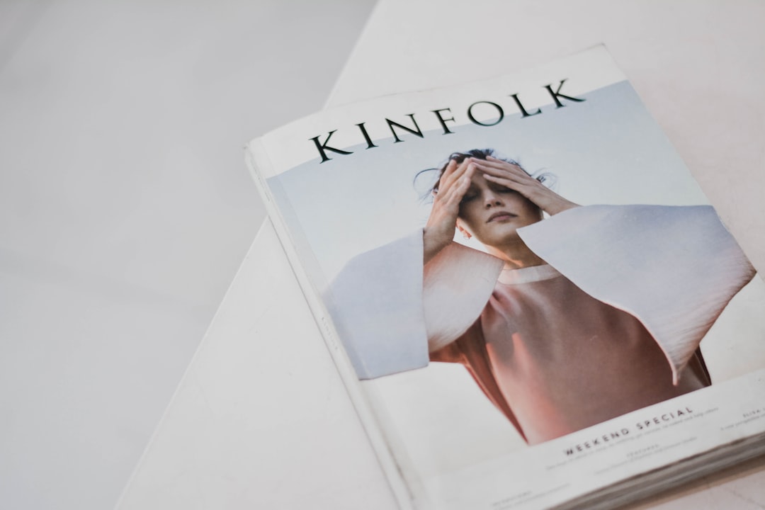
If your magazine has a cover, the same discipline applies there; see our principles for cover design, much of which translates directly to a strong magazine front.
Frequently Asked Questions
What grid is best for magazine layout?
A multi-column grid of two to four columns suits most magazines, combined with a baseline grid so body text aligns across columns and spreads. Use wider columns for calm features and narrower ones for dense department pages. The exact column count depends on page size and content density.
What is a baseline grid in magazine design?
A baseline grid is a set of evenly spaced horizontal lines that body text snaps to, so every line sits at a shared height across columns and spreads. It is the main reason professional magazines look clean — when you flip a page, text lines in adjacent columns align exactly.
What font size should magazine body text be?
Magazine body text typically runs about 9–10pt with leading around 120–135% of the type size, aiming for roughly 45–75 characters per line. Captions sit smaller at 7–8pt. These ranges balance density with readability; tighter measures suit narrow department columns, wider measures suit features.
How do I design a feature opener spread?
Commit to one dominant element — a full-bleed image or an oversized headline — rather than competing focal points. Keep body text minimal on the opener, then return to the full column grid on continuation spreads. The opener’s job is to announce the feature and pull the reader in.
Which software is best for magazine layout?
Adobe InDesign is the industry standard, offering master pages, paragraph styles, baseline grids, and press-ready PDF/X export. Affinity Publisher is a strong subscription-free alternative with similar capabilities. Both handle multi-page documents far better than tools like Figma, which lacks true automatic text flow.


