Font Pairing Guide: How to Combine Typefaces That Work
Good font pairing is mostly about managing contrast and avoiding conflict. A pairing works when the two typefaces are clearly different enough to create hierarchy, yet share enough underlying structure to feel intentional. The fastest reliable formula is a distinctive face for headlines and a quiet, highly legible face for body text. This guide gives you the rules professionals actually use, plus tested combinations you can drop into a website, deck, or brand today.
If you’d rather skip straight to ready-made combinations for a specific context, jump to our supporting guides: best Google Font pairings for websites, serif and sans-serif pairings designers use, Canva font pairings, PowerPoint font pairings, resume font pairings, font combinations by industry, and the modern font pairings for 2026.
The one principle behind every good pairing: contrast with harmony
Type pairing fails in two directions. Too similar and the fonts look like a mistake — two near-identical sans-serifs read as a glitch, not a choice. Too different, with no shared logic, and the page feels chaotic. The sweet spot is meaningful contrast: a clear difference in role (headline vs. body), supported by some shared DNA (era, proportion, or x-height) so the two faces feel like they belong to the same system.
Hold two ideas at once: make the difference obvious, make the relationship feel deliberate.
The vocabulary you need first
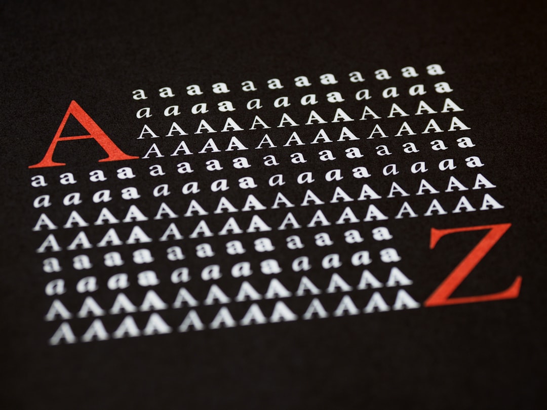
A handful of terms make every pairing decision faster. Serif fonts have small strokes (feet) at the ends of letters; sans-serif fonts don’t. Contrast, in type, is the variation between thick and thin strokes within a letter — a “high-contrast” face like Playfair has dramatic thicks and thins; a “low-contrast” sans like Inter is nearly uniform. x-height is the height of a lowercase “x” relative to the capital; tall x-heights read larger and feel more modern. Weight is stroke thickness (Light, Regular, Bold, Black). And a typeface is the whole design while a font is technically one weight/style of it. Keep these in mind and the rules below click into place.
Rule 1: Pair by contrast, not by similarity
The most dependable pairing is a serif with a sans-serif, because the structural difference (with vs. without serifs) does the hierarchy work for you. A classic: Playfair Display headlines over Source Sans 3 body, or Fraunces headlines over Inter body. The serif brings character up top; the sans keeps long text clean and legible.
When you do pair two sans-serifs or two serifs, force contrast another way — weight (Black headline / Regular body), width, or scale. Two fonts at the same weight, size, and style with only tiny differences is the most common amateur mistake. A practical test: if you squint and the two fonts blur into the same gray texture, they’re too similar to create hierarchy. You want a visible jump between the headline and the body when you step back from the screen.
Rule 2: Establish a clear hierarchy
A pairing exists to separate levels of information: headline, subhead, body, captions. Decide which font owns which level and stick to it. Typically:
- Display/headline font — the characterful one. Used large and sparingly.
- Body font — the workhorse. Maximum legibility, neutral personality.
- Accent (optional) — small caps, labels, or a mono for data.
Two fonts is the safe default. Three is the practical maximum, and only when each has a clear, distinct job. More than that and you’ve lost the plot.
Rule 3: Match the mood and the era
Fonts carry connotations. A geometric sans (Futura, Poppins) feels modern and clean; a transitional serif (Georgia, Lora) feels classic and trustworthy; a high-contrast didone (Playfair Display, Bodoni) feels luxurious and editorial. Pair fonts whose moods reinforce the same message. A playful rounded display over a stiff legal-document serif sends mixed signals. Pairing within a shared era — two faces that could plausibly come from the same design period — almost always reads as coherent.
Rule 4: Use superfamilies for instant harmony
The lowest-risk pairing strategy is to use a superfamily — a set of fonts designed to work together with matching proportions and metrics. These are designed to pair:
- IBM Plex — Sans, Serif, Mono, and Condensed. Pair Plex Serif headlines with Plex Sans body and you cannot go wrong.
- Source — Source Serif 4 + Source Sans 3 (+ Source Code Pro). Adobe’s open, reliable trio.
- Noto — Sans + Serif across nearly every writing system; the multilingual safe choice.
- Roboto — Roboto + Roboto Slab + Roboto Mono.
Superfamilies remove guesswork because the contrast (serif vs. sans) is built in while the harmony (shared skeleton) is guaranteed. All four above are free under open licenses — see our free-for-commercial-use fonts list to grab them safely.
Rule 5: Mind x-height, scale, and spacing
Two fonts can be conceptually perfect and still look broken if their x-heights clash. When a body font has a tall x-height and a headline font has a short one (or vice versa), set sizes optically rather than mathematically — bump or shrink one until they feel balanced, not until the point sizes match. Set generous line height for body text (1.4–1.6), tighten headline leading, and give all-caps display text extra letter-spacing. Pairing is as much about spacing as font choice.
Rule 6: Limit yourself to two (maybe three) fonts
Restraint reads as polish. A single well-chosen pairing applied consistently looks more professional than five fonts fighting for attention. If you need more variety, get it from weights and styles within your two families — Light, Regular, Semibold, Bold, Italic — rather than adding new typefaces. A variable font like Inter or Fraunces gives you an entire range of expression from one file.
Tested pairings you can use today
These combinations are reliable starting points. All are free Google Fonts unless noted.
| Use case | Headline | Body | Why it works |
|---|---|---|---|
| Modern startup / SaaS | Space Grotesk | Inter | Distinctive techy display over a neutral, legible UI workhorse |
| Editorial / blog | Fraunces | Source Serif 4 | High-contrast character headline, comfortable long-form serif |
| Premium brand | Playfair Display | Inter | Luxurious didone serif against a clean modern sans |
| Corporate / trustworthy | IBM Plex Serif | IBM Plex Sans | Superfamily harmony, professional and coherent |
| Friendly / approachable | Poppins | Work Sans | Geometric warmth up top, optimized screen body |
| Editorial display, 2026 feel | Bricolage Grotesque | Lora | Contemporary quirky display, classic readable serif |
For the full set tuned to live websites, see best Google Font pairings for websites. For the serif-plus-sans logic specifically, see serif and sans-serif pairings designers use.
Pairing for specific tools and documents
The right pairing depends on where it lives. The fonts available in Canva, PowerPoint, and a resume PDF aren’t the same, and each context has its own constraints:
- Canva — work within its built-in library; we cover the best safe combinations in Canva font pairings.
- PowerPoint / Google Slides — stick to fonts that travel between machines; see PowerPoint font pairings.
- Resumes — legibility and ATS-safety matter more than flair; see resume font pairings.
- By industry — finance, tech, beauty, and law each have conventions; see font combinations by industry.
A repeatable process for choosing a pairing from scratch
When you’re staring at a blank canvas, work in this order instead of scrolling font lists at random:
- Pick the body font first. It carries the most words and the most risk, so choose a proven, legible reading face — Inter, Work Sans, Source Serif 4, or Lora — before anything else. Get the foundation right and the headline is easy.
- Define the mood in one word. “Trustworthy,” “playful,” “luxurious,” “technical.” That word narrows the headline category instantly: didone serif for luxurious, geometric sans for technical, rounded sans for playful.
- Choose a headline font that contrasts the body. If the body is a sans, lean toward a serif or a high-character display face, and vice versa.
- Test with real content. Paste an actual headline and two paragraphs of real copy — never “lorem ipsum” at a single size. Problems only show up with genuine text.
- Set the type scale. Lock in sizes for H1, H2, body, and captions so the hierarchy is consistent everywhere.
This sequence — body first, mood second, contrast third — prevents the most common failure mode: falling in love with a pretty headline face and then forcing an awkward body font to live underneath it.
Pairing for the web specifically
On websites, pairing decisions interact with performance and accessibility. Limit your families to keep page weight down, prefer variable fonts so you ship one file instead of many weights, self-host for speed and privacy, and make sure your body font stays legible at 16px and up. Faces like Inter, Work Sans, and Source Serif 4 were drawn for screens and remain crisp at small sizes — which is exactly why they appear in so many of our website pairings.
Quick troubleshooting: why a pairing looks off
- They look too similar — your two fonts share a category and weight. Swap one for a different category or push the weight/scale contrast.
- It looks chaotic — too many fonts, or two display faces competing. Cut back to one display + one body.
- The sizes feel wrong — clashing x-heights. Adjust optically, not by matching point sizes.
- It feels dated or off-brand — mood mismatch. Re-pick within a single era and tone.
- Body text is tiring — line height too tight or measure too wide. Set 1.5 line height and 60–75 characters per line.
Staying current: 2026 pairing directions
Type trends in 2026 favor expressive, slightly imperfect display faces (Bricolage Grotesque, Instrument Serif) over clinical geometrics, paired back with calm, highly legible bodies. The pattern holds: let the headline carry personality and the body carry the reading load. For the current crop, see our modern font pairings for 2026 and broader font trends for 2026.
Frequently Asked Questions
How do I pair fonts that work together?
Pick one distinctive font for headlines and one highly legible font for body text, then create clear contrast — usually a serif with a sans-serif. Keep some shared DNA (era, proportion, or x-height) so the two feel intentional. Stick to two fonts and let weights handle the rest.
How many fonts should I use in one design?
Two is the safe default — one for headlines, one for body. Three is the practical maximum, and only when each has a distinct job, such as adding a monospace for data. For more variety, use different weights and styles within your two families rather than adding new typefaces.
What is the easiest reliable font pairing?
Use a superfamily like IBM Plex or Source, which includes matching serif, sans, and mono designed to work together. Pair the serif for headlines with the sans for body and the contrast and harmony are both built in. All are free under open licenses.
Can I pair two serif fonts or two sans-serifs?
Yes, but you must create contrast another way since the serif-vs-sans difference is gone. Use a strong weight difference (Black headline over Regular body), differing width, or a large scale jump. Avoid two faces that are similar in category, weight, and size at once.
What’s the most common font pairing mistake?
Choosing two fonts that are too similar — same category, weight, and size — so the page looks like an error rather than a deliberate choice. The fix is to increase contrast in category, weight, or scale, and to assign each font a clear role in the hierarchy.
Try it live: Use our free font pairing generator to preview these combinations and copy the CSS in one click.
Try it live: Use our free type scale calculator to generate a modular font-size scale and copy the CSS variables.

