Book Typography: Setting Readable Body Text
Book typography is invisible when it works. A reader should sink into the text for hours without noticing the type at all — and that effortlessness is the result of dozens of deliberate decisions about size, measure, spacing, and font choice. This guide is a practical checklist for setting body text that disappears in exactly the right way.
It is part of our broader editorial design guide, the pillar covering grids, layout, and publication craft across the cluster.
The Three Numbers That Matter Most
Three measurements do most of the work in readable body text. Get these right and you are most of the way there:
- Point size: roughly 9–11pt for printed book body text. Larger for children’s or large-print editions; smaller risks eye strain.
- Measure (line length): 45–75 characters per line, with about 66 often cited as the comfortable ideal. Too long and the eye loses its place returning to the next line; too short and reading becomes choppy.
- Leading (line spacing): about 120–145% of the type size. Longer measures generally need a touch more leading to stay easy to track.
These three are interdependent. A wider measure wants more leading; a smaller size on a generous page can take a slightly tighter line. Tune them together, not in isolation. For setting display and heading scales that complement your body size, our type scale calculator generates a harmonious size ramp.
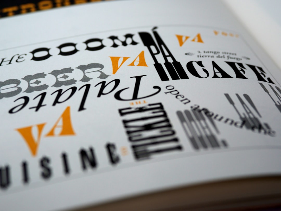
Choosing a Body Typeface
For sustained reading, old-style and transitional serifs are the proven choice. Their moderate stroke contrast and generous, open letterforms stay legible at small sizes, and their proportions feel natural in long paragraphs. Reliable workhorses:
- Garamond — an old-style classic; elegant, economical, and easy on the eye. Adobe Garamond Pro is the common professional cut (paid); EB Garamond is a strong free alternative.
- Caslon — warm and sturdy with real character; the old printer’s maxim “when in doubt, use Caslon” still holds for text.
- Minion Pro — Adobe’s purpose-built text serif with excellent optical sizes; a dependable default that ships with Creative Cloud.
For contemporary literary and editorial books that want a slightly sharper voice, Tiempos and Lyon (both paid, from Klim and Commercial Type respectively) read cleanly at body size while their display weights handle titles. Choosing a complementary face for headings is a pairing problem — our font pairing guide covers how to do it well.
Optical Sizing Matters
A typeface designed at one size does not automatically work at another. Optical sizes are separate cuts tuned for specific size ranges: text cuts have sturdier strokes, more open spacing, and larger detail to survive at 10pt, while display cuts have finer detail meant for large headlines. Fonts like Minion Pro and many quality serif families include optical size variants (caption, text, subhead, display) — use the text or caption cut for body and the display cut for titles. Using a display cut at 10pt is a common cause of body text that looks fragile and reads poorly.
Spacing, Justification, and Hyphenation
Most books set body text justified (flush on both sides), which demands good hyphenation to avoid ugly gaps. Enable hyphenation and tune the H&J (hyphenation and justification) settings so word and letter spacing stay even. If you set ragged right (flush left) instead — common in more modern or design-forward books — you avoid spacing problems but must manage the rag so it does not form awkward shapes.
Other spacing essentials:
- Avoid widows and orphans — a lone line at the top or bottom of a page, or a single word ending a paragraph. Adjust spacing or rephrase to clear them.
- Use proper punctuation — curly quotes, em dashes, and true apostrophes, never straight typewriter marks.
- Indent or space, not both — signal new paragraphs with a first-line indent or extra space, never both at once.
- Mind the kerning at display sizes — title and chapter-opener type benefits from manual kerning that body text does not need.
Page-Level Considerations
Body type lives on a page, and the margins are part of the typography. Books traditionally use asymmetric margins — a larger outer and bottom margin — which both looks balanced and leaves room for thumbs. Sit your text on a baseline grid so facing pages align line-for-line, a detail that quietly signals quality.
| Setting | Comfortable range | Notes |
|---|---|---|
| Body size | 9–11pt | Depends on typeface x-height |
| Measure | 45–75 characters | ~66 is the classic ideal |
| Leading | 120–145% | More for wider measures |
| Paragraph indent | 1 em | Or use space, not both |
A Quick Setup Checklist
- Choose a text-optimized serif and its text optical cut.
- Set body to 9–11pt, then tune measure to 45–75 characters.
- Set leading to 120–145% and lock the text to a baseline grid.
- Enable hyphenation and refine justification, or manage a clean rag.
- Sweep for widows, orphans, and bad breaks before export.
Do this in Adobe InDesign or Affinity Publisher, where paragraph styles let you apply every decision consistently across a whole book. For the structural layer beneath the type — columns, margins, and modular construction — see our guide to grid systems in graphic design.
Frequently Asked Questions
What is the best font for book body text?
Old-style and transitional serifs work best for long reading. Garamond, Caslon, and Minion Pro are dependable workhorses thanks to their open letterforms and moderate stroke contrast. EB Garamond is a strong free option, while Tiempos and Lyon suit contemporary literary books that want a sharper voice.
What size should book body text be?
Printed book body text is typically set at 9–11pt, adjusted for the typeface’s x-height. Larger sizes suit children’s or large-print editions; smaller sizes risk eye strain. Tune the point size alongside your line length and leading, since the three settings work together to determine readability.
How long should a line of text be in a book?
Aim for 45–75 characters per line, with around 66 often cited as the comfortable ideal. Lines that are too long make the eye lose its place when returning to the start of the next line, while lines that are too short make reading feel choppy and broken.
What is optical sizing in typography?
Optical sizing means a typeface has separate cuts tuned for different sizes. Text cuts have sturdier strokes and more open spacing to stay legible at small sizes, while display cuts have finer detail for large headlines. Use the text or caption cut for body and the display cut for titles.
Should book text be justified or ragged right?
Most books use justified text with good hyphenation enabled to keep spacing even. Ragged right (flush left) avoids spacing gaps and suits more modern or design-forward books, but you must manage the rag so it does not form awkward shapes. Both are valid; choose for the book’s tone.


