Grid Systems in Graphic Design Explained
Grid systems are the invisible scaffolding behind almost every well-organized layout. A grid divides the page into columns, rows, margins, and gutters so that text and images snap to shared alignments instead of floating at random. The result is work that feels intentional and consistent — and a faster, calmer design process for you.
This guide explains the main grid types and how to build one. It supports our editorial design guide, the pillar covering publication layout across the cluster.
Why Grids Matter
A grid does two jobs at once: it makes layouts look organized, and it removes guesswork. Instead of nudging every element by eye, you align to predefined columns and a baseline. That consistency is what separates professional layouts from amateur ones, and it scales — a grid keeps a 200-page document coherent in a way intuition alone never could.
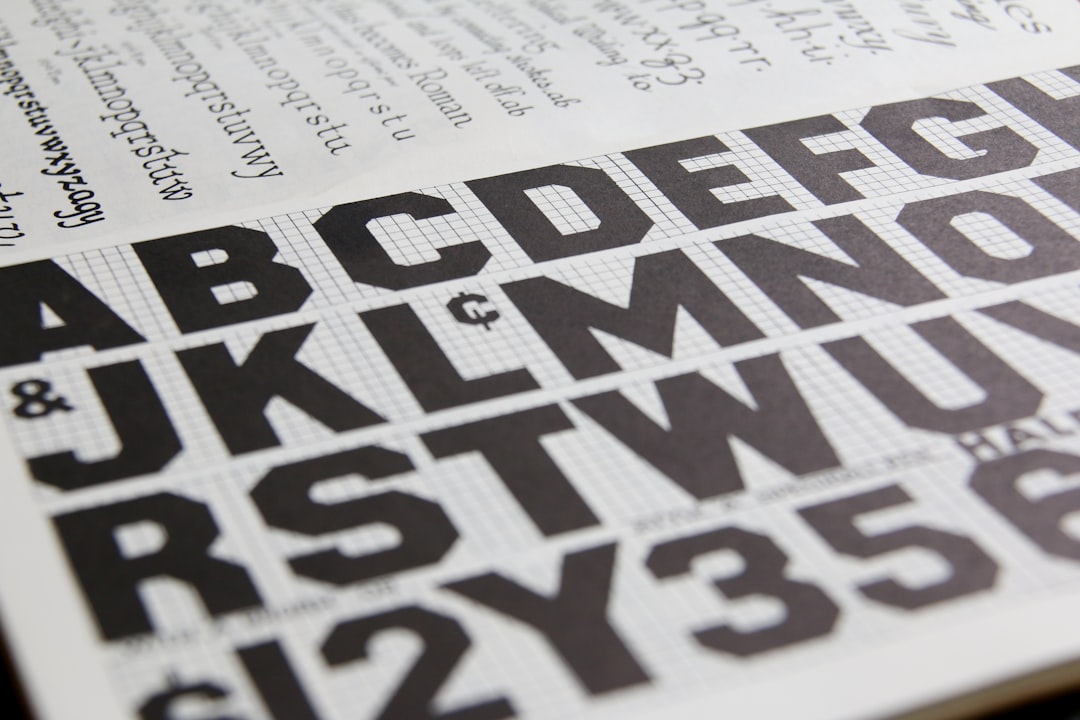
The systematic use of grids is rooted in mid-century Swiss design (the International Typographic Style). Josef Müller-Brockmann’s Grid Systems in Graphic Design codified the approach and remains the standard reference; it is worth reading if you want the full theory behind what follows.
The Anatomy of a Grid
Every grid is built from the same parts:
- Margins — the space framing the content area; they protect content from the trim and give the page room to breathe.
- Columns — vertical divisions that text and images align to.
- Gutters — the gaps between columns that keep adjacent content from colliding.
- Rows / modules — horizontal divisions (in modular grids) that create a matrix of cells.
- The baseline grid — evenly spaced horizontal lines that body text snaps to for vertical rhythm.
Types of Grids
There are four grids you will use again and again, each suited to a different kind of content.
Single-Column (Manuscript) Grid
One large text block per page, framed by margins. It is the grid of books, essays, and long-form documents — anything meant for sustained linear reading. The craft here lives in the margins and the body type; see our guide to book typography for setting that text well.
Column Grid
The page is split into two or more vertical columns. It is the backbone of magazines and newspapers because it lets content flow flexibly — a story can occupy one column or span several. For applying this to editorial work specifically, see our guide to magazine layout design.
Modular Grid
Columns crossed with rows create a matrix of modules. This is the grid for catalogs, data-heavy layouts, and image galleries, where you need to place many elements of varying size in a consistent structure. Each module (or a span of several) becomes a slot for content.
Baseline Grid
Not a layout grid on its own but an underlay: a set of horizontal lines spaced to your leading, so every line of body text across every column sits at the same height. It is the detail that makes multi-column layouts feel rigorously clean.
| Grid type | Best for | Strength |
|---|---|---|
| Single-column | Books, essays | Uninterrupted reading |
| Column | Magazines, newspapers | Flexible content flow |
| Modular | Catalogs, data, galleries | Order at scale |
| Baseline | Any multi-column text | Vertical rhythm |
Building a Grid Step by Step
- Set the page size — the format dictates everything else.
- Define the margins — books often use asymmetric margins (larger outer and bottom); screens and posters can be tighter.
- Choose the column count — two to four for most editorial work; more columns give more flexibility but more complexity.
- Set the gutter — wide enough to separate columns clearly, usually proportional to your body leading.
- Add the baseline grid — match its increment to your body leading so text locks to it.
- Add rows if needed — for a modular grid, divide the height into matching modules.
Tie your baseline increment and column proportions to your type sizes for a unified system. A consistent type scale across headings and body makes the whole grid feel harmonious — our type scale calculator generates a matching size ramp you can build the grid around.
The 8-Point Grid and Digital Layouts
On screen, many designers use an 8-point grid: all spacing and sizing is a multiple of 8 pixels (with 4 as a half-step). It keeps spacing consistent and aligns cleanly to common screen densities, which is why it is the default in many design systems. The principle is identical to print grids — shared increments produce visual order — just expressed in pixels.
When to Break the Grid
A grid is a tool, not a cage. Once the structure is solid, deliberately breaking it — a full-bleed image that ignores the columns, an element that crosses the gutter — creates emphasis and energy precisely because the rest of the layout is disciplined. The key word is deliberately. Break the grid for a reason, not because you forgot it was there. In looser formats like zine design, those deliberate breaks become part of the charm.
Tools for Working With Grids
Adobe InDesign and Affinity Publisher both offer column and baseline grid setup for print documents. Figma has flexible layout grids and is ideal for the 8-point grid in digital work. Whichever you use, set the grid up before placing content — retrofitting a grid onto a finished layout is far harder than designing to one from the start.
Frequently Asked Questions
What is a grid system in graphic design?
A grid system is a structure of columns, rows, margins, and gutters that divides a page so text and images align to shared positions. It makes layouts look organized and removes guesswork, letting designers align elements consistently. Grids are the foundation of professional editorial, print, and digital design.
What are the main types of grids?
The four main grids are the single-column (manuscript) grid for books, the column grid for magazines and newspapers, the modular grid for catalogs and data-heavy layouts, and the baseline grid for vertical rhythm. Many layouts combine a column grid with a baseline grid for clean, aligned text.
What is a baseline grid?
A baseline grid is a set of evenly spaced horizontal lines, matched to your text leading, that every line of body text snaps to. It ensures lines across different columns sit at the same height, giving multi-column layouts a clean, rigorous appearance. It is an underlay rather than a layout grid itself.
What is the 8-point grid?
The 8-point grid is a digital layout convention where all spacing and sizing uses multiples of 8 pixels, with 4 as a half-step. It keeps spacing consistent and aligns well to common screen densities, which is why many design systems adopt it as their default spacing rule.
When should you break the grid?
Break the grid deliberately, once the structure is solid, to create emphasis — for example with a full-bleed image or an element crossing the gutter. It works because the surrounding layout is disciplined. Avoid breaking the grid by accident; do it for a clear reason that draws the eye.