Mid-Century Modern Design Explained
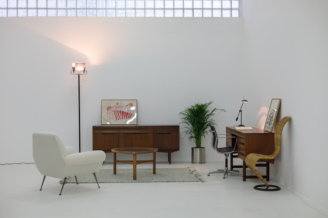
Mid-century modern design is the optimistic, clean, and quietly playful style that defined the postwar decades — roughly the mid-1940s through the 1960s. It took European modernist rigor and warmed it up with American confidence, organic shapes, and a fresh palette. Whether on a film title sequence, a corporate logo, or an Eames chair, the look still reads as timeless and effortlessly cool.
This guide explains where mid-century modern came from, its defining traits, the designers who shaped it, and how to use the style without falling into retro pastiche. For the full context, see our complete graphic design history timeline.
What Is Mid-Century Modern Design?
Mid-century modern is less a strict movement than a broad postwar aesthetic spanning architecture, furniture, product design, and graphics. After the Second World War, prosperity, suburban growth, and new manufacturing made good design widely affordable for the first time. The style answered the moment: forward-looking, uncluttered, and human, without the austerity of pre-war modernism.
Crucially, it absorbed the principles that Bauhaus emigrés carried to America when their school closed. Where the Bauhaus could feel severe, mid-century designers softened it with organic curves, warmth, and humor, making modernism feel friendly rather than utopian.
The History: Modernism Meets Madison Avenue
In graphic design specifically, the mid-century period coincided with the golden age of American advertising. The “big idea” approach — a single sharp concept communicated with wit and economy — replaced cluttered hard-sell layouts. Designers gained real status inside agencies and corporations, and the discipline of corporate identity was effectively born here.
European influence flowed in two directions: the rational Swiss design style and its grid provided structure, while the lingering glamour of Art Deco design contributed a taste for elegant geometry. American designers blended both with a native sense of optimism and play.
Defining Visual Traits
Mid-century modern graphics have a recognizable personality — clean but never cold, structured but never stiff.
- Clean geometric forms balanced with organic, biomorphic shapes (the “boomerang” and amoeba forms).
- Warm, confident color palettes: mustard yellow, teal, burnt orange, olive, and warm neutrals.
- Bold, simple logos reduced to a single memorable idea.
- Playful illustration and hand-drawn elements alongside clean type.
- Expressive typography — a willingness to mix scripts, serifs, and sans-serifs for personality.
- Generous negative space inherited from European modernism.
The combination of structure and warmth is the signature. Pure Swiss design is colder; pure Art Deco is more decorative. Mid-century modern sits in the friendly middle.
The Key Designers
A handful of American designers defined the era, and their work is still taught and imitated.
- Paul Rand — the most influential corporate identity designer of the century, responsible for the logos of IBM, UPS, ABC, and Westinghouse. He proved a logo could be simple, witty, and enduring.
- Saul Bass — revolutionized the film title sequence (for Hitchcock, Preminger, and others) and designed lasting corporate marks for AT&T and United Airlines.
- Charles and Ray Eames — the husband-and-wife duo whose furniture and films embodied the playful, problem-solving spirit of mid-century design.
- Alvin Lustig — brought abstract, modern book-cover design into the American mainstream.
- Lou Dorfsman — shaped the cohesive visual identity of CBS, one of the era’s design landmarks.
How Mid-Century Modern Compares
| Movement | Mood | Color | Shape language |
|---|---|---|---|
| Mid-century modern | Optimistic, playful | Warm, saturated | Geometric plus organic |
| Swiss design | Neutral, objective | Restrained, single accent | Strict grid |
| Bauhaus | Functional, austere | Primary colors | Pure geometry |
| Art Deco | Glamorous, luxurious | Gold, black, high contrast | Symmetrical geometry |
Think of mid-century modern as the moment European theory became American popular culture — the grid and the geometry are there, but so is a sense of fun.
Mid-Century Typography
Mid-century type is more eclectic than its Swiss cousin. Geometric sans-serifs like Futura were everywhere, prized for their clean modern feel, while warm, friendly scripts and quirky display faces added personality to advertising. The era also loved hand-lettering, giving brands a human, crafted touch alongside machine-set body copy.
To recreate the look authentically, mix a confident geometric sans for headlines with a characterful script or a clean serif for contrast. Our roundup of vintage fonts is a useful source for period-appropriate choices that avoid looking like a costume.
How to Use the Style Today
Mid-century modern has enjoyed a long revival because it hits a sweet spot: modern enough to feel current, warm enough to feel human. It suits lifestyle brands, hospitality, editorial, and anything that wants to feel optimistic and crafted rather than corporate.
- Anchor with a warm retro palette — mustard, teal, and burnt orange instantly read mid-century.
- Pair a geometric sans with one playful accent face, not five.
- Add a single organic shape (a boomerang or amoeba form) for that era’s signature.
- Keep logos and concepts simple in the Paul Rand spirit — one clear idea.
- Use illustration over stock photography for an authentic handcrafted feel.
Why the Style Keeps Coming Back
Mid-century modern has been “back in fashion” almost continuously since the late 1990s, which raises the question of why it never fully goes away. Part of the answer is balance. The style sits at a comfortable midpoint between the coldness of strict modernism and the busyness of more decorative styles, so it flatters a wide range of brands without committing to an extreme. It feels designed but not intimidating, modern but not sterile.
Another factor is cultural nostalgia paired with genuine quality. The original mid-century work was made by serious designers solving real problems, so the references hold up under scrutiny. A Paul Rand logo or an Eames chair is not just a period curiosity; it is a genuinely good solution that happens to carry an era’s flavor. Borrowing from mid-century modern therefore means borrowing proven ideas, not just a surface aesthetic, which is why the revivals keep producing strong work rather than empty pastiche.
For designers, the practical takeaway is restraint with warmth. The era’s masters earned their playfulness through discipline — a single sharp idea, a tight palette, and clean structure underneath the fun. Copy the mustard-and-teal color scheme without that underlying rigor and you get kitsch; combine the warm palette with genuine conceptual clarity and you get work that feels both timeless and contemporary.
Frequently Asked Questions
What is mid-century modern design?
Mid-century modern design is the postwar aesthetic of roughly the mid-1940s through the 1960s that blended European modernist rigor with American optimism. It features clean geometry mixed with organic shapes, warm color palettes, and simple, witty graphics. It spans architecture, furniture, product design, and graphic design.
What years are considered mid-century modern?
The period spans roughly from the mid-1940s to the late 1960s, with some definitions stretching into the early 1970s. It coincided with postwar prosperity, suburban growth, and the golden age of American advertising, which together made well-designed objects and graphics widely affordable.
Who are the most famous mid-century modern designers?
In graphic design, Paul Rand (IBM, UPS, ABC logos) and Saul Bass (film titles and corporate marks) are the defining figures. In furniture and product design, Charles and Ray Eames are the icons. Alvin Lustig and Lou Dorfsman were also highly influential in publishing and broadcast identity.
What colors define mid-century modern design?
The palette is warm and confident: mustard yellow, teal, burnt orange, olive green, and warm neutrals like cream and walnut brown. These saturated yet earthy tones distinguish mid-century modern from the cooler, more restrained palettes of pure Swiss modernism.
How is mid-century modern different from Swiss design?
Both share modernist roots and clean structure, but Swiss design is neutral, objective, and grid-strict, while mid-century modern is warmer, more playful, and more eclectic in its typography and color. Mid-century absorbed Swiss and Bauhaus ideas and softened them with American optimism and humor.


