Color Grading: A Beginner’s Guide
Color grading is the step that turns a folder of mismatched photos into a coherent visual system — the difference between an amateur gallery and a brand that looks designed. It is not about heavy filters; it is about controlling white balance, contrast, and individual colors so every image shares one deliberate look. This guide explains the core tools and the order to use them, with honest notes on Lightroom, Photoshop, and Capture One.
Color grading is the final leg of the imagery workflow in our photography for designers guide. Here is how to do it without overthinking it.
Color Correction vs Color Grading
These two terms get used interchangeably, but they are different jobs and they happen in order.
- Color correction comes first: fixing problems so the image looks accurate and neutral — correct white balance, proper exposure, natural skin tones. The goal is “right.”
- Color grading comes second: applying a creative look — warm and nostalgic, cool and clinical, muted and editorial. The goal is “intentional.”
Always correct before you grade. If you apply a stylish look on top of a color cast, you are building on a crooked foundation, and the result will fight you. Get the image neutral, then make it beautiful.
Start With White Balance
White balance is the foundation of everything. It defines what counts as neutral white under the current light, removing the orange cast of indoor bulbs or the blue cast of shade. Get it wrong and every later adjustment inherits the error; skin tones go sickly and product colors lie.
Two sliders control it: temperature (blue–yellow) and tint (green–magenta). The fastest reliable method is the eyedropper tool — click something that should be neutral gray or white in the image, and the software balances around it. Nail white balance first and the rest of the grade falls into place. It is also the first fix in any product photography edit, where color accuracy is critical.
Curves and Contrast
The tone curve is the most powerful single control in color grading. The horizontal axis is input brightness, the vertical is output; dragging the line reshapes the image’s tones.
- Set the black and white points at the ends of the curve to define your darkest and brightest values.
- An S-curve (lift the highlights, drop the shadows) adds punchy contrast — the classic move for a crisp look.
- Lifting the bottom-left point raises the blacks toward gray, producing the soft, faded, “matte” film look.
- Individual RGB curves let you push color into shadows or highlights — for example, adding warmth to highlights and coolness to shadows for cinematic split-toning.
If you learn only one grading tool deeply, make it curves. Almost every signature look can be built from curve adjustments alone.
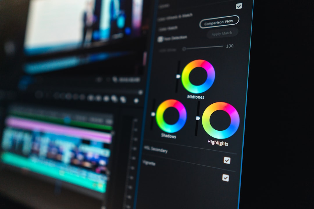
HSL: Targeted Color Control
HSL stands for Hue, Saturation, and Luminance, and it lets you adjust individual color ranges independently — a precise, surgical tool.
- Hue shifts a color (e.g., nudge greens toward teal or yellows toward gold).
- Saturation intensifies or mutes a specific color without touching the rest.
- Luminance brightens or darkens a color range (e.g., darken a blue sky for drama).
HSL is how you fix one problem color or create a signature palette — muting distracting backgrounds, making a brand color pop, or deepening skies. Because it targets ranges rather than the whole image, it gives you control no global slider can.
LUTs: Reusable Looks
A LUT (Look-Up Table) is a saved color transformation you can apply to any image or video for an instant, repeatable look. Think of it as a recipe: build a grade once, save it as a LUT, and apply the same treatment across an entire batch.
LUTs are how brands and production teams keep dozens of images and video clips consistent. In photo work, the equivalent everyday tool is a preset — a saved set of slider positions. Either way, the principle is the same: define your look once, apply it everywhere, and your imagery instantly reads as one cohesive system. This is the secret to making mismatched stock look like a deliberate set, as covered in our stock photography guide.
The Tools: Lightroom, Photoshop, Capture One
| Tool | Strength | Best for |
|---|---|---|
| Adobe Lightroom | Fast batch grading, presets, non-destructive library | Grading whole photo sets consistently |
| Adobe Photoshop | Precise, layer-based, pixel-level control | Detailed single-image work and compositing |
| Capture One | Superb color tools, tethered shooting | Studio and product photographers |
For most designers, Lightroom is the right starting point: it grades whole libraries quickly, syncs a look across many images in one click, and keeps every edit non-destructive. Photoshop is for precise, per-image work and compositing. Capture One is favored by studio and product shooters for its color tools and tethered workflow. Free alternatives exist too, but the workflow concepts transfer regardless of tool.
Common Looks and How to Build Them
Most popular grades are recipes you can recreate once you understand the tools above. A few worth knowing:
- The matte film look: lift the bottom-left point of the tone curve so blacks become soft gray, slightly desaturate, and add a touch of warmth. Reads as nostalgic and editorial.
- Cinematic teal-and-orange: push shadows toward teal and highlights toward orange using split-toning or RGB curves. Skin tones pop against cool backgrounds — the look of countless films.
- Clean and bright: accurate white balance, lifted exposure, gentle contrast, and natural saturation. The standard for e-commerce, lifestyle brands, and anything that must feel honest and fresh.
- Moody and muted: lower overall saturation, deepen shadows with an S-curve, and cool the white balance slightly for a quiet, premium feel.
The point of naming these is not to copy them blindly but to see that every “look” decomposes into the same handful of moves: white balance, curves, saturation, and color targeting. Once you can read a look, you can rebuild it — and then save it as a preset to reuse.
Color Grading Mistakes to Avoid
Beginners tend to overdo it. The most common errors:
- Skipping correction: grading over a color cast guarantees an off result no creative look can rescue.
- Over-saturating: cranked saturation looks garish and ruins skin tones; restraint reads as professional.
- Crushing the blacks too hard: losing all shadow detail flattens an image and looks heavy-handed.
- Inconsistency across a set: grading each image differently defeats the entire purpose, which is cohesion.
When in doubt, do less. A subtle, consistent grade applied across every image beats a dramatic one applied unevenly. Cohesion is the goal, not spectacle.
A Simple Grading Workflow
- Correct white balance with the eyedropper on a neutral area.
- Set exposure and contrast, then refine with the tone curve (black/white points, then an S-curve or matte lift).
- Adjust HSL to fix problem colors or build your palette.
- Apply your creative look via split-toning, a preset, or a LUT.
- Save it as a preset/LUT and sync across the whole set for consistency.
Follow this order every time and grading stops feeling random. The discipline is simple: correct, then shape tone, then target color, then apply and reuse a look. Do that across a project and your images will look like they belong to the same brand — which is the entire point.
Frequently Asked Questions
What is color grading?
Color grading is the creative process of adjusting an image’s color and tone to achieve a specific mood or consistent look — warm, cool, muted, or cinematic. It follows color correction, which first fixes problems like color casts and exposure. Grading makes a set of images feel intentional and on-brand.
What is the difference between color correction and color grading?
Color correction fixes problems so an image looks accurate and neutral, including white balance, exposure, and natural skin tones. Color grading then applies a creative look on top. Always correct first, because grading over an uncorrected color cast builds your style on a flawed foundation.
What software is best for color grading?
Adobe Lightroom is best for most designers because it grades whole photo libraries quickly and syncs a look across many images non-destructively. Photoshop suits precise single-image work, while Capture One is favored by studio and product photographers for its color tools and tethered shooting.
What is a LUT in color grading?
A LUT, or Look-Up Table, is a saved color transformation applied to images or video for an instant, repeatable look. Build a grade once, save it as a LUT, and apply it across an entire batch. In photo editing, presets serve the same purpose for consistency.
How do I make my photos look consistent?
Correct white balance on every image, then build one creative look and save it as a preset or LUT. Apply that same treatment across the whole set. Consistent white balance plus a shared look is what makes varied photos read as a single, deliberate brand system.


