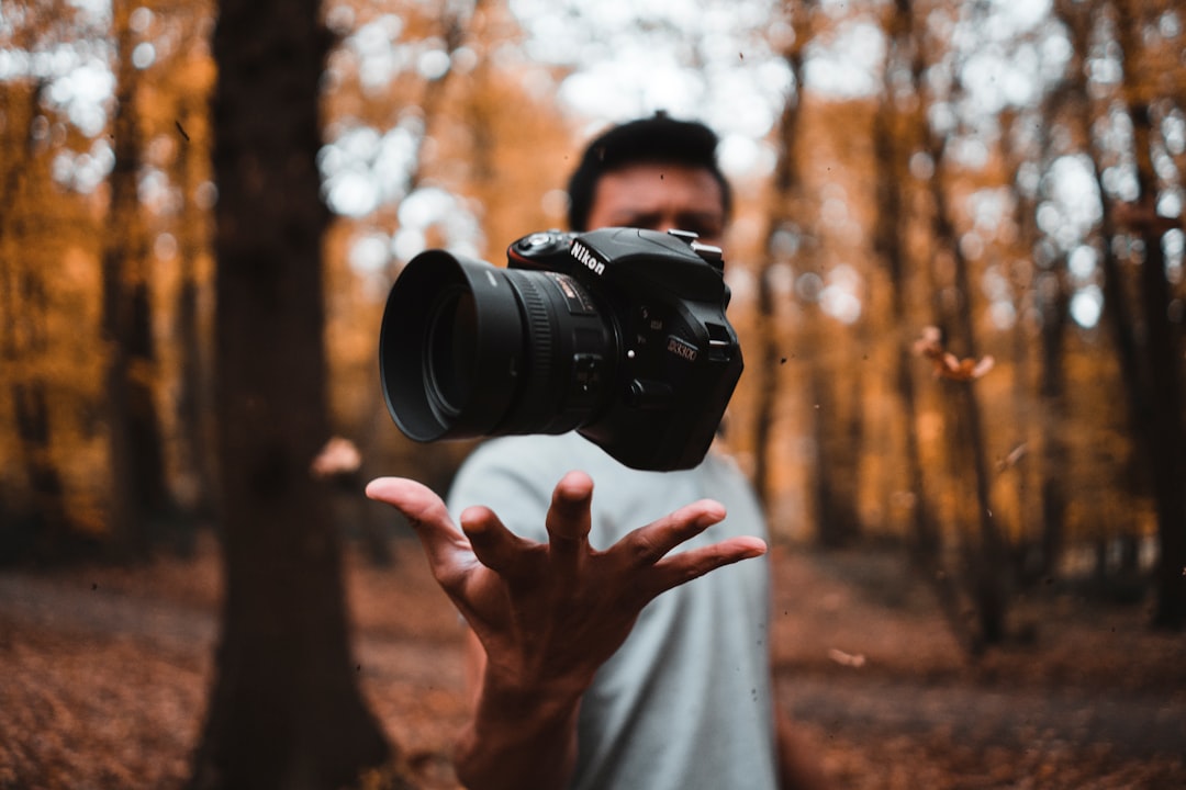
Stock Photography: A Guide for Designers
Stock photography is the fastest, cheapest way to fill a layout with usable imagery — and the easiest place to get a client into legal trouble or make work look generic. Used well, stock is invisible; used carelessly, it screams “template.” This guide covers the licenses you must understand, the releases that keep commercial work legal, and the selection habits that separate professional use from amateur padding.
For the wider picture of how imagery fits into design work, see our pillar on photography for designers. This article zooms in on sourcing images the right way.
What Stock Photography Actually Is
Stock photography is pre-produced imagery licensed for reuse, rather than commissioned for one project. A photographer shoots it speculatively, a library hosts it, and you license the right to use it under specific terms. The key mental shift for designers: you are not buying the photo, you are buying permission to use it within limits. Those limits are the whole game.
Libraries split broadly into free and paid. Free sites like Unsplash, Pexels, and Pixabay offer generous licenses at no cost. Paid agencies like Shutterstock, Adobe Stock, Getty Images, and iStock charge per image or by subscription and offer deeper, more exclusive catalogs. We compare specific options in our roundup of the best stock photo sites in 2026.
License Types You Must Understand
Three license models cover nearly everything, and confusing them is the most common — and most expensive — mistake in stock usage.
| License | What it allows | Watch out for |
|---|---|---|
| Royalty-free (RF) | Pay once or subscribe, reuse many times across projects | “Free” is a misnomer — it means no recurring royalties, not no cost |
| Rights-managed (RM) | Licensed for a defined use, region, time, and medium | Going outside the agreed scope breaches the license |
| Editorial-only | News, commentary, education contexts | Cannot be used in ads or promotion — no releases on file |
Royalty-free is what most designers use day to day: one purchase, broad reuse. Rights-managed trades flexibility for exclusivity and is worth it when a client needs an image no competitor can also use. Editorial-only is the trap — it covers recognizable people, branded products, and private property that lack legal clearance, so it is illegal to drop into a commercial campaign no matter how perfect it looks.
Model and Property Releases
Two documents decide whether you can use an image commercially:
- Model release: signed permission from a recognizable person to use their likeness commercially. Without it, you cannot use their face to sell or promote anything.
- Property release: permission to depict recognizable private property, trademarked goods, distinctive buildings, or artworks in a commercial context.
On reputable paid libraries, each image’s page states whether releases are on file. If it says “no release” or “editorial use only,” treat it as off-limits for advertising, packaging, or any promotional design. When in doubt, check the file’s license panel before you place it — fixing this after launch is far costlier than checking up front.
Free vs Paid: How to Choose
Free libraries have closed much of the quality gap, but the decision still depends on the job.
- Choose free (Unsplash, Pexels, Pixabay) for blogs, social posts, internal decks, and fast-turnaround content where budget is tight and uniqueness is not critical.
- Choose paid (Adobe Stock, Shutterstock, Getty) when you need niche subjects, guaranteed releases, vector and template assets, or imagery less likely to appear on a competitor’s site.
One honest caveat about free sites: the most popular images are wildly overused. A free hero photo you love has probably appeared on a thousand other landing pages. Paid catalogs are deeper and less saturated, which is part of what you pay for.
How to Pick Images That Don’t Look Like Stock
“Looking like stock” is a real, avoidable failure. The tells are predictable, and so are the fixes:
- Avoid the obvious clichés: staged handshakes, laughing people eating salad, generic “teamwork” poses. These read as filler instantly.
- Favor candid over posed: images with natural light and unforced moments age better and feel authentic.
- Crop hard: a tight, intentional crop often rescues a so-so image and makes it feel art-directed.
- Grade for consistency: apply one color treatment across every stock image in a project so they look like a set, not a grab bag. Our color grading guide for beginners shows how.
- Check for negative space: choose images with room for your headline rather than fighting a busy frame.
The single highest-leverage habit is grading: when ten mismatched stock photos share one consistent look, they stop reading as stock and start reading as a brand. Strong composition choices help too — see photo composition rules every designer should know for what to look for in a frame.
Common Licensing Mistakes That Cost Money
Most stock disasters trace back to a handful of avoidable errors. Knowing them is cheaper than learning them the hard way:
- Treating Google Images as a source. Search results are not a library; the vast majority of those images are copyrighted and licensed to someone else. “I found it online” is not a defense.
- Using editorial images in ads. The most common professional mistake — a perfect-looking shot of a celebrity, branded product, or landmark that lacks releases and is illegal in promotional work.
- Exceeding a rights-managed scope. Licensing an image for a regional print run and then using it in a global digital campaign breaches the agreement, even though it is the “same image.”
- Assuming free means unrestricted. Even generous free licenses can forbid reselling the unmodified file, using it to imply endorsement, or depicting recognizable people commercially without care.
- Losing the paper trail. No saved receipt or image ID means no way to prove your rights if a platform or rights-holder questions the image.
Each of these is a five-minute check at sourcing time versus a potential takedown, rework, or legal claim after launch. Build the habit of reading the license panel on every single download — it becomes automatic fast.
Building a Stock Workflow
A repeatable process keeps sourcing fast and safe:
- Define the brief: subject, mood, aspect ratio, and where copy needs to sit.
- Search smart: use specific, concrete keywords; filter by orientation and color.
- Verify the license: confirm royalty-free vs editorial and check release status before downloading.
- Download at the right size: high resolution for print, web-optimized for screen.
- Grade and place: unify the color treatment, then crop into the layout.
- Keep records: save license receipts and IDs so you can prove usage rights later.
That last step matters more than it seems. If a client or platform ever questions an image’s rights, a saved license record is the difference between a two-minute reply and a takedown. Treat documentation as part of the design deliverable, not an afterthought.
Frequently Asked Questions
Does royalty-free mean the image is free?
No. Royalty-free means you pay once (or via subscription) and then reuse the image many times without paying recurring royalties. Some libraries offer royalty-free images at no cost, but the term itself only describes the payment structure, not whether the image is free.
Can I use editorial stock photos in advertising?
No. Editorial-only images lack model and property releases, so they are restricted to news, commentary, and educational use. Using one in an advertisement, on packaging, or in any promotional design risks legal claims over likeness or trademark rights. Always check the license panel before commercial use.
Is free stock photography safe to use commercially?
Usually, but read each site’s license. Unsplash, Pexels, and Pixabay generally permit commercial use, yet some restrict reselling unmodified images or depicting recognizable people without care. Free licenses also rarely guarantee model releases, so verify before using a face to promote a product.
How do I make stock photos not look like stock?
Avoid clichéd staged scenes, favor candid imagery, crop tightly, and apply one consistent color grade across every image in a project. Consistent grading is the biggest fix — it makes a mismatched set look like a deliberate brand system rather than assorted downloads.
What is the difference between royalty-free and rights-managed?
Royalty-free lets you reuse an image broadly after a single payment. Rights-managed licenses a specific use, region, duration, and medium, often with exclusivity. Rights-managed costs more and is more restrictive, but it can guarantee that competitors are not using the same image.


