How to Make a Mood Board (With Examples)
A mood board is a curated collection of visual references — colors, type, imagery, textures, and competitor work — gathered on one surface to define a design direction before you commit to it. It is the cheapest place in any project to change your mind, and the fastest way to get a client and a designer pointing at the same thing.
This guide walks through what a mood board is for, the tools to build one in, a repeatable process, and what separates a board that guides a project from a pile of pretty pictures. A mood board is the first visual step in building a complete visual identity, so it pays to do it well.
What a Mood Board Is For
The purpose of a mood board is alignment and direction, not decoration. It answers one question: “what should this feel like?” Before anyone draws a logo or picks a font, the board lets everyone involved agree on a mood — bold and energetic, calm and editorial, warm and handmade — in a form you can point at instead of describe.
This matters because words are unreliable. “Modern” means something different to every person in the room. A mood board replaces vague adjectives with concrete images, so when you later choose brand colors or brand fonts, you have a reference to measure them against. It also de-risks the project: it is far cheaper to discover a direction is wrong at the board stage than after a finished comp.
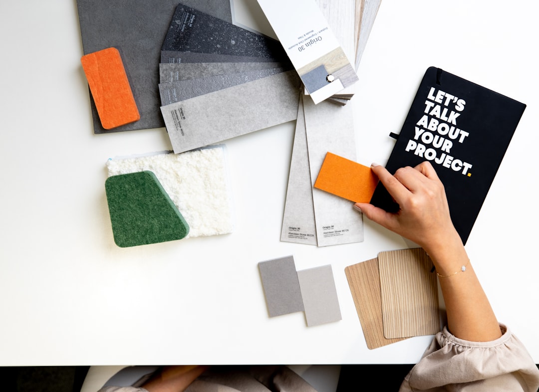
Digital vs Physical Mood Boards
You can build a mood board on a screen or on a wall. Both work; the right choice depends on how you collaborate.
| Type | Best for | Trade-off |
|---|---|---|
| Digital | Remote teams, fast iteration, easy sharing | Less tactile; easy to over-collect |
| Physical | Texture, materials, in-person workshops | Hard to share, slow to rearrange |
Most professional work today is digital because it is shareable and editable, but a physical board still wins when materials matter — packaging, fashion, interiors — because you can pin real fabric, paper stock, and finishes that a screen flattens.
The Best Tools for Building a Mood Board
You do not need expensive software. Pick the tool that matches how loosely or precisely you want to work.
- Pinterest — the fastest way to gather raw inspiration. Excellent for early, wide-net collection; weaker for a polished, presentable layout.
- Milanote — built for mood boards and creative planning. Free-form boards, drag-and-drop, and clean exports make it a favorite for client-facing work.
- Figma — ideal if your identity work continues in Figma. Infinite canvas, precise control, and the board lives next to your design files.
- Adobe tools — Illustrator, Photoshop, or Express for designers who want full layout control and integration with the rest of their pipeline.
A practical workflow is to collect widely in Pinterest, then move the strongest references into Milanote or Figma to build the curated, presentable version.
How to Make a Mood Board: Step by Step
A board comes together in a predictable sequence. Rushing the early steps produces a board that looks busy but says nothing.
- Define the brief in one sentence. Write the feeling you are chasing — “a warm, editorial wine brand for a younger audience.” This is your filter for every image.
- Collect widely. Pull 40 to 60 references without editing. Include color, type specimens, photography, textures, packaging, and at least a few things from outside your industry.
- Cut hard. Reduce to the 12 to 20 images that best express the one feeling. If an image is there because it is nice but off-brief, remove it.
- Group by theme. Cluster the survivors — color in one zone, type in another, imagery in a third. The grouping is what turns a collage into a direction.
- Add a short caption. One line per board stating the direction in words. This anchors the visuals and prevents misreading.
- Pull a starter palette. Sample three to five recurring colors so the board hands off directly into color selection.
What Makes a Strong Mood Board
The difference between a useful board and a wall of noise is almost always editing. Strong boards share a few traits.
- One clear feeling. A viewer should be able to name the mood in a few words without prompting.
- Restraint. Fewer, sharper images beat a crowded grid. Every image should earn its place.
- Range within a theme. Color, type, and imagery all represented — not twenty variations of the same photo.
- References, not the answer. A board points at a direction; it is not a draft of the logo. Avoid pinning competitors’ finished work as something to copy.
Mood Board Examples by Style
Concrete directions are easier to picture than abstract advice. Here is how the same process produces very different boards.
- Editorial / minimal: lots of white space, one serif specimen, muted neutrals, black-and-white photography, generous margins. Feeling: calm, considered, premium.
- Bold / energetic: saturated color blocks, a heavy grotesque headline face, high-contrast photography, tight grids. Feeling: confident, loud, youthful.
- Warm / handmade: textured paper, a humanist serif, earthy palette, natural-light photography, hand-drawn marks. Feeling: honest, crafted, approachable.
- Tech / clean: a neutral sans like a grotesque, cool grays with one bright accent, product photography on plain backgrounds, strict alignment. Feeling: precise, modern, trustworthy.
Each of these reads as a coherent direction because the elements agree with one another — exactly the coherence you will later codify in brand guidelines.
From Mood Board to Identity
A mood board is a beginning, not a deliverable. Its job is to feed the next decisions: the palette you sample from it, the type direction it implies, the photography style it sets. Treat it as a contract for the look — once it is approved, every later choice should be defensible against the board. If a proposed color or font does not belong on the board, that is a signal, not a stylistic preference.
Frequently Asked Questions
How many images should a mood board have?
Aim for roughly 12 to 20 curated images in the final board. Collect far more during research — 40 to 60 is normal — then cut hard. A tight board communicates a single clear direction, while a crowded one dilutes the message and confuses anyone reviewing it.
What is the difference between a mood board and a style guide?
A mood board explores a direction before any design exists; it is loose, exploratory, and made of references. A style guide or brand guidelines document the final, locked decisions — exact colors, fonts, and usage rules. The board comes first and inspires the guide that follows.
Can I make a mood board for free?
Yes. Pinterest and the free tiers of Milanote and Figma are all capable of producing a professional mood board at no cost. The quality of a board depends on curation and editing, not on paid software, so free tools are perfectly adequate for most projects.
Should a mood board include competitor work?
A little, for context — to understand the visual territory and find white space. But do not fill a board with competitors’ finished designs as things to copy. A mood board should point toward an original direction, using references as ingredients rather than a recipe to replicate.


