Vinyl Record Design: Sleeves and Labels
Vinyl record design is the most generous canvas in music packaging — and the most unforgiving on specs. You’re not designing one square; you’re art-directing a jacket, a spine, a back cover, inner sleeves, and a tiny center label, all of which have to be set up correctly for the pressing plant or you’ll pay for a reprint. This guide covers the exact dimensions, bleed, color, and layout you need to design vinyl that looks pro and presses clean.
Your vinyl package should grow out of the same concept as your album cover design — the jacket front is essentially the cover scaled up to 12 inches, so the art has to hold detail it never needed as a thumbnail. Plan the full package as one system from the start.
Vinyl Sizes and Dimensions
The record itself comes in three standard sizes, and the jacket is slightly larger than the disc. The most important numbers are the 12-inch LP jacket at 12.375 × 12.375 inches (the jacket is a touch bigger than the 12-inch disc) and the center label sizes. Build every panel at 300 DPI in CMYK with full bleed.
| Element | Approx. size | Notes |
|---|---|---|
| 12″ LP jacket (front/back) | 12.375 × 12.375 in | Add bleed; design the iconic square here |
| 12″ disc | 12 in diameter | The record itself |
| Center label (12″) | ~4 in diameter | Tiny; legibility is the whole challenge |
| 7″ single jacket | ~7.25 × 7.25 in | Smaller package, same rules |
| 10″ jacket | ~10.25 × 10.25 in | Less common, EP format |
Always get the exact template from your pressing plant. Spine width, hole punch position, and bleed vary slightly by manufacturer, and using their template is the single best way to avoid a costly setup error.
The Parts of a Vinyl Package
A full release is several connected pieces. Map them all before you start so the design carries across every surface:
- Front jacket: the hero — your cover art at full 12-inch scale.
- Back jacket: tracklist, credits, barcode, copyright, and often a secondary image.
- Spine: a narrow strip showing artist and title so it’s findable in a crate.
- Inner sleeve: can hold lyrics, liner notes, art, or be a plain printed sleeve.
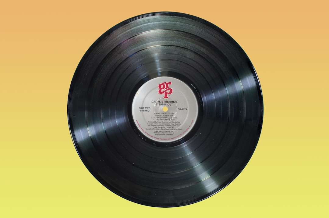
- Center label: the small printed disc — side, tracklist, catalog number, and legal text.
- Gatefold (optional): a fold-out interior doubling your art space.
Designing the Jacket
At 12 inches, the jacket rewards detail that a streaming thumbnail can’t show — fine texture, intricate illustration, and rich color. But the same art usually has to also work as Spotify cover art at thumbnail scale, so design a version that holds up small and a version that exploits the big format if the two need to differ slightly.
The spine is easy to forget and important to get right: keep the artist and title centered and legible, because that’s all anyone sees when the record is filed in a crate. Leave generous safe margins on every panel — jackets are trimmed and folded, and edge-hugging text gets clipped.
Designing the Center Label
The center label is roughly four inches across with a hole punched through the middle, which makes it the hardest piece to lay out. Everything has to read at small size and route around the center hole and spindle area.
- Keep type large and clear; reserve fine print for the perimeter.
- Account for the center hole — don’t place key elements where they’ll be punched out.
- Differentiate sides (A/B) clearly so listeners flip correctly.
- Include the essentials: tracklist, catalog number, side marking, and legal/copyright text.
- Echo the jacket’s palette and type so the label feels part of the same release.
For label type that stays readable at this size, lean on the same legibility-at-small-scale thinking that drives good font pairing — a clean, sturdy face for the data and a display face only for the title.
Color, Bleed, and Print Specs
Vinyl is print, so the rules are print rules. Design in CMYK at 300 DPI and accept that on-screen neons will shift more muted on paper. Different stocks (matte vs gloss, uncoated inner sleeves) change how color reads, so request a proof if the budget allows. Build full bleed on every panel and keep a safe margin inside each trim and fold line.
- CMYK, 300 DPI, full bleed on jacket, inserts, and label.
- Use the plant’s template for trims, folds, spine width, and the hole.
- Embed or outline fonts in print PDFs to prevent substitution.
- Proof legal text — catalog numbers and copyright lines are easy to mis-key.
Designing the Back Cover and Inserts
The back cover does the unglamorous but essential work, so give it the same care as the front. It carries the tracklist, songwriting and production credits, the barcode, catalog number, and copyright lines. The temptation is to dump all of it in small type; resist that. Set a clear typographic hierarchy — track titles larger, credits smaller, legal text smallest — and align everything to a simple grid so the panel feels designed rather than filled.
- Give the barcode quiet space and a light background so scanners read it reliably.
- Keep credits readable; fans genuinely study liner notes on physical records.
- Carry the front’s palette and type to the back so the package feels unified.
- Use inner sleeves intentionally — lyrics, an extra image, or notes turn a plain sleeve into part of the experience.
Inserts and inner sleeves are where deluxe releases earn their price. A printed inner sleeve with lyrics, an art print, or a download card gives the buyer more to hold and read, reinforcing why physical vinyl is worth owning in a streaming world.
Special Finishes and Colored Vinyl
Vinyl invites tactile, collectible touches that screens can’t match, and they’re worth designing around rather than bolting on. Common options change how your art is perceived:
- Colored or splatter vinyl: the disc itself becomes part of the design — coordinate it with the jacket palette.
- Matte vs gloss lamination: matte feels premium and muted; gloss makes color pop. Each shifts how your CMYK reads.
- Spot UV, foil, or emboss: raised or shiny accents on the title or logo add depth, but they need vector-clean artwork to register correctly.
- Etched B-side: a one-sided or etched record turns the blank face into a canvas.
Each finish has its own setup file (a spot-color or spot-UV layer, for instance), so confirm requirements with the plant early. Designing the art and the finish together — rather than adding effects at the end — is what makes a special edition look intentional instead of gimmicky.
Tie It Into the Whole Brand
A vinyl release is a flagship object, and fans treat it as collectible — so it’s worth making every panel intentional. The package should obviously belong to the same act as the merch, the posters, and any band logo design, using shared color, type, and motifs. Consistency across the physical and digital release is what makes a small band look established.
Frequently Asked Questions
What size is a vinyl record jacket?
A standard 12-inch LP jacket is 12.375 × 12.375 inches — slightly larger than the 12-inch disc inside. Design it at 300 DPI in CMYK with full bleed. The 7-inch single jacket is about 7.25 inches square and the 10-inch about 10.25 inches. Always confirm exact dimensions with your pressing plant’s template.
What size is a vinyl center label?
The center label on a 12-inch record is roughly 4 inches in diameter with a hole punched through the middle for the spindle. Keep type large and route critical elements away from the center hole. Include the tracklist, side marking, catalog number, and copyright text, set in CMYK at 300 DPI.
Do I design vinyl art in CMYK or RGB?
CMYK, because vinyl packaging is printed. RGB is only for the digital/streaming version of the cover. Note that CMYK can’t reproduce the brightest RGB neons, so saturated screen colors will print more muted. Request a printed proof when possible, since stock and finish also affect how color appears.
What is a gatefold sleeve?
A gatefold is a vinyl jacket that folds open like a book, giving you a large interior spread for additional artwork, lyrics, or liner notes. It roughly doubles your visual canvas and is common for double LPs and deluxe releases. It costs more to print, so reserve it for projects where the extra space earns its place.
Where do I get a vinyl design template?
Get the template directly from your pressing plant. Spine width, fold lines, bleed, and the center-hole position vary by manufacturer, so their template is the most reliable starting point and the best way to avoid a setup error that forces a reprint. Design every panel inside that template.