UI Kits: What They Are and How to Use Them
A UI kit is a reusable library of interface components, styles, and rules that lets a team design screens fast and keep them consistent. Instead of redrawing buttons, inputs, and cards on every screen, you assemble from a shared set of parts that all obey the same type, color, and spacing decisions. This guide explains what a UI kit actually contains, how it relates to a design system, and how to choose between buying one and building your own.
UI kits are the engine behind efficient app work covered in our complete app design guide. Read that for the broader process, then use this to set up your component library.
What Is in a UI Kit?
A good UI kit is more than a folder of pretty components. It is a connected set of decisions that compound into consistency.
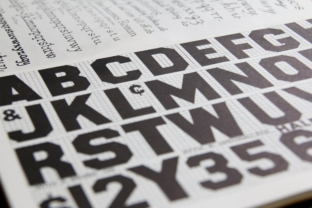
- Components — buttons, inputs, toggles, cards, navigation bars, modals, and more, each with their states (default, hover/pressed, disabled, error).
- Design tokens — the named values behind everything: color, spacing, type sizes, radius, and elevation, stored once and referenced everywhere.
- Typography styles — a defined type scale mapped to roles (heading, body, caption) rather than ad-hoc sizes.
- Color styles — semantic colors (primary, surface, error) plus light and dark variants.
- Grid and spacing rules — usually an 8-point system that keeps layouts in rhythm.
- Iconography — a consistent icon set at standard sizes.
- Usage guidance — when to use each component and when not to.
UI Kit vs Design System
People use the terms loosely, so it helps to draw the line. A UI kit is the visual building blocks — the components and styles, usually in a design tool. A design system is broader: it includes the UI kit plus the coded components, documentation, accessibility standards, content guidelines, and the governance that keeps everything in sync between design and engineering.
| Aspect | UI kit | Design system |
|---|---|---|
| Scope | Visual components and styles | Components, code, docs, principles, governance |
| Lives in | Figma / Sketch library | Design tool + code repo + documentation site |
| Owned by | Designers | Cross-functional team |
| Includes code? | Usually not | Yes |
In short: every design system contains a UI kit, but a UI kit on its own is not a design system.
How Design Tokens Power Everything
Design tokens are the most important and least visible part of a modern UI kit. A token is a named value — for example, a “primary” color or a “space-4” spacing step — that components reference instead of hard-coded values. Change the token once and every component using it updates automatically. In Figma, variables make this practical: define your palette and spacing as variables, bind components to them, and rebrand or add dark mode by swapping values rather than editing hundreds of layers. Tokens are also what let design and code share a single source of truth.
Figma Libraries in Practice
The day-to-day power of a UI kit comes from shared libraries. In Figma, you publish your components and styles as a library; every file that enables it can drop in instances that stay linked to the source. Update a button in the library and every instance across every project updates. Sketch offers the same concept through shared libraries and symbols. This is what makes a UI kit a force multiplier — fix something once, and it propagates everywhere.
Components and variants
Build components with variants so a single button component carries all its sizes, styles, and states in one tidy set, switchable with properties. This keeps your library small, makes designers’ lives easier, and mirrors how engineers think about props in code — which smooths handoff.
Popular UI Kits
You do not have to start from zero. Several well-maintained kits give you a strong foundation:
- Material Design Kit — Google’s official components for Android and beyond, matching the Material guidelines exactly.
- Apple Design Resources — Apple’s official iOS UI kits for Figma and Sketch, ideal for native iOS work.
- Community Figma kits — broad, general-purpose component libraries for rapid prototyping and dashboards.
- Tailwind-aligned kits — popular when your build uses utility-CSS, keeping design and code conventions close.
When evaluating a kit, prioritize how well it matches your target platform, how cleanly it uses tokens and variants, and how actively it is maintained.
Buy or Build?
Adopt an existing kit when you want to move fast, you are prototyping, or you are building straightforwardly on a platform with an official kit. Build your own when your brand and product are distinctive enough that a generic kit would fight you, or when you are maturing into a full design system. A practical middle path is to start from an official platform kit, then progressively replace its tokens and components with your own — you get speed now and ownership later.
Keeping a UI Kit Healthy Over Time
The biggest risk to a UI kit is not building it — it is letting it drift. Teams that treat a kit as a one-time deliverable watch it slowly diverge from the real product as designers create one-off variants and engineers ship components the kit never captured. A healthy kit needs light governance: a clear owner or small group responsible for additions, a simple process for proposing new components, and periodic audits that compare the live app against the library. When you find a one-off that has been copied three times, that is a signal it should become a proper component.
Versioning matters too. Treat your kit like software — version it, note what changed, and flag breaking changes loudly so nobody is surprised when a button’s padding shifts across every screen at once. The discipline that keeps code maintainable keeps a UI kit maintainable.
Bridging Design and Engineering
A UI kit delivers its full value only when design and code share the same vocabulary. The cleanest setups map design tokens directly to the variables used in the codebase, so a “primary” color or a “space-4” step means the same thing in Figma and in production. Component names, variants, and props should line up too: if your designers think in terms of a button with size and state variants, your engineers should find the same structure in code. This alignment turns handoff from a translation exercise into a lookup, cuts implementation bugs, and makes design review against the real build far faster. Where possible, generate token files that both sides consume from a single source, so a color change never has to be entered twice.
Getting the Most From a UI Kit
- Define tokens first, then build components on top of them.
- Use variants to keep the library compact and states explicit.
- Publish as a shared library so updates propagate automatically.
- Document when to use each component, not just how it looks.
- Keep design tokens aligned with engineering’s variables for clean handoff.
- Version the kit and communicate breaking changes to the team.
A consistent kit pays off most on high-frequency surfaces. Use yours to keep mobile navigation components uniform across screens, and to make your onboarding screens feel like the same product as the rest of the app.
Frequently Asked Questions
What is a UI kit?
A UI kit is a reusable library of interface components, styles, and design tokens that lets a team build consistent screens quickly. It typically includes buttons, inputs, navigation, typography, and color styles, usually housed in a Figma or Sketch shared library so updates propagate across every project automatically.
What is the difference between a UI kit and a design system?
A UI kit is the visual building blocks — components and styles in a design tool. A design system is broader, adding coded components, documentation, accessibility standards, content guidelines, and governance. Every design system contains a UI kit, but a standalone UI kit is not a complete design system.
What are design tokens?
Design tokens are named values — like a primary color or a spacing step — that components reference instead of hard-coded numbers. Change a token once and everything using it updates. In Figma, variables implement tokens, making rebrands, theming, and dark mode a matter of swapping values rather than editing layers.
Should I buy a UI kit or build my own?
Adopt an existing kit to move fast, prototype, or build on a platform with an official library. Build your own when your brand is distinctive or you are maturing into a full design system. A common middle path is starting from an official kit and gradually replacing its tokens and components with your own.
Where can I get UI kits?
Strong starting points include Google’s Material Design kit and Apple’s official Design Resources for iOS, both available for Figma and Sketch, plus well-maintained community libraries. When choosing, prioritize platform fit, clean use of tokens and variants, and how actively the kit is maintained.