Proposal Design: Win More Clients
A proposal is a sales document, and design is part of the pitch. Strong proposal design follows a proven path — problem, solution, scope, price, proof — and makes each step effortless to read. When a proposal looks considered and the pricing is easy to find, it signals that the work will be considered too. That impression closes deals.
This guide covers structuring and laying out a winning proposal. For the shared foundations behind every business document, see our pillar on report design.
The Winning Structure: Problem to Proof
The most reliable proposal structure moves the reader from their pain to your evidence in a clear order:
- Problem — restate the client’s challenge in their words to show you understood them.
- Solution — your approach, framed around their outcome, not your process.
- Scope — exactly what is included (and, importantly, what is not).
- Price — clear, scannable, with options where it helps.
- Proof — testimonials, case study highlights, and relevant credentials.
Leading with the client’s problem is what separates a winning proposal from a generic template. It proves you listened before you start selling.
Page Size and Layout
Proposals are almost always delivered as PDFs, read on screen, occasionally printed. Use A4 or US Letter portrait and build on a document grid so every section, table, and image aligns. A 12-column grid handles full-width narrative, two-column comparisons, and pricing tables without guesswork — see our guide to grid systems in graphic design. Keep the proposal as short as it can be while covering the five sections; a tight, well-organized proposal reads as more confident than a padded one.
Cover and First Impression
The cover should feel made-for-them, not mass-produced. Include the client’s name and project title, your organization, and the date. Personalizing the cover — even just naming the client prominently — signals effort and immediately sets your proposal apart from boilerplate. Keep it clean and on-brand; a calm, confident cover beats a busy one.
Type Hierarchy and Readability
Decision-makers skim proposals before they read them, so design for the skim and the read:
- Body text: 10–12pt for print, 16px or larger on screen, with comfortable leading around 140%.
- Clear section headings that name the structure — The Challenge, Our Approach, Scope, Investment, Why Us — so a reader can jump straight to what they care about.
- Pricing set large and clean with tabular figures so numbers align and totals are easy to find.
A professional sans like Inter works for headings, pricing, and labels with strong figures; pair it with a readable serif for body copy if you want a more premium, editorial feel. For consistent heading steps, use our type scale calculator.
Designing the Pricing Section
Pricing is the most-read section of any proposal, so design it deliberately. Make it scannable, and remove ambiguity:
| Package | What’s included | Investment |
|---|---|---|
| Essential | Core deliverables, standard timeline | $X |
| Recommended | Core plus added scope and support | $Y |
| Premium | Everything, priority timeline, extras | $Z |
A tiered table lets the client choose how much to spend rather than whether to spend, and a clearly marked recommended option guides the decision. Use the word “investment” or “package” framing, align all prices with tabular figures, and make totals unmistakable. Never make a client hunt for the number — that friction kills deals.
Building Trust With Proof
The proof section converts interest into confidence. Include a short, relevant case study highlight with real metrics, one or two genuine client testimonials with names and companies, and any credentials that matter for this specific project. Keep it relevant — proof tied to the client’s industry or problem is far more persuasive than a generic logo wall. If you publish full case studies, link or reference them so the client can dig deeper.
Brand Consistency and Polish
A proposal represents your standard of work, so it must be consistent: one palette, one type system, aligned tables, and clean spacing throughout. Build a reusable template with placeholder slots for the client name, problem, scope, pricing, and proof so each proposal is fast to produce and uniformly polished. The discipline that shows in a tidy proposal is exactly what a client is buying.
Visuals and Data
Most proposals need little data, but where you include it — a timeline, a results chart from a past project, a simple scope diagram — keep it clean and labeled. Strip chart clutter and label the key figure directly; our chart design best practices covers the essentials. A clear project timeline graphic is often the single most useful visual in a proposal.
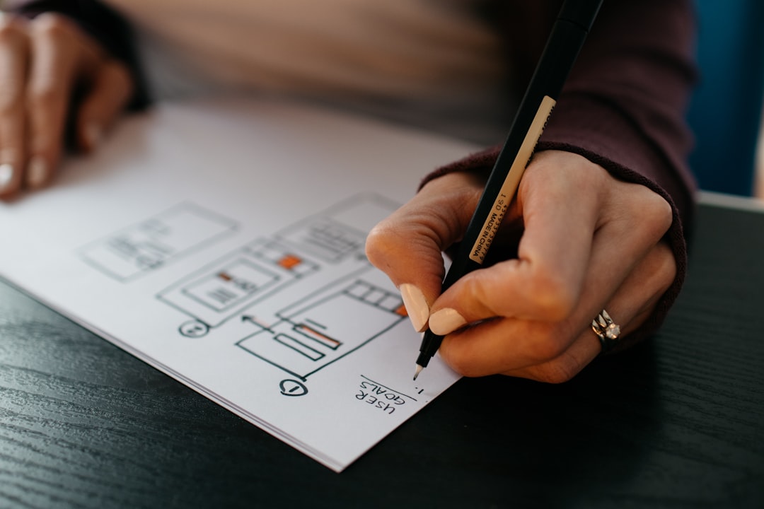
Defining Scope Visually
The scope section is where deals go right or wrong after they are signed, so design it to remove every ambiguity. A simple table that lists deliverables alongside what is explicitly excluded protects both you and the client. Pair it with a clear project timeline graphic — a horizontal bar or milestone diagram showing phases, durations, and key dates — because clients absorb a timeline visually far faster than they read a schedule in prose. Number the phases and tie them to the deliverables so the relationship between what you will do and when is obvious at a glance. A well-designed scope section reduces back-and-forth, sets expectations, and signals that you have done this before.
Writing Tone and Layout Together
Design and language reinforce each other in a proposal. Write in the second person, focused on the client and their outcome rather than your company’s history. Keep paragraphs short so they sit cleanly in the grid and never become intimidating blocks. Use the section headings to carry the argument, so a reader who only skims still understands the offer. Replace dense capability paragraphs with scannable bullets, and let the layout’s white space give the document a calm, confident pace. A proposal that reads quickly and looks composed conveys that working with you will feel the same way — and that impression is part of what closes the deal.
Export, PDF, and Accessibility
Export a clean PDF with embedded fonts and, for longer proposals, bookmarks for each section. Make it a tagged PDF so the structure is readable by assistive tech, add alternative text to any charts or diagrams, and keep at least 4.5:1 contrast for body text and pricing. An accessible, well-tagged proposal also tends to look more professional to everyone.
Tools for Proposal Design
Adobe InDesign produces the most polished, print-ready proposals with grids and styles. Figma suits teams that want collaborative, brand-controlled templates and easy reuse. Dedicated proposal software is popular for sales teams that need e-signatures and tracking, but enforce the type hierarchy and pricing layout so the output does not look templated. Canva works for speed if you keep the design disciplined.
Related Guides in This Cluster
A proposal closes what other documents open. Strengthen it with proof from a focused case study design, and use a sharp pitch deck to set up the conversation that leads to the proposal.
Frequently Asked Questions
What is the best structure for a business proposal?
Use the problem, solution, scope, price, proof structure. Restate the client’s challenge in their words, present your approach around their outcome, define exactly what is and is not included, show clear pricing, and back it with relevant testimonials and case study results. Leading with the client’s problem proves you listened.
How should I present pricing in a proposal?
Make pricing scannable and unambiguous. A tiered table with two or three packages lets clients choose how much to spend rather than whether to spend, and marking a recommended option guides the decision. Align prices with tabular figures, make totals unmistakable, and never make the client hunt for the number.
How long should a proposal be?
As short as possible while clearly covering problem, solution, scope, price, and proof. A tight, well-organized proposal reads as more confident than a padded one. Cut boilerplate and anything that does not move the client toward a decision; decision-makers skim before they read.
How do I make a proposal stand out?
Personalize it. Name the client on the cover, restate their specific problem in their own words, and include proof relevant to their industry rather than generic logos. A clean, consistent layout with easy-to-find pricing signals that your actual work will be just as considered, which is what wins the deal.


