Personal Trainer Branding: A Practical Guide for Coaches
Personal trainer branding is different from gym branding in one crucial way: you are the brand. Clients hire a coach, not a building, so your identity is built around a person, a method, and a results story rather than a logo on a wall. This guide covers how to build a coaching brand that looks professional, stands out in a crowded feed, and turns followers into paying clients.
This sits inside our broader pillar on gym branding, and it shares the typographic and color toolkit covered in our fitness logo design guide.
Personal Brand vs. Business Brand
A gym brand can outlive its founder; a trainer brand usually centers on the trainer. That changes the design priorities:
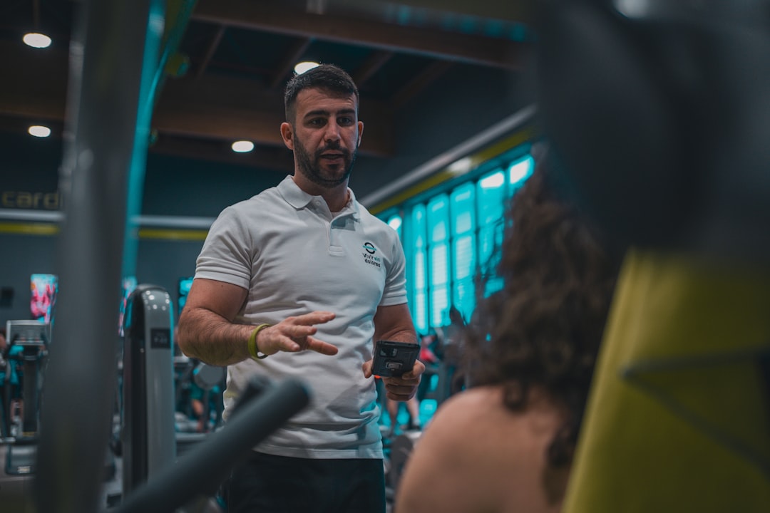
- You are the hero of the visuals. Photography of you coaching and training carries more weight than the logo.
- Your name often is the brand. A clean wordmark or monogram of your name frequently beats an abstract symbol.
- Voice matters more. How you talk — tough-love, supportive, science-based — is a core part of the identity.
- Niche is positioning. “Postpartum strength for busy moms” is a brand; “personal trainer” is not.
Define Your Coaching Niche and Personality
Before any visuals, lock your positioning. Who do you train, what transformation do you deliver, and how do you make clients feel? A clear niche makes every design decision easier and makes you findable. Match the visual energy to the promise:
- Hardcore strength coach: bold condensed type, black-and-accent palette, gritty gym photography.
- Premium / executive coach: refined type, muted palette, clean editorial photos.
- Supportive wellness coach: warm humanist type, earthy colors, natural light.
- Online program / influencer coach: high-contrast, social-first templates built for thumbnails.
The Trainer Logo and Wordmark
Most personal trainers are best served by a wordmark or monogram built from their own name, often paired with a small icon. It feels personal and scales easily from a watermark on coaching videos to a profile avatar. Follow the same craft rules as any fitness mark:
- Use a strong, ownable typeface — condensed and bold for energy, refined sans or serif for premium.
- Build a monogram of your initials for the avatar, app icon, and video watermark.
- Keep a one-color black and white version for apparel and stamps.
- Keep masters as vectors so they scale cleanly everywhere.
For the typeface and color toolkit specific to fitness, lean on the recommendations in our fitness logo design piece — condensed faces like Oswald and Anton for energy, Inter for clean body and UI text.
Color and Typography
Trainer brands follow the same high-energy logic as gyms — a dark base plus one accent reads as strong and modern, while earthy or soft palettes suit wellness coaching. The difference is restraint: because your face and content are the focus, the palette should support rather than shout. Pick two to three colors and one or two fonts, then apply them relentlessly across every post so your feed is instantly recognizable.
| Touchpoint | Brand element that carries it |
|---|---|
| Instagram / TikTok feed | Photography style, accent color, caption templates |
| Video watermark | Monogram |
| Coaching app / PDFs | Wordmark, type system, accent |
| Apparel | One-color logo, monogram |
| Website / landing page | Full identity plus testimonials |
Photography: Your Most Important Brand Asset
For a coach, photography and video are the brand. Invest in a consistent shoot: you coaching, you training, candid client moments, and clean headshots. Decide on a treatment — high-contrast and gritty, bright and clean, or warm and natural — and keep it consistent so the grid reads as one brand. Authentic content of real clients getting results outperforms stock imagery every time, and it doubles as social proof.
Social and Content Templates
The bulk of a trainer’s brand exposure happens on social, so build a reusable template kit in Figma or Canva using your fonts, colors, and logo. Cover the formats you post most:
- Workout and tip carousels.
- Client transformation and testimonial posts.
- Quote and motivation graphics.
- Program launch and offer announcements.
- Reel and video cover thumbnails with consistent typography.
Consistent templates let you post daily without rebuilding from scratch, and the repetition is what makes a personal brand stick in someone’s memory.
Digital Touchpoints: App, Site, and Programs
Many coaches deliver training through an app or digital programs. Brand those surfaces with your type system, accent color, and monogram so the experience feels cohesive from the first DM to the workout dashboard. If you build a custom coaching app or web portal, the same UI principles apply as any fitness product — see our guide to fitness app design for dark UI, large tap targets, and progress tracking. To structure the full identity system around your visuals, our visual identity design guide is a useful framework.
Naming and Positioning Your Coaching Brand
Many trainers default to “[First Name] [Last Name] Fitness,” which is fine but forgettable. A more memorable option is a short brand name that captures your method or promise, with your name attached as the founder. Whatever you choose, secure the matching domain and social handles, and make sure the name still makes sense if your niche evolves. The strongest trainer brands lead with a specific promise — a clear transformation for a clearly defined client — rather than a generic “I help people get fit.” That specificity is what makes word-of-mouth referrals easy and makes your content findable.
Turning Followers Into Clients
Branding for a coach is not decoration — it is a sales engine. The visual consistency and clear positioning exist to move a stranger from a scroll to a paid program. A few touchpoints do most of that work:
- Profile and bio: a clean monogram avatar, a one-line promise, and an obvious link to your offer.
- Social proof: on-brand testimonial and transformation graphics build trust faster than any claim you make about yourself.
- A simple offer ladder: a free resource, a low-cost program, and premium 1:1 coaching, each presented in consistent branded templates.
- A focused landing page: one page that explains who you help, shows results, and has a single clear call to action.
When every one of these looks like it comes from the same confident brand, a prospect trusts you before you ever speak — and trust is what converts a follower into a client.
Staying Consistent at Scale
The hardest part of a personal brand is keeping it consistent while you post constantly. The fix is systems, not willpower. Save your fonts, colors, and logo as reusable assets, build a small set of post templates you can refill in minutes, and keep a simple one-page brand cheat sheet — your palette values, fonts, voice notes, and logo files — so anything you make or hand to an editor stays on brand. Consistency over time is what compounds a personal brand from “a trainer who posts” into a name people recognize and recommend.
Tools for Trainer Branding
Adobe Illustrator for the vector logo and wordmark, Figma or Canva for the ongoing social template kit, and Photoshop or Lightroom for editing your photography to a consistent treatment. Keep your logo files as vectors and store your color and font choices somewhere you can reuse them every time you post.
Frequently Asked Questions
Do personal trainers need a logo?
Yes, but it can be simple. A clean wordmark or monogram of your name plus a small icon usually works better than an abstract symbol, because clients hire you, not a building. Keep a one-color version for apparel and a monogram for your avatar and video watermark.
How is trainer branding different from gym branding?
A trainer is a personal brand built around a person, method, and results story, while a gym brand centers on a place and can outlive its founder. For trainers, photography, voice, and niche positioning carry more weight than the logo, and your name is often the brand itself.
What should a personal trainer post to build a brand?
Consistent, on-brand content: workout tips, client transformations and testimonials, motivation graphics, and program offers, all using one font set, palette, and logo. Build reusable templates in Figma or Canva so you can post daily without rebuilding designs, since repetition is what makes a personal brand memorable.
What colors work for a fitness coach brand?
The same high-energy logic as gyms: a dark base with one electric accent reads strong and modern, while earthy or soft palettes suit wellness coaching. Keep it restrained — two or three colors — because your face and content are the focus, and the palette should support rather than compete.


