Gym Branding: How to Build a Fitness Brand That Sticks
Strong gym branding is the difference between a studio people walk past and one they tag in their workout selfies. A fitness brand lives across far more surfaces than most businesses — the logo has to survive embroidery on a hoodie, a 20-foot window decal, a tiny app icon, and a sweaty Instagram story. This guide walks through every decision, from the core mark to the touchpoints members actually see, so the whole system pulls in one direction.
What Gym Branding Actually Covers
Branding is not just a logo. For a gym it is the full sensory package: the name, the mark, the typography, the color palette, the photography style, the tone of the coaching voice, the smell of the lobby, and the music in the weight room. The visual identity is the part you design on screen, but it only works when every physical and digital touchpoint agrees.
The fitness category rewards a clear personality more than almost any other. A CrossFit box, a boutique cycling studio, a powerlifting gym, and a yoga sanctuary should look nothing alike — and members self-select partly on that look. Before you open Illustrator, decide who you are training and how you want them to feel walking in: intimidated-in-a-good-way, welcomed, calm, or hyped.
Define the brand personality first
- High-energy / hardcore: bold condensed type, black-and-one-accent palettes, aggressive angles. Think barbell clubs and HIIT.
- Premium boutique: refined serif or elegant sans, muted or jewel tones, lots of whitespace. Think boutique reformer Pilates.
- Community / functional: friendly geometric sans, warm secondary colors, approachable photography. Think neighborhood strength gyms.
- Wellness / calm: soft humanist type, earthy palettes, organic shapes. Think yoga and recovery studios.
The Gym Logo: Built for Every Size
The gym logo is the load-bearing element of the whole system. The single biggest mistake is designing a logo that only looks good large and in full color. A fitness mark gets stamped on a chest, stitched onto a cap, etched on a glass door, and shrunk to a 32-pixel app icon — so it has to hold up everywhere.
Design a small family of logo assets rather than one lockup:
- Primary lockup — icon plus wordmark, for the website header and signage.
- Stacked version — icon above wordmark, for square spaces and social avatars.
- Icon / monogram — the mark alone, for the app icon, embroidery, and watermarks.
- One-color version — solid black and solid white, for screen printing, etching, and reversed-out signage.
Dynamic marks read as athletic: forward lean, motion lines, a bold geometric monogram, or a strong negative-space shape. Avoid thin hairlines and tiny detail — they vanish on a shirt and clog up in embroidery. For the full step-by-step on going from sketch to vector, see our logo design process guide, and for fitness-specific direction read our deep dive on fitness logo design tips and examples.
Typography That Sounds Like It Lifts
Type carries half the energy of a fitness brand. The athletic category leans heavily on strong, condensed, and uppercase typefaces because they look like effort — tall, tight, and bold reads as power and speed, and condensed letters let you set a big confident headline in a narrow space like a tank top or a banner.
| Typeface | Why it works for fitness | Cost / source |
|---|---|---|
| Oswald | Free condensed sans with an industrial, athletic feel; great for big numbers and headlines | Free (Google Fonts) |
| Anton | Ultra-heavy single weight; maximum impact for short hero words like “GRIND” | Free (Google Fonts) |
| Archivo / Archivo Narrow | Versatile grotesque with condensed widths; modern and high-energy without being a cliche | Free (Google Fonts) |
| Bebas Neue | All-caps condensed display, instantly “gym poster”; pair carefully so it doesn’t feel generic | Free |
| Inter | High x-height, neutral body and UI text; the workhorse for the website and app | Free |
Use a two-font system: a heavy condensed display face for headlines and numbers, and a clean neutral sans (Inter is the reliable choice) for body copy, schedules, and app interfaces. Set rules for case — many fitness brands run headlines in all-caps for energy but keep body copy sentence case for readability.
Color: Bold, Contrasty, Confident
Most successful gym palettes are high-contrast and minimal: a near-black or charcoal base, a punch of one saturated accent (electric green, hot orange, volt yellow, red, or cyan), and plenty of negative space. The dark base photographs well in gym lighting, makes apparel look premium, and lets the accent do the shouting.
- Base: a true near-black (#101114) or deep charcoal — easier to print and screen than pure #000.
- Accent: one electric color used sparingly for CTAs, highlights, and stat numbers.
- Neutrals: a mid-gray and an off-white for backgrounds and secondary text.
Wellness and boutique brands can break this rule with earthy or pastel palettes, but the principle holds: pick a tight palette and apply it consistently. Document exact HEX, RGB, CMYK, and Pantone values so your sign maker and apparel printer get the same color you approved on screen. For the broader framework of building a coherent identity system, our visual identity design guide covers palettes, logo grids, and brand rules end to end.
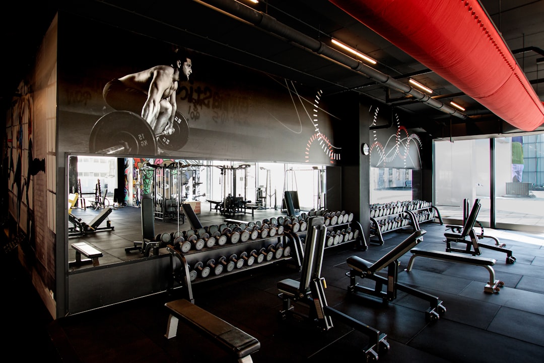
Touchpoints: Where Members Actually See the Brand
A gym brand lives in the physical world far more than a typical software company. Plan the identity around these surfaces from day one — designing the logo in a vacuum and then discovering it can’t be embroidered is a costly do-over.
Signage and the physical space
Exterior signage, window decals, wall graphics, and floor markings. The mark needs a clean one-color and reversed-out version for vinyl and channel letters. Wayfinding and motivational wall type should use your display face at large scale. Consider how the logo reads at 50 feet from the parking lot and at 50 centimeters on a locker.
Apparel and merch
Hoodies, tees, tanks, caps, and water bottles are walking billboards — members become your ad network. This is where the icon and one-color logo earn their keep. Keep embroidered marks simple (no fine gradients), and design a couple of merch-only graphics that extend the brand without leaning on the full logo every time.
App and digital
A modern gym brand needs a booking and tracking app, a website, and a heavy social presence. The app icon is the monogram; the in-app type is your neutral sans; the accent color drives buttons and progress states. Plan the brand to work in a dark interface, since members use it in dimly lit gyms. We cover this in detail in our guide to fitness app design UI and UX.
Social and content
Templates for class schedules, member milestones, and motivational posts keep the feed on-brand. Build a small kit in Figma or Canva using your fonts, colors, and logo so coaches can post consistently without a designer in the loop.
Branding the Different Gym Models
The same principles flex across formats, but the emphasis shifts:
- Big-box / commercial gyms: need the most scalable, neutral system because it stretches across many locations and signage types.
- Boutique studios: can be more expressive and design-forward; the brand is a big part of the premium price.
- Sports teams and clubs: follow their own conventions — a primary mark plus secondary marks and often a mascot. See our guide to sports team logo design and how it interacts with sports jersey design.
- Personal trainers and coaches: are a personal brand first; the identity is built around a person, not a building. Our personal trainer branding guide covers that distinction.
Naming and Voice
The name is the first branding decision and the hardest to change later. Strong fitness names tend to be short, punchy, and easy to chant, hashtag, and put on a hat — one or two syllables of energy beat a long descriptive phrase. Check that the name is available as a domain and social handle before you fall in love with it, and say it out loud: if it is awkward to shout across a gym floor, it is the wrong name.
Voice is the verbal half of the brand. Decide how your coaching speaks across captions, app notifications, and signage — tough-love and commanding, warm and encouraging, or expert and calm. A consistent voice makes the brand feel like a person, and it should match the visual energy. A hardcore black-and-volt identity that writes gentle, apologetic copy feels disjointed; the words and the design have to agree.
Photography and Imagery Style
For a gym, photography carries as much brand weight as the logo. Decide on one consistent treatment and apply it everywhere — website, social, ads, and signage — so the whole presence reads as one brand:
- Gritty and high-contrast: hard shadows, dark backgrounds, sweat and chalk. Reads serious and intense.
- Bright and clean: daylight, open space, smiling members. Reads welcoming and accessible.
- Warm and natural: soft light, calm tones. Reads wellness and recovery.
Authentic shots of real members and coaches outperform stock imagery every time — they build trust and double as social proof. Budget for at least one proper shoot of your space, your equipment, and real training in action, and re-shoot periodically so the library stays current.
Build a Brand Guidelines Document
Once the pieces are designed, lock them in a short brand guidelines PDF so anyone — printer, sign maker, social manager, apparel vendor — applies the brand correctly. A practical fitness brand guide includes:
- Logo versions, clear space, and minimum sizes.
- Color values (HEX, RGB, CMYK, Pantone).
- Typography rules: faces, weights, case, and hierarchy.
- Photography and tone-of-voice direction.
- Do’s and don’ts (no stretching, no off-palette colors, no busy backgrounds behind the logo).
Tools for the Job
For the core identity, Adobe Illustrator is the standard for vector logos and print-ready signage artwork. Figma is ideal for the website, app UI, and social template kit because it is collaborative and component-based. Photoshop handles photography, apparel mockups, and merch graphics. Keep master logo files as vectors so they scale from app icon to billboard with no quality loss.
Frequently Asked Questions
How much does gym branding cost?
It varies widely. A solo designer might deliver a logo and basic kit for a few hundred to a couple thousand dollars, while a full identity system with guidelines, signage, apparel, and app design from a studio runs into five figures. Budget for application costs like printing and signage too, not just design.
What colors are best for a gym brand?
High-contrast palettes work best: a near-black or charcoal base plus one electric accent such as volt yellow, hot orange, or cyan. Dark bases photograph well in gym lighting and make apparel look premium. Wellness studios are the exception, often using earthy or muted tones.
What font should I use for a fitness brand?
Pair a strong condensed display face — Oswald, Anton, Bebas Neue, or Archivo Narrow — for headlines and big numbers with a clean neutral sans like Inter for body and app text. Condensed, bold, often all-caps type reads as power and energy, which suits the category.
Do I need a logo that works in one color?
Yes. A single-color version is essential for embroidery on caps and hoodies, vinyl window decals, glass etching, and reversed-out signage. Always design the mark so it survives in solid black and solid white before adding color, or you will face expensive reworks later.
What touchpoints matter most for a gym?
Signage, apparel and merch, the booking/tracking app, the website, and social media are the core five. Apparel is especially powerful because members wear your logo in public. Design the identity to work across all of them — large signage to tiny app icon — from the start.


