Fitness App Design: UI and UX Tips
Great fitness app design has to work in a place most apps never get tested: a dimly lit gym, one-handed, mid-set, with sweaty fingers. That context shapes every decision — dark interfaces, oversized tap targets, glanceable progress, and microcopy that keeps people motivated when they want to quit. This guide covers the UI and UX choices that turn a workout app from a chore into a habit.
An app is one of the core touchpoints in any modern fitness brand, so this pairs with our pillar on gym branding and the personal-coaching side in our personal trainer branding guide. For general app UX fundamentals, see our app design guide.
Design for the Gym Context First
The biggest mistake in workout apps is designing them for a calm desk session instead of a real gym. The constraints are specific:
- Low light: gyms and early-morning runs are dark, so a dark UI is the default, not an option.
- One-handed, mid-set: users tap between exercises with one hand while holding a weight or catching their breath.
- Sweaty, imprecise taps: fine controls fail; everything needs to be big and forgiving.
- Glance, don’t read: users check the screen for a second between reps, so information must be instantly scannable.
Dark UI Is the Default
A dark interface reduces glare in dim gym lighting, saves battery on OLED screens, and looks premium and athletic. Build it correctly:
- Use a near-black or very dark gray base (#101114) rather than pure black, which can look harsh and crush shadows.
- Layer surfaces with subtle elevation — slightly lighter cards on a darker background — to create hierarchy.
- Use one saturated accent color for primary actions, active states, and progress, matching the brand’s accent.
- Keep text high-contrast: off-white body text, not pure white, to reduce eye strain.
Big Tap Targets and Thumb-Friendly Layout
During a workout, precision is gone. Design for big, forgiving touch:
- Large tap targets: primary buttons should comfortably exceed the standard minimum (around 44–48px) — go bigger for in-workout controls.
- Thumb zone: put the most-used actions — log set, next exercise, rest timer — in the lower half of the screen where a thumb reaches.
- Generous spacing: space controls apart so a sweaty mis-tap doesn’t trigger the wrong action.
- Big numbers: reps, weight, and timer should be large and glanceable from arm’s length.
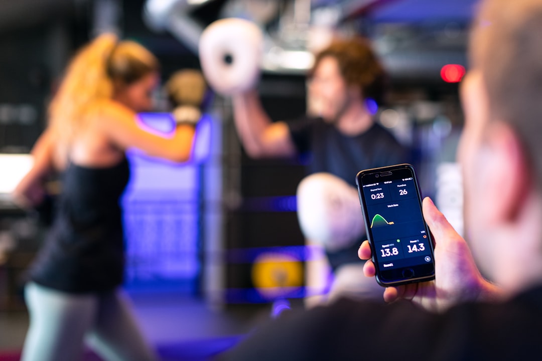
Workout Tracking: The Core Loop
The heart of a fitness app is the logging loop: start a workout, see the next exercise, log sets and reps, rest, repeat. Make this loop frictionless:
- Pre-fill from last time: show the user’s previous weight and reps so they only adjust what changed.
- One-tap set logging: confirm a set with a single big tap, not a multi-field form.
- Auto rest timer: start the rest countdown automatically after a set, with a clear, large display.
- Clear “next exercise” state: the user should always know what’s coming without hunting.
Progress Charts and Motivation
People stick with fitness apps that show progress. Visualizing improvement is the strongest retention tool you have:
- Progress charts: simple line and bar charts of weight lifted, runs completed, or body metrics over time.
- Streaks and milestones: celebrate consistency, personal records, and goal completion.
- Rings and bars: glanceable daily-goal indicators that reward closing the loop.
- History at a glance: let users scroll past workouts to feel the accumulation of effort.
Keep charts readable on a dark background — bright accent lines, restrained gridlines, and large value labels.
Motivational Microcopy
Tone is part of the UX. Microcopy — the small text on buttons, empty states, and notifications — should sound like a good coach: encouraging, direct, never nagging. Replace generic system text with brand voice:
- Empty state: “No workouts yet — let’s change that” beats “No data.”
- Completion: “Session done. New PR on squats!” beats “Workout saved.”
- Rest timer: “30s — shake it out” beats a bare countdown.
- Push notifications: motivating, not guilt-tripping. “Your next session is ready” beats “You haven’t worked out in 3 days.”
Onboarding and First Run
Get users to their first logged workout fast. A long sign-up before any value kills retention. Ask only what you need to personalize (goal, experience level, available equipment), let users explore quickly, and defer optional setup. The faster someone completes one real workout in the app, the more likely they are to come back.
Typography and Visual System
Pair a clean, high-x-height sans like Inter for body text, labels, and data with a bolder condensed face for big stat numbers and screen titles to carry athletic energy — the same type logic that runs through the brand’s fitness logo and identity. Keep the UI type system tight: a few sizes, clear hierarchy, and large numerals for anything the user reads mid-set.
| Element | Recommendation | Why |
|---|---|---|
| Theme | Dark by default | Reduces glare in dim gyms, saves OLED battery |
| Tap targets | Oversized, thumb-zone | Sweaty, one-handed, mid-set use |
| Body / data font | Inter | High x-height, legible at small sizes |
| Stat numbers | Bold condensed face | Glanceable and energetic |
| Charts | Bright accent on dark | Readable progress at a glance |
Key Screens to Get Right
Most fitness apps live or die on a handful of core screens. Designing each one for the gym context — glanceable, dark, thumb-friendly — does more for retention than any extra feature:
- Today / home: the single most important screen. Show today’s planned workout and one obvious “start” action, plus a glanceable streak or goal ring. Don’t bury the start button under stats.
- Active workout: the screen used mid-set. Big current-exercise name, pre-filled set inputs, a one-tap log button, and an auto rest timer dominating the lower thumb zone.
- Progress: charts of weight, volume, or distance over time, plus personal records. This is the screen that proves the app is working.
- History: a scrollable record of past sessions so effort accumulates visibly.
- Profile / goals: where users set targets and personalize, kept light so it never blocks the first workout.
Accessibility and Inclusive Design
Designing for sweaty, one-handed, low-light use overlaps heavily with good accessibility. Maintaining strong text contrast on the dark theme, large tap targets, and clear focus states benefits everyone, not just users with impairments. Don’t rely on color alone to signal state — pair the accent color with an icon or label so a completed set or an active timer is unmistakable. Support the platform’s dynamic text sizing so the data stays readable for users who scale up their fonts, and test the whole flow at the largest size to make sure layouts don’t break.
Notifications and Re-engagement
Notifications are part of the UX, and they are easy to get wrong. The goal is to bring users back without nagging them into deleting the app. Time reminders to a user’s actual workout pattern rather than blasting everyone at the same hour, celebrate streaks and personal records, and keep the tone like a supportive coach. A notification that says “Your next session is ready when you are” earns a tap; one that says “You’ve skipped 3 workouts” earns an uninstall. Always let users tune notification frequency, and respect that choice.
Tools for Fitness App Design
Figma is the standard for designing and prototyping the UI, building a component library, and handing off to developers. Use it to test the dark theme on a real device in low light and to validate tap-target sizes with the thumb zone in mind. Photoshop and Illustrator handle the app icon, marketing screens, and any custom illustration or iconography.
Frequently Asked Questions
Why do fitness apps use dark mode?
A dark interface reduces glare in dim gym lighting and during early-morning or evening workouts, saves battery on OLED screens, and looks premium and athletic. Use a near-black base rather than pure black, layer subtle elevation for hierarchy, and keep text off-white and high-contrast to reduce eye strain.
What makes a good workout tracking UX?
A frictionless logging loop: pre-fill weight and reps from last time, confirm a set with one big tap, auto-start the rest timer, and always show the next exercise clearly. Users log sets one-handed mid-set, so big tap targets, generous spacing, and large glanceable numbers are essential.
How big should tap targets be in a fitness app?
Comfortably above the standard minimum of around 44–48px, and bigger for in-workout controls, because users tap one-handed with sweaty, imprecise fingers. Place the most-used actions in the lower thumb zone and space controls apart so a mis-tap doesn’t trigger the wrong action.
How do fitness apps keep users motivated?
By visualizing progress and using encouraging microcopy. Progress charts, streaks, personal records, and glanceable goal rings show improvement, which is the strongest retention tool. Coach-like button text, empty states, and notifications that encourage rather than guilt-trip reinforce the habit and keep users coming back.