Airline Branding: Identity at 30,000 Feet
Airline branding may be the most demanding identity work in travel. The same mark has to look right painted across a tail fin, printed on a paper boarding pass, glowing in a phone app, embroidered on a uniform, and embossed on a lounge door. Few brands operate across such extreme scales and materials, which is why airline identity is often studied as the gold standard of brand consistency. This guide explains how airlines build and hold an identity across every touchpoint a traveler encounters.
Airline branding sits within the broader hospitality identity world. If you want the strategic foundations first, our pillar on hotel branding covers positioning, touchpoint mapping, and tier cues that apply just as much to carriers as to properties.
Why Airline Branding Is Uniquely Hard
An airline brand has to do three difficult things at once. It must signal safety and trust, because flying is an act of faith in an institution. It must differentiate in a category where the core product — getting from A to B — is nearly identical between competitors. And it must remain perfectly consistent across a sprawling, multinational operation staffed by thousands of people and serviced by contractors in dozens of countries. Consistency is not a nice-to-have here; it is the brand’s primary signal of competence.
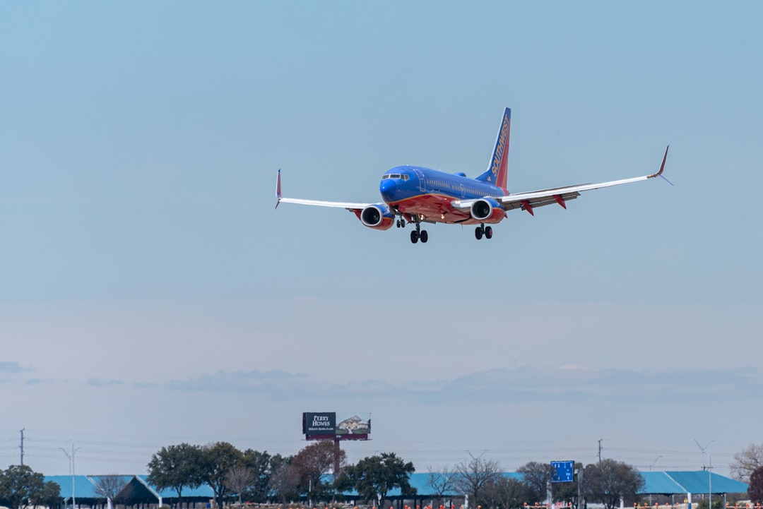
The Tail: An Airline’s Most Visible Asset
The tail design is the single most recognizable element of any airline. It is the part of the aircraft most visible from the terminal, on the tarmac, and in photography, so it functions almost like a flag. Strong tail designs are bold, simple, and legible from a distance, often built on a single confident motif — a symbol, a flag-derived pattern, or a distinctive color block. Because the tail is seen at long range and at speed, fine detail disappears; the design has to communicate as a silhouette and a color story.
Livery: Branding the Whole Aircraft
The full livery is the paint scheme across the entire fuselage, wings, and engines. Designing it is part graphic design and part industrial constraint. Paint adds weight and cost, curved surfaces distort artwork, and the design must accommodate windows, doors, and registration markings. Good livery resolves the tension between brand expression and these physical realities, keeping the wordmark legible along the fuselage and the palette coherent from nose to tail. A refreshed livery is also one of the most expensive rebrands in any industry, since repainting a fleet takes years, which is why airlines change it rarely and carefully.
The Touchpoint Journey
A passenger meets an airline brand dozens of times in a single trip, and many of those moments are small, stressful, or both. The brand has to feel like one voice across all of them.
| Phase | Touchpoint | Branding job |
|---|---|---|
| Book | Website, app, confirmation | Feel reliable and easy |
| Pre-flight | Boarding pass, check-in kiosk, signage | Reduce stress, stay legible |
| Ground | Lounge, gate, staff uniforms | Signal tier and care |
| Onboard | Cabin, safety card, menu, IFE | Reinforce identity in detail |
| Post-flight | Baggage tag, email, loyalty | Close the loop cleanly |
The boarding pass deserves special attention. It is read in a hurry, often on a small screen or crumpled paper, so legibility beats decoration. A well-branded boarding pass uses clear typographic hierarchy — gate, seat, and boarding time instantly findable — while still carrying the airline’s color and type. It is a perfect example of branding that has to serve function first.
Typography and Legibility at Scale
Airlines lean heavily on highly legible type because their information is often safety-critical and read under pressure. A custom or carefully chosen sans-serif typically anchors the system, working across signage, the app, the boarding pass, and onboard materials. Inter and similar humanist sans faces are popular reference points for digital interfaces because of their high x-height and broad language coverage — essential when passengers speak dozens of languages. The display weight of the type may carry personality, but the workhorse text weight always prioritizes clarity.
Color and the Brand Mark
Airline palettes tend to be tight: one or two ownable brand colors plus neutrals. Color is doing identification work at a distance — across a runway, a terminal, a row of tail fins — so a distinctive, consistent hue is worth more than a complex palette. The wordmark or symbol, meanwhile, has to be reproducible in metallic for some applications, single-color for embossing, and full-color on screen. For the underlying craft of building a mark that survives this range, see our travel logo design guide and the broader visual identity design overview.
Consistency Across a Global Operation
The hardest part of airline branding is governance. Thousands of staff, hundreds of vendors, and countless printed and digital surfaces are produced far from any central design team. Airlines solve this with extremely detailed brand systems: comprehensive guidelines, locked templates for everything from gate signage to safety cards, and approved asset libraries. The discipline is what keeps a check-in kiosk in one country looking like the lounge in another. When you see an airline that feels effortlessly coherent everywhere, you are seeing rigorous documentation, not luck.
Uniforms and the Human Side
Uniforms are wearable branding and one of the most emotionally resonant touchpoints. They signal the airline’s tier and personality — formal and tailored for a premium carrier, relaxed and modern for a low-cost brand — and they are the face passengers interact with directly. Coordinating uniform color and detailing with the wider palette ties the human experience back to the visual identity, closing the gap between graphics and people.
Where Airline Branding Connects
The lessons here — consistency, legibility under pressure, and identity across many materials — apply across travel. For the property side of the journey, see resort branding, and for the marketing that inspires the trip in the first place, our tourism poster design guide explores the evocative imagery and place-typography that make people want to fly somewhere new.
Frequently Asked Questions
Why is the tail the most important part of airline branding?
The tail is the most visible part of an aircraft from terminals, the tarmac, and in photography, so it functions like a flag. It is seen at distance and at speed, meaning the design must work as a bold silhouette and color story. That makes it the airline’s single most recognizable brand asset.
How often do airlines change their branding?
Rarely, because repainting an entire fleet is one of the most expensive rebrands in any industry and can take years. Airlines tend to evolve their identity gradually rather than overhaul it, refreshing digital touchpoints first and rolling new livery onto aircraft as they cycle through scheduled maintenance.
What typography do airlines use?
Airlines favor highly legible sans-serif typefaces, often custom or carefully selected, because their information is frequently safety-critical and read under stress. Humanist sans faces with high x-heights and broad language support are common reference points, since passengers speak many languages and need instant clarity on signage and boarding passes.
What is the difference between livery and tail design?
The tail design is the motif on the aircraft’s vertical stabilizer, the most visible single element. Livery is the complete paint scheme across the entire aircraft — fuselage, wings, and engines. The tail is part of the livery, but it carries the most recognition weight and is often designed as the anchor of the whole scheme.
How do airlines keep branding consistent worldwide?
Through rigorous governance: detailed brand guidelines, locked templates for signage, boarding passes, and onboard materials, and centrally approved asset libraries. Because thousands of staff and vendors produce branded surfaces far from any design team, documentation and approval processes are what hold the identity together across a global operation.


