Car Dealership Branding Guide
Car dealership branding has to do something most retail brands never face: earn trust before a customer commits to one of the largest purchases of their life. The lot, the showroom glass, the salesperson’s badge, and the logo on every loaner all reinforce one question in the buyer’s mind — “can I trust these people?” This guide shows how to build a dealership identity that reads as professional, premium-but-approachable, and consistent across every touchpoint.
For the wider system this fits into, start with our pillar on automotive branding, then come back here for the dealership specifics.
What Dealership Branding Has to Achieve
Dealerships are unusual: many sell another company’s product (the manufacturer’s vehicles) while building their own retail brand on top. Your identity has to coexist with OEM branding without disappearing into it. The goals:
- Signal trust and longevity — buyers want a dealer that will still be there for service.
- Feel premium yet approachable — aspirational enough to match the cars, friendly enough to walk in.
- Stay consistent across lot signage, showroom, web, and staff so the operation looks tight.
- Coexist with manufacturer branding — your mark complements OEM logos, never competes with them.
The Dealership Logo: Lead With a Wordmark
Because the dealership’s name is the brand customers search and recommend, a strong wordmark usually wins. It scales cleanly onto a 40-foot pylon sign and shrinks onto a key fob. Build it with a confident, clean typeface — a refined sans for modern, a restrained serif for established/luxury — and add one distinctive detail so it isn’t generic.
A combination mark works too if you want an icon for social avatars and small decals. Whatever you choose, the construction discipline matters; our logo design process guide covers building it properly in vector from the start. Keep chrome and metallic effects restrained — a subtle silver can read premium, but the flat version must stand on its own for embroidery and one-color signage.
Color and Type for Automotive Retail
Dealership palettes lean toward authority and cleanliness. The reliable formula:
- A confident primary — deep blue (trust), near-black (premium), or a brand red (energy) anchors the identity.
- Generous neutral space — white and light gray make the showroom feel clean and the cars the hero.
- A single accent for calls to action and pricing flags.
- Sparing metallic for a premium touch on hero signage only.
For type, pair one clean display face for the name and headlines with a highly legible workhorse for pricing, disclaimers, financing fine print, and the mountain of paperwork dealerships generate. Legible numerals are non-negotiable — your pricing has to be unambiguous.
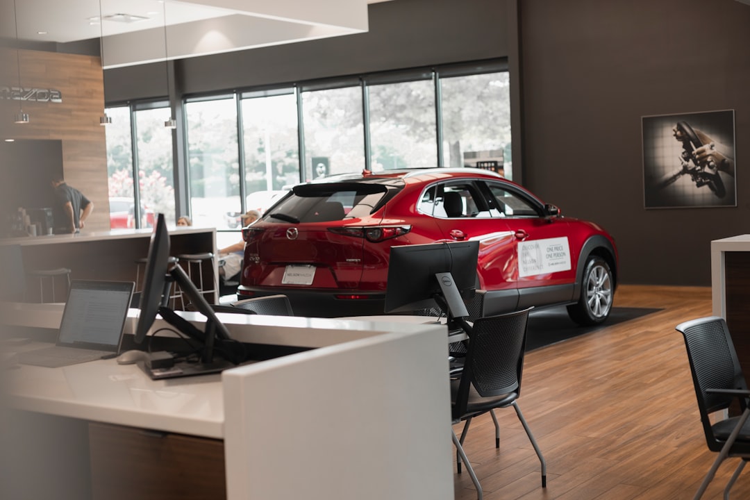
Showroom and Lot Signage
Signage is where dealership branding becomes physical. A coherent system covers:
- The pylon / monument sign — read from the road; the name dominates, logo and OEM marks support.
- Showroom exterior — illuminated channel letters or a clean fascia logo.
- Showroom interior — service desk, finance office, and wayfinding in the same type and palette.
- Lot signage — pricing flags, “certified pre-owned” banners, and department directionals.
- Window and door graphics — hours, financing partners, and the etched logo.
All of it must derive from one vector master file so the blue on the pylon matches the blue on the finance desk. Mismatched signage is the single fastest way to look like a fly-by-night operation.
Extending the Brand Across Touchpoints
Dealerships have an enormous surface area. The identity needs to carry onto loaner and shuttle vehicles, license plate frames, sales staff badges and embroidered shirts, service department invoices, the website, and the inevitable email and SMS follow-ups. Treat each as part of one system. Our visual identity design guide explains how to extend a mark into a full toolkit, and for loaner and shuttle vehicles, our vehicle wrap design guide covers legibility and templates.
| Touchpoint | Branding goal | Production note |
|---|---|---|
| Pylon / road sign | Read from the road at speed | Vector art, OEM-approved layout |
| Showroom interior | Premium, clean, on-brand | Match exact palette, neutral backdrop |
| Loaner / shuttle vehicles | Mobile advertising, legible | Partial wrap on manufacturer template |
| Staff uniforms & badges | Trust and approachability | Single-color embroidery version |
| Paperwork & invoices | Clarity and professionalism | One-color logo, legible numerals |
Working With Manufacturer Brand Guidelines
If you’re a franchised dealer, the OEM dictates how their logos, colors, and store imagery appear — and they audit it. Your own brand should occupy the space the manufacturer’s guidelines leave open: your name, your service personality, your local-trust positioning. Design your wordmark and palette to sit comfortably beside OEM blue or silver rather than fighting it. Independent and used-car lots have full freedom here, which is an advantage worth using to stand out from cookie-cutter franchise stores.
Branding the Service and Parts Departments
Here is the part most dealerships underplay: the showroom sells a car once every several years, but the service department sees that customer two or three times a year for the life of the vehicle. Service and parts are where repeat revenue and long-term loyalty actually live, yet they’re often branded as an afterthought — a different sign font, a generic uniform, a plain invoice. Treat the service drive, the waiting lounge, and the parts counter as full brand environments. The same palette, the same logo, the same clean type on the service estimate as on the showroom window. When a customer’s three-year service relationship feels like the same premium brand that sold them the car, they come back to buy the next one there too. The trust cues overlap heavily with standalone repair shops, so borrow from our auto repair logo design guide for the service-side identity.
Digital and Local-Search Presence
Modern car buyers research online before they ever set foot on the lot, so the dealership brand has to be just as consistent on screen as it is on the pylon sign. That means the exact logo, palette, and type carry onto the website, the Google Business Profile, inventory listings, and every paid ad. A few practical priorities:
- Use the vector logo and locked colors everywhere online — a fuzzy, off-color logo on the website undoes the polish of the physical lot.
- Keep the Google Business Profile photos on-brand — clean, well-lit shots of the actual showroom and signage, not stock imagery.
- Match inventory-listing templates to the brand so third-party marketplace ads still feel like you.
- Maintain consistent name, hours, and contact info across every listing — inconsistency hurts both trust and local search.
The website is effectively a second showroom, and for many buyers it’s the first one they visit. Building the digital presence from the same system you use for physical signage is what makes the whole operation feel established.
Dealership Branding Mistakes to Avoid
- Inconsistent signage colors across the pylon, showroom, and lot — instantly reads as cheap.
- Over-styled logos drowning in chrome and gradients that fail on embroidery and one-color signage.
- Tiny or unreadable pricing type on flags and windows.
- Ignoring the service department — repeat revenue lives there, so it deserves full brand treatment.
- Letting OEM branding swallow your identity so customers can’t recall which dealer they visited.
Related Reading
If your shop also handles service in-house, the trust cues overlap heavily with our auto repair logo design guide. And for a polished, premium aesthetic that suits luxury and CPO lots, borrow ideas from car detailing branding.
Frequently Asked Questions
What style of logo works best for a car dealership?
A clean, confident wordmark usually works best because the dealership name is what customers search and recommend. It scales from a roadside pylon sign down to a key fob. A combination mark also works if you want an icon for social avatars and small decals; keep metallic effects restrained.
How do I keep dealership branding consistent across the lot and showroom?
Build every sign, badge, and document from a single vector master file with locked Pantone, CMYK, and HEX color values. Specify exact placement and color for the pylon, showroom, lot flags, and uniforms. Consistency across touchpoints is what makes a dealership look established and trustworthy.
How does dealership branding work with manufacturer guidelines?
Franchised dealers must follow the OEM’s rules for their logos, colors, and imagery, which are often audited. Your own brand should occupy the space those guidelines leave open — your name, service personality, and local positioning — and be designed to sit beside OEM colors rather than competing with them.
What colors suit a car dealership brand?
Deep blue signals trust, near-black reads premium, and a brand red conveys energy. Pair your primary with generous white and gray neutrals so the showroom feels clean and the cars stay the hero. Add one accent for pricing and calls to action, and use metallic sparingly.


