Automotive Branding: A Complete Guide
Automotive branding is the discipline of building a recognizable, trustworthy identity for any business that sells, services, moves, or modifies vehicles — from a single-bay repair shop to a national dealership group. Get it right and your logo reads cleanly from across a parking lot, your wraps stay legible at highway speed, and your fleet looks like one company instead of twelve. This guide covers the full system: the marks, the colors, the livery, the production realities, and the trade-specific cues that make each automotive niche feel authentic.
What Automotive Branding Actually Includes
Most owners think branding stops at a logo. In automotive, the logo is maybe 20% of the work. The identity has to survive being shrunk onto a business card, blown up across a box truck, embroidered onto a technician’s shirt, and etched into a glass showroom door. A complete automotive identity system covers:
- The primary logo — usually a wordmark, a badge/emblem, or a combination mark.
- Logo variations — horizontal, stacked, icon-only, and a mandatory single-color version.
- A color palette built around bold primaries plus restrained metallic or chrome accents.
- Typography — one display face with attitude, one clean workhorse for fine print and forms.
- Vehicle livery — how the brand lives on wraps, decals, and partial graphics.
- Fleet and signage standards so every truck, sign, and uniform matches.
Each automotive sub-trade leans on different cues, which is why this is a cluster rather than a single article. Below, every supporting guide goes deep on its niche.
The Automotive Logo: Wordmark, Badge, or Combination
The first decision is the logo type, and the automotive industry has strong conventions worth respecting.
Badge and emblem marks (heritage and motorcycle)
Crests, shields, and circular badges signal heritage, craftsmanship, and pride. They dominate motorcycle culture and performance shops because they carry decades of visual history. The tradeoff: badges are detail-heavy and need a simplified version for small applications. If you want this route, read our dedicated guide to emblem logo design for construction techniques and our breakdown of motorcycle brand design, where the badge is practically mandatory.
Wordmarks (dealerships and corporate fleets)
When the company name is the brand — most dealerships and trucking firms — a strong wordmark wins. It scales, it’s easy to read on a moving vehicle, and it reinforces the name customers will search. The risk is blandness, so the type choice and a single distinctive detail (a custom ligature, a speed cut on one letter) carry the personality.
Combination marks (repair, detailing, service)
An icon plus a wordmark gives you flexibility: the icon works as a social avatar and a small decal, the lockup works on signage. This is the safest default for most service businesses, including auto repair logo design and car detailing branding.
Color Strategy: Bold Primaries, Sparing Chrome
Automotive color leans bold and high-contrast because the brand has to work in motion and at distance. A few principles that hold up across the industry:
- Pick a strong primary — saturated red, blue, or near-black anchors most automotive identities and reads from far away.
- Use chrome and metallic effects sparingly. A chrome-look gradient can sell premium, but it does not survive single-color printing, embroidery, or small sizes. Always design the flat version first, then add the metallic treatment as a “hero” variant.
- Reserve a high-visibility accent (safety yellow, orange) for fleets that value being seen on the road.
- Black is your friend for premium detailing and performance; it photographs glossy and pairs with any accent.
Whatever you choose, lock the exact values — Pantone for vinyl and paint matching, CMYK for print, RGB/HEX for screen. Wrap shops and sign makers need spot or vinyl references, not “kind of blue.”
Typography That Moves
Automotive type usually pairs a personality face with a workhorse. The display face can be a heavy condensed sans (great for speed and for fitting long shop names on a door panel), a slab serif (rugged, mechanical, ideal for repair and trucking), or an industrial italic that implies motion. The workhorse handles phone numbers, hours, DOT numbers, and disclaimers — pick a clean, highly legible sans with real numerals and tight spacing control.
Two rules that prevent regret: avoid trendy script fonts on anything that must be read at speed, and confirm your display face has a license that covers signage and vehicle wraps (commercial display use), not just web.
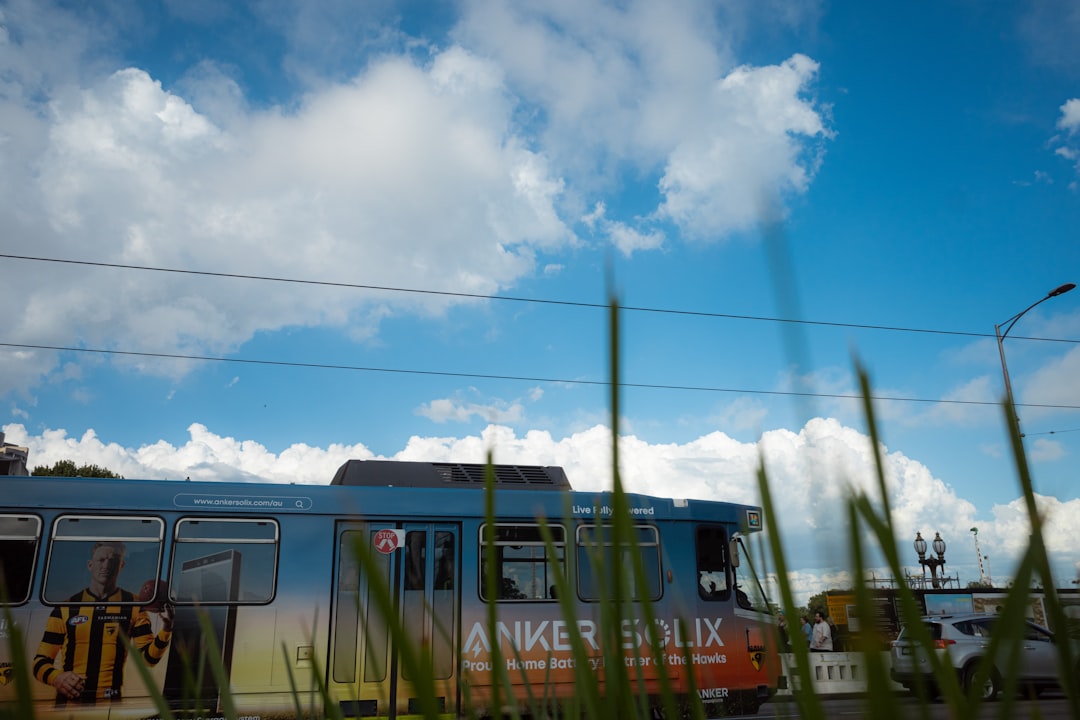
Vehicle Livery and Wrap Legibility
This is where automotive branding earns its money — your vehicles are mobile billboards seen for two seconds at 60 mph. The brand has to communicate instantly. Practical livery rules:
- Lead with the name and the phone number at the largest size the panel allows. Everything else is secondary.
- Maximize contrast. Light type on a dark wrap (or vice versa) reads; tone-on-tone disappears at distance.
- Design around the vehicle’s geometry — door handles, wheel wells, and body lines will cut through your artwork. Get the manufacturer’s vehicle template before designing.
- Keep critical info above the lower third so it isn’t blocked by parked cars or curbs.
- Limit the message to three things: who you are, what you do, how to reach you.
For the full production workflow — templates, bleed, panel seams, and proofing — see our guide to vehicle wrap design. And for a niche where the wrap basically is the storefront, read how car detailing brands stand out.
Fleet Branding Consistency
One van looks great; a fleet of fifteen looks great only if they match. Inconsistency reads as carelessness, which is poison for trades selling reliability. Build a fleet standard that specifies exact decal placement (measured from a fixed reference like the door seam), the approved palette, mandatory legal markings, and a single source of vector artwork that every wrap shop receives. For regulated fleets — especially trucking — placement of the DOT number and carrier name is a legal requirement, not a design choice; our trucking company logo guide covers those rules.
| Asset | File format | Why |
|---|---|---|
| Logo for wraps & signage | Vector (AI / EPS / SVG) | Scales to any size without pixelation |
| Single-color logo | Vector, one solid color | Etching, embroidery, faxes, stamps |
| Uniform embroidery | Vector + stitch file (DST) | Thread can’t reproduce gradients or fine detail |
| Web & social | PNG / SVG, RGB | Transparent background, screen color |
| Mockups & photos | PSD layered | Composite wraps onto vehicle shots |
Trade-Specific Cues Across the Cluster
Each automotive niche has a visual vocabulary customers subconsciously expect. Matching it builds instant credibility.
- Dealerships — clean, confident, premium-but-approachable; consistent signage and showroom standards. See car dealership branding.
- Auto repair — trustworthy, mechanical, strong; gears, wrenches, and solid slab type say “competent and honest.” See auto repair logo design.
- Detailing — glossy, premium, precise; deep blacks, water-bead imagery, and a polished finish. See car detailing branding.
- Trucking — rugged, reliable, no-nonsense; bold condensed type, earned-trust cues, and compliant DOT markings. See trucking company logo design.
- Motorcycle — rebellious, heritage, attitude; badges, wings, and aggressive lettering. See motorcycle brand design.
The Production Workflow
Strong automotive branding is built to be produced, not just admired on a screen. The professional sequence is: design the mark in Adobe Illustrator as clean vectors; build flat one-color and full-color versions before any chrome treatment; test legibility by viewing the logo at thumbnail size and squinting; prepare wrap artwork on the manufacturer’s vehicle template; and render premium mockups in Adobe Photoshop to show the client how it lives on a real vehicle. If you’re starting from scratch, our logo design process walkthrough sets the foundation, and our visual identity design guide covers extending the mark into a full system.
Building the Brand Strategy First
Before any pixel is drawn, the strongest automotive brands settle three strategic questions. Skipping this step is why so many shops end up re-branding within two years.
- Who is the customer, exactly? A luxury-import service center and a budget tire-and-lube shop both fix cars, but their customers want opposite signals — one wants premium restraint, the other wants approachable value. The visual identity has to commit to one.
- What is the single promise? Trust, speed, premium finish, ruggedness, or attitude — pick the one cue your trade leads with and let it drive color, type, and the logo. Trying to say everything says nothing at 60 mph.
- Where will the brand be seen most? A mobile detailer lives on Instagram; a trucking carrier lives on the interstate; a dealership lives on a pylon sign. Design for the dominant surface first, then adapt down to the business card — not the other way around.
Answering these turns branding from decoration into a decision-making filter. Every later choice — “should the logo have chrome?” “is this font too playful?” — has a clear answer once the strategy is locked. Our visual identity design guide goes deeper on translating positioning into a system.
Naming and the Wordmark Connection
In automotive, the name and the logo are tightly linked because the name has to be readable, memorable, and searchable. A name that’s hard to spell hurts you on a Google Business Profile; a name that’s too long won’t fit on a truck door without shrinking into illegibility. When you have naming flexibility, favor short, punchy, easy-to-spell names that survive being set in bold condensed caps. If the name is already fixed and long, the design job becomes fitting it cleanly — usually with a strong condensed face and a clear hierarchy that lets the most important word dominate. Either way, the wordmark is doing double duty as both a logo and a legibility test, so prototype it on the actual surfaces (door panel, sign, avatar) before committing.
Budgeting and Phasing a Rollout
Automotive rebrands are expensive to deploy because the brand lives on physical, durable surfaces — re-wrapping a fleet or re-doing a pylon sign costs real money. Smart owners phase the rollout to control cost without looking half-finished:
- Lock the core identity first — logo, palette, type, and the brand guidelines document. This is cheap relative to deployment and prevents costly rework.
- Deploy high-visibility surfaces next — exterior signage, the website, and the most-seen vehicles. These drive the most recognition per dollar.
- Roll the fleet over on a schedule — re-wrap vehicles as they come due for service or replacement rather than all at once, using one master vector file so early and late vehicles still match.
- Finish with the long tail — uniforms, invoices, signage interiors, and packaging touches.
Because vehicles and signs are built to last years, the durability of the design matters as much as the look. A trend-proof, production-ready identity is what keeps a phased rollout from looking dated by the time it’s complete.
Common Automotive Branding Mistakes
- Chrome everything. Metallic gradients look cheap when overused and break in single-color production. Use them as an accent, never the foundation.
- Tiny phone numbers on wraps. If a driver can’t read it in two seconds, it isn’t working.
- No single-color version. You will eventually need it for embroidery, etching, or a one-color invoice stamp.
- Trendy fonts. Vehicles last years; a logo built on a 2026 trend ages badly and costs a fortune to re-wrap.
- Inconsistent fleet. Mismatched vehicles undo the trust your individual designs build.
Frequently Asked Questions
What makes automotive branding different from other branding?
Automotive branding must work in motion and at distance. Logos and livery are read for seconds at speed, so legibility, high contrast, and bold type matter more than fine detail. It also demands production-ready vector files for wraps, signage, embroidery, and single-color uses.
Should an automotive logo be a badge or a wordmark?
Use a badge or emblem for heritage-driven trades like motorcycle and performance shops. Use a wordmark when the company name is the brand, such as dealerships and trucking firms. Most service businesses are best served by a combination mark — an icon plus a wordmark for maximum flexibility.
How important are chrome and metallic effects in car branding?
They can signal premium quality but should be used sparingly. Chrome and metallic gradients fail in single-color printing, embroidery, and small sizes. Always design a flat, solid-color logo first and treat the metallic version as an optional hero variant for hero placements only.
What file formats do I need for vehicle wraps and signage?
You need vector files — Illustrator AI, EPS, or SVG — so artwork scales to any vehicle size without pixelation. Wrap shops also need exact Pantone or vinyl color references, the manufacturer’s vehicle template, and a single-color version for legal markings and one-color applications.
How do I keep a vehicle fleet looking consistent?
Create a fleet standard that specifies exact decal placement measured from fixed reference points, an approved color palette, required legal markings, and one master vector artwork file sent to every wrap shop. Consistency across vehicles signals reliability, which is critical for trades selling trust.


