Motorcycle Brand Design: Marks With Attitude
Motorcycle branding is the most emotional corner of automotive design. A great moto mark isn’t just a logo — it’s something riders tattoo on their arms, stitch onto a jacket, and defend at a bar. It has to carry attitude, heritage, and identity in a single badge. This guide covers the emblem cues, type, colors, and production files that build a motorcycle brand riders are proud to wear.
It’s part of our wider automotive branding cluster — read the pillar for the full system, then use this for the rebellious, heritage-driven specifics of two wheels.
Why Motorcycle Branding Is Its Own Beast
Most automotive branding sells trust or premium service. Motorcycle branding sells belonging. Riders identify with their brand the way fans identify with a team. That changes the brief:
- It must have attitude — bold, confident, a little rebellious.
- It leans on heritage — badges and crests imply history, even for a new brand.
- It has to look great as merch — patches, tank decals, T-shirts, and pins are core to the business.
- It must survive a single tank-badge size while still feeling rich.
The Badge Is King
Where dealerships use wordmarks and service shops use combination marks, motorcycle brands live on emblems and badges. The badge format carries the heritage and pride that defines the category. Common, proven directions:
- The winged badge — wings signal speed, freedom, and the open road; a genre classic.
- The crest / shield — heritage, brotherhood, and a “founded in” sense of history.
- The circular seal — name on the arc, an icon in the center; works as a patch and a tank badge.
- The skull / mechanical motif — for the rebellious, custom, and outlaw end of the spectrum.
Badges are detail-rich, which is their strength and their challenge. You must design a simplified single-color version for a tank badge, an embroidered patch, and a one-color stamp. Our dedicated guide to emblem logo design covers building a layered badge that simplifies cleanly — essential reading for this niche.
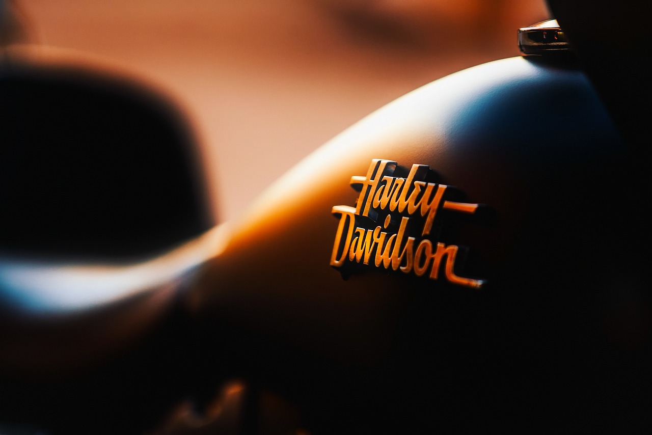
Typography: Heritage Meets Attitude
Moto type swings between two poles depending on the brand’s personality:
| Style | Feel | Best for |
|---|---|---|
| Vintage serif / Tuscan | Heritage, classic, founded-in | Cruiser, retro, café-racer brands |
| Heavy gothic / blackletter | Outlaw, tough, rebellious | Custom, chopper, biker culture |
| Bold condensed sans | Modern, aggressive, fast | Sport and performance brands |
| Hand-drawn script | Custom, personal, garage-built | Boutique and custom builders |
The key is matching the type to the tribe. A blackletter brand and a clean sport-bike brand are speaking to different riders. Whatever you choose, confirm the license covers merch and apparel — these marks end up on products you sell.
Color: Bold, Dark, Confident
Motorcycle palettes are high-impact and usually dark:
- Black — the foundation of moto culture; tough, premium, endlessly versatile.
- Red — power, speed, aggression; a classic pairing with black.
- Chrome / metallic silver — echoes the chrome on the bike itself; works on a badge but needs a flat fallback.
- Vintage cream / gold — heritage warmth for retro and café-racer brands.
- Orange / yellow accents — energy and visibility for sport brands.
Chrome and metallic effects feel natural here — they mirror the machine — but a tank badge or embroidered patch still needs a clean solid-color version. Design flat first, add the metallic treatment as the hero variant.
Designed to Become Merch
For most motorcycle brands, apparel and accessories aren’t an afterthought — they’re a revenue stream and the primary way the brand spreads. Design with these end uses in mind from the start:
- Embroidered patches — simplify detail; thread can’t render gradients or hairlines.
- Tank and fender badges — must read at small size, often in one color or chrome.
- T-shirts and jackets — bold, high-contrast, screen-print-ready.
- Pins and stickers — the icon alone should work without the wordmark.
Build the mark in Adobe Illustrator as clean vectors with a layered full-color version and a simplified one-color version. Render apparel and tank mockups in Adobe Photoshop so the client sees the badge as merch, not just on screen. Our logo design process guide covers the vector build, and our visual identity design guide helps extend the badge into a full brand world.
Building the Badge to Simplify Cleanly
The single hardest technical challenge in motorcycle branding is making a rich, detailed badge that still works when it’s shrunk to a tank emblem or stitched as a patch. The professional approach is to design in tiers of detail from the start rather than trying to strip a complex badge down later:
- The hero badge — the full, detailed emblem with all the wings, banners, and texture, used large on apparel and the website.
- The medium mark — a simplified badge that drops the finest details but keeps the silhouette, for medium sizes and embroidery.
- The icon — the core shape alone (the wing, the shield outline, the monogram) that reads at pin and favicon size.
Designing all three at once forces good decisions early: if the icon can’t survive on its own, the badge is over-reliant on detail. This tiered system is the heart of strong emblem logo design, and it’s what separates a badge that works on every product from one that only looks good on a screen.
Designing for the Tribe, Not Everyone
The biggest strategic mistake in motorcycle branding is trying to appeal to all riders. Moto culture is tribal — sport riders, cruiser riders, adventure riders, and the custom/outlaw scene have distinct aesthetics and don’t want to be lumped together. A brand that tries to please everyone reads as belonging to no one. Pick your tribe and commit hard:
- Sport / performance — aggressive condensed sans, sharp angles, high-energy accents; modern and fast.
- Cruiser / heritage — vintage serifs, classic crests, warm metallics; timeless and proud.
- Custom / outlaw — blackletter, skulls, hand-built textures; rebellious and raw.
- Adventure / touring — rugged but clean, utilitarian, exploration cues; capable and serious.
The riders you commit to will reward you with loyalty precisely because the brand feels made for them. That depth of identification is the entire payoff of motorcycle branding — and it only happens when you’re willing to not be for everyone.
Heritage Without Faking It
Riders are quick to call out a brand that fakes its history. You can evoke heritage through classic badge construction, vintage type, and a “founded” date that is real — but never invent a fictional backstory or borrow another brand’s marks. Authentic attitude beats manufactured legend every time, and it keeps you clear of trademark and credibility trouble.
Related Reading
The badge-building skills here transfer directly to any heritage automotive mark — see how the same emblem logic applies in our broader automotive branding pillar. If your shop also services bikes, the trust cues in auto repair logo design are a useful counterpoint to the attitude-first approach of a rider brand.
Frequently Asked Questions
What makes motorcycle branding different from car branding?
Motorcycle branding sells belonging, not just trust or service. Riders identify with their brand like sports fans, tattoo the logo, and wear it on jackets and patches. That means the mark must carry attitude and heritage, work brilliantly as merch, and survive a single tank-badge size while still feeling rich.
Why do motorcycle brands use badges and emblems?
Badges and crests carry the heritage, pride, and brotherhood that define motorcycle culture. The emblem format implies history even for a new brand and works perfectly as a patch, tank badge, or pin. The tradeoff is detail, so every badge needs a simplified single-color version for small applications.
What fonts suit a motorcycle brand?
Match type to the tribe. Vintage serifs and Tuscan faces suit cruiser and café-racer heritage brands, heavy gothic and blackletter suit outlaw and custom culture, bold condensed sans suits sport and performance, and hand-drawn scripts suit boutique custom builders. Confirm the license covers merchandise and apparel.
How do I design a motorcycle logo for patches and merch?
Design in vector with both a layered full-color version and a simplified single-color version, since embroidery and small badges can’t render gradients or hairlines. Make the icon work alone for pins and stickers, keep contrast high for screen printing, and test the mark at tank-badge size before finalizing.


